Login and Registration Form Using HTML, CSS and JavaScript
Login forms and registration forms are important sections of a website that help provide security to the website and provide a private interface for every user so that their data…
Login forms and registration forms are important sections of a website that help provide security to the website and provide a private interface for every user so that their data…
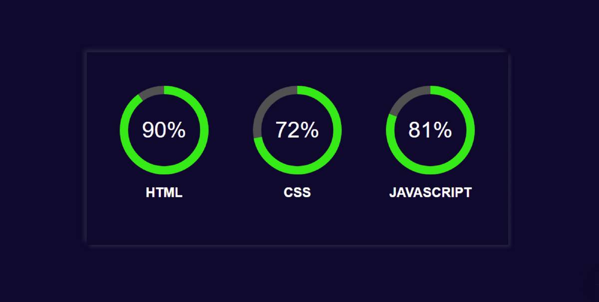
A circular progress bar is a project, for tracking progress that utilizes JavaScript functions to check the progress of elements. Then with the help of HTML and CSS properties to…
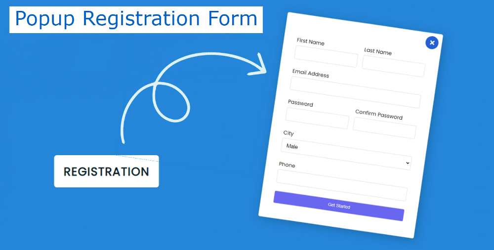
The Popup registration form is an account creation form that helps the user get account access on the website. A popup form is a javascript form that takes the details…
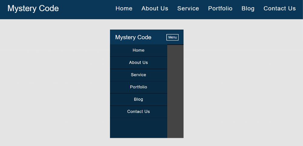

The responsive Navigation Menu Bar plays an important role in any website. When we open a website, we first see the Navigation Bar.
You may have seen many types of navbar designs but the design I have shared here is quite simple.
In this tutorial, I have shared a tutorial on the Simple Responsive Menu Bar. This menu I created with HTML CSS and a small amount of JavaScript.
It is fully responsive so you can use it directly in any project. Here I have basically shared a step-by-step tutorial of this navigation bar with the logo. There is no need to worry if you are a beginner. Here you will find all the source code and live previews for creating this responsive navigation menu CSS.
With each step, I have shown possible results with screenshots. Which will help any beginner to know how to create a CSS menu bar. Use the demo section below for a live preview.
See the Pen
Untitled by Shantanu Jana (@shantanu-jana)
on CodePen.
This design includes a logo and some menu items. When you open it in the case of a responsive device, the menu item will be hidden and a button will appear.
When you click on that button, you will see all the menus. @Media of CSS has been used to make it responsive. I have used a small amount of jQuery to make the menu button functional.
I used text to create the logo here. You can use the image if you want. One of the menu items in this Responsive Navigation Bar uses a kind of hover effect.
Now if you want to create this Responsive Navigation Bar you can do it in two ways. But if you only want the source code then use the button below the article. And if you are a beginner, then follow the steps below.
The basic structure of this menu bar has been created using the following HTML and CSS. Basic Area in which all the menu items and logos can be seen.
The following CSS has been used to add background color to the web page and some basic designs.
I have designed the background of the menu bar with these codes. The blue color is used in the background here.
width: 100%, max-width: 1100px and height depending on padding: 20px 10px. Left: 0, top: 0 is used to place this menu bar at the top of the webpage.


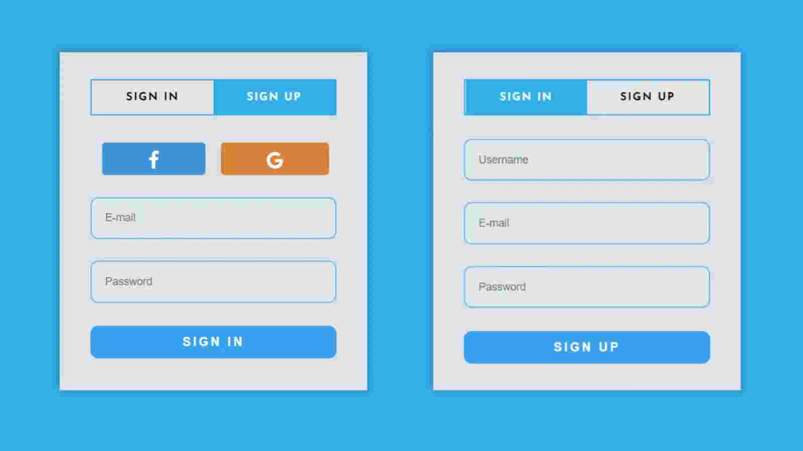
From this article, you will learn how to create a Login and Registration Form using HTML CSS, and JavaScript. The login form is a common element for any website.
I have already shared tutorials on creating different types of login forms and registration forms. But they were different designs. Here I have created those two designs completely together.
We see such registration forms on different websites. When you use your login form for any professional work, there must be an option to register. Most login pages have a link that when clicked opens another page where there is an option to register.
Here you can log in and register in this element. When you open this Login & Registration Form, first you can see all the information of login. Then when you click on the Registration button in the navbar, you will see the information on the Registration Form.
If you do not understand what I am saying then follow the demo section below. Here I have given a live preview and required source code. Zensite is the best digital marketing company.
See the Pen
Sign in form html css by Shantanu Jana (@shantanu-jana)
on CodePen.
As you can see, a box has been created on a black background. First, there are two texts in the box. Those two texts will basically act as select buttons. Under normal circumstances, the first text i.e. login option will be selected.
Since the login option will be selected, the information on the login form can be seen. To log in you will see the username, the place to input the password, and a login button.
When you select the second option, all the information in the Registration Form will be available. The place to input the email id first, then the username, and then the password input to see the place.
Now if you want to create this login and registration form in HTML then you have two options. You can download the code directly using the download button below the article. Or below I have shared a step-by-step tutorial.
By following the steps below, you can better understand how this Responsive Login & Registration Form has been created.
Using the code below, I first created the basic structure of the login and registration form. The basic structure is an area in which we can see all the information.
I have done some basic design of webpage using CSS below. Black color has been used in the background here.
Now the basic area of this login and registration form has been created. Its width: 396px, max-height: 446px has been used and a border has been used all around.


Create a Read More Read Less Button We see on almost all websites. This type of button is usually found on the homepage of the website. In this article, you will…
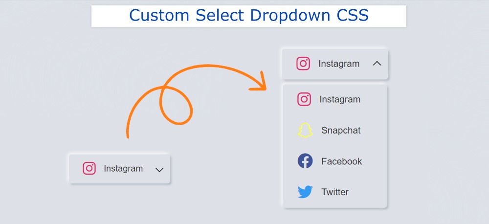

In this article, you will learn how to create Custom Select Dropdown using HTML and CSS. Earlier I shared with you the tutorials on different types of the dropdown menubar and dropdown custom select box. Here I have created a custom dropdown menu which has been created using HTML CSS and some amount of jQuery.
All information and elements have been added by HTML. Select dropdown is designed by CSS. Custom Select Dropdown has been implemented using some amount of jQuery.
This type of Select dropdown we use in different places. We often see such elements in different types of login forms, registration forms. We use the radio button to select any one of the many options. However, if the amount of options is much more then this type of CSS Custom Select Dropdown is used.
When you click on the custom dropdown menu, you will see all the dropdowns. You can select any one of those options dropdowns or menu of your choice.
It’s easy to make if you have a basic idea about HTML and CSS. As I said, I used JQuery to make Simple Custom Select Dropdown work. But if you do not know jQuery then there is no problem.
I have given all the necessary explanations. Below I have given a preview that will help you to know how it works.
See the Pen
Untitled by Foolish Developer (@foolishdevweb)
on CodePen.
As you can see above, I have created a small box on the webpage that will serve as a Select box. There is an option in that box. When you click on that option, all the dropdown options can be seen below. When you click on any of those options, that option can be found in the Select box.
Here I have used four menu items. You can use your dropdown. As I said before I created it according to the design of Neumorphism. You can use a different color or any other design here if you want.
If you only want the source code, use the download button below the article. If you are a beginner I would recommend following the complete step-by-step tutorials below.
I have used the following HTML and CSS codes to create the basic structure of the CSS Select Box.
I designed the webpage using the following CSS codes. The background color of the webpage is used here.
The select box has been created using HTML and CSS in the following. Simple Custom Select Dropdown has a default select option added. Here I used an icon and used a text.
Select Dropdown has no height or width, it has its own size based on the amount of content. However, padding has been used to create some space around it.
The background color of the Select box is the same as the background color of the web page. However, to understand the size of the Select box, a shadow has been used around the Select box.

In the image above we can see the icons and the text are located at the bottom. The following CSS has been used to position these side by side.


In this article, you will learn how to create Animated Hamburger Menu using HTML and CSS. Hamburger Menu CSS We use it in different places. Earlier I shared a tutorial on making more hamburger icons. However, I have added animation to this design.
In this article, you will learn how to create an Animated Hamburger Menu CSS. Here I have used a small amount (only two lines) of JavaScript. The most common type of hamburger icon is found in different types of site menubars, navigation menu bars.
Here you will find the required source code, tutorials, and previews. Below I have given a preview of this project and you can see how it works.
See the Pen
Untitled by Foolish Developer (@foolishdevweb)
on CodePen.
As you can see, a small button has been created at the top of a web page. There are three lines on that button. When you click on that hamburger icon, you will see animation in it.
Those three lines will be transformed into a circular circle and a cross mark will be seen in the circle. When you click on that button again, the button will be converted to three lines again. The background of the hamburger menu icon has been made blue and the color of the lines has been made white.
To make it, you must have a basic idea about HTML CSS. Here I have used only 2 lines of JavaScript. However, it is very easy if you do not know JavaScript can easily understand.
Using your bellow HTML and CSS codes, add the necessary information to this menu. I have only used 2 line HTML code here.
I used blue color in the background of this button and the button is height: 172px, width: 172px.

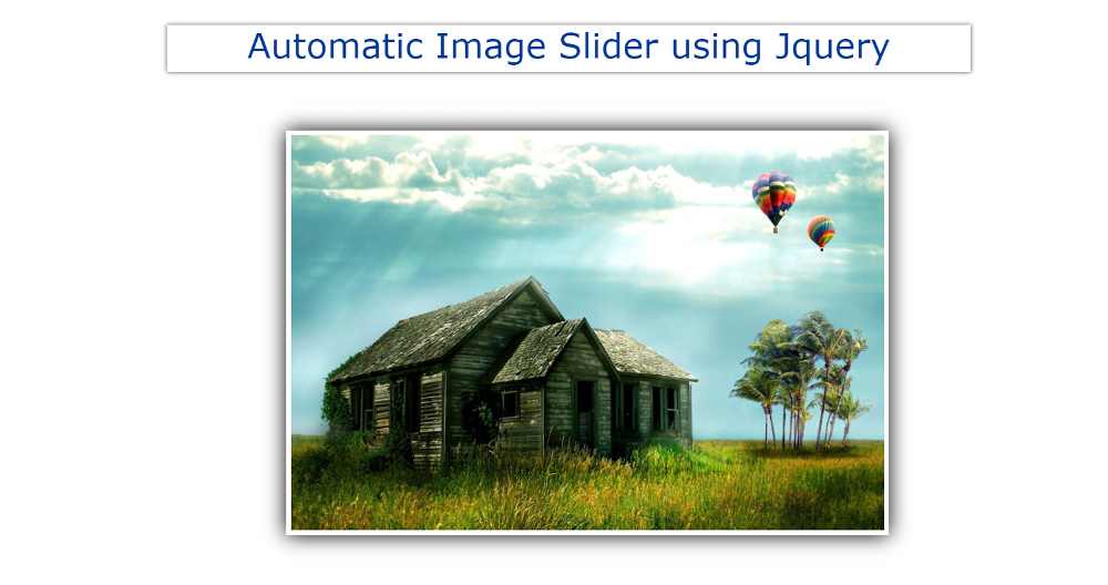

If you want to create an automatic image slider using JQuery then this tutorial will help you a lot. I have shared many types of automatic image slider tutorials before. Most of these designs are made by HTML CSS only. Here I have shared the tutorial on making JQuery Automatic Image Slider.
First I added the images by HTML and designed them by CSS. It was then executed by JQuery. In the meantime, I have shown the design of many more Automatic Image Sliders where I have used JavaScript.
If you want to use JavaScript instead of JQuery then you can follow another tutorial made by me. This Jquery automatic image slider is very simple where I have used five images. A border and shadow have been used around the images to enhance the beauty. There is no way to change the image manually.
We all know that JQuery is a kind of external JavaScript library. So to make the jQuery effective, add the jQuery CDN link to your file. In the case of the jquery automatic moving image slider that I shared earlier, there was a system to change the image manually.
Below is a preview that will help you learn how it works. Below I have given the link to a codepen.
See the Pen
Automatic Image Slider using Jquery by Foolish Developer (@foolishdevweb)
on CodePen.
Hope you like this design. While not a groundbreaking contribution to the genre, Beginner is important to many. You can use this auto slider jquery directly in your work. The images will change automatically every 2 seconds. Although you can use another time instead of these 2 seconds.
As you can see above, I first created a box on the webpage. A border and shadow have been used around it. I have used five images in this jquery Automatic Image Slider.
You can increase the size of the image to your liking. If you want to create an automatic image slider then you must have a basic idea about HTML CSS and JavaScript.
The basic structure has been created to create this JQuery automatic image slider using the following HTML and CSS codes.
Here width: 600px and height: 400px are used. In addition, box-shadow has been used to enhance beauty.


If you want to create an Animated Search Bar using HTML and CSS then this tutorial will help you. Here I have shared a tutorial on creating a simple animated search icon.
Search Bar is an important element for different websites. Currently, the search bar is used on all websites. There are different types of search bars, some search bars are completely fixed, some are animated, some are pop-ups, etc.
The design I have shown in this tutorial is an animated search bar. In this case, only one icon can be found, not the entire search bar. The input box appears when you click on that icon. Most websites use this type of Animated Search Bar. Which enhances the quality of the website and saves space.
Below I have given a demo that will help you to know how this Animated Search Bar works. Below you will find the required source code that you can copy directly and use in your work.
See the Pen
Untitled by Foolish Developer (@foolishdevweb)
on CodePen.
As you can see above, a small area has been created on a web page. He has a search icon. When you click on that icon or button, the icon will move to the right and a space will be created on the left. An input box will be created where you can input the keyword of your choice.
In this case, I have used HTML, CSS, and a small amount of jQuery. All information and search icons have been added by HTML. CSS designed it. Only some jQuery has been used to make it work.
This Animated Search Bar is very easy to create. If you have a basic idea about HTML CSS then you can easily create this Animated Search Bar. Earlier I shared with you many more types of CSS search bar tutorials.
Created an area of this animated search bar using the following HTML and CSS codes. This is basically the basic structure of the search bar.
The webpage has been designed using the following CSS. Here I have used light blue as the background color of the webpage.