
In this article, you will learn how to create Custom Select Dropdown using HTML and CSS. Earlier I shared with you the tutorials on different types of the dropdown menubar and dropdown custom select box. Here I have created a custom dropdown menu which has been created using HTML CSS and some amount of jQuery.
All information and elements have been added by HTML. Select dropdown is designed by CSS. Custom Select Dropdown has been implemented using some amount of jQuery.
This type of Select dropdown we use in different places. We often see such elements in different types of login forms, registration forms. We use the radio button to select any one of the many options. However, if the amount of options is much more then this type of CSS Custom Select Dropdown is used.
When you click on the custom dropdown menu, you will see all the dropdowns. You can select any one of those options dropdowns or menu of your choice.
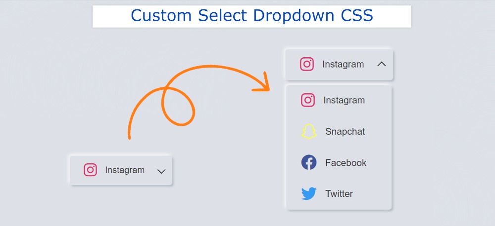
Custom Select Dropdown Example
It’s easy to make if you have a basic idea about HTML and CSS. As I said, I used JQuery to make Simple Custom Select Dropdown work. But if you do not know jQuery then there is no problem.
I have given all the necessary explanations. Below I have given a preview that will help you to know how it works.
See the Pen
Untitled by Foolish Developer (@foolishdevweb)
on CodePen.
As you can see above, I have created a small box on the webpage that will serve as a Select box. There is an option in that box. When you click on that option, all the dropdown options can be seen below. When you click on any of those options, that option can be found in the Select box.
How to Create a Custom Select Box
Here I have used four menu items. You can use your dropdown. As I said before I created it according to the design of Neumorphism. You can use a different color or any other design here if you want.
If you only want the source code, use the download button below the article. If you are a beginner I would recommend following the complete step-by-step tutorials below.
Step 1: Basic structure of Select Box
I have used the following HTML and CSS codes to create the basic structure of the CSS Select Box.
I designed the webpage using the following CSS codes. The background color of the webpage is used here.
Step 2: Default option of Select Dropdown
The select box has been created using HTML and CSS in the following. Simple Custom Select Dropdown has a default select option added. Here I used an icon and used a text.
Select Dropdown has no height or width, it has its own size based on the amount of content. However, padding has been used to create some space around it.
The background color of the Select box is the same as the background color of the web page. However, to understand the size of the Select box, a shadow has been used around the Select box.

In the image above we can see the icons and the text are located at the bottom. The following CSS has been used to position these side by side.

Step 3: List of Custom Select Dropdown
Now I have added four options in the Select box. If you want to increase the number of options, you can add the options of your choice here according to this format.
The following CSS has been used to activate the Select box. That is, when you click on the Select box, it is determined what will change.
Here opacity: 1 is used. When you click on Select, you will see the options. With this, the arrow mark will rotate 225 degrees.
The results below are currently unavailable to you. You will see this result after using JQuery.

Step 4: The color of the menu icon
Now different colors have been added for the icons in this Custom Select Dropdown. Here I have used four Select Dropdown.

Step 4: Activate Custom Select Dropdown
Now it’s time to use the Custom Select Dropdown menu to execute the query. Here I have used a very small amount of jquery. If you know basic JavaScript then you can easily understand the following code.
The Onclick function is used here. I have instructed here that the ‘active’ function will be effective when you click on the select box. I have added the required CSS code of “active” above.
Now I have arranged to select any one option from Custom Select Dropdown. This means that the option that you click on one of the options here can be found in the Select box by default. The following codes have been used for this.

Hopefully, you have learned from the above tutorial how I created this Select Box using HTML and CSS.
If there is any problem while creating this Custom Select Dropdown then you can definitely let me know by commenting. Earlier I created many more types of dropdown menu bars and Select Dropdown menu.