In this article, you will learn how to create Animated Login Form using HTML and CSS. Earlier I shared the design of different types of login forms. Notable among them are the Glassmorphism login form, Neumorphism, transparent login form, etc.
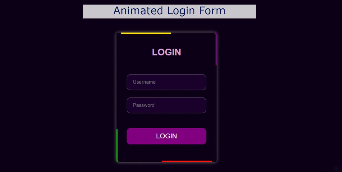
The design I shared in this article is an animated login form HTML CSS. No special animations were added, only a border animation was used around the login form. It is a simple login form with two input boxes and a button at the end.
Below I have given a demo that will help you to know how this animated login form works. I used HTML and CSS to make it. Below you will find the demo and the required source code. As you can see above, we first created an area on the webpage. I first used a heading and then made two input boxes for input. There is a login button to log in at the end of all. This is definitely a simple login form. A color animation has been used on the border of this login form.
CSS has been used to make the animation work. If you know basic HTML and CSS then you can easily create this animated login form. I did not share step by step tutorial here as it is a very simple design.
I have provided the required source code which you will not have any difficulty in understanding.
How to create Animated Login Form
Now it’s time to create this animated login form HTML CSS. For this, you need to take the help of HTML and CSS. First, you create an HTML and CSS file. Here I have given the required source code. You can copy them and add them to your file.
HTML Code (index.html)
The following HTML codes are used to generate the basic information of this login form. Copy these codes and paste them into your HTML file. Be sure to rename your HTML file using index.html.
Now is the time to design this login form with CSS. Copy these codes and paste them into your CSS file. Be sure to use the rename style.css of your CSS file.
You do not need to attach your CSS file to the HTML file here. I have already added the required code to attach the CSS file to the HTML file.
* {
padding: 0;
margin: 0;
box-sizing: border-box;
}
body {
font-family: sans-serif;
justify-content: center;
min-height: 100vh;
background: #0c0116;
display: flex;
align-items: center;
}
.form {
position: relative;
background: #0c0116;
overflow: hidden;
box-shadow: 0px 0px 10px 0px rgb(116, 119, 114);
border-radius: 5px;
padding: 60px 15px;
width: 270px;
height: 350px;
}
.form-inner {
position: absolute;
top: 50%;
left: 50%;
background: #0c0116;
height: 98%;
width: 98%;
transform: translate(-50%, -50%);
}
.content {
width: 100%;
padding: 25px;
height: 100%;
}
.form-inner h2 {
text-align: center;
padding-top: 35px;
font-size: 25px;
color: #d7a3d7;
}
.input {
display: block;
padding: 12px 15px;
border: 1.5px solid rgb(109, 87, 121);
outline: none;
background: #19052c;
color: white;
width: 100%;
left: 50%;
border-radius: 10px;
margin-top: 20px;
}
.btn {
margin-top: 40px;
width: 100%;
cursor: pointer;
color: white;
border: none;
font-size: 18px;
border-radius: 10px;
transition: 0.4s;
padding: 12px;
outline: none;
background: #800080;
}
.btn:hover {
background: #c907c9;
}
.form span {
height: 50%;
width: 50%;
position: absolute;
}
.form span:nth-child(1) {
background: #ffda05;
animation: 5s span1 infinite linear;
animation-delay: 1s;
top: 0;
left: -48%;
}
.form span:nth-child(2) {
background: #00a800;
bottom: 0;
right: -48%;
animation: 5s span2 infinite linear;
}
.form span:nth-child(3) {
background: #800080;
top: 0px;
animation: 5s span3 infinite linear;
right: -48%;
}
.form span:nth-child(4) {
animation: 5s span4 infinite linear;
animation-delay: 1s;
background: #ff0000;
bottom: 0;
right: -48%;
}
@keyframes span1 {
0% {
top: -48%;
left: -48%;
}
25% {
top: -48%;
left: 98%;
}
50% {
top: 98%;
left: 98%;
}
75% {
top: 98%;
left: -48%;
}
100% {
top: -48%;
left: -48%;
}
}
@keyframes span2 {
0% {
bottom: -48%;
right: -48%;
}
25% {
bottom: -48%;
right: 98%;
}
50% {
bottom: 98%;
right: 98%;
}
75% {
bottom: 98%;
right: -48%;
}
100% {
bottom: -48%;
right: -48%;
}
}
@keyframes span3 {
0% {
top: -48%;
left: -48%;
}
25% {
top: -48%;
left: 98%;
}
50% {
top: 98%;
left: 98%;
}
75% {
top: 98%;
left: -48%;
}
100% {
top: -48%;
left: -48%;
}
}
@keyframes span4 {
0% {
bottom: -48%;
right: -48%;
}
25% {
bottom: -48%;
right: 98%;
}
50% {
bottom: 98%;
right: 98%;
}
75% {
bottom: 98%;
right: -48%;
}
100% {
bottom: -48%;
right: -48%;
}
}
Final Output:
Conclusion:
Hopefully, you have been able to create this animated login form using the codes above. If there is any difficulty then you must let me know by commenting.
Earlier I shared with you the design of different types of login forms. Please comment on how you like this Animated Login Form Design.