50+ Hamburger Menu (Free code+ demo)
Hey folks, Let's step into another blog, another step of learning. Welcome to our new blog of the amazing and latest collection of 50+ Hamburger menus using HTML, CSS, and…
Hey folks, Let's step into another blog, another step of learning. Welcome to our new blog of the amazing and latest collection of 50+ Hamburger menus using HTML, CSS, and…
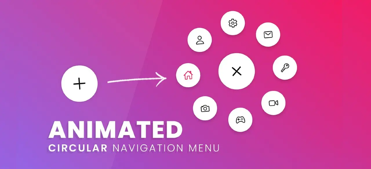
Are you looking for the best Circular Navigation Menu for your website? In this article I will share with you 20 Best CSS Circular Navigation Menu Designs. Circular navigation menus…

Do you want to create a dropdown sidebar menu? If yes then this tutorial will help you. In this article, you will learn how to create a sidebar dropdown menu…
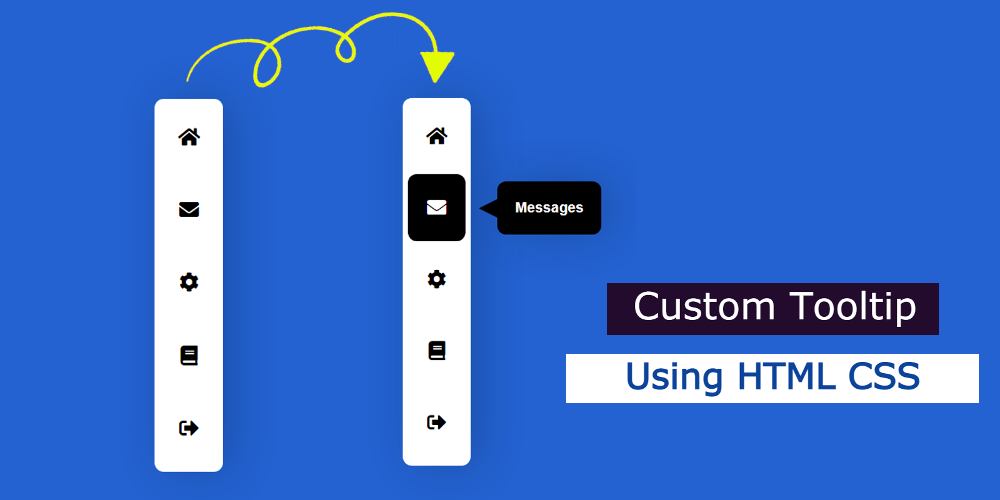
In this article, you will learn how to make Custom Tooltip using HTML CSS. Currently, CSS Tooltip is used in different elements of the website. What is a tooltip in…
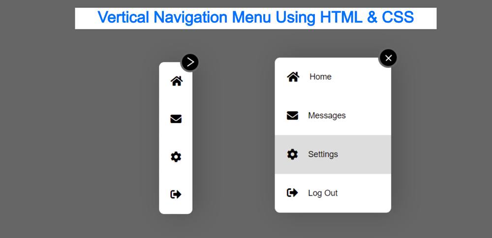

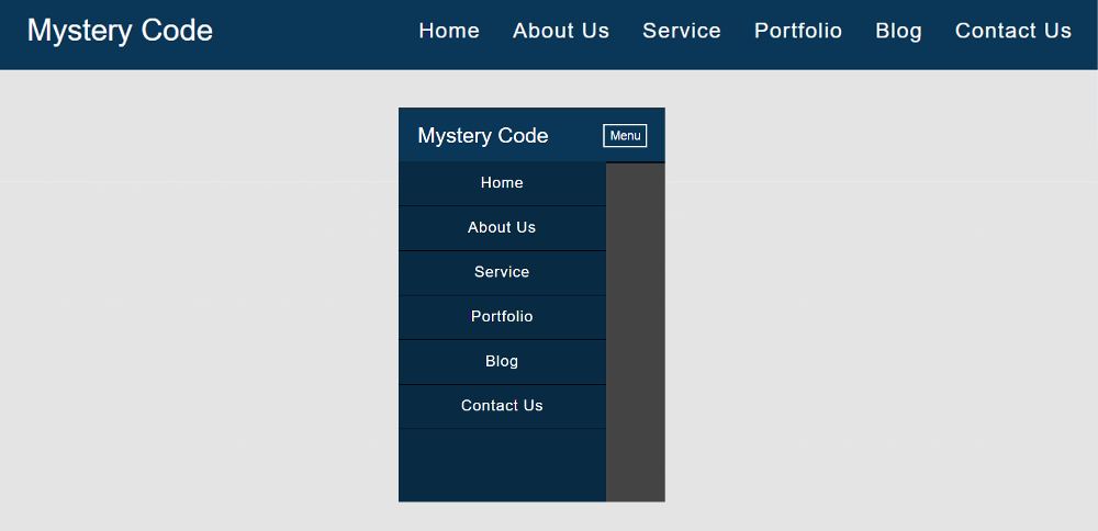
Do you want to create a Vertical Navigation Menu using HTML and CSS?
This tutorial will help you to know how to create a vertical navigation bar. Although you will find many tutorials on this topic on the Internet. However, in this article, I have given you some special information.
Here I will discuss with you what can be the problem while creating a CSS Vertical Navigation. With this, I have shown step by step how I have created this CSS Vertical menu. Earlier I shared a tutorial on creating horizontal navigation bar CSS.
This is just a demo so here are just four menu items I added. Although you can add a lot of menu items here according to your needs.
If you don’t understand what I said then follow the demo below. Here you will find out how it works and get all the source code to make it.
See the Pen
Vertical Navigation Menu by Shantanu Jana (@shantanu-jana)
on CodePen.
In the case of websites, we see the menu bar on the top the most. However, the Vertical Menu bar or side menu bar is currently being used extensively. Many websites have a Vertical menu bar along with a top navigation bar.
I make this design in a very simple way so only HTML and CSS are used here. But here I have used only 2 lines of JavaScript.
When you first open this Side Navigation Bar, you can see only a few menu item icons. But no test can be found. The tests will be completely hidden.
Under normal conditions, the width of the Vertical Navigation Menu will be: 67px. When you click on the arrow sign here, the length of the menubar will increase to width: 225px. As a result, the text of the menu item can be seen.
This Responsive Side Navigation Bar is basically for those who are brand new and trying to create a Vertical menu bar for the first time.
The basic structure of this menu bar has been created using the following HTML and CSS code. As I said before, under normal circumstances the width of this menu bar will be: 67px. Here height: 300px is used. Although the height you can change according to your needs.

After activating this Simple Vertical Navigation Menu, the width of the menu bar has been added here. Although I did the work of activating later.

The responsive Navigation Menu Bar plays an important role in any website. When we open a website, we first see the Navigation Bar.
You may have seen many types of navbar designs but the design I have shared here is quite simple.
In this tutorial, I have shared a tutorial on the Simple Responsive Menu Bar. This menu I created with HTML CSS and a small amount of JavaScript.
It is fully responsive so you can use it directly in any project. Here I have basically shared a step-by-step tutorial of this navigation bar with the logo. There is no need to worry if you are a beginner. Here you will find all the source code and live previews for creating this responsive navigation menu CSS.
With each step, I have shown possible results with screenshots. Which will help any beginner to know how to create a CSS menu bar. Use the demo section below for a live preview.
See the Pen
Untitled by Shantanu Jana (@shantanu-jana)
on CodePen.
This design includes a logo and some menu items. When you open it in the case of a responsive device, the menu item will be hidden and a button will appear.
When you click on that button, you will see all the menus. @Media of CSS has been used to make it responsive. I have used a small amount of jQuery to make the menu button functional.
I used text to create the logo here. You can use the image if you want. One of the menu items in this Responsive Navigation Bar uses a kind of hover effect.
Now if you want to create this Responsive Navigation Bar you can do it in two ways. But if you only want the source code then use the button below the article. And if you are a beginner, then follow the steps below.
The basic structure of this menu bar has been created using the following HTML and CSS. Basic Area in which all the menu items and logos can be seen.
The following CSS has been used to add background color to the web page and some basic designs.
I have designed the background of the menu bar with these codes. The blue color is used in the background here.
width: 100%, max-width: 1100px and height depending on padding: 20px 10px. Left: 0, top: 0 is used to place this menu bar at the top of the webpage.


In this article, you will learn how Responsive Top Navigation Menu Bar is created using HTML and CSS. Earlier I designed many more types of menubars. The beauty and quality…
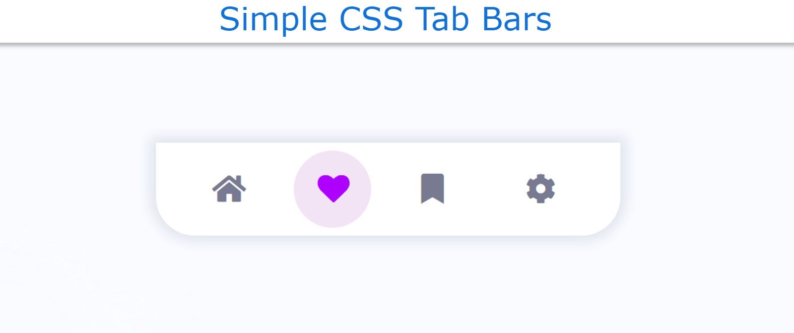
In this article, you will learn how to make a simple Tab Bar using HTML and CSS. The CSS Tab Bar is basically a type of navigation bar that can…
In today's article, you are going to learn how to create a simple dropdown menu bar using HTML and CSS code. If you are looking for good Websites & SEO Company…


In this article, I am going to show you how to create a responsive navigation menu bar using HTML, CSS, and javascript. I have designed many types of navigation and side menubars before. However, this design is much simpler and simpler. If you are a beginner and want to know about the concept of a navigation menu bar then this tutorial will definitely help you.
This is a fully responsive CSS navigation menu bar. Bootstrap or other external links were not used to make Responsive. It has been made Responsive using Pure CSS Code. In this case, I have used a small amount of JavaScript only to execute the menu button.
First I designed the background for navigation and in this case, I used black color in the background. First of all, I used a logo here. In this case, I have used text to create a logo. However, you can use separate images.
Then I used five menu items here. I have used the color white for menu items and logos which can be seen very clearly on a black background.
It is a fully responsive device so it can adapt itself beautifully to any device. In the case of responsive devices, menu items are completely hidden, instead, a small menu button is seen.
If you click on that button, you can see the complete menu items. It is a very simple design that you can create if you know the basic HTML CSS.