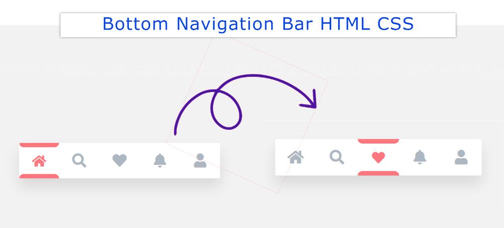
Responsive Navigation Menu Bar in HTML and CSS

The responsive Navigation Menu Bar plays an important role in any website. When we open a website, we first see the Navigation Bar.
You may have seen many types of navbar designs but the design I have shared here is quite simple.
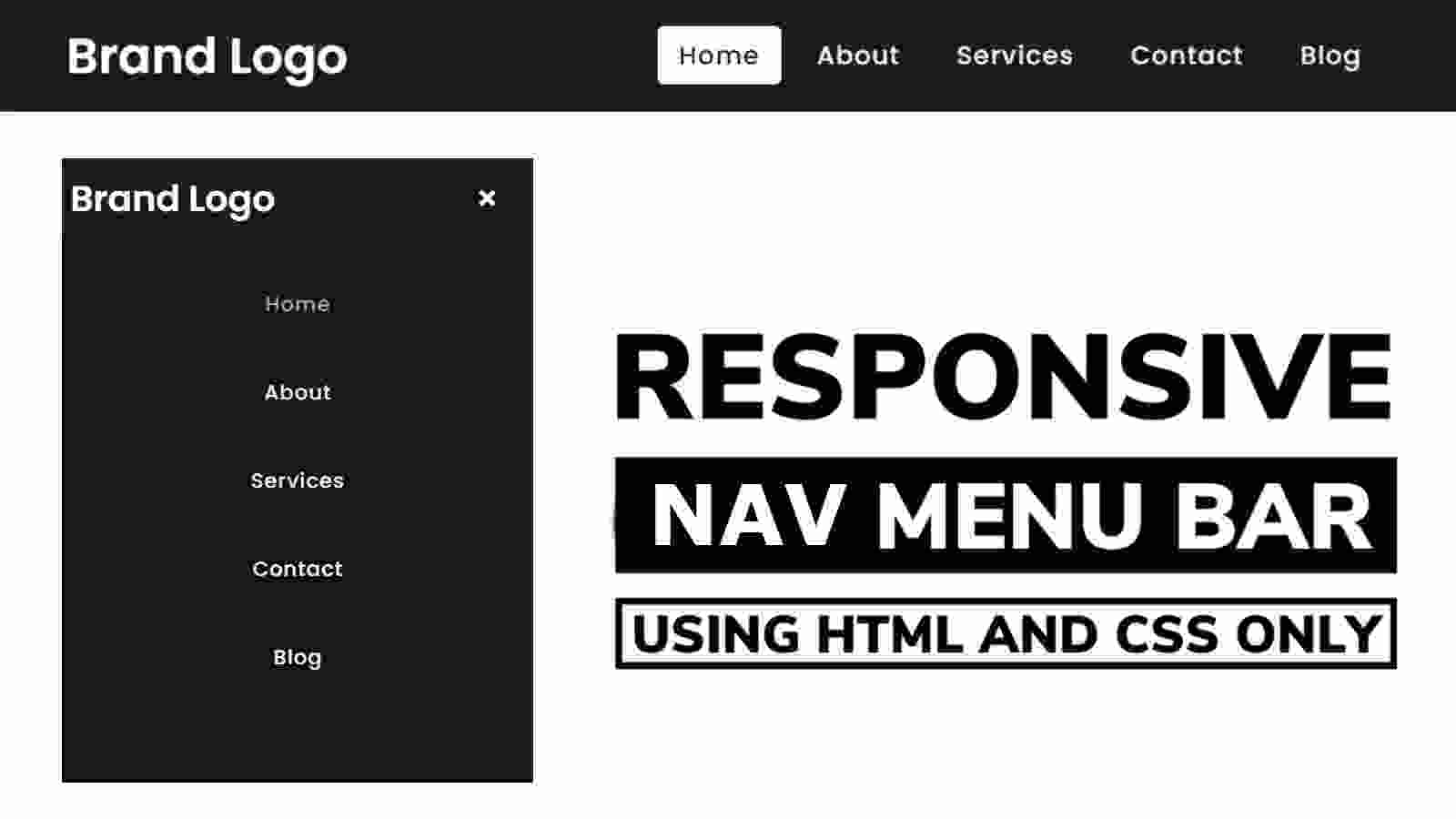
In this tutorial, I have shared a tutorial on the Simple Responsive Menu Bar. This menu I created with HTML CSS and a small amount of JavaScript.
It is fully responsive so you can use it directly in any project. Here I have basically shared a step-by-step tutorial of this navigation bar with the logo. There is no need to worry if you are a beginner. Here you will find all the source code and live previews for creating this responsive navigation menu CSS.
Responsive Navigation Menu CSS
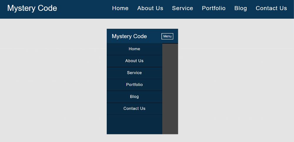
With each step, I have shown possible results with screenshots. Which will help any beginner to know how to create a CSS menu bar. Use the demo section below for a live preview.
See the Pen
Untitled by Shantanu Jana (@shantanu-jana)
on CodePen.
This design includes a logo and some menu items. When you open it in the case of a responsive device, the menu item will be hidden and a button will appear.
When you click on that button, you will see all the menus. @Media of CSS has been used to make it responsive. I have used a small amount of jQuery to make the menu button functional.
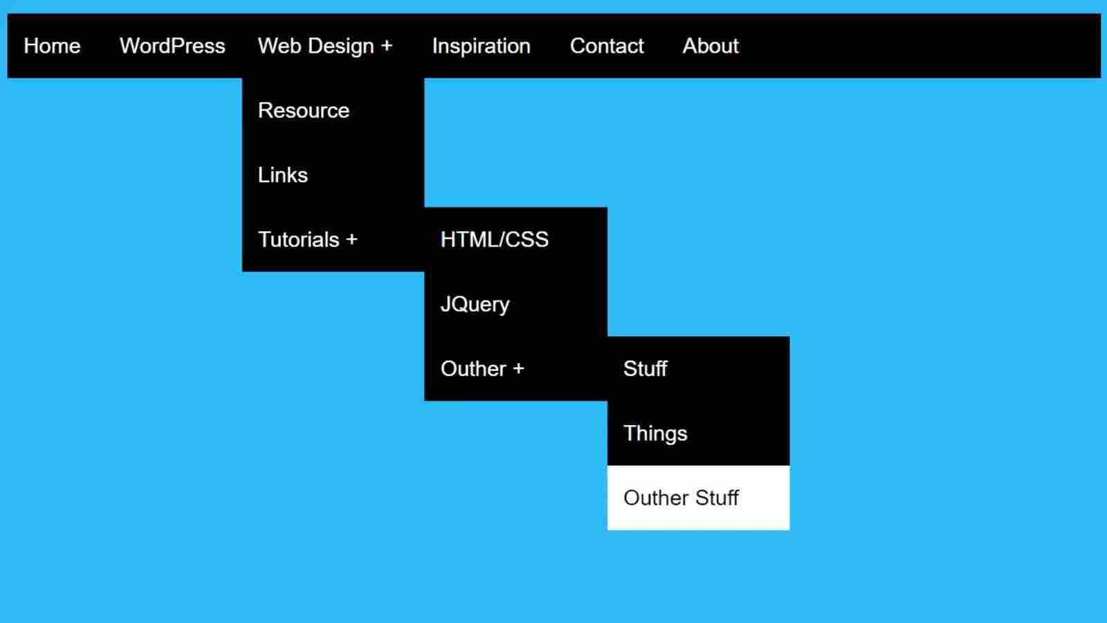
I used text to create the logo here. You can use the image if you want. One of the menu items in this Responsive Navigation Bar uses a kind of hover effect.
How to Create Navigation Menu bar in HTML
Now if you want to create this Responsive Navigation Bar you can do it in two ways. But if you only want the source code then use the button below the article. And if you are a beginner, then follow the steps below.
Create a menu bar area
The basic structure of this menu bar has been created using the following HTML and CSS. Basic Area in which all the menu items and logos can be seen.
The following CSS has been used to add background color to the web page and some basic designs.
I have designed the background of the menu bar with these codes. The blue color is used in the background here.
width: 100%, max-width: 1100px and height depending on padding: 20px 10px. Left: 0, top: 0 is used to place this menu bar at the top of the webpage.