Hovering Cards V1 Using HTML CSS
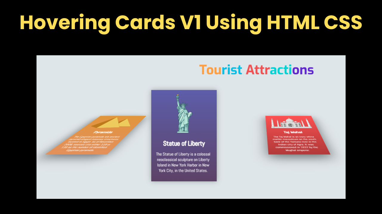
Introduction : Hello friends, welcome all of you to today's new beautiful project. Today we have created Hovering Cards V1 Using HTML CSS for you, in which when the user…
Introduction : Hello friends, welcome all of you to today's new beautiful project. Today we have created Hovering Cards V1 Using HTML CSS for you, in which when the user…
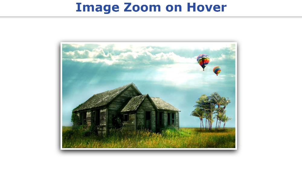
Image Zoom on Hover makes the image slider or gallery much more interesting and suitable. You can easily create an image zoom using only HTML and CSS. However, some amount…
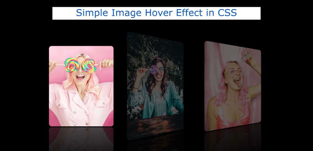
In this article, you will learn how to create Image Hover Effects using only HTML and CSS. I have already shared an image hover tutorial using JavaScript. We use different…

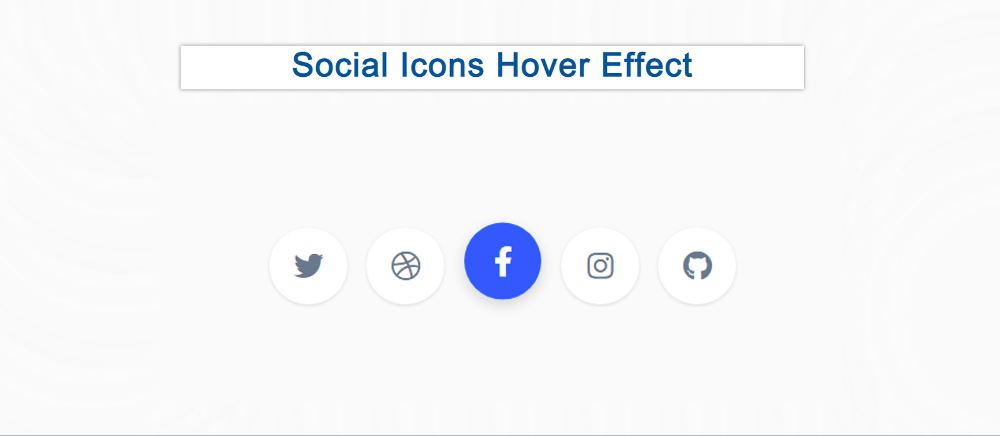
This is a CSS tutorial where you will learn how to create simple social media icons with a hover effect. The hover or animation effect makes the social button much more interesting. Here a few CSS social buttons have been created and hover colors have been used in them.
Social icons are a common element among different websites or projects. The social media buttons that have been created here use animated hover colors.
This social icon hovers effect is made using only HTML and CSS you can use anywhere. I have added icons using HTML. These social icons have been designed and hovered using CSS.
See the Pen
Social Icon Hover Effect by Shantanu Jana (@shantanu-jana)
on CodePen.
This is a complete tutorial where you can get all the source code, step-by-step tutorials, and live previews. So if you are a beginner then this tutorial will help you a lot. If you want to see the preview then use the demo section above.
Here five hover effect social icons are used and they are given in the form of a round button.
Now if you want to make it, you need to have some idea about HTML and CSS. If you are not technical then use the download button directly below the article.
All social icons have been added by the following HTML code. Here I have used 5 social icons.
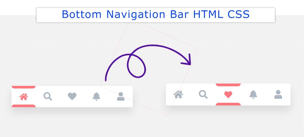

In this tutorial, you will learn how to create Bottom Navigation Bar HTML CSS. Earlier I shared another tutorial on creating a Bottom Navigation Menu. This type of CSS tab we see mainly in the case of responsive devices.
This type of Bottom Navigation Bar HTML is found mainly in the case of mobile apps. This design can only be created by HTML CSS.
Although I have used some JavaScript to make the animation used here work. If you omit the animation, you can create this mobile bottom navigation bar with HTML CSS.
For your convenience, I have given a preview below. Icons have been used instead of text for menus. If you only want the source code, use the button below the article.
See the Pen
Navigation Bar – JS by Foolish Developer (@foolishdevweb)
on CodePen.
First, the basic structure of the Fixed bottom navbar has been created on the webpage. White color has been used in the background of the navbar.
Then I used 5 icons here. You can increase the amount of menu according to your needs. Here the color of the active icon will be red. Borders have been added to the active icons using CSS before and after.
A border of 8px can be seen above and below the menu item that will be active. When you click on another icon, its borders will be removed and added to that icon.
Below I have shared step by step tutorial and show how to create a bottom navigation bar design. For this, you need to have an idea about HTML, CSS, and javascript.
However, if you are a beginner, follow the tutorial below. If you create this Bottom Navigation Menu using HTML checkboxes then you don’t need to use JavaScript.
First, the basic structure of this fixed bottom navbar has been created.
I designed the webpage using the code below and added a background color.
I have used min-height: 30px, min-width: 200px of this navbar and the background color is white.

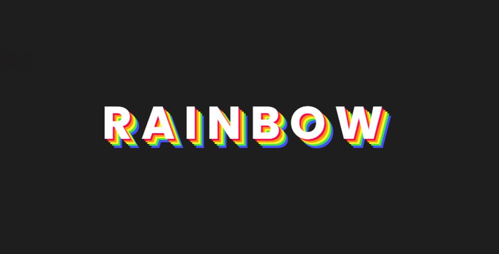
You will learn how to make CSS rainbow text animation from this tutorial. Here I will tell you step-by-step how to create rainbow text animation using only HTML and CSS.…

This tutorial will help you to create smooth zoom transition CSS. Earlier I shared tutorials on different types of image zoom. In this article, you will learn how to make…
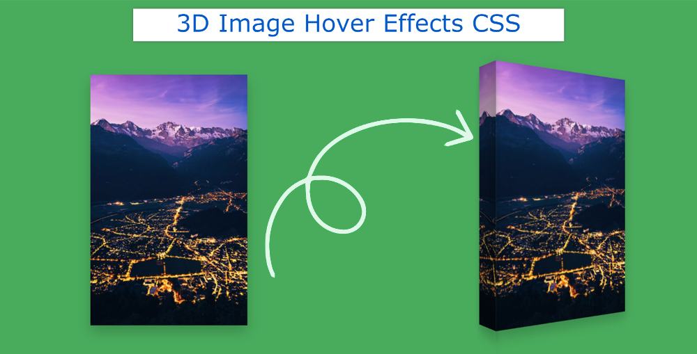
This tutorial will help you if you want to create 3D Image Hover Effects CSS. Here you will learn how to create a 3d hover effect using HTML and CSS.…