
This tutorial will help you if you want to create 3D Image Hover Effects CSS. Here you will learn how to create a 3d hover effect using HTML and CSS.
You can use this type of hover effect in your image slider or image gallery. This 3d hover effect CSS can be seen when you click on the image or move the mouse.
Earlier I shared tutorials on different types of 3D image sliders, simple image hover effects. This is the first time I am going to share a tutorial on 3D Image Hover Effect CSS.
3D Image Hover Effects CSS
Below is a demo that will help you get a live preview of this project. If you want to copy the source code and use it in your work, you can find it in the demo section below.
See the Pen
3D IMAGE HOVER EFFECT by Foolish Developer (@foolishdevweb)
on CodePen.
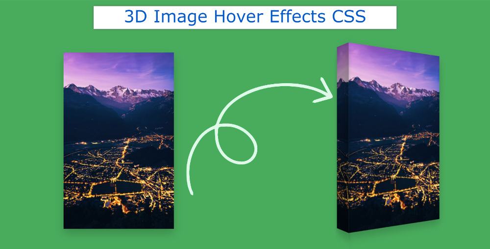
As you can see above, the color green has been used on a web page. An image can be seen on him. When you hover over that image, the image will look a bit like a thick book.
If you turn a box or a thick book at a 30-degree angle, you will see exactly the same type of view in the image.
Step 1: Image Hover Basic structure
The basic structure of this project has been created using the following HTML codes. I have used only one line of HTML code here.
However, I did not add any images here. I have added the image to the CSS code. I have created only one area of the image here.
Now CSS has designed 3D Image Hover Effects. First I designed some of the basics of web pages.

Step 2: Add images to 3D Image Effects
Now I have designed the area of the image using the following CSS and added an image to it. Image area width: 250px, height: 400px. You can use the image you like here.

Step 3: Add a 3D effect to the image
Now I have created this 3D effect using ‘before’. As I said before when you hover or mouse over this image, the image will look a bit like a thick book.
The width of that part: 60px, height: 100%. This element will be perpendicular to the image along the y-axis. This means that this effect will create a 90-degree angle with the image.
Even after using the above code, we do not see any results. This is because this element is perpendicular to the back of the image. As a result, under normal conditions, we do not see the 3D element. We can see that element only when the image is rotated a bit.
I have indicated here that when you hover over the image, the image will rotate 35 degrees along the y-axis and the image will zoom slightly.

Hope you learned from the above tutorial how I created this CSS 3D Image Hover Effects. If there is any problem then you can definitely let me know by commenting. If you want the source code of this 3d effect on hover then use the button below.