Introduction :
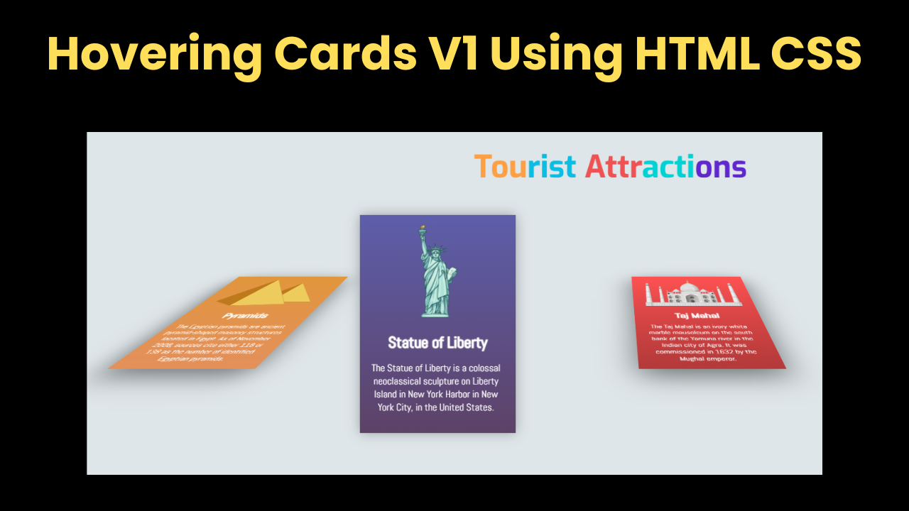
Hello friends, welcome all of you to today’s new beautiful project. Today we have created Hovering Cards V1 Using HTML CSS for you, in which when the user hovers the card, he gets to see animation there. We have used transform property in this hover card. In this we have kept the card in sleep position and when the user hovers the card, he gets the card to become flat, which looks quite amazing. Creating this is quite an easy task. If you have knowledge of CSS, then you can make this.
Explanation :
For any project, it is very important to have HTML. First of all, we have to prepare the structure of the project with the help of HTML, which is a very easy task.
- Head Section:
- <meta>: The head section contains all the main things that help in our project like the link of which font but the most important among these is the meta link.
- <link>: There are many types of links in the head section but the most important links are font links, custom file links or icon links.
- <title>: If you want to add a title to your project then you have to add it in your head section only.
- Body Section:
- <div class=”title”>: First of all in HTML we have created a title box in which we have added the heading of our project.
- <div class=”card1″>: To create a card box, we have left one box. We have made a total of 3 boxes whose method is also exactly the same.
- <img>: To add image in the box we have used image tag in which we have added our image.
- <h3>: We have also added heading in card box which is H3 heading.
In the same way we have created the rest of the boxes which are quite easy, we have followed the same method and also added paragraphs in the card box.
CSS Styling:
- title: We have kept the width of the title of the project 100% and along with this we have kept it in the center.
- card1: In the card we have kept the text align center, used postive absolute and used linear-gradient in the background.
- We have also used transition in the card, margin is kept 10px from top.
- hover: In the card box we have used hover effect in which we have used transform and to make the box look good we have used shadow.
- img: We have also used transform in the image of the card box, we have translated it in it.
In the same way we have designed the rest of the card box in which we have used shadow and transform. If you have proper knowledge of CSS then you can design even better.
Index.html:
<div class="title">
  <h1><span style="color: #ff9f43">Tou</span><span style="color: #0abde3">rist</span> <span style="color: #ee5253">Attr</span><span style="color: #00d2d3">acti<span><span style="color: #5f27cd">ons<span></h1>
</div>
<div class="card1">
  <img src="http://www.pngmart.com/files/5/Pyramids-PNG-HD.png" alt="">
  <h3>Pyramids</h3>
  <p>The Egyptian pyramids are ancient pyramid-shaped masonry structures located in Egypt. As of November 2008, sources cite either 118 or 138 as the number of identified Egyptian pyramids.</p>
</div>

<div class="card2">
  <img src="https://wallazee.global.ssl.fastly.net/images/dynamic/items/383-1024.png" alt="Eiffel Tower">
  <h3>Statue of Liberty</h3>
  <p>The Statue of Liberty is a colossal neoclassical sculpture on Liberty Island in New York Harbor in New York City, in the United States.</p>
</div>

<div class="card3">
  <img src="http://pluspng.com/img-png/download-taj-mahal-png-images-transparent-gallery-advertisement-1185.png" alt="">
  <h3>Taj Mahal</h3>
  <p>The Taj Mahal is an ivory-white marble mausoleum on the south bank of the Yamuna river in the Indian city of Agra. It was commissioned in 1632 by the Mughal emperor.</p>
</div>
Style.css:
@import url('https://fonts.googleapis.com/css?family=Exo:700');
@import url('https://fonts.googleapis.com/css?family=Abel');
body {
  background-color: #dfe6e9;
  -webkit-transform: perspective(900px);
  -webkit-transform-style: preserve-3d;
}
.title{
  width: 100%;
  text-align: center;
}
.title h1{
  font-size:50px;
  font-family: 'Exo', sans-serif;
}
.card1 {
  text-align:center;
  position: absolute;
  left: 100px;
  width: 250px;
  height: 350px;
  margin-top: 10px;
  margin-bottom: 10px;
  background: linear-gradient(rgb(225,150,58),rgb(227,144,91));
  transition:.6s;

  transform: rotatex(75deg) translatey(-200px) translatez(-100px);
  box-shadow: 0px 20px 60px rgba(0,0,0, 0.5);
}
.card1:hover{
  transform: rotatex(0deg);
  transform: rotatez(0deg);
  transition:.6s;
  box-shadow: 0px 0px 20px rgba(0, 0, 0, 0.3);
}
.card1 img{
  transform: translateY(15px);
  width:200px;
  height:120px;
}
h3{
  font-size:25px;
  font-family: 'Abel', sans-serif;
  color:rgb(255,255,255);
  text-shadow: 0 0 2px rgb(255,255,255);
  transform: translatey(10px);
}

p{

  font-family: 'Abel', sans-serif;
  color: white;
  text-align:center;
  width:220px;
  transform: translatex(12px);
}


.card2 {
  text-align:center;
  position: absolute;
  left: 550px;
  width: 250px;
  height: 350px;
  margin-top: 10px;
  margin-bottom: 10px;
  background: linear-gradient(rgb(93,94,170),rgb(93,66,103));
  animation: animate 1s linear infinite;
  transition:.6s;

  transform: rotatex(75deg) translatey(-200px) translatez(-100px);
  box-shadow: 0px 20px 60px rgba(0, 0, 0, 0.5);
}
.card2:hover{
   transform: rotatex(0deg);
  transition:.6s;
  box-shadow: 0px 0px 20px rgba(0, 0, 0, 0.3);
}
.card2 img{
  transform: translateY(15px);
  width:180px;
  height:150px;
}
.card3 {
  text-align:center;
  position: absolute;
  left: 1000px;
  width: 250px;
  height: 350px;
  margin-top: 10px;
  margin-bottom: 10px;
  background: linear-gradient(#ff5252, #b33939);
  transition:.6s;

  transform: rotatex(75deg) translatey(-200px) translatez(-100px);
  box-shadow: 0px 20px 60px rgba(0, 0, 0, 0.5);
}
.card3:hover{
   transform: rotatex(0deg);
  transition:.6s;
  box-shadow: 0px 0px 20px rgba(0, 0, 0, 0.3);
}
.card3 img{
  transform: translateY(15px);
  width:200px;
  height:120px;
}
.footer{
  position: absolute;
  top: 500px;
  margin: 10px;
  width: 100%;
   text-align: center;
}
.footer h2{
  font-size:18px;
  font-family: 'Exo', sans-serif;

}