
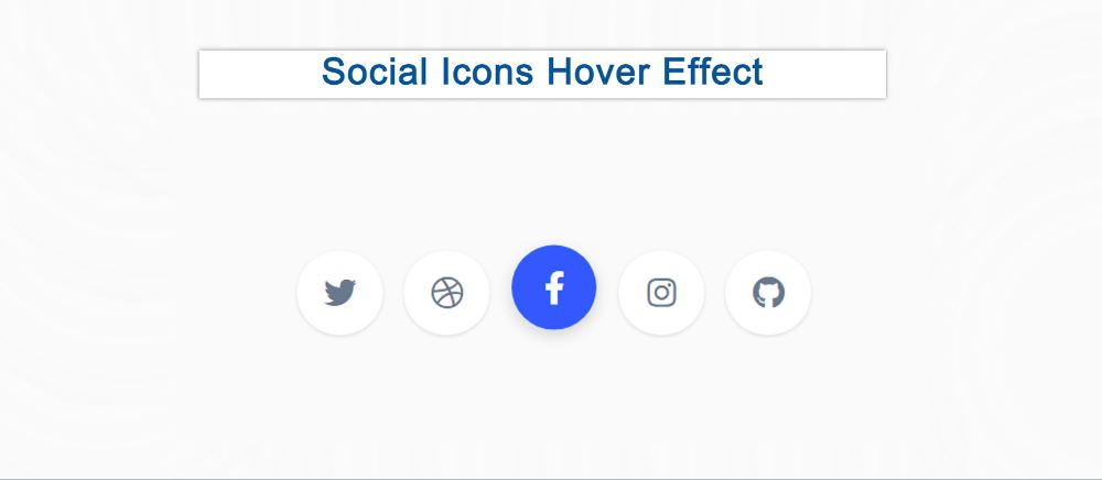
This is a CSS tutorial where you will learn how to create simple social media icons with a hover effect. The hover or animation effect makes the social button much more interesting. Here a few CSS social buttons have been created and hover colors have been used in them.
Social icons are a common element among different websites or projects. The social media buttons that have been created here use animated hover colors.
Social Media Icons hover effect
This social icon hovers effect is made using only HTML and CSS you can use anywhere. I have added icons using HTML. These social icons have been designed and hovered using CSS.
See the Pen
Social Icon Hover Effect by Shantanu Jana (@shantanu-jana)
on CodePen.
This is a complete tutorial where you can get all the source code, step-by-step tutorials, and live previews. So if you are a beginner then this tutorial will help you a lot. If you want to see the preview then use the demo section above.
Create a Social Media Buttons with CSS
Here five hover effect social icons are used and they are given in the form of a round button.
Now if you want to make it, you need to have some idea about HTML and CSS. If you are not technical then use the download button directly below the article.
Step 1: HTML code of Social Icons
All social icons have been added by the following HTML code. Here I have used 5 social icons.
Step 2: Basic design of webpage by CSS
Now the basic design of the webpage has been done with some CSS.

Step 3: Design Social Media Icons
Now the social icons have been designed and shaped like a button. The width and height of the buttons are 75px, the background color is white and shadows have been used around the buttons. Border-radius: 50% is used to round the buttons.

Step 4: Add ‘: after’ effects to icons
Now the ‘: after’ effect has been used in the buttons. Animation has been added by this after effect. Then there is a different background color for each button.
Step 5: Add hover effect in Social Media Icons
Now the hover effect has been added to the social button. Here hover effect is used between both button and icon.

Hopefully, Social Media Icons have been able to create a hover effect using the code above. If there is any problem, you can let us know by commenting. Be sure to comment on how you like these CSS Social Media Buttons.