
You will learn how to make CSS rainbow text animation from this tutorial. Here I will tell you step-by-step how to create rainbow text animation using only HTML and CSS. Earlier I shared with you tutorials on different types of text effects, text typing animations, etc.
Many times we use different types of headings on web pages. I want to use different types of animations in that heading. This rainbow text effect will make your general text much more interesting.
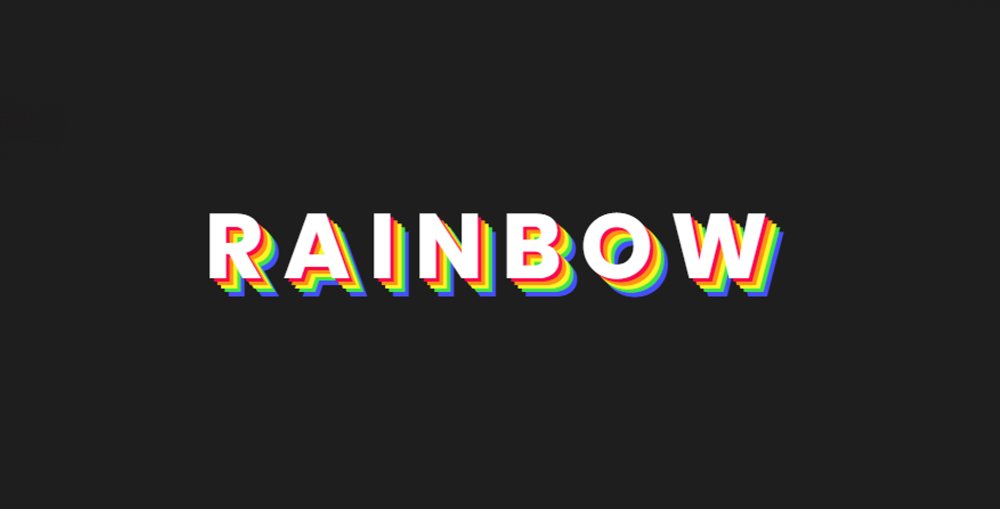
To create these Animated rainbow text Effects I first used text using HTML. Then I added color here using CSS. A total of 6 types of colors have been used here.
CSS Rainbow Text Animation
In the text animations I have shown before, animation can be noticed in general conditions. But the hover effect has been added to the text. When you move the mouse over the text, you will see Pure CSS Rainbow Text Animation.
Below I have given a demo that will help you to understand how this text animation works.
See the Pen
Untitled by Foolish Developer (@foolishdevweb)
on CodePen.
As you can see above, I used black as the background color for a web page. I have added a text to it. Here we have used the background black color to clearly understand the colors of the Rainbow Text. You can change this color when you use it in your project.
How to Create Rainbow Rext Animation CSS
It’s easy to make if you have a basic idea about HTML and CSS. Below I have shared all the source code and step-by-step tutorials.
If you want the required source code, you can use the download button at the bottom of the demo section or at the bottom of the article.
Step 1: Add and design a text
Using the following HTML codes, I first added a test to this project and designed that text. The text size has been kept slightly larger and the color white has been used.

Step 2: Add Rainbow Animation to text
When you click on this text or move the mouse, you can see the Rainbow Text shadow in the background. A total of 6 colors can be seen in this Simple Rainbow Text Animation. For this, I have used CSS’s ‘: hover’.
There is a certain distance from each color text. As a result, the shadow colors are mixed with each other and some gaps are found.

Hope you find out from the above code and tutorial how I created this CSS rainbow text animation. Earlier I created different types of text typing animations, text hover effects.
Below I have given all the source code to create this rainbow text animation CSS.