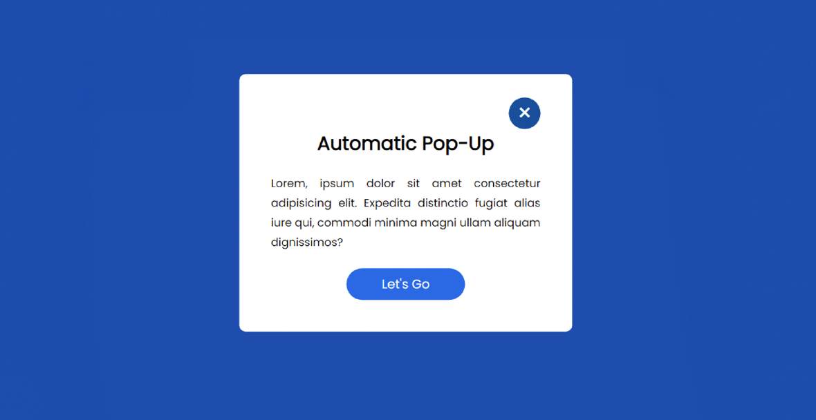
How to Create Automatic Popup Window using HTML & CSS
An automatic popup window is a javascript project that uses different javascript functions and loads as soon as the website loads on the user's browsers this type of automatic pop-up…
An automatic popup window is a javascript project that uses different javascript functions and loads as soon as the website loads on the user's browsers this type of automatic pop-up…
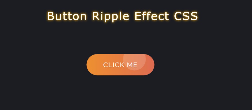

In this article, you will learn how to create Button Ripple Effect using HTML, CSS, and JavaScript. I have shared many more button animations with you before. This is the first time I will create a Ripple Effect in a button.
Button Ripple Effect CSS is basically a kind of onclick effect i.e. when you click on the button this Button Ripple Effect JavaScript can be seen.
If you don’t know what Ripple Effect is, let me tell you, it is a kind of simple effect. When you click on something, a colorful circle will be created in that place. These colorful circles can be matched in size.
Below I have given a demo that will help you to understand how this circular ripple effect works. Here you will find the required source code and live preview.
See the Pen
Untitled by Foolish Developer (@foolishdevweb)
on CodePen.
Although I have shared tutorials on creating many more types of buttons before, the most notable of which are neon buttons, gradient buttons, glowing buttons, etc.
Html, CSS, and javascript have been used to create this button ripple effect. The button’s structure was first created using HTML. Then it was designed by CSS. After all, the ripple effect has been implemented by JavaScript.
You need JavaScript enabled to view it to create this button ripple animation. JavaScript will basically help you determine the position of your causer and create those colorful circles in the place where you click.
If you want to create this Button Ripple Effect you can follow the step-by-step tutorial below. If you know basic HTML, CSS, and javascript then you can create it.
If you only want the source code, you can use the download button or code section at the bottom of the article.
First, the basic structure of the button was created using some HTML code.
The webpage is designed with the following CSS. I have used black as the background color of the webpage here.

Now the button has been designed. The size of this button depends on the padding and linear-gradient color is added to the background.

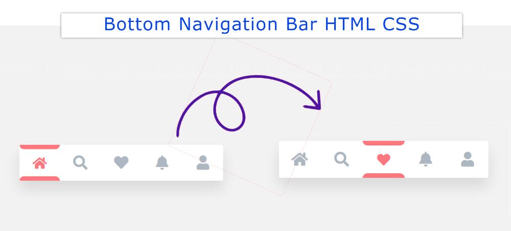

In this tutorial, you will learn how to create Bottom Navigation Bar HTML CSS. Earlier I shared another tutorial on creating a Bottom Navigation Menu. This type of CSS tab we see mainly in the case of responsive devices.
This type of Bottom Navigation Bar HTML is found mainly in the case of mobile apps. This design can only be created by HTML CSS.
Although I have used some JavaScript to make the animation used here work. If you omit the animation, you can create this mobile bottom navigation bar with HTML CSS.
For your convenience, I have given a preview below. Icons have been used instead of text for menus. If you only want the source code, use the button below the article.
See the Pen
Navigation Bar – JS by Foolish Developer (@foolishdevweb)
on CodePen.
First, the basic structure of the Fixed bottom navbar has been created on the webpage. White color has been used in the background of the navbar.
Then I used 5 icons here. You can increase the amount of menu according to your needs. Here the color of the active icon will be red. Borders have been added to the active icons using CSS before and after.
A border of 8px can be seen above and below the menu item that will be active. When you click on another icon, its borders will be removed and added to that icon.
Below I have shared step by step tutorial and show how to create a bottom navigation bar design. For this, you need to have an idea about HTML, CSS, and javascript.
However, if you are a beginner, follow the tutorial below. If you create this Bottom Navigation Menu using HTML checkboxes then you don’t need to use JavaScript.
First, the basic structure of this fixed bottom navbar has been created.
I designed the webpage using the code below and added a background color.
I have used min-height: 30px, min-width: 200px of this navbar and the background color is white.

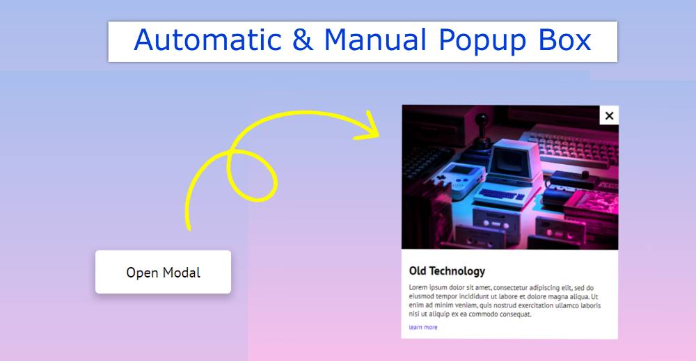

This article will help you to know how to create Modal Popup JavaScript. Here we have shared step by step tutorial using JavaScript to create a modal popup.
Earlier I showed you how to create an automatic popup window. However, here you can open the window in two ways, automatic and manual.
When we open a website, we see different types of subscription forms, such as Advantage, with the help of this type of JavaScript Modal Popup. However, the javascript popup window used on most websites is automatic. This means that when the page is opened, this popup box is automatically seen.
This design is a little different. This Modal Popup JavaScript will be visible when you load the page. There is also a button that allows you to see this box. Below is a preview of how this design works.
See the Pen
Modal by Foolish Developer (@foolishdevweb)
on CodePen.
As I said it is an automatic and manual model pop-up created by JavaScript. First I used a gradient background color on the page.
Then I created a button that can be used to manually view this Modal Popup JavaScript. Also, when you load that page, this window will automatically appear in front of you.
There is a Cancel button to hide Modal Popup. This window contains an image, a heading, some text, and a cancel button.
If you know basic HTML, CSS, and javascript then you can easily create this modal popup in javascript. First I added basic information using HTML.
Then I designed it with CSS and arranged it to open it automatically. Finally, the popup button and the cancel button have been activated by JavaScript.
We first created a button using the following HTML and CSS code that will act as a popup button.
I designed the webpage using the following CSS. The linear-gradient background color is used on the page.

Now I have designed the button. Depending on the size padding of this button.

line-height: 2em;}
h3{text-align: left;
font-family: Open Sans,Arial,sans-serif;
line-height: 1.7em;
color:black;
color:#333131;
font-weight: 520;
-webkit-font-smoothing: antialiased;
}
h2{text-align: left;
font-family: Open Sans,Arial,sans-serif;
line-height: 1.7em;
color:black;
font-weight: 620;
-webkit-font-smoothing: antialiased;
}
.class {
background:#edf0f2;
font-family: Consolas,Monaco,Lucida Console,monospace;
line-height: 1.65;
word-wrap: break-word;
border-radius: 5px;
color:#001d8f;
font-size:17.1px;
padding-left:10px;
white-space: pre-wrap;}
button.last-btn{
padding:14px 29px;
font-size:17px;
background-color:#0e87f0;
border-radius:6px;
color:white;
font-family: Open Sans,Arial,sans-serif;
border:none;
margin-left:35%;
}
@media only screen and (max-width: 400px) {
button.last-btn{
margin-left:0px;
margin-right:0px;
}
}
@media only screen and (max-width: 300px) {
button.last-btn{
margin-left:0px;
margin-right:0px;
}
}
@media only screen and (max-width: 600px) {
button.last-btn{
margin-left:0px;
margin-right:0px;
}
}
@media only screen and (max-width: 800px) {
button.last-btn{
margin-left:0px;
margin-right:0px;
}
}
@media only screen and (max-width: 400px) {
.copyButton {
width: 45%;
}

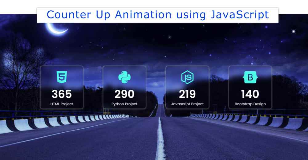
In this article, you will learn how to create Responsive Counter Up Animation using HTML CSS, and JavaScript. We use javascript Counter Up Animation in many places. For different types of personal websites, business websites, etc.
This type of responsive counter up animation is most commonly used in business websites. For example, you can use this project in case you want to show the quantity of any product on your business website.
30 OTP input fields using HTML, CSS, and JS
Count animation is used between the numbers here. This type of Responsive Counter Up Animation is often used by developers to create queries. But if you want you can make it with the help of simple javascript. This tutorial will show you how to create JavaScript Counter Up Animation.
Html, CSS, and javascript have been used to create this Counter Up Animation JavaScript. A very simple code is used here for beginners.
Below is a preview of this Number Countup Animation. Which will help you to know how it works. I used a nice background image on a web page as you saw above. On which four small boxes have been made. One icon, one number, and one test have been added to the box.
See the Pen
Untitled by Foolish Developer (@foolishdevweb)
on CodePen.
I have made the background of this simple count-up animation transparent. As a result, these small boxes can be seen almost transparently in the background.
I have already shared tutorials on creating many elements such as login forms, profile cards, etc. using transparent design.
To create this Responsive Counter Up Animation you need to have a basic idea about HTML, CSS, and javascript. I have shared step by step tutorial here. I have given possible results with pictures after each step.
I have added all the information using the following code. I made four boxes. In that box you can see the icon first, then the number count down, and then a text.

I have designed the webpage using the following CSS codes. Here an image is used in the background of the web page. You can use any background color instead of this image.

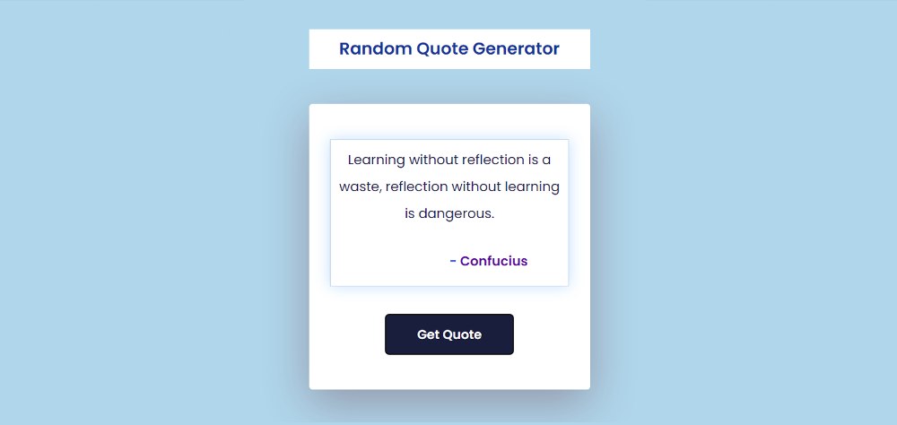

Javascript Random Quote Generator will basically help you to create a random quote using an API link. You can easily create this kind of simple Quote Generator if you know the basics of HTML, CSS, and javascript.
In this tutorial, I have shown how to create Random Quote Generator using JavaScript. Quote Generator can be made in two ways. In the first case, you will collect all the information from any other third-party source using an API link. Then you can show it in the place of your choice.
You can also manually add all the quota information here. Here I have used the API link. To make this Quote Generator Javascript you must have a basic idea about HTML, CSS, and JavaScript. If you are looking for Premium WordPress Host then you can use JustWP.
Below I have given a demo that will help you to know how this Random Quote Generator HTML works. If you only want the source code, you can use the download button below the article.
See the Pen
Untitled by Foolish Developer (@foolishdevweb)
on CodePen.
First I created a heading on a webpage with a blue background. Then I made a box with a display. Quote, and author’s name can be seen in that display. In the end, there is a button that will generate a different quote every time you click on it.
As I said before, all these quotes are not added manually. It has been collected and brought to other websites using API links.
First I added all the information using HTML and CSS and did the design work. Then I implemented Random Quote Generator using JavaScript.
Here I have used API links on a website. If you want you can use the API link on the website of your choice. There are many websites on the internet that provide such API links.
Below I have shared the complete step-by-step tutorial on how to create Javascript Random Quote Generator. I have shown the possible result of each step with a picture. Which will help you understand what kind of changes may occur after using any code.
I have created the basic structure of this Random Quote Generator using the following codes. Here the background color of the webpage is blue.


If you want to create a Responsive Image Slider then this tutorial will help you completely. Here I have shared a tutorial on creating a Simple Responsive Image Slider HTML CSS and provided the necessary source code.
Earlier I created different types of image sliders. However, this slider has been made fully responsive. This allows you to use it directly for any purpose.
Image slider is used to organize a large number of images on different websites. There are different types of image sliders. In some sliders, the image is changed automatically, in some cases the image has to be changed manually.
There are two buttons for manually changing the image. Although I have previously shared various types of automatic and 3D image sliders in this tutorial.
Below I have given a preview that will help you to know how it works. Here you will find the complete source code. Although I have been given many more options to get the source code.
Below the article, you will find a box to copy the source code. There is also a button to download the code.
See the Pen
Untitled by Foolish Developer (@foolishdevweb)
on CodePen.
As you can see above, a box has been created on a web page. In it, I have added all the necessary images. Here I have added 4 images. If you want you can increase the number of images of your choice.
There are two buttons for manually changing the image. Here a border is used around the image and shadows are used to enhance the beauty. Importantly, highlights or indicators have been used here. That is, there are a few small points that will indicate how many numbered images have been opened.
This design is made with HTML CSS and JavaScript. First added various information and images using HTML. Then I designed it using CSS and made it Responsive. Finally, it is implemented using JavaScript.
I have used four images here so I have used four indicators. The first indicator will be highlighted when the first image is open. And when the second image opens, the second point will be highlighted.
If you want to create this Responsive Image Slider, you need to have a basic idea about HTML CSS, and JavaScript.
The basic structure of Responsive Image Slider has been created first using the following HTML and CSS codes. All images in this area can be seen.
Slider width: 80% and max-width: 600px used. It also has a 10-pixel white border and box-shadow to enhance its beauty.

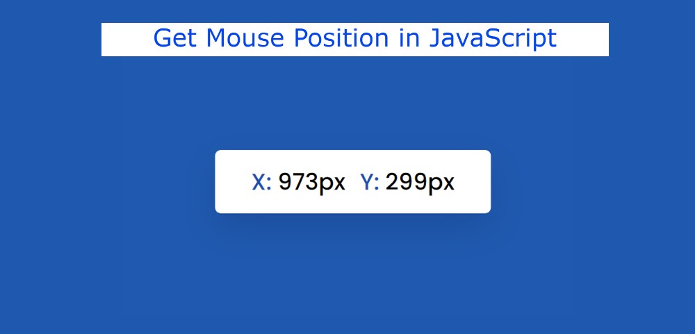
In this tutorial, you will learn how to get Mouse Position using JavaScript. This javascript get mouse position project will help you know which position you currently have your mouse…
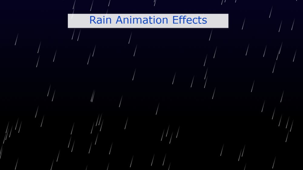

In this article, you will learn how to create Rain Animation Effects using CSS and javascript. You will see this kind of CSS Rain Effects animation in different places. Creating this effect is much easier if you know basic CSS and javascript.
This type of Rain Animation effect is used in the background of different projects or elements. The black color of the webpage background has been used to create this CSS animation rain. Then the point of white water is falling from top to bottom. Although JavaScript has been used to make it work.
Here you can use color instead of white color which is more beautiful and attractive. This design is used in the background of various projects which basically helps to enhance the beauty.
Below I have given a demo that will help you to know how it works. Live Demo 👇👇
See the Pen
Untitled by Foolish Developer (@foolishdevweb)
on CodePen.
As you can see above a lot of water droplets are falling from the top to the bottom on a gradient background. This project looks very difficult but it is very easy to make. This beautiful CSS rain animation with Lightning can be created with very little code.
If you only want the source code, you can use the download button below the article. And use the demo section above to get the live demo.
Below I have shown with some steps how I have created Rain Animation Effects using CSS. No HTML code is used here.
These animations can be seen in the background of the webpage. So the body tag of the webpage has been used. So there is no need to use any HTML separately.

In this article, you will learn how to create Pulsing Heart Animation using HTML and CSS. Earlier I shared with you different types of Pulsing Animation Effects. However, in this…