
This article will help you to know how to create Modal Popup JavaScript. Here we have shared step by step tutorial using JavaScript to create a modal popup.
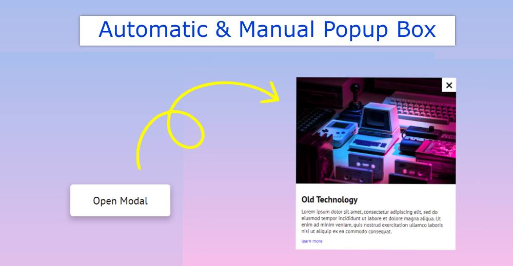
Earlier I showed you how to create an automatic popup window. However, here you can open the window in two ways, automatic and manual.
When we open a website, we see different types of subscription forms, such as Advantage, with the help of this type of JavaScript Modal Popup. However, the javascript popup window used on most websites is automatic. This means that when the page is opened, this popup box is automatically seen.
Modal Popup JavaScript
This design is a little different. This Modal Popup JavaScript will be visible when you load the page. There is also a button that allows you to see this box. Below is a preview of how this design works.
See the Pen
Modal by Foolish Developer (@foolishdevweb)
on CodePen.
As I said it is an automatic and manual model pop-up created by JavaScript. First I used a gradient background color on the page.
Then I created a button that can be used to manually view this Modal Popup JavaScript. Also, when you load that page, this window will automatically appear in front of you.
There is a Cancel button to hide Modal Popup. This window contains an image, a heading, some text, and a cancel button.
How to Create a Modal popup in JavaScript
If you know basic HTML, CSS, and javascript then you can easily create this modal popup in javascript. First I added basic information using HTML.
Then I designed it with CSS and arranged it to open it automatically. Finally, the popup button and the cancel button have been activated by JavaScript.
Step 1: Create popup button
We first created a button using the following HTML and CSS code that will act as a popup button.
I designed the webpage using the following CSS. The linear-gradient background color is used on the page.

Now I have designed the button. Depending on the size padding of this button.

Step 2: Basic structure of Modal Popup
Now I have created the basic structure of the Modal Popup window. In this basic structure, you can add the information you need. Display: none is used here, which means that the general condition of this box cannot be seen.
Then display: flex using the ‘open’ tag. This means that when the ‘open’ tag is activated, this JavaScript Modal Popup can be seen.
I have added animations using some code below. This effect will be visible when this popup box appears.
We can’t see any box in the picture below because there is no information in this box. The box will be visible when a specific size of this box is determined or information is added.

Step 3: Add information in the modal window
Now various information has been added in this Modal Popup box. I have used an image, a heading, some text here. You will use the information here as you like.

Step 4: Button to cancel popup box
Now it’s time to create a cancel button that will help hide the popup window.

Step 5: Activate Modal Popup using JavaScript
I have created this javascript popup window using HTML and CSS above. I have arranged to show the box automatically by CSS above. Now I have activated this popup button and Cancel button using JavaScript.
First, the constant of the id of some HTML element is determined. The id of the box, popup button, cancel button has been set to constant.
Now I have activated the popup button. I have used the on-click function here. I have instructed here that the ‘Open’ function will be added when you click on that button.
I have added in CSS what will change if the open function is implemented. In ‘open’ I used ‘display: flex’. That is, when ‘open’ is active, the Modal Popup box can be seen.
Now the Cancel button has been activated. The instructions here are that when you click on the Cancel button, ‘Open’ will be removed, meaning we will not see the box.

JavaScript Modal Popup [Source Code]
There are many beginners who just want the source code. I have given all the codes for them below to create this javascript Modal Popup. However, if you want to download the source code, you can take the help of the button at the bottom of the article.
Here I have given HTML, CSS, and javascript code together. You just create an HTML file. Then copy the following code and add it to the file.
See the Pen
Modal by Foolish Developer (@foolishdevweb)
on CodePen.
Hopefully, you have been able to create this javascript popup window using the code above. If there is any difficulty then you can definitely let me know by commenting.
If you want to create an automatic pop-up window, you can follow another article I created. Be sure to comment on how you like this design (modal popup in javascript).