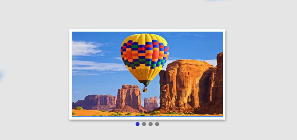
If you want to create a Responsive Image Slider then this tutorial will help you completely. Here I have shared a tutorial on creating a Simple Responsive Image Slider HTML CSS and provided the necessary source code.
Earlier I created different types of image sliders. However, this slider has been made fully responsive. This allows you to use it directly for any purpose.
Image slider is used to organize a large number of images on different websites. There are different types of image sliders. In some sliders, the image is changed automatically, in some cases the image has to be changed manually.
There are two buttons for manually changing the image. Although I have previously shared various types of automatic and 3D image sliders in this tutorial.
Responsive Image Slider
Below I have given a preview that will help you to know how it works. Here you will find the complete source code. Although I have been given many more options to get the source code.
Below the article, you will find a box to copy the source code. There is also a button to download the code.
See the Pen
Untitled by Foolish Developer (@foolishdevweb)
on CodePen.
As you can see above, a box has been created on a web page. In it, I have added all the necessary images. Here I have added 4 images. If you want you can increase the number of images of your choice.
There are two buttons for manually changing the image. Here a border is used around the image and shadows are used to enhance the beauty. Importantly, highlights or indicators have been used here. That is, there are a few small points that will indicate how many numbered images have been opened.
How to Create Responsive Image Slider
This design is made with HTML CSS and JavaScript. First added various information and images using HTML. Then I designed it using CSS and made it Responsive. Finally, it is implemented using JavaScript.
I have used four images here so I have used four indicators. The first indicator will be highlighted when the first image is open. And when the second image opens, the second point will be highlighted.
If you want to create this Responsive Image Slider, you need to have a basic idea about HTML CSS, and JavaScript.
Step 1: Basic structure of image slider
The basic structure of Responsive Image Slider has been created first using the following HTML and CSS codes. All images in this area can be seen.
Slider width: 80% and max-width: 600px used. It also has a 10-pixel white border and box-shadow to enhance its beauty.
Step 2: Add image to the slider
Now I have added the necessary images. Here I have used four images. If you want you can increase the number of images of your choice.
You need to increase the number of highlights or indicators when you increase the number of images.
I have made this image change a bit smoother by using the following codes. As a result, when the images change, we now see a kind of light animation.
Step 3: Add indicators to the image slider
Now I have created dots or indicators. As I said before, you have to use as many dots as there are images.
Since I have used four images, I have added four indicators here. When these indicators are active, the background will be purple. Although I have used JavaScript to make this indicator work. These dots will not work without JavaScript.
Step 4: Create image change buttons
Now the control button in this Responsive Image Slider has been created. These two buttons will help to change the images. One button will help you see the next image and the other the previous image.
The buttons have been placed in the correct place using the code below.
Step 5: Make the image slider responsive
Now is the time to make this image slider responsive. The amount CSS used for this. Here max-width: 576px is used.
As a result, when you open this Responsive Image Slider on a device with a screen size of less than 576px, it will reduce its size.
Arrangements have now been made to hide the images. ‘display: none’ will hide all images in the slider.
Step 6: Activate Responsive Image Slider with JavaScript
Now is the time to activate this Responsive Image Slider HTML CSS using JavaScript. Above we have done Degan’s work. If you know the basics of JavaScript you can easily create it.
First, the global constant of some HTML elements has been determined. Because we can’t use any HTML element directly in JavaScript.
Now the value of the index is 0. That means no image can be found at first.
Responsive image slider HTML CSS (source code)
If you cannot attach the above code, you can copy and use the following code. Here I have combined all the code (HTML, CSS, and javascript) together. All you have to do is create an HTML file and copy and paste these codes.
See the Pen
Untitled by Foolish Developer (@foolishdevweb)
on CodePen.
Hopefully, you can create this Responsive Image Slider in HTML CSS using the tutorials and code above. If there is a problem then use the button below.
The button below will help to download all the code. If there is any difficulty in understanding, you can let me know by commenting.


