
In this tutorial, you will learn how to create Bottom Navigation Bar HTML CSS. Earlier I shared another tutorial on creating a Bottom Navigation Menu. This type of CSS tab we see mainly in the case of responsive devices.
This type of Bottom Navigation Bar HTML is found mainly in the case of mobile apps. This design can only be created by HTML CSS.
Although I have used some JavaScript to make the animation used here work. If you omit the animation, you can create this mobile bottom navigation bar with HTML CSS.
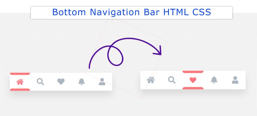
Bottom Navigation Bar HTML CSS
For your convenience, I have given a preview below. Icons have been used instead of text for menus. If you only want the source code, use the button below the article.
See the Pen
Navigation Bar – JS by Foolish Developer (@foolishdevweb)
on CodePen.
First, the basic structure of the Fixed bottom navbar has been created on the webpage. White color has been used in the background of the navbar.
Then I used 5 icons here. You can increase the amount of menu according to your needs. Here the color of the active icon will be red. Borders have been added to the active icons using CSS before and after.
A border of 8px can be seen above and below the menu item that will be active. When you click on another icon, its borders will be removed and added to that icon.
How to Create a Bottom Navigation Menu
Below I have shared step by step tutorial and show how to create a bottom navigation bar design. For this, you need to have an idea about HTML, CSS, and javascript.
However, if you are a beginner, follow the tutorial below. If you create this Bottom Navigation Menu using HTML checkboxes then you don’t need to use JavaScript.
Step 1: Basic structure of Bottom Navbar
First, the basic structure of this fixed bottom navbar has been created.
I designed the webpage using the code below and added a background color.
I have used min-height: 30px, min-width: 200px of this navbar and the background color is white.

Step 2: Add menu items to the Navigation Bar
Now I have added the menu items. Here I have added five menu items. You can add the icons of your choice here. No text was used here. Icons have been used instead of text.

The following CSS has been used to design the menu icons added above. Height: 4rem, width: 4.5rem of each menu box.

The following code has been used to design the icons better. Added to this is what the color will change when the icons are activated.

Step 3: Add color effect
Now I have added an animation effect in Bottom Navigation Bar HTML CSS. As you can see in the demo, you can see a border below and above the active icon.
First, we added a solid border at the bottom using before. Then a solid border is applied to the top of the icons using After. The color of the border used here is red.

Step 4: Activate Bottom Navigation using JavaScript
Hopefully, you have created the structure of this Bottom Icon Navigation Menu. However, to activate this you need to use JavaScript.
However, if you do not want to use JavaScript, you can add icons through the HTML checkbox. JavaScript is very easy to use here. These codes will help you to select menu items and change the color effect.
Here is the global constant of menu items and color effects. Because no HTML element can be used directly in JavaScript.

Bottom Navigation Menu HTML (Source Code)
Now it’s time to copy the source code and create this Bottom Navigation Menu. Although below I have given the download button.
However, if you want to copy the code and use it in your work, you can use this section. First, you create an HTML file.
No need to create another file here. Because all the code is included in HTML format. Copy the code directly and create the bottom navigation bar HTML CSS.
See the Pen
Navigation Bar – JS by Foolish Developer (@foolishdevweb)
on CodePen.
We hope you find out how to create this mobile bottom navigation bar HTML CSS using the tutorials, demos, and code above. Use the button below to download the source code.