In this article, I am going to show you how to create a responsive navigation menu bar using HTML, CSS, and javascript. I have designed many types of navigation and side menubars before. However, this design is much simpler and simpler. If you are a beginner and want to know about the concept of a navigation menu bar then this tutorial will definitely help you.
This is a fully responsive CSS navigation menu bar. Bootstrap or other external links were not used to make Responsive. It has been made Responsive using Pure CSS Code. In this case, I have used a small amount of JavaScript only to execute the menu button.
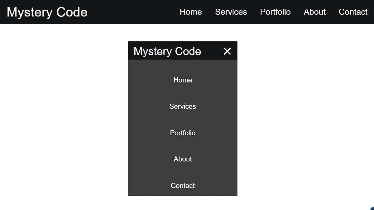
First I designed the background for navigation and in this case, I used black color in the background. First of all, I used a logo here. In this case, I have used text to create a logo. However, you can use separate images.
Then I used five menu items here. I have used the color white for menu items and logos which can be seen very clearly on a black background.
Responsive Navigation Menu bar
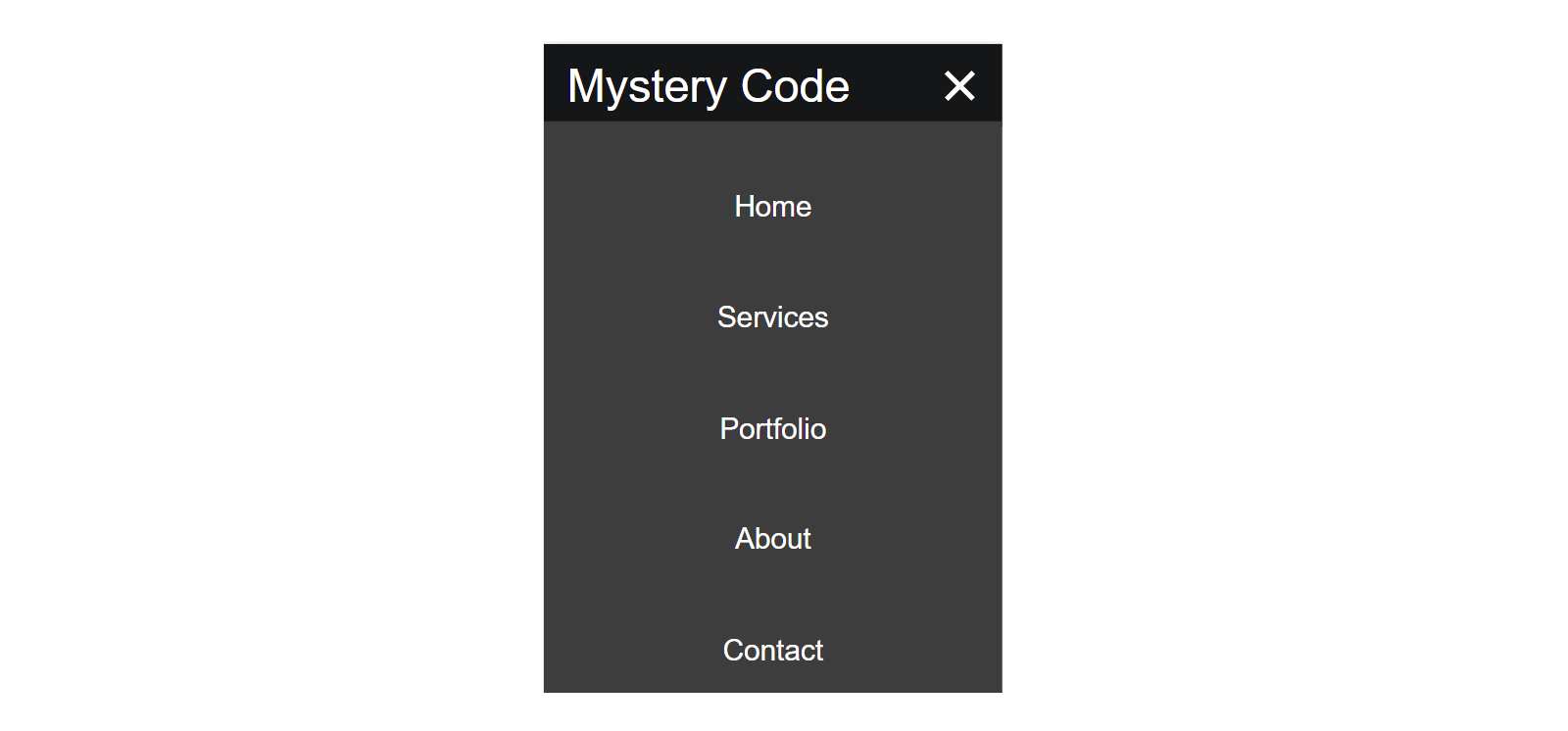
It is a fully responsive device so it can adapt itself beautifully to any device. In the case of responsive devices, menu items are completely hidden, instead, a small menu button is seen.
If you click on that button, you can see the complete menu items. It is a very simple design that you can create if you know the basic HTML CSS.
I have given the demo section below to see the live demo of how it works. From it, you can feel its live demo. Here you will find the required source code which you can copy and use for any purpose. I have also given the download link at the bottom of the article which will help you to download these codes.
See the Pen
Untitled by Foolish Developer (@fghty)
on CodePen.
Hopefully, the demo has helped you to know clearly how it works. Now is the time to learn step by step how I made the Navigation Menu bar.
Responsive Navigation Menu bar using HTML & CSS
Below I have added some basic CSS code first of all. These are basically used to design your webpage.
Step 1: Create the basic structure of the navbar
First of all, I will create a basic structure in the menu bar. For this below I have used HTML and CSS code. I used black as the background color of this navbar.
If you want to use another color, you can add the color of your choice in place of this background color.
Step 2: Create a logo
I made a small logo, in this case, I did not use any image, I made this logo using text. I have font-size: 30px and color: white of the logo.
Step 3: Add navigation menu items
Now I have added all the necessary menu items. In this case, I basically added five menu items. However, you can increase or decrease the amount of your choice.
Margin-left: 3rem has been used to keep menu items a bit away from each other. Used font-size: 19px and color white for each item. Howie’s color has been given on it. The color will change when you click on these items.
Step 4: Create menu buttons for responsive devices
Now I will create a menu button for Responsive Devices. As I said before, in the case of responsive devices, these menu items are completely hidden. A menu button is available instead. I have used the following CSS and HTML codes to create that button.
Step 5: Make the menu bar responsive using CSS code
Now I will design this menu bar for Responsive Devices. Basically, @media has been used in this case, and max-width: 668px. The following codes will be applied to devices with a screen size below 668px.
Step 6: Add animation with the menu button
I animated this menu button. When you click on that menu button, the hidden menu items will appear. Basically, this button is made up of three lines.
When you click on this button, the first line will be at a 45-degree angle with the third line and the second line will not be visible. This will place the first and second lines in the shape of a cross.
Step 7: Activate the menu button using JavaScript code
Now I have used a small amount of JavaScript code to execute this menu button. First I defined one of the three-class function variables.
I have executed the animation in the menu button using the JavaScript code below. I have also activated the menu button and the cancel button. After using it, when you click on the menu button, all the menus will appear and when you click again, all the menus will be hidden.
Hope you learned from this tutorial how I created this Responsive Navigation menu bar using HTML CSS and JavaScript code. I have already shared with you many more types of navigation menu designs that you can see if you want.
If you want to know more, you can watch the video tutorial above. I have given the download button below for the required source code. You can download the source code required to create a menu bar on this CSS by clicking on that button.

