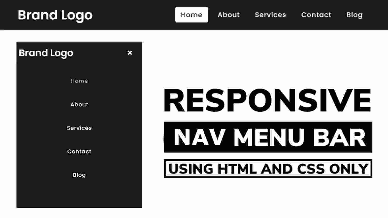

Learn how to create a navigation menu bar using Html and CSS. The nav menu bar is found on almost all websites which enhances the quality of the website. Earlier I designed many more types of navigation and side menu bar. The navigation menu bar is basically used for every website.
Using this menu you can arrange all kinds of content on your website nicely on the home page. There are many types of navigation menus. In many cases, full-page or overlay navigation menus are used. In some cases, side menus are used and in some cases, such general navigation menus are used.
If you know more HTML and CSS then you can definitely make this kind of design. Basically, I took the help of HTML to enhance the structure of this menu bar and add the necessary links. With the help of CSS code, I made it responsive and designed the items in this menu bar.
Navigation Menu Bar HTML CSS
First of all, I have been given the option to use a title or logo in the menu bar. In this case, you can see the other designs I made for you to use the image. I have used five links. You can add other links here if you want. One kind of effect has been used on each link. The background color changes when you move or click the mouse on that link.
You must make the navigation bar responsive or suitable for other devices. Nowadays people use many websites with the help of mobile so if your design is not effective for mobile then it cannot be used on any website. So I made this design responsive using CSS code.
Step 1: Create the navbar background and logo
First of all, you create an HTML file then copy the programming structure below and add it to your HTML file. In this case, I have used an icon. You must add the font awesome CDN link to your HTML file.
I basically designed the basic background of this navigation bar and the logo inside it using the CSS code below. I have used height: 80px and width: 100% of this navbar.
In this case, I have used black as the background color. If you want you can change this color as per your need. In this case, the font size: 36px, and the color are white.

Step 2: Add a link (menu item) in the navigation bar
I have added the following HTML codes to add the links in this menu bar or to use the menu items. In this case, I have used five menu items. You can use many more menu items here as you wish.
I have designed these menu items using the CSS programming code below. I have used the font size: 18px and color white of the menu links. In this case, I have used a kind of hover effect. Clicking on the menu item will change the color of the background.

Step 3: Create menu buttons for responsive devices
For mobile or responsive devices, this menu bar is completely hidden and a menu button appears. When you click on it, the menu items will appear. The HTML and CSS code below helped to create and design that button.
Step 4: Make the menu bar responsive using CSS code
So far we have only designed it for desktop, now we will create a complete structure for mobile. In this case, I have used a maximum width of 920px. This means that for devices with a width of less than 920px, the menu bar will determine its size according to the following programming structures.

Hope you learned from this tutorial how I created this Responsive Navigation menu bar using HTML and CSS programming code. I have already made many more designs like this, you can follow those designs if you want. If you like this design, please comment and give your opinion.