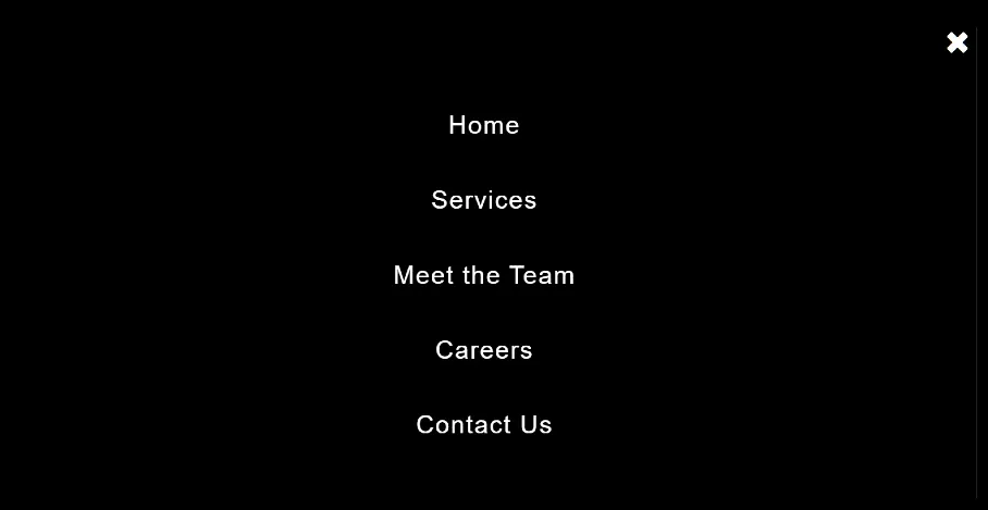
Full Screen Menu Using Bootstrap (Code + Demo)
In this article you will know how Full Screen Menu Using Bootstrap. Earlier I have shared with you the tutorial of making Full Screen Menu using css. I used very…
In this article you will know how Full Screen Menu Using Bootstrap. Earlier I have shared with you the tutorial of making Full Screen Menu using css. I used very…
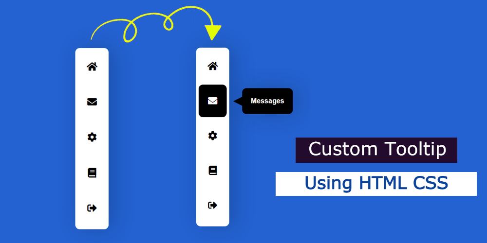
In this article, you will learn how to make Custom Tooltip using HTML CSS. Currently, CSS Tooltip is used in different elements of the website. What is a tooltip in…
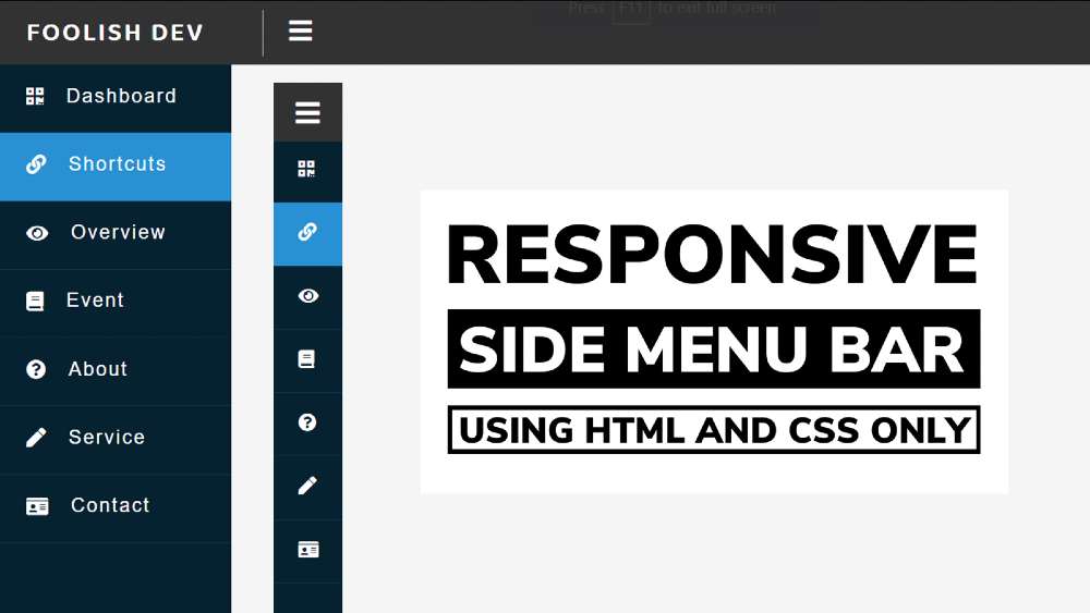

In this article, you will learn how to create a responsive sidebar menu bar using HTML CSS and JavaScript. Earlier I shared with you the design of many more types of responsive side navigation bars. I took the help of HTML CSS to create the basic structure of the Simple Sidebar. The menu buttons here help Javascript to work.
At first, I created a top bar but did not add any menu items. Just added a logo here and it has a menu button. I’ve added a number of menu items to the sidebar, each with an icon. Under normal circumstances, only icons can be seen and text cannot be seen.
Nowadays menu bar is a very important element for any website. Different websites use a top menu bar and some websites use top and side two types of menus. Undoubtedly the sidebar is much more attractive and attracts the attention of the user.
The width of the sidebar is 220px but in the normal case, its width will be 70px. When you click on the menu button here, you will see the icons with full text and the width of the sidebar will be 220px. In the case of small devices, this design (sidebar menu HTML CSS) can completely adapt itself.
Hopefully, the video above has helped you to know how it works. To build it you must have a basic idea of HTML CSS and JavaScript.
Here is a step-by-step tutorial for beginners with a video where we have shared the complete tutorial. There is also a download button at the bottom of the article to download the source code.
Using the HTML and CSS code below, I have created the basic structure for this sidebar. All HTML code will be added to this HTML structure.
I have created the top menu bar with the help of the following codes. Here I have used the width: 100% and height: 60px of the top navigation bar. The background color is black and ‘top: 0’ and ‘left: 0’ are used to place it on top of the web page.

1. Create a logo using text
Now a logo has been added to this top bar. I have added this logo with the help of text. Background width of this logo: 250px and font-size: 25px.

2. Create menu button
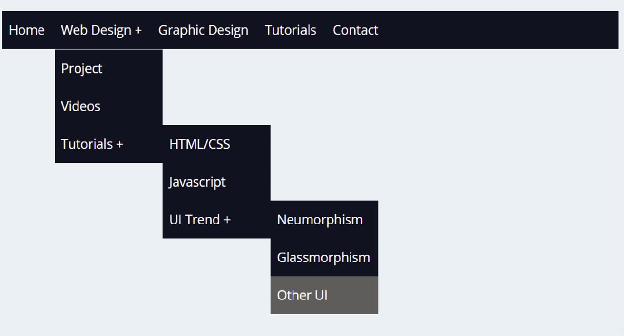
In today's article, you are going to learn how to create a simple dropdown menu bar using HTML and CSS code. If you are looking for good Websites & SEO Company…
Javascript Accordion Menu is used to organize questions and answers on various websites. Here you will find the source code for creating the Accordion section using javascript. Today you will…

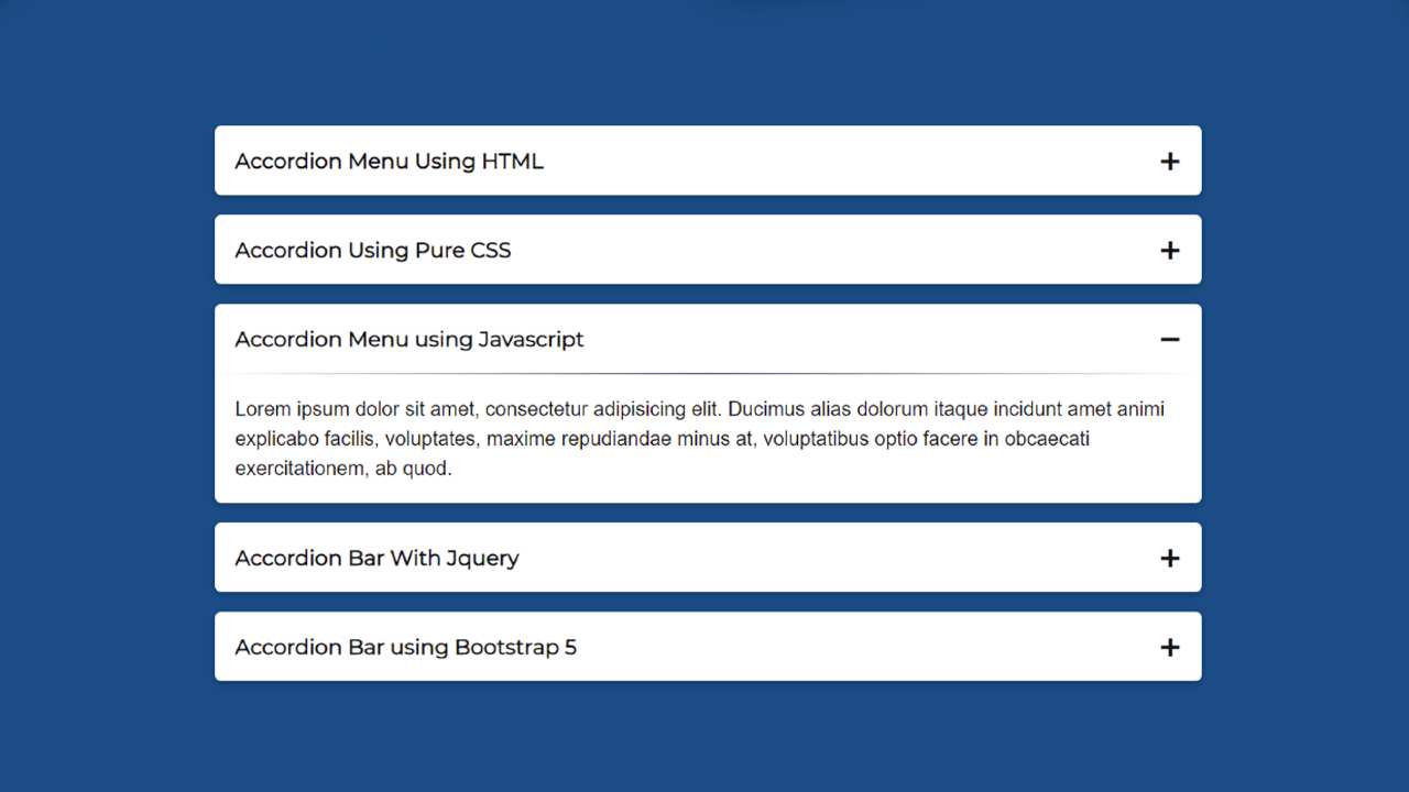
In this article, I am going to show you how to create an Accordion Menu menu using HTML, CSS, and JavaScript code. Earlier I showed the design of many more types of Animated CSS accordion menus. Now it’s time to recreate it with JavaScript.
The responsive accordion menu has an original heading. When you click on that heading, all the information related to that heading can be seen below.
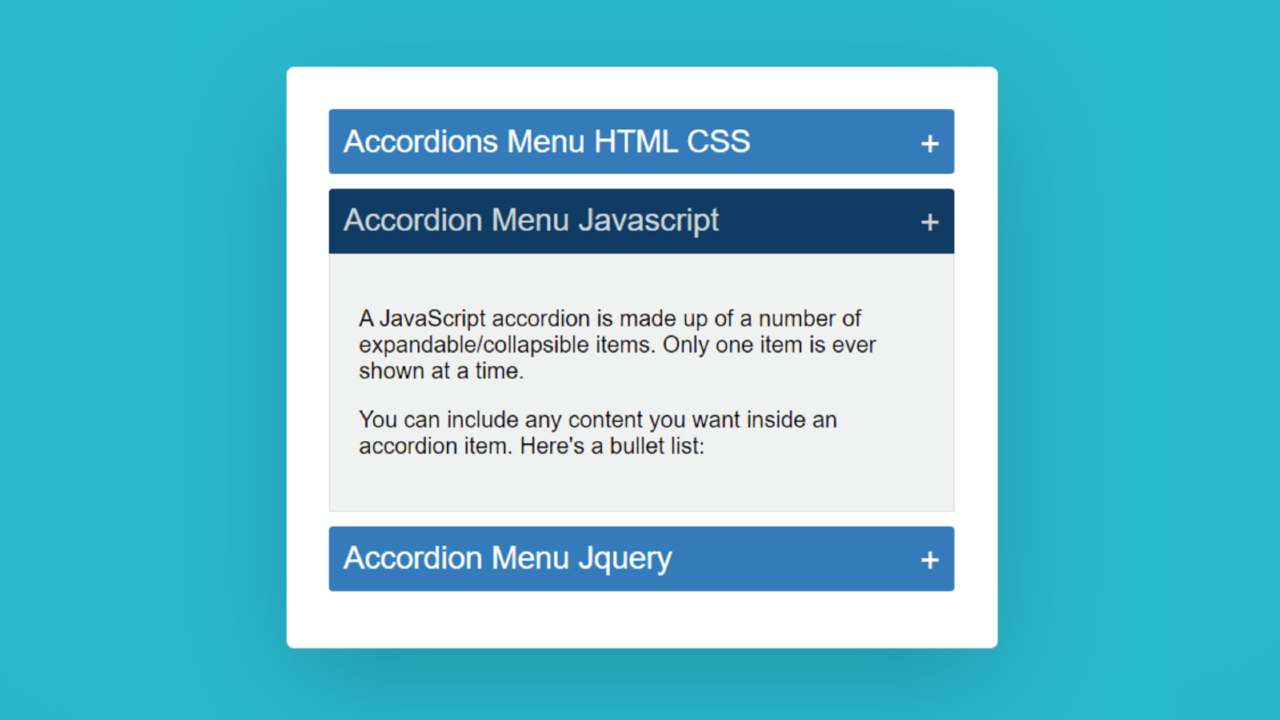
Accordion Menu is a modern content structure where a large amount of information can be neatly arranged in one place. This type of structure is used on different types of websites. This type of design is mainly used in the FAQ section or question-answer section.
This type of Accordion Menu is very important for arranging related questions and answers for different types of services. In addition, a large amount of text is arranged on different types of websites depending on the different headings.
If you do not understand what I am saying then you can watch the video tutorial below. This video tutorial will help you to know how I made this simple javascript accordion.
We hope you have learned how to make this design from the video tutorial above.
I made a small box on a web page as you can see above. I used three headings in that box. I have given the background color to highlight those headings and made it a bit bigger in size. Then I added some amount of content under that heading.
Here you can add any type of content. Under normal circumstances, information is hidden. When you click on that heading, the information under that heading can be seen below.
You can use the demo section below to get a live experience of this design. Here you will find the required source code which you can copy and use in your own work.
See the Pen
Accordions Menu HTML CSS by Foolish Developer (@fghty)
on CodePen.
Hopefully, the demo above has helped you to know how this javascript accordion works.

In this article, I am going to show you how to create a side menu bar using only simple HTML and CSS programming code. I have designed different types of…