In this article, you will learn how to make a simple Tab Bar using HTML and CSS. The CSS Tab Bar is basically a type of navigation bar that can be found in the case of small devices. The quality and beauty of a website depend a lot on the bar.

So the navbar needs to be beautiful and suitable enough for every device as well. We see on various websites that the navigation bar looks beautiful in the case of desktops but is not attractive in the case of small devices.
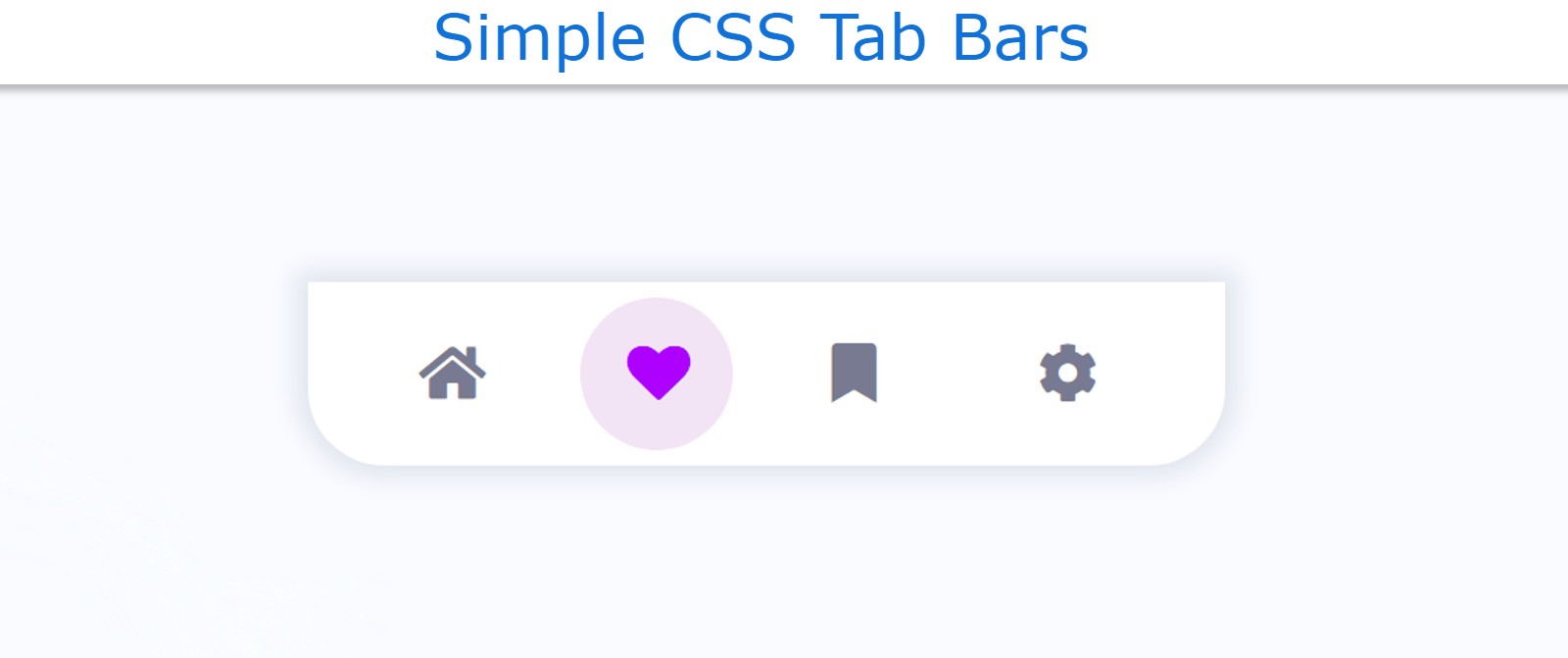
Simple CSS Tab Bar with Animation
In this case, I have created a project (Simple CSS Tab Bar with Animation) in which I have added color animation. If you know the basic HTML CSS, you can easily create a design.
I have given four menu items for this tab bar. Only the icons of the menus can be seen here. I have also added hover animations on those icons. Below I have given a live demo that will help you know how it works.
See the Pen
tab bar css by Foolish Developer (@fghty)
on CodePen.
If you want to know how to make it, follow the tutorial below. All you have to do is have an idea about basic HTML and CSS.
I have designed the webpage using the following CSS. Here I have set the background color of the webpage to white.
Step 1: Create the basic structure of the tab bar
I have created the basic background of this Tab Bar using the following HTML and CSS code. I have used background-color white and its width is 24rem. No specific height is given here, its height depends on the content.

Step 2: Add the menu icons to the CSS tab bar
Now I have added the menu items i.e. icons in the Simple CSS Tab Bar. The font awesome CDN link has been used to make the icons work.
Here I have used 4 icons you can add more if you want. Here the background of the icons is determined. I have used 4rem for height and length of background. Also, border-radius has been used so that the background has a round shape.

Step 3: Design the menu icons using CSS
These icons have been designed using the following CSS, i.e. a specific size and color of the icons have been used. The colors of the icons have been used a bit gray and I have used the font size to increase the size.

Step 4: Activate the Tab Bar using JavaScript
Now JavaScript has been used to activate these menu items. Above we have created the perfect design. If you want to make it work, that is, click on other menu items as needed, you need to use JavaScript.
First I set the constants of the menu bar and the menu item one by one. Then I executed it using the click function. If you know basic JavaScript then this project (tab bar animation CSS) can be easily understood.

Hopefully, you have learned from this article how I created the CSS tab bar animation. I have shared many more types of menu bar designs with you before. If there is any problem then you can definitely let me know by commenting.