Simple Vertical Navigation Menu Using HTML & CSS

Do you want to create a Vertical Navigation Menu using HTML and CSS?
This tutorial will help you to know how to create a vertical navigation bar. Although you will find many tutorials on this topic on the Internet. However, in this article, I have given you some special information.
Here I will discuss with you what can be the problem while creating a CSS Vertical Navigation. With this, I have shown step by step how I have created this CSS Vertical menu. Earlier I shared a tutorial on creating horizontal navigation bar CSS.
CSS Vertical Navigation Bar
This is just a demo so here are just four menu items I added. Although you can add a lot of menu items here according to your needs.
If you don’t understand what I said then follow the demo below. Here you will find out how it works and get all the source code to make it.
See the Pen
Vertical Navigation Menu by Shantanu Jana (@shantanu-jana)
on CodePen.
In the case of websites, we see the menu bar on the top the most. However, the Vertical Menu bar or side menu bar is currently being used extensively. Many websites have a Vertical menu bar along with a top navigation bar.
I make this design in a very simple way so only HTML and CSS are used here. But here I have used only 2 lines of JavaScript.
How to Create a Vertical Menu in HTML CSS
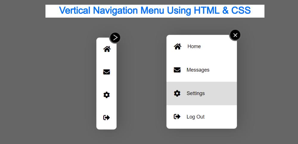
When you first open this Side Navigation Bar, you can see only a few menu item icons. But no test can be found. The tests will be completely hidden.
Under normal conditions, the width of the Vertical Navigation Menu will be: 67px. When you click on the arrow sign here, the length of the menubar will increase to width: 225px. As a result, the text of the menu item can be seen.
This Responsive Side Navigation Bar is basically for those who are brand new and trying to create a Vertical menu bar for the first time.
Step 1: Basic structure of Vertical Menu
The basic structure of this menu bar has been created using the following HTML and CSS code. As I said before, under normal circumstances the width of this menu bar will be: 67px. Here height: 300px is used. Although the height you can change according to your needs.

After activating this Simple Vertical Navigation Menu, the width of the menu bar has been added here. Although I did the work of activating later.