
Responsive Top Navigation Menu Bar with HTML CSS
In this article, you will learn how Responsive Top Navigation Menu Bar is created using HTML and CSS. Earlier I designed many more types of menubars. The beauty and quality…
In this article, you will learn how Responsive Top Navigation Menu Bar is created using HTML and CSS. Earlier I designed many more types of menubars. The beauty and quality…
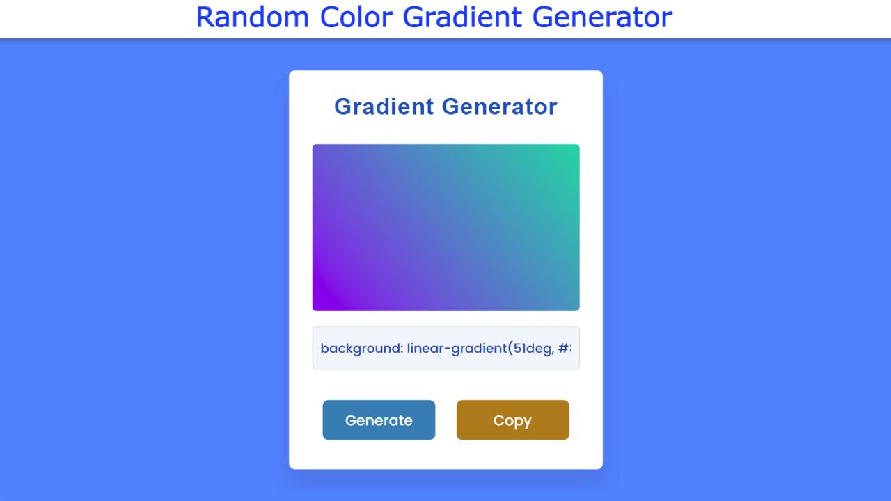
In this article, you will learn how to build a Random Gradient Generator using JavaScript, HTML, and CSS. CSS Gradient Generator is basically a simple JavaScript project that will increase…
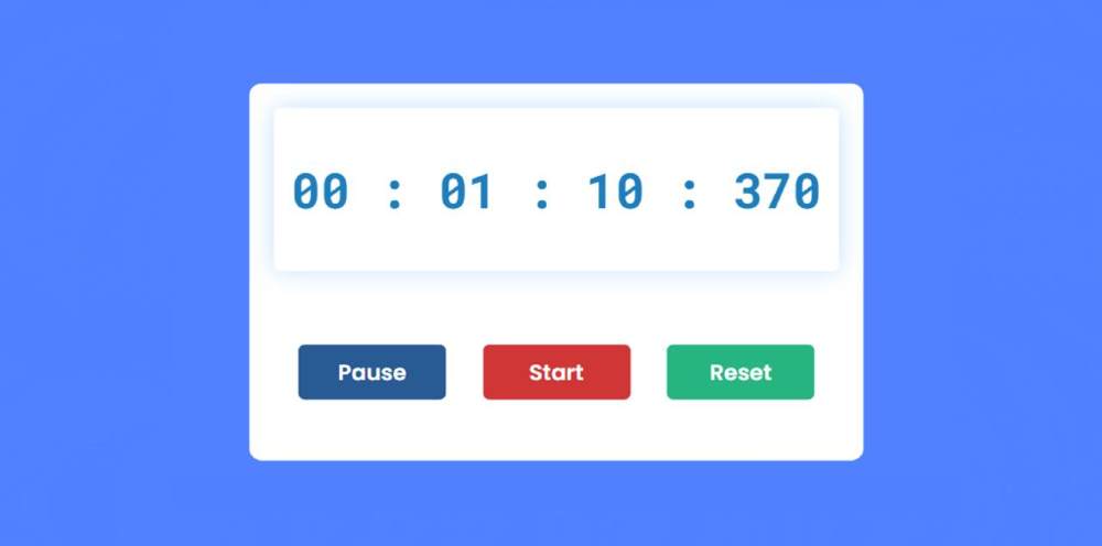
In this article, I am going to show you how to make a simple javascript stopwatch. Many times this type of design is needed in different types of projects or websites.…
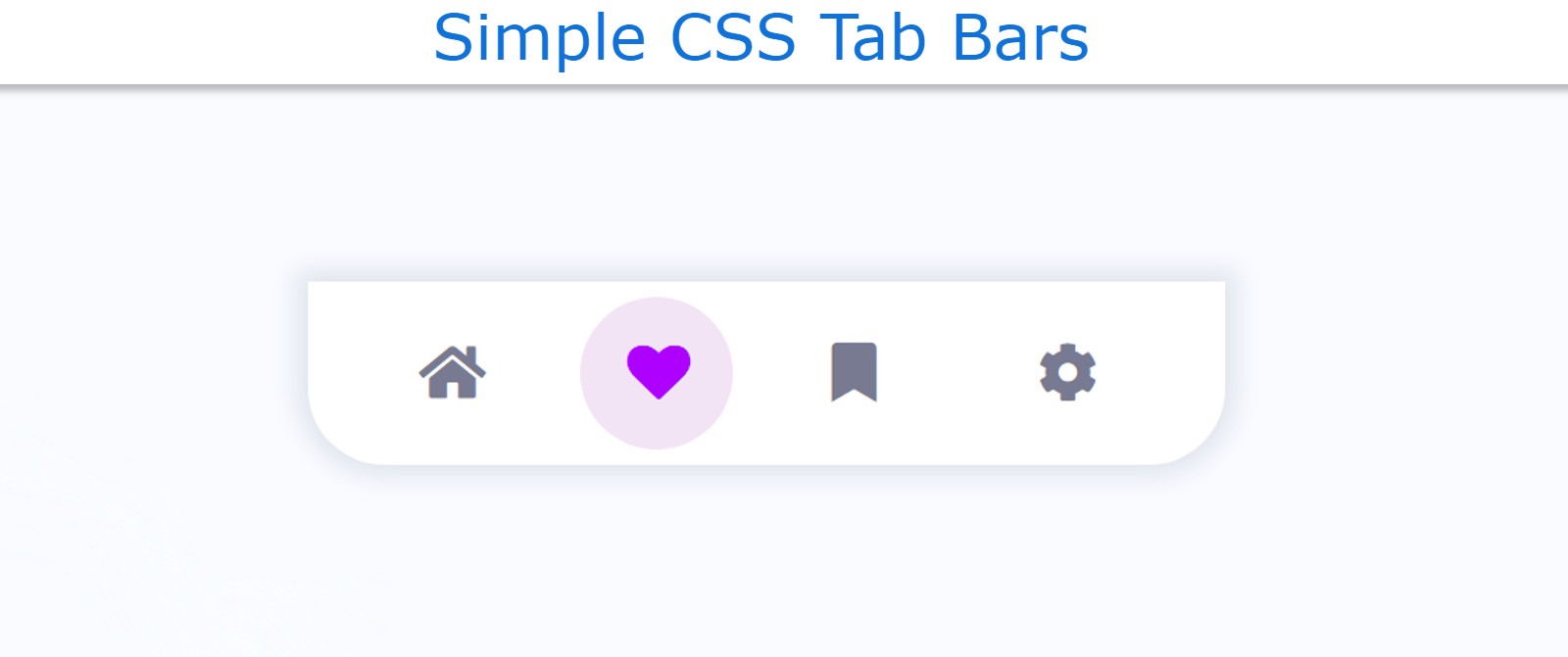
In this article, you will learn how to make a simple Tab Bar using HTML and CSS. The CSS Tab Bar is basically a type of navigation bar that can…
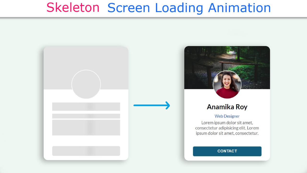
In this article, you will learn how to create Skeleton Screen Loading Animation using HTML CSS, and JavaScript. It is a modern design used for loading anything. Basically, when loading…
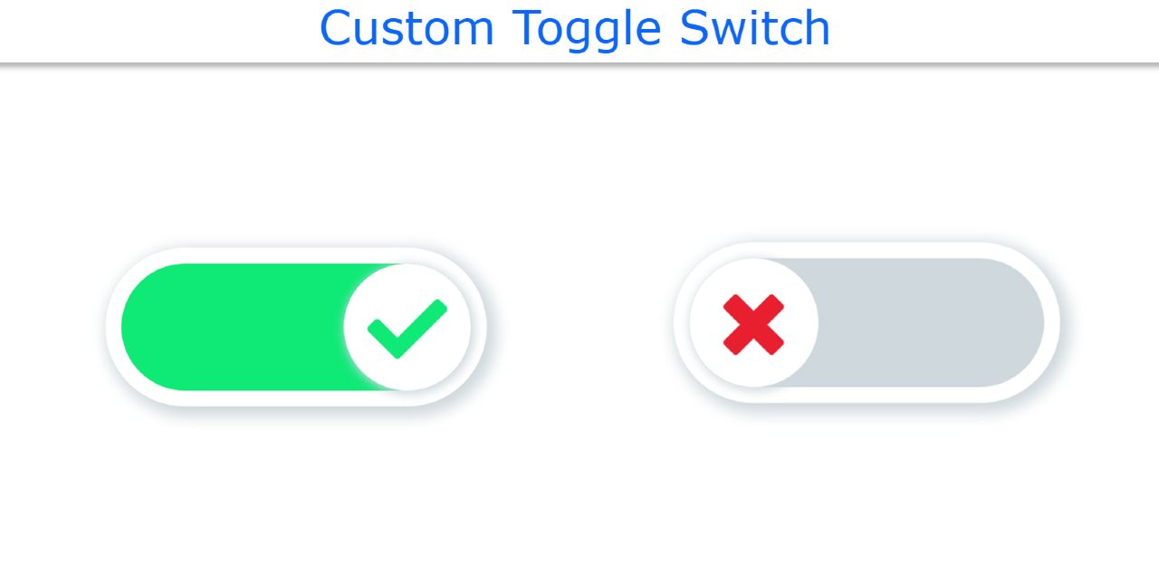
In this article, you will learn how to create Custom Toggle Switch using HTML and CSS. Toggle Switch is a type of radio button with some animation and color effects.…
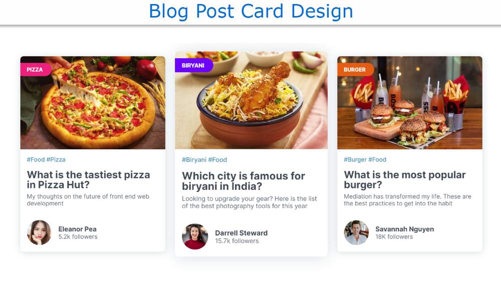
In this article, I will show you how to create a Blog Post Card Design using HTML and CSS. You must have seen it on various blogs or news websites…

JavaScript Digital Clock is a beautiful project that helps to increase knowledge about JavaScript. If you are a beginner then of course JavaScript digital clock will be an important project…

Circular Progress Bar is currently used on many websites. The progress bar circular is the most popular for arranging any information nicely through animation.Circular progress bar helps us in tracking the progess of…
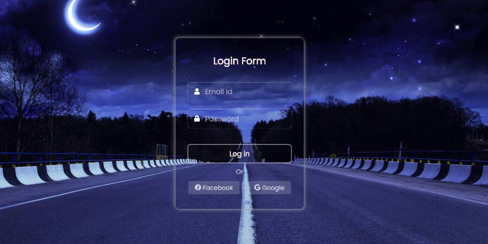
The transparent login form is a beautiful login design whose background is completely transparent. In this article, I am going to show you how to create a transparent login form…