
Circular Progress Bar is currently used on many websites. The progress bar circular is the most popular for arranging any information nicely through animation.
Circular progress bar helps us in tracking the progess of the user, this type of project are used in the website where we need to keep the live track on the progress of the individual , like we keep check on the progress of the individual courses , we uses the progress bar in ed tech platform which offers different courses .
There are many types of progress bars, and the circle is one of them. This type of design is most commonly seen in e-commerce websites or various types of business websites.
If you are a beginner and want to know how to create a Circular Progress Bar using only HTML and CSS then this tutorial is for you.

There are many such designs on the internet but most of the designs are made by JavaScript or JQuery. However, this circle progress bar CSS has been created entirely with HTML and CSS.
For this type of design, a circle has been created with a slightly thicker border. Color animation is added to this border. The whole circle is taken as the handed person. In this Circular Progress Bar, you can play border animation up to the desired percentage.
Circular Progress Bar
I have already shared the design of much Circular Progress Bar. But in all those cases I used JQuery or JavaScript.
Below I have given a preview that will help you to know how it works. Here you will find all the necessary step-by-step tutorials. If you are a beginner, be sure to follow the tutorials.
However, if you only want to download the source code, use the download button at the bottom of the article.
See the Pen Circular Progress Bar using HTML CSS by Raj Template (@RajTemplate) on CodePen.
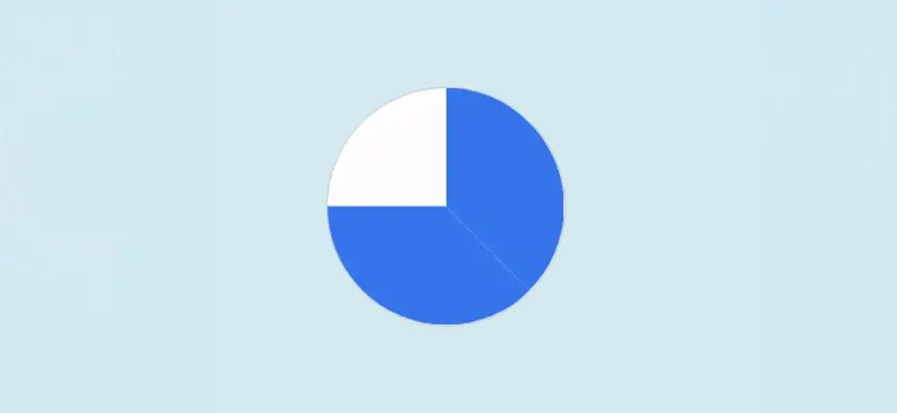
As you can see above, this is a simple pure CSS Circular Progress Bar. There are some spaces in the middle of this design where the percentage number can be found.
How to Make a Circular Progress Bar in HTML
To create this radial progress bar you must have some basic idea about HTML CSS. Under normal circumstances, Animation Zero will remain.
When you load the webpage, this color animation will reach the meaning you set from zero. Here I have used 75%. You can use any value you like.
1. Make a circle on the webpage
First, you need to create a basic structure of the progress bar. Created the structure with the following HTML and then designed it with CSS.
					<div class=”circle-wrap”>
  <div class=”circle”>

  </div>
</div>
I have designed the webpage with the following css. Light blue is used in the background of the webpage here.
					body {
  font-family: “Roboto”, sans-serif;
  background:#d2eaf1;
}
Now I have designed the circle. This width: 150px, height: 150px has been used and border-radius: 50% has been used for rounding. White color has been used in the background of this circle.
					.circle-wrap {
  margin: 150px auto;
  width: 150px;
  height: 150px;
  background: #fefcff;
  border-radius: 50%;
  border: 1px solid #cdcbd0;
}

2. Half of the Circular progress bar
This step is very important. I am first trying to explain to you how to create this Circular Progress Bar.
First I made a circle. Then I divided him into two parts. I will add background color animation separately for those two parts. The percentage of this color will be controlled by the degree.
After adding all the animations, one more small circle has been created in this big circle. Since the size of this new circle is a bit smaller. This will create a border of the circle in which we can see the animation.
Now I’ve added color to the first half of that circle. How many places this color can be seen is determined by clip: rect (0px, 75px, 150px, 0px).
					<div class=”mask half”>
    <div class=”fill”></div>
</div>
.circle-wrap .circle .mask,
.circle-wrap .circle .fill {
  width: 150px;
  height: 150px;
  position: absolute;
  border-radius: 50%;
}

.mask .fill {
  clip: rect(0px, 75px, 150px, 0px);
  background-color: #227ded;
}

3. The other half of the Circular Progress Bar
Now we have to make the other half part. How much color can be seen in this part too is determined by clip: rect (0px, 150px, 150px, 75px).
Then I added animation and activated the animation with @keyframes. There is a time limit of 3 seconds for the animation
(360/100) * 75 = 270
We know that a circle is formed by 360. Since here we have divided the CSS circle progress bar into two parts, so each part is 180 degrees.
Here we have set a 135-degree animation for each part using Transform. So it will be 270 degrees for the total circle. Here I want to increase the animation to 75% so I have used 270 degrees.
					<div class=”mask full”>
   <div class=”fill”></div>
</div>
					.circle-wrap .circle .mask {
  clip: rect(0px, 150px, 150px, 75px);
}

.mask.full,
.circle .fill {
  animation: fill ease-in-out 3s;
  transform: rotate(135deg);
}

@keyframes fill{
  0% {
    transform: rotate(0deg);
  }
  100% {
    transform: rotate(135deg);
  }
}
4. Add a percentage number to the Progress Bar
Now if we do this last step, we will create this Circular Progress Bar. Here I will make one more small circle and arrange to see the percentage number.
First I added numbers using HTML. Then his background is converted to a circle. The width of this small circle: 122px, height: 122px, and border-radius: 50% have been used to make it round.
<div class=”inside-circle”> 75% </div>
					.circle-wrap .inside-circle {
  width: 122px;
  height: 122px;
  border-radius: 50%;
  background: #d2eaf1;
  line-height: 120px;
  text-align: center;
  margin-top: 14px;
  margin-left: 14px;
  color: #1e51dc;
  position: absolute;
  z-index: 100;
  font-weight: 700;
  font-size: 2em;
}
Hopefully you have been able to create the Circular Progress Bar with the above code. If you want to create this CSS Circular Progress Bar with less code then check out the design below.
Circular Progress bar with single HTML element
Now we will create a single div Circular Progress Bar with html and css. Above we used a lot of html and css. This CSS Circular Progress Bar is created by Com and Advanced code.
As with the design above, I still give a good explanation of how I made it. So hopefully you can create this Circular Progress Bar very easily.

Circular Progress Bar HTML Code
First, I will add the elements of this Circular Progress Bar. Below the code I have explained which line of code I used for which function.
					<div role="progressbar"
     aria-valuenow="65"
     aria-valuemin="0"
     aria-valuemax="100"
     style="--value:65">
</div>
roleattribute is set to “progressbar”, which identifies the element as a progress bar.aria-valuenowattribute is set to “65”, which represents the current value of the progress bar.aria-valueminattribute is set to “0”, which represents the minimum value that the progress bar can have.aria-valuemaxattribute is set to “100”, which represents the maximum value that the progress bar can have.- The
styleattribute sets a custom CSS property,--value, to “65”, which represents the width of the progress bar in percentage, relative to its parent container.
This code produce a visual representation of a progress bar with 65% completion, where the width of the bar is 65% of the width of its parent container.
The aria attributes help accessibility tools understand the purpose and current state of the progress bar, making it easier for people with disabilities to use the website.
Circular Progress Bar CSS Code
Now the Circular Progress Bar should be designed by CSS. First I will design some of the body with some basic css.
					body {
  margin: 0;
  display: flex;
  align-items: center;
  justify-content: center;
  height: 100vh;
}
					div[role="progressbar"] {
  --size: 12rem;
  --fg: #369;
  --bg: #def;
  --pgPercentage: var(--value);
  animation: growProgressBar 3s 1 forwards;
  width: var(--size);
  height: var(--size);
  border-radius: 50%;
  display: grid;
  place-items: center;
  background:
    radial-gradient(closest-side, white 80%, transparent 0 99.9%, white 0),
    conic-gradient(var(--fg) calc(var(--pgPercentage) * 1%), var(--bg) 0)
    ;
  font-family: Helvetica, Arial, sans-serif;
  font-size: calc(var(--size) / 5);
  color: var(--fg);
}
This code is written in CSS and styles the HTML element with a role attribute of “progressbar” to make this Circular Progress Bar.
It defines several custom properties, such as:
--size: sets the size of the progress bar to 12rem.--fg: sets the color of the foreground (the color of the progress bar) to “#369”.--bg: sets the color of the background to “#def”.--pgPercentage: sets the percentage of the progress bar as the value of the--valuecustom property.
The animation property is set to growProgressBar with a duration of 3 seconds and set to run once and only forwards. This means that the animation will run once, starting from the beginning and finishing at the end, but will not run in reverse.
					@keyframes growProgressBar {
  0%, 33% { --pgPercentage: 0; }
  100% { --pgPercentage: var(--value); }
}
					div[role="progressbar"]::before {
  counter-reset: percentage var(--value);
  content: counter(percentage) '%';
}
This custom property is used to determine the percentage of the CSS Circular Progress Bar that should be filled.
The value of --pgPercentage is used in the conic gradient function of the progress bar’s background to set the point at which the color changes from the foreground color to the background color.
					@property --pgPercentage {
  syntax: '<number>';
  inherits: false;
  initial-value: 0;
}
This code defines a custom property in CSS using the @property rule. The custom property is named --pgPercentage and has the following characteristics:
syntax: the syntax of the value that the property accepts is a<number>, which means it can only accept a numerical value.inherits: the property is set tofalse, meaning that it does not inherit its value from its parent element.initial-value: the initial value of the property is0, which means that if the property is not set anywhere else in the CSS, it will have a value of 0.
Final Output:

Conclusion:
Hopefully from this tutorial, you have learned how to create Circular Progress Bar using CSS. If there is any difficulty in making it using the above code then use the button below. Please comment on how you like this CSS Circular Progress Bar.
In the meantime, I have created many types of circle progress bars using JavaScript. You can see those designs.