
You will learn how to build a Custom Range Slider using HTML CSS and JavaScript. Custom Range Slider We see it in different types of e-commerce websites or different types of business websites. This type of HTML range slider is used to select a specific value in the slider.
This is a kind of input function of HTML. HTML has many types of inputs like text, password, file, slider, etc. This type of Custom Range Slider has a minimum and maximum value. The user can select any one of those values.
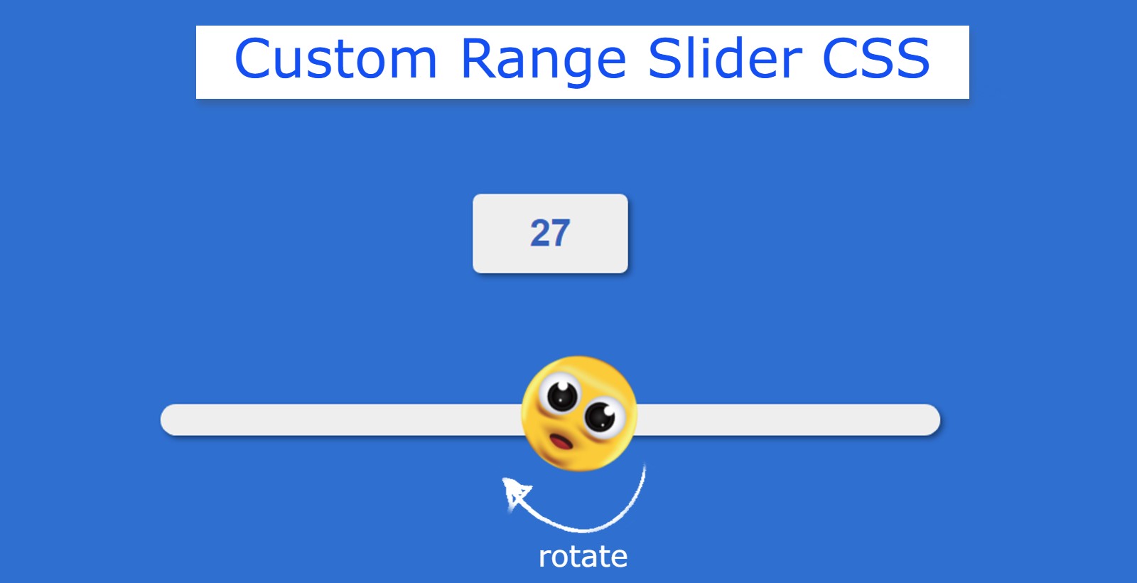
This type of range slider with min and max values is very important for an eCommerce site. I have used animation in this Custom Range Slider. The button that changes the value is designed with CSS. Emojis are used instead of buttons.
How to Create Custom Range Slider with HTML CSS
The emoji in the slider can rotate 360 degrees. The emoji will be at 0 degrees at the slider minimum value. It will rotate when you change the position of the emoji. If you are a beginner then this project (Custom Range Slider using HTML CSS) is very important for you.
See the Pen
Untitled by Foolish Developer (@foolishdevweb)
on CodePen.
First, we created the basic structure of the slider using HTML. Then JavaScript has been used to activate this Custom Range Slider.
This slider can be used in addition to JavaScript. However, JavaScript is important for activating the display. The value of the display will change when you change the position of the button on the slider.
To make this custom range slider HTML CSS you need to have a basic idea about HTML CSS. I have given a demo that will help you to know more about this custom range slider.
Step 1: Basic structure of Custom Range Slider
Now is the time to create the basic structure of the Custom Range Slider. We know that Range Slider is created using input function. Here I first created Custom Range Slider using input and designed using some amount of CSS.
With this, a small box has been created using the level. All information can be found in this box. This means that the value of this display will change when you change the position of the slider button.

Step 2: Design a value viewing display
Now I have designed the level i.e. the following codes have been used to design the value view display. I made a small box with a white background color. The color blue of the text is used here.

Step 3: Use images instead of slider buttons
Now the Custom Range Slider has been designed. Here the transparent background of the slider is used. Later I used a different background for this. An emoji is used here instead of the Range Slider button.
As I said before, an emoji has been used to enhance beauty. This emoji will basically act as a button. We know that in the case of a normal Range Slider the button can be relocated. Here too the value of the range will be changed by relocating the image.
As mentioned earlier this button can rotate 360. But that work has been done with the help of JavaScript.

Step 4: Design the runnable track of the Range Slider
Now this slider has created a runnable track. That means the background of the slider has been designed. The background is made in white color on which the image will continue.

Step 5: Activate Custom Range Slider with JavaScript
Now is the time to activate the display in this slide and arrange the emoji to rotate 360 degrees. As a result, changing the position of the image will change the value of the display. With this, the emoji will rotate 360 whenever it is changed.
First I set the input and level, that is, the constant of the image and the display, one by one. Because we can’t use any HTML function directly in JavaScript.

Hopefully from this tutorial, you have learned how to create Custom Range Slider Using HTML CSS, and JavaScript. If there is any problem while making this Range Slider, you can definitely let me know by commenting.
If you want the source code needed to create this simple Custom Range Slider, you can take the help of the download button below.