
In this article, I have shown you how to create Simple 3D Text Animation Effects. Earlier I shared with you the tutorials of different types of text animation.
Notable among them are 3D Text Effects, Text Animation, Text Typing Effect, Multiple Text Typing, etc. This 3D Text Animation effect is created by HTML and CSS only. Shadow is used here to show plain text in 3D.
CSS 3D Text Animation Effects
To create it you need to have a basic idea about HTML and CSS. Below I have shared all the tutorials that will help you to know how to create this 3d text animation for free. Below is a demo that will help you learn how it works.
See the Pen
Untitled by Foolish Developer (@foolishdevweb)
on CodePen.
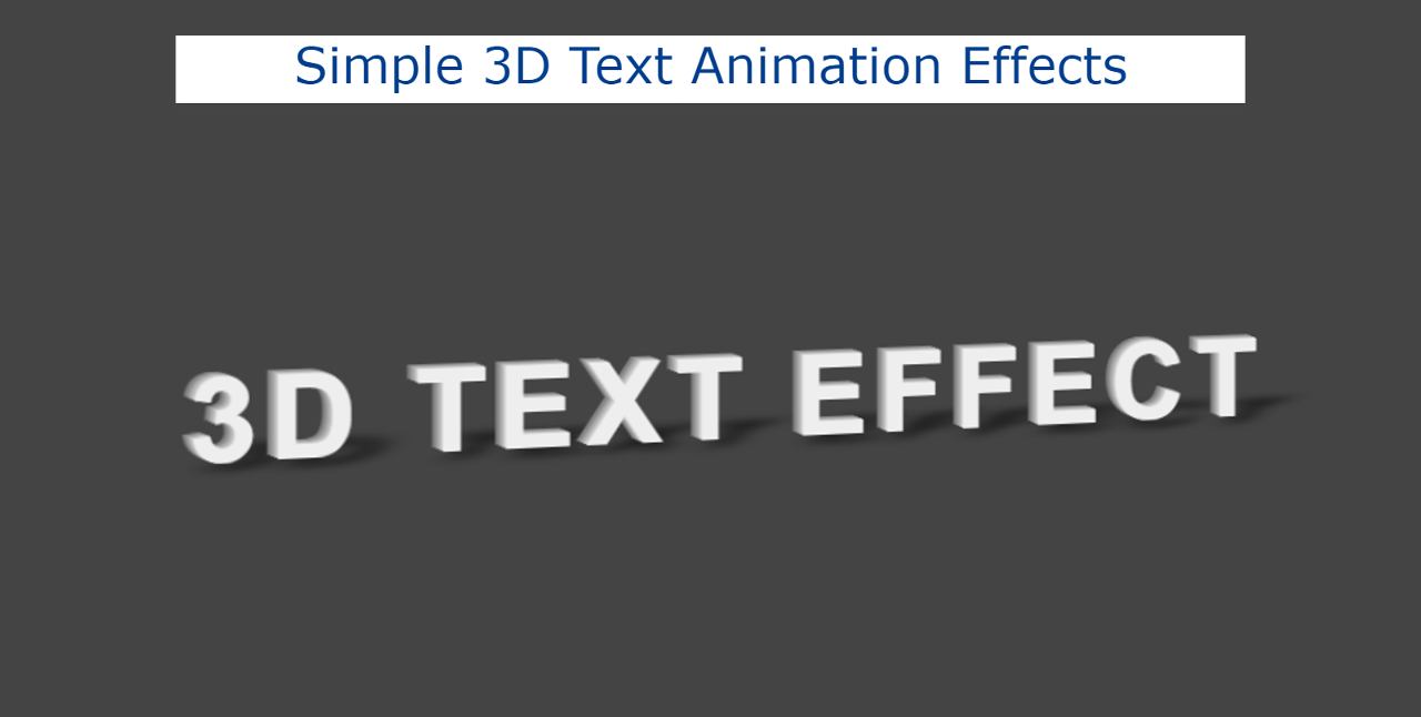
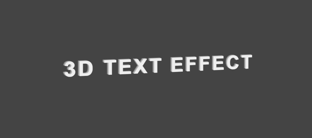
As you can see above, some amount of text has been added to the top of a web page. That text was created in 3d. Shadow is used here to better understand the 3D effect.
Animation has been used in this text. As a result, the text continues to rotate slightly to the left and slightly to the right.
Step 1: Basic structure of 3D Text Effects
The basic structure of this project and the required text have been added using the following HTML and CSS. Here some text has been used using the h1 tag and “data-shadow” has been added along with it. In the “data-shadow” option, add the text you want to show in the shadow.
When you change the text in h1 you need to change the value of that “data-shadow”. I used black as the background color of that webpage.

Step 2: Text is designed by CSS
The text has been designed using the following CSS. Font-size: 4em has been used to increase the size of the text and I have used the color black.

Step 3: Add 3d animations to text
Now animation has been added to this text using @keyframes. Every 2 seconds this text will bend slightly to the left along the y-axis and again to the right after two seconds.
Step 4: Add shadow to the 3D text effect
Here I have used CSS before and added shadows in 3D Text Animation Effects. Animation has also been added to this shadow. This will cause the shadow to change its position with the text.
There are some risks along the Axis to make that shadow more real. It looks like the shadow of that text has fallen on a flat place.

Hopefully from the above tutorial, you have learned how I created this animated 3D effect using HTML and CSS. I have created many more text fixes before. The source code of this CSS 3D Text Effects is in the button below.