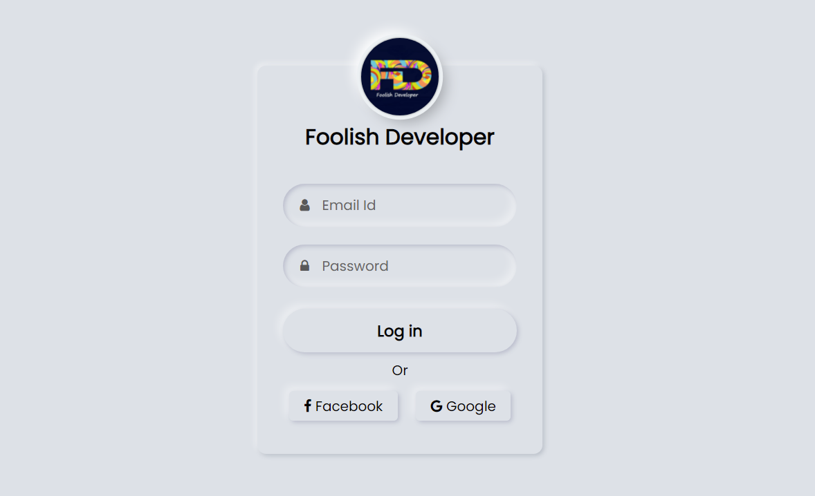
Neumorphism login form is a modern design login form created using HTML and CSS code. Hello friends, in this article I will show you how to create a login form of Neumorphism design using only HTML and CSS programming code.
Login designs come in different types like transparent, Neumorphism, Glassmorphism, responsive, animated, etc. Earlier I showed you the design of many more types of login forms and showed you how I created those login forms. The login form of this design is much more beautiful and attractive than the general design. Like the general design, it has everything, i.e. there is a place to input the email ID and password to log in.
Everyone has a place to use their first profile image or website logo. There is a nice login button to login here and below it is the Facebook and Google buttons. In other words, the user will be able to login with the help of an email id or Facebook and Google account.
Neumorphism Login Form Using HTML and CSS
Hover effects have been added to each. Normally the buttons are slightly upwards but when the mouse is moved or clicked the buttons will move inwards. In the case of this neomorphic design, the background and the color of the background of the login form are completely the same.
However, it has been given the shape of a login form by creating a color effect with the help of CSS code.
See the Pen
Neumorphism login form by shantanu jana (@fghty)
on CodePen.
If you want to see the live demo, you can use the demo button at the bottom of the article. You can also download the required source code. However, if you are a beginner, you can definitely watch the tutorial below.
First of all, you create an HTML file. Then you copy the HTML structure below and paste it into that HTML file.
Step 1: Basic HTML structure of this login form
<!DOCTYPE html>
<html>
<link rel=”stylesheet” href=”https://cdnjs.cloudflare.com/ajax/libs/font-awesome/4.7.0/css/font-awesome.min.css”>
<head>
<meta name=”viewport” content=”width=device-width, initial-scale=1″>
<style>
@import url(‘https://fonts.googleapis.com/css2?family=Poppins&display=swap’);
*{
margin:0;
padding: 0;
box-sizing: border-box;
font-family: ‘Poppins’, sans-serif;
}
html,body{
height: 100%;
}
</style>
</head>
<body>
<div class=”content”>
</div>
</body>
</html>
Step 2: Neumorphism structure with the help of CSS code
This structure has been converted to a Neumorphism design using the following programming code and given a size.
body{
display: grid;
place-items: center;
text-align: center;
background: #dde1e7;
}
.content{
width: 330px;
background: #dde1e7;
border-radius: 10px;
padding: 40px 30px;
box-shadow: -3px -3px 7px #ffffff73,
2px 2px 5px rgba(94, 104, 121, 0.288);
}
Result:
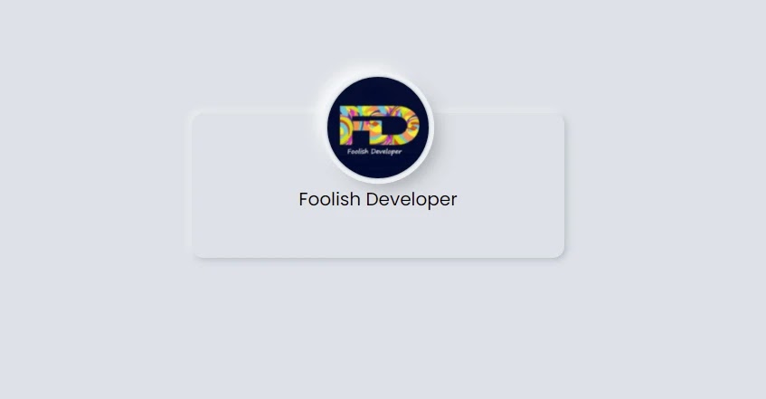
Step 3: Add a profile image to the login form
I created this logo or profile image using the following programming codes. I have also added titles here.
<img src=”https://lh3.googleusercontent.com/a-/AOh14Gj99VObFyE8W_h8RrcwZO_aYiIHu5AAa_XpnOym=s600-k-no-rp-mo”>
<div class=”text”>Foolish Developer</div>
.content img{
width: 90px;
height: 90px;
margin-top: -100px;
border-radius: 50px;
box-shadow:
0px 0px 2px #5f5f5f,
0px 0px 0px 5px #ecf0f3,
8px 8px 15px #a7aaaf,
-8px -8px 15px #ffffff
;
}
.content .text{
font-size: 25px;
font-weight: 600;
margin-bottom: 35px;
color: #000;
}
Result:
Step 4: Make a place to input email and password
I have used the following codes to create a place to input email ID and password. I used the CSS programming code below to design these and sort them into Neumorphism designs.
<div class=”field”>
<span class=”fa fa-user”></span>
<input type=”text” required>
<label>Email Id</label>
</div>
<div class=”field”>
<span class=”fa fa-lock”></span>
<input type=”password”>
<label>Password</label>
</div>
.content .field{
height: 50px;
width: 100%;
display: flex;
position: relative;
}
.field input{
height: 100%;
width: 100%;
padding-left: 45px;
font-size: 18px;
outline: none;
border: none;
color: #595959;
background: #dde1e7;
border-radius: 25px;
box-shadow: inset 2px 2px 5px #babecc,
inset -5px -5px 10px #ffffff73;
}
.field input:focus ~ label{
box-shadow: inset 2px 2px 5px #babecc,
inset -1px -1px 2px #ffffff73;
}
.field:nth-child(2){
margin-top: 20px;
}
.field span{
position: absolute;
width: 50px;
line-height: 50px;
color: #595959;
}
.field label{
position: absolute;
top: 50%;
left: 45px;
pointer-events: none;
color: #666666;
transform: translateY(-50%);
}
.field input:focus ~ label{
opacity: 0;
}


