In this article, I am going to show you how to create an animated circular progress bar using only HTML CSS and BoostApp programming code. I have designed many more types of animated progress bars before but this design has been designed in a completely modern way.
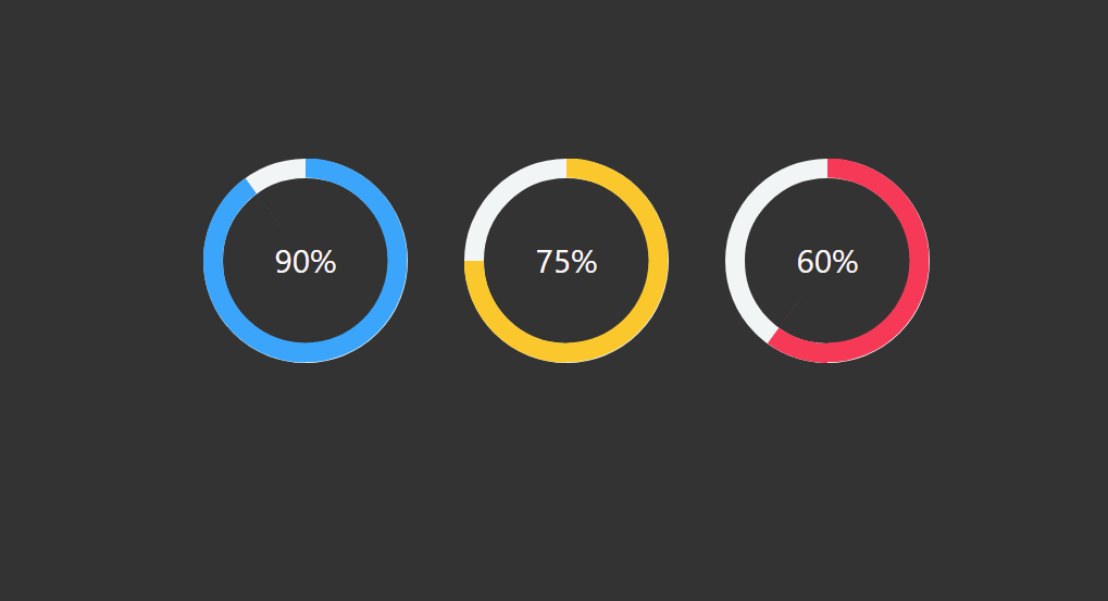
Animated circular Progress Bar is a type of statistical design used in a variety of websites. It is mainly used to indicate the percentage of one’s qualification in a portfolio website or personal website. It is fully animated, that is, under normal conditions, it has zero percent then it will gradually reach the pre-determined percentage. Different colors have been used to denote percentages.
See the Pen @codemediaweb )CodePen .
Animated Circular progress bar using Html and CSS I used Html, CSS, and bootstrap programming code to make it. In the case of this circular progress bar, you can pre-determine the percentage as needed. This means that you can pre-determine the percentage of progress this animation will stop. In this case, I have basically made a circle of three signs of progress and used different colors for each of them.
Below I have shown in full step by step how I have created this progress bar and which programming code I have used to create any element. Below the article is a download button where you can download the required source code by clicking.
Step 1: Create the structure of the progress bar
<!–Bootstrap Cdn link–>
<link rel =“stylesheet” href =“https://cdn.jsdelivr.net/npm/bootstrap@4.6.0/dist/css/bootstrap.min.css” integrity =“sha384-B0vP5xmATw1+K9KRQjQERJvTumQW0nPEzvF6L/Z6nronJ3oUOFUFpCjEUQouq2+l” crossorigin =“anonymous” >
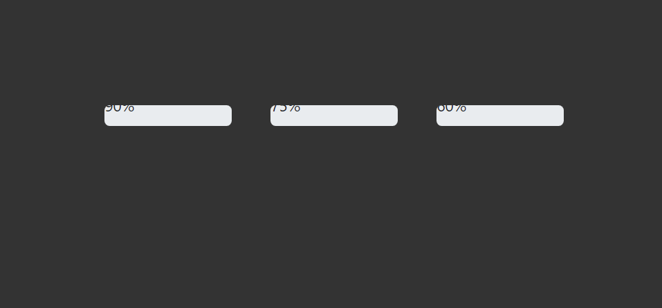
<div class =“container” >
<div class =“row” >
<div class =“col-md-3 col-sm-6” >
<div class =“progress blue” >
<span class =“progress-left” >
<span class =“progress-bar” ></span >
</span >
<span class =“progress-right” >
<span class =“progress-bar” ></span >
</span >
<div class =“progress-value” >90%</div >
</div >
</div >
<div class =“col-md-3 col-sm-6” >
<div class =“progress yellow” >
<span class =“progress-left” >
<span class =“progress-bar” ></span >
</span >
<span class =“progress-right” >
<span class =“progress-bar” ></span >
</span >
<div class =“progress-value” >75%</div >
</div >
</div >
<div class =“col-md-3 col-sm-6” >
<div class =“progress pink” >
<span class =“progress-left” >
<span class =“progress-bar” ></span >
</span >
<span class =“progress-right” >
<span class =“progress-bar” ></span >
</span >
<div class =“progress-value” >60%</div >
</div >
</div >
</div >
</div >
body {
background-color: #333 ;
margin: 10 % ;
margin-left: 30 % ;
}
Result:
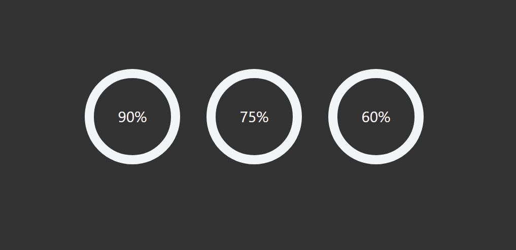
Step 2: Design round shape with CSS code.progress {
background: none ;
margin: 0 auto ;
box-shadow: none ;
width: 150 px ;
height: 150 px ;
line-height: 150 px ;
position: relative ;
}
.progress:after {
content: “” ;
border-radius: 50 % ;
border: 15 px solid #f2f5f5 ;
position: absolute ;
width: 100 % ;
height: 100 % ;
top: 0 ;
left: 0 ;
}
.progress > span {
position: absolute ;
top: 0 ;
z-index: 1 ;
width: 50 % ;
height: 100 % ;
overflow: hidden ;
}
.progress .progress-left {
left: 0 ;
}
.progress .progress-bar {
border-width: 15 px ;
border-style: solid ;
position: absolute ;
width: 100 % ;
height: 100 % ;
background: none ;
top: 0 ;
}
.progress .progress-left .progress-bar {
left: 100 % ;
border-top-right-radius: 80 px ;
border-bottom-right-radius: 80 px ;
border-left: 0 ;
-webkit-transform-origin: center left ;
transform-origin: center left ;
}
.progress .progress-right {
right: 0 ;
}
.progress .progress-right .progress-bar {
left: -100 % ;
-webkit-transform-origin: center right ;
transform-origin: center right ;
border-top-left-radius: 80 px ;
border-bottom-left-radius: 80 px ;
border-right: 0 ;
animation: loading-1 1.8 s linear forwards ;
}
.progress .progress-value {
font-size: 24 px ;
color: rgb (250 , 245 , 245 );
text-align: center ;
width: 100 % ;
height: 100 % ;
position: absolute ;
}
Result:
Step 3: Add loading animations in the progress bar
@keyframes loading-1 {
0%{
-webkit-transform: rotate (0 deg );
transform: rotate (0 deg );
}
100%{
-webkit-transform: rotate (180 deg );
transform: rotate (180 deg );
}
}
@keyframes loading-2 {
0%{
-webkit-transform: rotate (0 deg );
transform: rotate (0 deg );
}
100%{
-webkit-transform: rotate (144 deg );
transform: rotate (144 deg );
}
}
@keyframes loading-3 {
0%{
-webkit-transform: rotate (0 deg );
transform: rotate (0 deg );
}
100%{
-webkit-transform: rotate (90 deg );
transform: rotate (90 deg );
}
}
@keyframes loading-4 {
0%{
-webkit-transform: rotate (0 deg );
transform: rotate (0 deg );
}
100%{
-webkit-transform: rotate (36 deg );
transform: rotate (36 deg );
}
}
@keyframes loading-5 {
0%{
-webkit-transform: rotate (0 deg );
transform: rotate (0 deg );
}
100%{
-webkit-transform: rotate (126 deg );
transform: rotate (126 deg );
}
}
Result:
Step 4: Add a different color to make the loading animation clearer
.progress.blue .progress-bar {
border-color: #26abfd ;
}
.progress.blue .progress-left .progress-bar {
animation: loading-2 1.5 s linear forwards 1.8 s ;
}
.progress.yellow .progress-bar {
border-color: #fdc426 ;
}
.progress.yellow .progress-left .progress-bar {
animation: loading-3 1 s linear forwards 1.8 s ;
}
.progress.pink .progress-bar {
border-color: #f83754 ;
}
.progress.pink .progress-left .progress-bar {
animation: loading-4 0.4 s linear forwards 1.8 s ;
}
Result:
Hopefully from this article, you have learned how to make it. If there is any difficulty, you can let me know by commenting.
Step by Step Tutorial: Click Here
The download will start automatically