Responsive Top Navigation Menu Bar Using HTML & CSS

Responsive Top Navigation Menu Bar Using HTML & CSS

Responsive Top Navigation Menu Using HTML & CSS

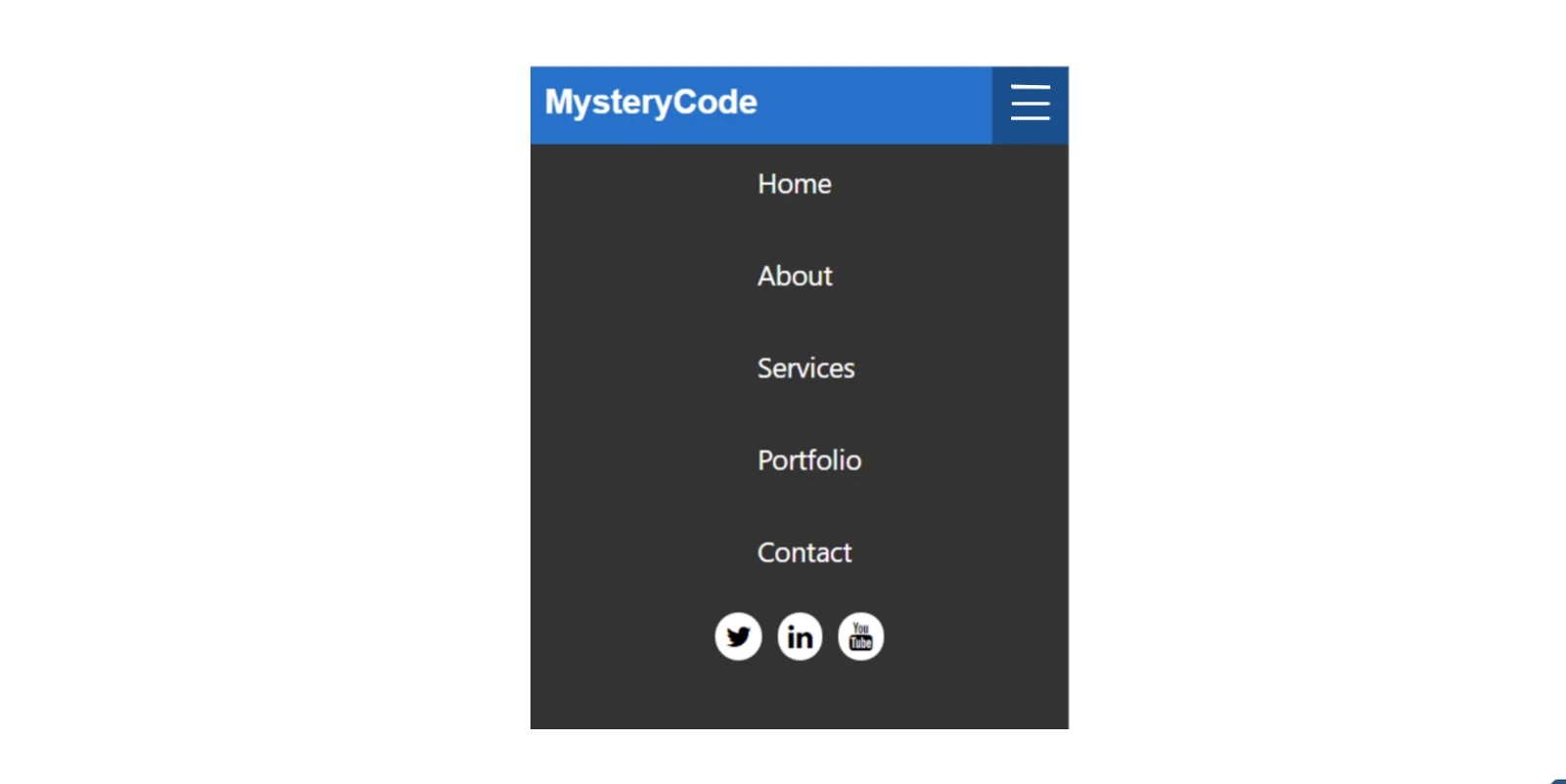
The navigation menu bar enhances the quality and beauty of the website by arranging all the content of each website in a beautiful way.

Hello friends, in this blog article I am going to show you how to create a menu bar on Responsive using only simple HTML and CSS programming code. I have designed many more types of menubars before, such as site menubars, overlay menubars, and so on. The navigation menu I created in this article is very simple and generally designed. HTML is used to build it and CSS code is used to design it. 

The menubar is a significant UI design of the website. With the help of which you can organize all kinds of content of the website beautifully. Each menu has a hover effect, meaning that when you hover or click on the menus, the color of the background will change. 

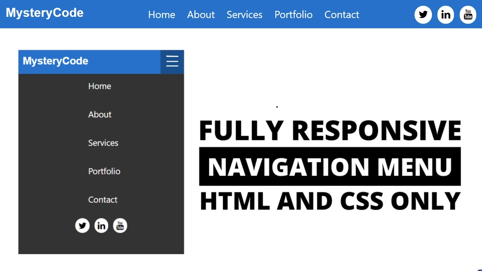
I have seen below how you can change this color as you wish. In the menubar on this navigator, I added some menus and used a logo. I also used social media icons. It is made fully responsive which means it can adapt itself beautifully to any device. Blue color has been used in the background.


How To Create a Responsive Top Navigation Menu

I hope you like this design. I will try to explain to you step by step and beautifully how I made this design. You can also find out which programming code has been used to extend an element. I showed the result after each step so that the beginners can understand. 

I used HTML and CSS programming code to design this menu bar. Mostly CSS programming code has been used here. You can use the download button below to download the source code directly.

Step 1: Create the basic design of this navbar

 <div class=“nav”>
       <!–logo–>
        <!–toggle button for mobile–>
        
        <div class=“nav-links”>
            <ul>
          <!–menu Item–>
         <!–Social Icon–>
            </ul>
        </div>
      </div>
* {
    box-sizing: border-box;
  }
  
  body {
    margin: 0px;
    font-family: ‘segoe ui’;
  }
  
  .nav {
    height: 50px;
    width: 100%;
    background-color: #1177ca;
    position: relative;
  }

Result:


Step 2: Create your brand’s logo

<input type=“checkbox” id=“nav-check”>
        <div class=“nav-header”>
          <div class=“nav-title”>
            MysteryCode
          </div>
        </div>
  .nav > .nav-header {
    display: inline;
  }
  
  .nav > .nav-header > .nav-title {
    display: inline-block;
    font-family: ArialHelveticasans-serif;
    padding: 10px 10px 10px 10px;
    font-size: 22px;
    color: #fff;
    font-weight: 550;
  }
  

Result:

Step 3: Add menu items as needed

      
          <li><a href=“#” target=“_blank”>Home</a></li>
          <li><a href=“#” target=“_blank”>About</a></li>
          <li><a href=“#” target=“_blank”>Services</a></li>
          <li><a href=“#” target=“_blank”>Portfolio</a></li>
          <li><a href=“#” target=“_blank”>Contact</a></li>
.nav > .nav-links {
    font-size: 18px;
    display: inline;
    float: right;
  }
  .nav > .nav-links > ul li a{
    color: #fff;
    line-height: 40px;
    font-size: 18px;
    display: block;
    padding: 0 8px;
    text-decoration: none;
  }
  .nav > .nav-links > ul{
    list-style: none;
    position: relative;
    padding: 0;
    margin-top: 5px;
    
  }
  .nav > .nav-links > ul li{
    display: inline-block;
    background-color: #1177ca;
    
    
  }
  .nav > .nav-links > ul li:hover{
      background-color: #0b65af;
      border-radius: 5px;
  }

Result:


Step 4: Add social media icons in the menu bar

        <a class=“icon”>
            <i class=“fa fa-twitter”></i>
            <i class=“fa fa-linkedin”></i>
            <i class=“fa fa-youtube”></i>
          </a>
 .nav .nav-links ul a.icon{
 margin-left: 80px;
 margin-right: 10px;
 }
 .nav .nav-links ul a i{
    padding: 7px;
    margin-left: 5px;
    background-color: #fff;
    border-radius: 50px;
 }

Result:

Step 5: Add toggle button for responsive devices

 <div class=“nav-btn”>
          <label for=“nav-check”>
            <span></span>
            <span></span>
            <span></span>
          </label>
        </div>
  .nav > .nav-btn {
    display: none; /*Hide toggle button for desktop*/
  }
   .nav > #nav-check {
    display: none;
  }

Step 6: Make the navigation menu Responsive

  @media (max-width:750px) {
    .nav > .nav-btn {
      display: inline-block;
      position: absolute;
      right: 0px;
      top: 0px;
    }
    .nav > .nav-btn > label {
      height: 50px;
      padding: 13px;
      display: inline-block;
      width: 50px;
    }
    .nav > .nav-btn > label:hover,.nav  #nav-check:checked ~ .nav-btn > label {
      background-color: rgba(0000.3);
    }
    .nav > .nav-btn > label > span {
      height: 10px;
      border-top: 2px solid #eee;
      display: block;
      width: 25px;
    }
    .nav > .nav-links {
      position: absolute;
      height: 0px;
      transition: all 0.3s ease-in;
      overflow-y: hidden;
      top: 50px;
      display: block;
      width: 100%;
      background-color: #333;
      left: 0px;
    }
    .nav > .nav-links > ul li a {
      display: block;
      width: 100%;
    }
    /*   */
    
      .nav > .nav-links > ul li{
        padding: 0;
        background-color: #333;
        display: block;
        margin-bottom: 20px;
         
      }
      .nav > .nav-links > ul li a{
          margin-left: 40%;
      }
      .nav .nav-links ul a.icon{
        margin-left: 33%;
      }
    /*   */
    .nav > #nav-check:not(:checked~ .nav-links {
      height: 0px;
    }
    .nav > #nav-check:checked ~ .nav-links {
      height: calc(100vh  50px);
      overflow-y: auto;
    }
  }

Result:

Hope you know how to make it. Here I have tried to explain to you in full step so hope you understand. If you have any problems, you can let me know by commenting.