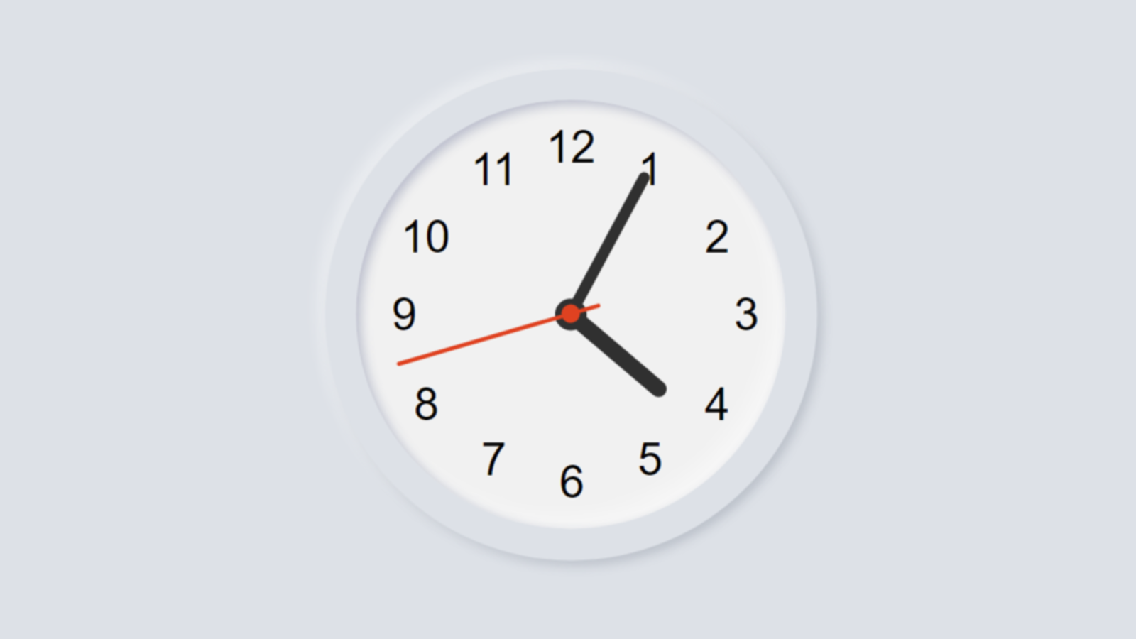
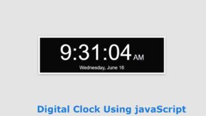
In this article, you are going to learn how to make an analog clock using HTML, CSS, and JavaScript programming code. Earlier I showed how digital clocks are made using JavaScript programming code. You must have knowledge of basic HTML, CSS, and JavaScript.
If you are a beginner then you can understand the design of this watch. Here I have shown step by step how I made this design. It shows the exact time, that is, the clock will show the time according to the time on your device. Like a normal watch, three hands have been used here. To indicate an hour, to indicate a second minute, and a third to indicate a second. The background of this watch is arranged in the form of a Neumorphism design. Many people wonder how the hands work in the case of these digital watches. Let me tell you, JavaScript programming code is used to rotate these thorns. Each cut is rotated 360 degrees using the js code. That is, one end of the hand is fixed and the other end is rotated 360. The second hand rotates 360 degrees once per minute.
How To Create a Clock using HTML, CSS, and JavaScript
If you have difficulty understanding, you can watch the demo below. Where you can understand how it works. There is also the necessary source code that you can copy and use in your own project. If you are a beginner, I would recommend you to watch the tutorial below. Here is a complete step-by-step guide to show which program I have used to create an element.
See the Pen
clock javascript 1 by shantanu jana (@fghty)
on CodePen.
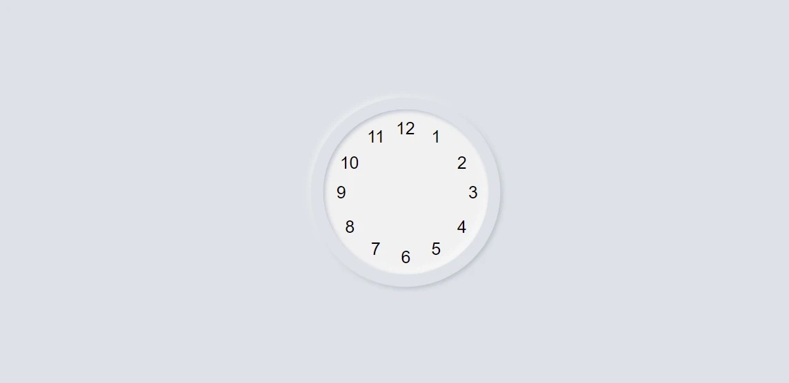
Step1: Create the basic structure for making this watch
A very small amount of HTML programming code has been used. Basically, the following programming codes have been used to make twelve cells, that is, to write numbers from 1 to 12. The CSS code has been used to design the background. Already seen in the demo I have used a Neumorphism design in the background which has made this analog watch much more beautiful and attractive.
HTML Code:
<div class=”icon-large icon-clock”>
<div class=”clock”>
<ol>
<li></li>
<li></li>
<li></li>
<li></li>
<li></li>
<li></li>
<li></li>
<li></li>
<li></li>
<li></li>
<li></li>
<li></li>
</ol>
<!– Clock hand–>
</div>
</div>
CSS Code:
html, body {
height: 100%;
background: #dde1e7;
position: relative;
}
.icon-large {
width: 220px;
height: 220px;
border-radius: 38px;
position: absolute;
top: 50%;
left: 50%;
transform: translate(-50%, -50%);
}
.icon-clock {
overflow: hidden;
background: #dde1e7;
border-radius: 50%;
box-shadow: -3px -3px 7px #ffffff73,
2px 2px 5px rgba(94, 104, 121, 0.288);
}
.clock {
width: 192px;
height: 192px;
border-radius: 50%;
background: #f1f1f1;
position: absolute;
top: 50%;
left: 50%;
transform: translate(-50%, -50%);
box-shadow: inset 2px 2px 5px #babecc,
inset -5px -5px 10px #ffffff73;
}
.clock ol {
list-style-type: none;
width: 100%;
height: 100%;
position: relative;
margin: 0;
padding: 0;
}
.clock ol li {
counter-increment: labelCounter;
position: absolute;
font-size: 1.25em;
}
Result:
Step 2: Create the numbers in the clock using the CSS code
The following HTML programming codes are used for numbers from 1 to 12 and to design them. Basically, many clocks use images in the background, so you don’t have to write these numbers separately. But I did not use any extra pictures of this design so I had to write each number at a certain distance.
CSS Code:
.clock ol li:before {
font-family: “Helvetica”;
content: counter(labelCounter) “”;
}
.clock ol li:nth-child(1) {
right: 55px;
top: 20px;
}
.clock ol li:nth-child(2) {
right: 25px;
top: 50px;
}
.clock ol li:nth-child(3) {
right: 12px;
top: 85px;
}
.clock ol li:nth-child(4) {
right: 25px;
top: 125px;
}
.clock ol li:nth-child(5) {
right: 55px;
top: 150px;
}
.clock ol li:nth-child(6) {
right: 90px;
top: 160px;
}
.clock ol li:nth-child(7) {
right: 125px;
top: 150px;
}
.clock ol li:nth-child(8) {
right: 155px;
top: 125px;
}
.clock ol li:nth-child(9) {
right: 165px;
top: 85px;
}
.clock ol li:nth-child(10) {
right: 150px;
top: 50px;
}
.clock ol li:nth-child(11) {
right: 120px;
top: 20px;
}
.clock ol li:nth-child(12) {
right: 85px;
top: 10px;
}
@-webkit-keyframes spin {
100% {
transform: rotate(360deg);
}
}
@keyframes spin {
100% {
transform: rotate(360deg);
}
}
Result:
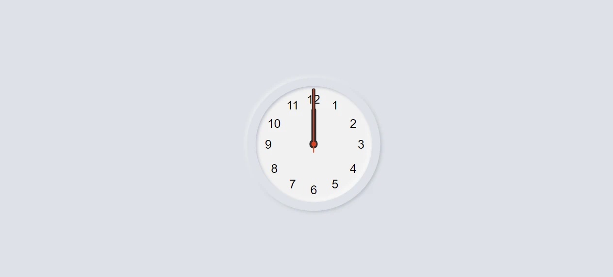
Step 3: Make the hands on the watch that indicate the time
There are basically three types of hands used in this watch. Each indicates a different time. One cut indicates the hour, the other the minute, and the other the second. The following CSS codes have been used to design each of the thorns. In this case, I have used a different color for each hand. You can change those colors if you want.
HTML Code:
<div id=”hour”></div>
<div id=”min”></div>
<div id=”sec”></div>
CSS Code:
#hour {
width: 14px;
height: 14px;
border-radius: 50%;
background: #303030;
position: absolute;
top: 50%;
left: 50%;
margin-top: -7px;
margin-left: -7px;
}
#hour:before, #hour:after {
content: “”;
display: block;
position: absolute;
}
#hour:before {
width: 8px;
height: 65px;
border-radius: 4px;
background: #303030;
position: absolute;
bottom: 2px;
left: 50%;
transform: translate(-50%, 0);
}
#min {
width: 0;
height: 0;
border-radius: 50%;
background: #303030;
position: absolute;
top: 50%;
left: 50%;
}
#min:before, #min:after {
content: “”;
display: block;
position: absolute;
}
#min:before {
width: 6px;
height: 90px;
border-radius: 4px;
background: #303030;
position: absolute;
bottom: 2px;
left: 50%;
transform: translate(-50%, 0);
}
#sec {
width: 4px;
height: 4px;
border-radius: 50%;
background: #dd3e1c;
border: 2px solid #e13e1b;
position: absolute;
top: 50%;
left: 50%;
margin-top: -4px;
margin-left: -4px;
}
#sec:before, #sec:after {
content: “”;
display: block;
position: absolute;
}
#sec:before {
width: 2px;
height: 105px;
border-radius: 4px;
background: #e13e1b;
position: absolute;
bottom: -12px;
left: 50%;
transform: translate(-50%, 0);
}
Result:
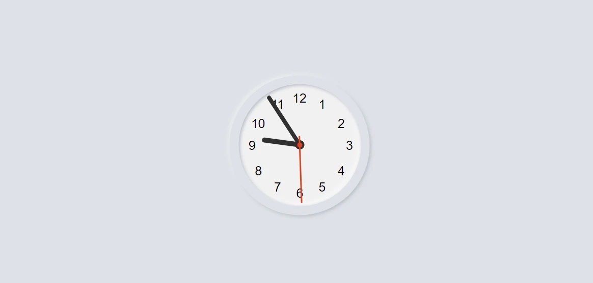
Step 4: Add JavaScript code to make the clockwork
So far we have designed this watch. Now we need to use JavaScript programming code to make this watch work.
JS Code:
window.requestAnimFrame = (function(){
return window.requestAnimationFrame ||
window.webkitRequestAnimationFrame ||
window.mozRequestAnimationFrame ||
function( callback ){
window.setTimeout(callback, 1000 / 60);
};
})();
//initialize the clock in a self-invoking function
(function clock(){
var hour = document.getElementById(“hour”),
min = document.getElementById(“min”),
sec = document.getElementById(“sec”);
//set up a loop
(function loop(){
requestAnimFrame(loop);
draw();
})();
Step 5: Indicate how the watch’s hand will rotate
The first thing I said was that the hands of this kite rotate 360. The following programming code determines how that tour is scheduled. You will see below that the seconds, minutes, and hours are given a specific time for each hand rotation.
JS Code:
//position the hands
function draw(){
var now = new Date(),//now
then = new Date(now.getFullYear(),now.getMonth(),now.getDate(),0,0,0),//midnight
diffInMil = (now.getTime() – then.getTime()),// difference in milliseconds
h = (diffInMil/(1000*60*60)),//hours
m = (h*60),//minutes
s = (m*60);//seconds
//rotate the hands accordingly
sec.style.webkitTransform = “rotate(” + (s * 6) + “deg)”;
hour.style.webkitTransform = “rotate(” + (h * 30 + (h / 2)) + “deg)”;
min.style.webkitTransform = “rotate(” + (m * 6) + “deg)”;
}
})();
Result:
Hopefully, in this tutorial, you have learned how to make an analog kite. If there is any difficulty, of course, you can comment. I will try to solve all your problems. If you know basic HTML CSS and JavaScript then you can definitely make this design.