
In this article, I am going to show you how to create a Responsive Image Gallery using HTML and CSS code. Earlier I showed you how to create a filterable image gallery using pure JavaScript.
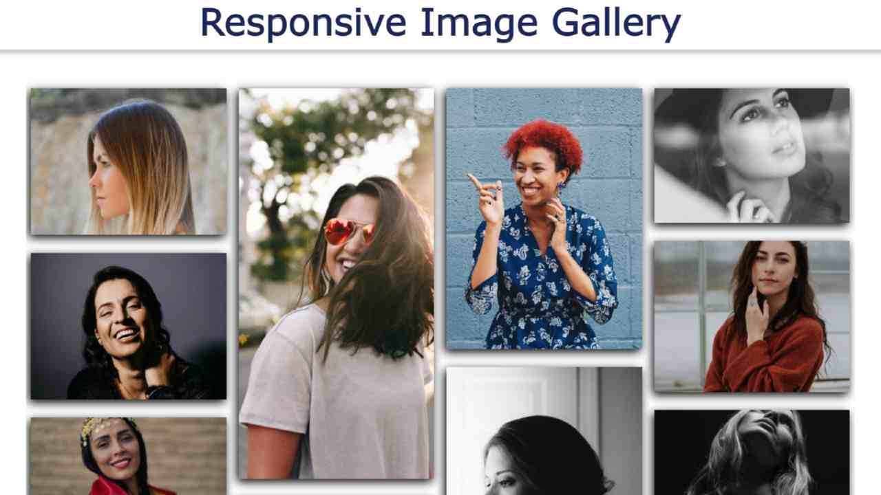
We see such image galleries on such websites. Where many types of images are neatly arranged together. This type of design is most commonly used on personal websites or image download websites. If you are wondering what Responsive Image Gallery is, let me tell you that Responsive is a very popular word in the web design world.
Being responsive, the design can be used by users of any screen size. This means that in the case of any device, this design can adapt itself depending on the screen of that device. In the meantime, I have shown how to create an image gallery with the help of bootstrap. Using Bootstrap does not require much CSS in that case.
Below I have given a live demo that will help you to know how this image gallery works.
See the Pen
Responsive Image Gallery by Raj Template (@RajTemplate)
on CodePen.
Hopefully, the demo above has helped you figure out how it works. The most important point of this design is that you can use different-sized images here.
As you can see above, there are many sizes of images in this Responsive Image Gallery. Some images are large in size, some are small, and some are long. In other words, the size of the image here is random. It is fully responsive. Images can be seen in a column whenever you use the slider on a small device.
How to Create Responsive Image Gallery using HTML and CSS
Now time is how I created Responsive Image Gallery. First of all, you create an HTML and CSS file. Open Notepad on your device to create HTML files. Then save it by adding dot HTML (rename.html) to the rename. Below I have given the HTML and CSS code which you can copy and paste between your HTML and CSS files.
Step 1: Add images using the following HTML code
The code below is the HTML programming code that helped to create the basic structure of this image gallery and add the necessary images.
<img src=”https://source.unsplash.com/1600×1200?female,portrait” class=”img-responsive”>
<img src=”https://source.unsplash.com/1024×768?female,portrait” class=”img-responsive”>
<img src=”https://source.unsplash.com/1366×768?female,portrait” class=”img-responsive”>
<img src=”https://source.unsplash.com/1920×1080?female,portrait” class=”img-responsive”>
<img src=”https://source.unsplash.com/640×360?female,portrait” class=”img-responsive”>
<img src=”https://source.unsplash.com/320×640?female,portrait” class=”img-responsive”>
<img src=”https://source.unsplash.com/1200×1600?female,portrait” class=”card img-responsive”>
<img src=”https://source.unsplash.com/800×600?female,portrait” class=”img-responsive”>
<img src=”https://source.unsplash.com/600×800?female,portrait” class=”img-responsive”>
<img src=”https://source.unsplash.com/400×600?female,portrait” class=”img-responsive”>
<img src=”https://source.unsplash.com/600×400?female,portrait” class=”img-responsive”>
<img src=”https://source.unsplash.com/1100×1600?female,portrait” class=”img-responsive”>
<img src=”https://source.unsplash.com/1600×1100?female,portrait” class=”img-responsive”>
<img src=”https://source.unsplash.com/992×768?female,portrait” class=”img-responsive”>
<img src=”https://source.unsplash.com/768×992?female,portrait” class=”img-responsive”>
</div>
Step 2: Design the gallery with CSS code
Now I have designed it using the following CSS codes. In this case, there is no need to use too much CSS code. I only used CSS code to sort the images and do some basic designs. I have used column-count: 4 for the images to be divided into maximum of four columns.
I also put a distance of 20px in the middle of each column. As a result, the images look a bit blank. You copy the css code then paste it in your css file. You can also add these codes to HTML files using style tags.
column-count:4;
column-gap:20px;
}
#gallery img {
width:100%;
height:auto;
margin: 4% auto;
box-shadow:-3px 5px 15px #000;
cursor: pointer;
transition: all 0.2s;
}
Step 3: Make the image slider responsive
I have made this design fully responsive using the following codes. Since I made it in response via CSS, I used @media to determine how to view these images for different skins.
If you were to build this slider using Bootstrap, you would not need to make it responsive with a separate CSS code. You copy these codes and then add them to your CSS file.
#gallery{
column-count:3;
column-gap:20px;
}
}
@media (max-width:800px){
#gallery{
column-count:2;
column-gap:20px;
}
}
@media (max-width:600px){
#gallery{
column-count:1;
}
}
Hopefully, you have been able to create this beautiful Responsive Image Gallery using html and css codes. In the meantime, I have created more image galleries via CSS.
If the above code does not work or there is a problem, you can download the source code using the download button below. If you have any questions about this design, please let me know in the comments.