Simple Snowfall Animation using HTML CSS (Free Code)
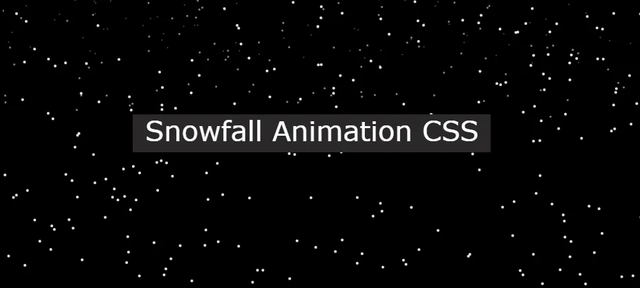
In this article you will learn how to create Snowfall Animation using HTML CSS and JavaScript. We see CSS Snow Animation Effect in many places which helps to enhance the…
In this article you will learn how to create Snowfall Animation using HTML CSS and JavaScript. We see CSS Snow Animation Effect in many places which helps to enhance the…
CSS Pulse Animation We see it in different places on web pages. Pulse Animation is used to make different UI elements interesting.
Here we will discuss how a Pulse Animation can be created using CSS. Here I have shared different types of designs such as Simple Pulse Animation CSS, button pulse animation, text pulse animation, image pulse animation, pulse animation on hover, etc.
Here I will use only CSS and HTML. I have shared here the complete information of each design, source code, and live demo of everything.
Examples – 1
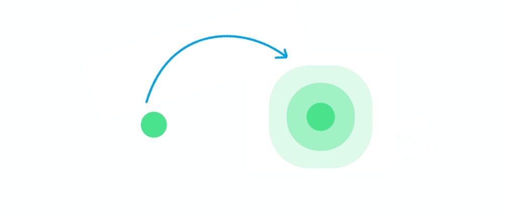
This is a simple Pulse Animation design created by HTML and CSS only. This design is basically a basic example of Pulse Animation.
There is a small round point here that will continue to be the center of animation.

Hopefully, with the help of the demo button above, you know how it works. If you want you can download all the code using the button below.
But below I have given all the HTML CSS code. The code used for this CSS Pulse Animation effect is very simple so you will not have any difficulty understanding it.
The following code is the HTML code that helps to add the basic information of this pulsing animation. Here I have put together all the HTML codes that you can copy and paste into your HTML file.
The following code is the CSS code that activates this pulsing animation. Copy these and paste them into your CSS file. Remember to rename your CSS file to ‘style.css’.
Hopefully, you have been able to create a simple pulse animation design using the above code.
Examples – 2
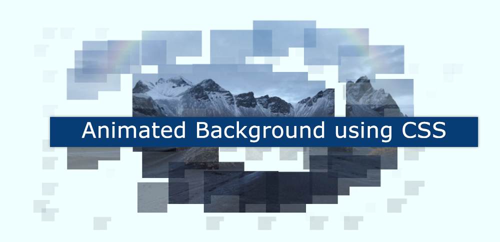
We see many kinds of background animations on the homepage of the website. If you want to create that kind of animated background using CSS then this tutorial is for…
In this tutorial, you will learn how to create a CSS Gradient Border using HTML and CSS. We use different types of borders in different places. However, if different types…

In this tutorial, you will learn how to create Mouse Cursor Effects using JavaScript. Earlier I showed you how to create a custom mouse follow. A type of JavaScript Mouse…
line-height: 2em;}
h3{text-align: left;
font-family: Open Sans,Arial,sans-serif;
line-height: 1.7em;
color:black;
color:#333131;
font-weight: 520;
-webkit-font-smoothing: antialiased;
}
h2{text-align: left;
font-family: Open Sans,Arial,sans-serif;
line-height: 1.7em;
color:black;
font-weight: 620;
-webkit-font-smoothing: antialiased;
}
.class {
background:#edf0f2;
font-family: Consolas,Monaco,Lucida Console,monospace;
line-height: 1.65;
word-wrap: break-word;
border-radius: 5px;
color:#001d8f;
font-size:17.1px;
padding-left:10px;
white-space: pre-wrap;}
button.last-btn{
padding:14px 29px;
font-size:17px;
background-color:#0e87f0;
border-radius:6px;
color:white;
font-family: Open Sans,Arial,sans-serif;
border:none;
margin-left:35%;
}
@media only screen and (max-width: 400px) {
button.last-btn{
margin-left:0px;
margin-right:0px;
}
}
@media only screen and (max-width: 300px) {
button.last-btn{
margin-left:0px;
margin-right:0px;
}
}
@media only screen and (max-width: 600px) {
button.last-btn{
margin-left:0px;
margin-right:0px;
}
}
@media only screen and (max-width: 800px) {
button.last-btn{
margin-left:0px;
margin-right:0px;
}
}
@media only screen and (max-width: 400px) {
.copyButton {
width: 45%;
}

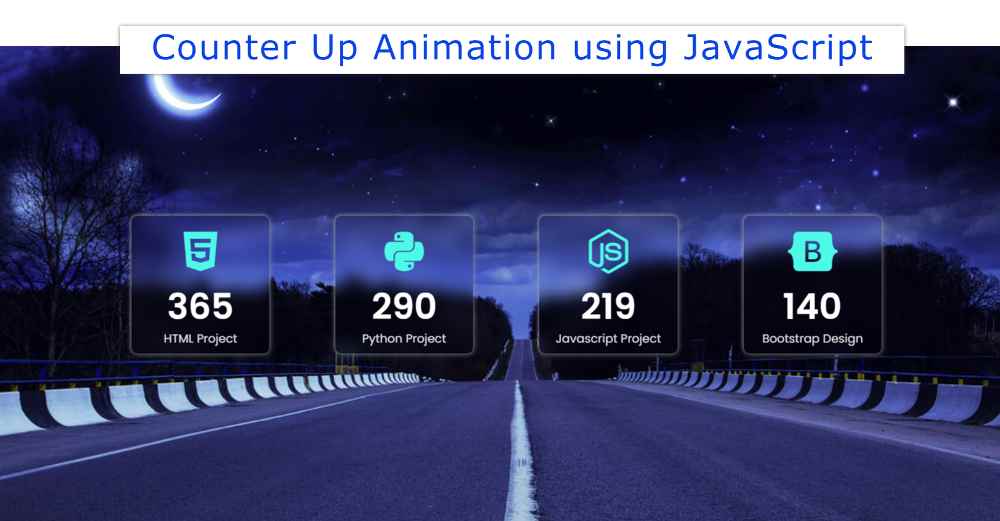
In this article, you will learn how to create Responsive Counter Up Animation using HTML CSS, and JavaScript. We use javascript Counter Up Animation in many places. For different types of personal websites, business websites, etc.
This type of responsive counter up animation is most commonly used in business websites. For example, you can use this project in case you want to show the quantity of any product on your business website.
30 OTP input fields using HTML, CSS, and JS
Count animation is used between the numbers here. This type of Responsive Counter Up Animation is often used by developers to create queries. But if you want you can make it with the help of simple javascript. This tutorial will show you how to create JavaScript Counter Up Animation.
Html, CSS, and javascript have been used to create this Counter Up Animation JavaScript. A very simple code is used here for beginners.
Below is a preview of this Number Countup Animation. Which will help you to know how it works. I used a nice background image on a web page as you saw above. On which four small boxes have been made. One icon, one number, and one test have been added to the box.
See the Pen
Untitled by Foolish Developer (@foolishdevweb)
on CodePen.
I have made the background of this simple count-up animation transparent. As a result, these small boxes can be seen almost transparently in the background.
I have already shared tutorials on creating many elements such as login forms, profile cards, etc. using transparent design.
To create this Responsive Counter Up Animation you need to have a basic idea about HTML, CSS, and javascript. I have shared step by step tutorial here. I have given possible results with pictures after each step.
I have added all the information using the following code. I made four boxes. In that box you can see the icon first, then the number count down, and then a text.

I have designed the webpage using the following CSS codes. Here an image is used in the background of the web page. You can use any background color instead of this image.

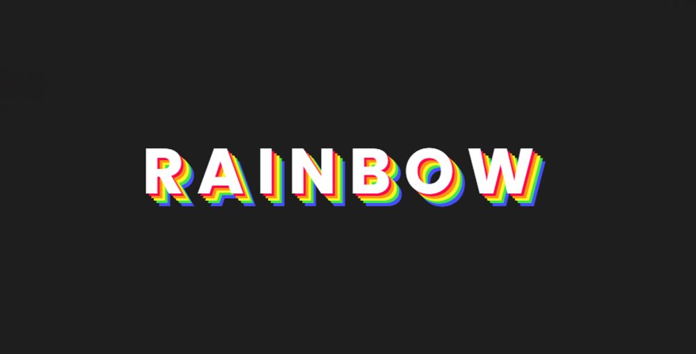
You will learn how to make CSS rainbow text animation from this tutorial. Here I will tell you step-by-step how to create rainbow text animation using only HTML and CSS.…
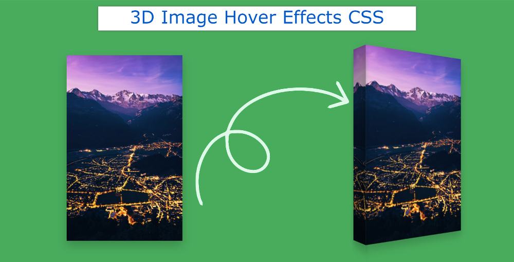
This tutorial will help you if you want to create 3D Image Hover Effects CSS. Here you will learn how to create a 3d hover effect using HTML and CSS.…
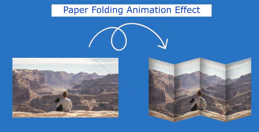
Here you will learn how to create paper folding animation CSS using HTML and CSS. Earlier I shared with you different types of image hover and animation. This is the…
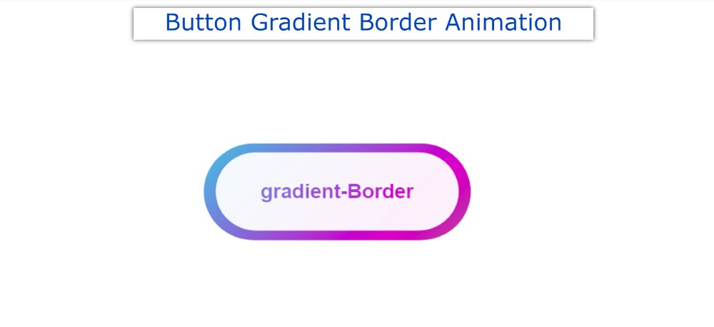

In this tutorial, you will learn how to make CSS Button Gradient Border. Earlier I shared with you the tutorials of different types of gradient buttons. However, the background gradient color was not used here. Instead, the background is kept completely transparent and CSS Gradient Borders are used on the button borders.
Buttons we use in different places. If that button is attractive and animated it attracts more user attention. In that case, you can use such a simple CSS Button Gradient Border Button. This will definitely enhance the beauty and quality of your website.
Only if you have a basic idea about HTML and CSS can you build it. Below I have given a demo that will help you to get a live preview of this project. If you only want the source code, you can use the download button at the bottom of the article.
See the Pen
Untitled by Foolish Developer (@foolishdevweb)
on CodePen.
I created a button on a web page as you can see above. A text has been used in the CSS Gradient button. I have kept the background of the button completely transparent.
However, I have used CSS Gradient Borders animation in button text and borders. Here you will have to animate different colors together. Here you can add colors of your choice.
Follow the steps below to create this CSS Button Gradient Border. I have given below all the code and step-by-step information.
The basic structure of this button has been created using the following HTML and CSS codes. I used linear-gradient color in the background of the button. Here I have used 5 colors.
You can add colors of your choice. Every color here can be seen at a 45-degree angle. Here I used the animation for four seconds. That means a color can be seen again after 4 seconds.
