

We see many kinds of background animations on the homepage of the website. If you want to create that kind of animated background using CSS then this tutorial is for you.
Here I have created a simple CSS Animated Background. Hover color animation can be seen by moving the mouse over it. I have used an image at the top of the web page here. However, under normal circumstances, the image can not be seen.
Because a background color has been used on the image. When you hover the mouse over that background, you can see the image in the background. In fact, the image of the place where you will be located. However, this Animated Background has been made very interesting.
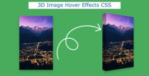
Create animated background in HTML CSS
If you have difficulty understanding what I mean, check out the preview below. Here you will find live previews.
See the Pen
Untitled by Shantanu Jana (@shantanu-jana)
on CodePen.
Here I have shown step by step how background animation CSS has been created. Use the button below if you want the source code.
Step 1: Basic structure of animated background
Some basic structure of this background animation has been created using the following code. Here the background of the webpage has been designed and the background color has been added.
This span element is created by JavaScript. This is basically the place where the background image can be seen.
Step 2: Add an image to the background
An image has been added to the background using ‘before’. Here opacity: 0 is used so the image cannot be seen.
Opacity: 1 used using hover. As a result, the image can be seen where your mouse is.
Step 3: Activate Background Animation
Now, this Animated Background has been activated by JavaScript. Only 2 lines of JavaScript have been used here.
Hopefully, you can create CSS Animated Background using the code above. If there is any problem then use the download button below. Please comment on how you like this background animation CSS.