Simple Analog Clock using HTML, CSS and JavaScript

Simple Analog Clock using HTML, CSS and JavaScript

If you want to make an analog clock using JavaScript then this article will help you. We all know that there are two types of watches, one analog and the other digital. Although digital watches are widely used, analog watches are also used in many places.

Simple Analog Clock using HTML, CSS and JavaScript

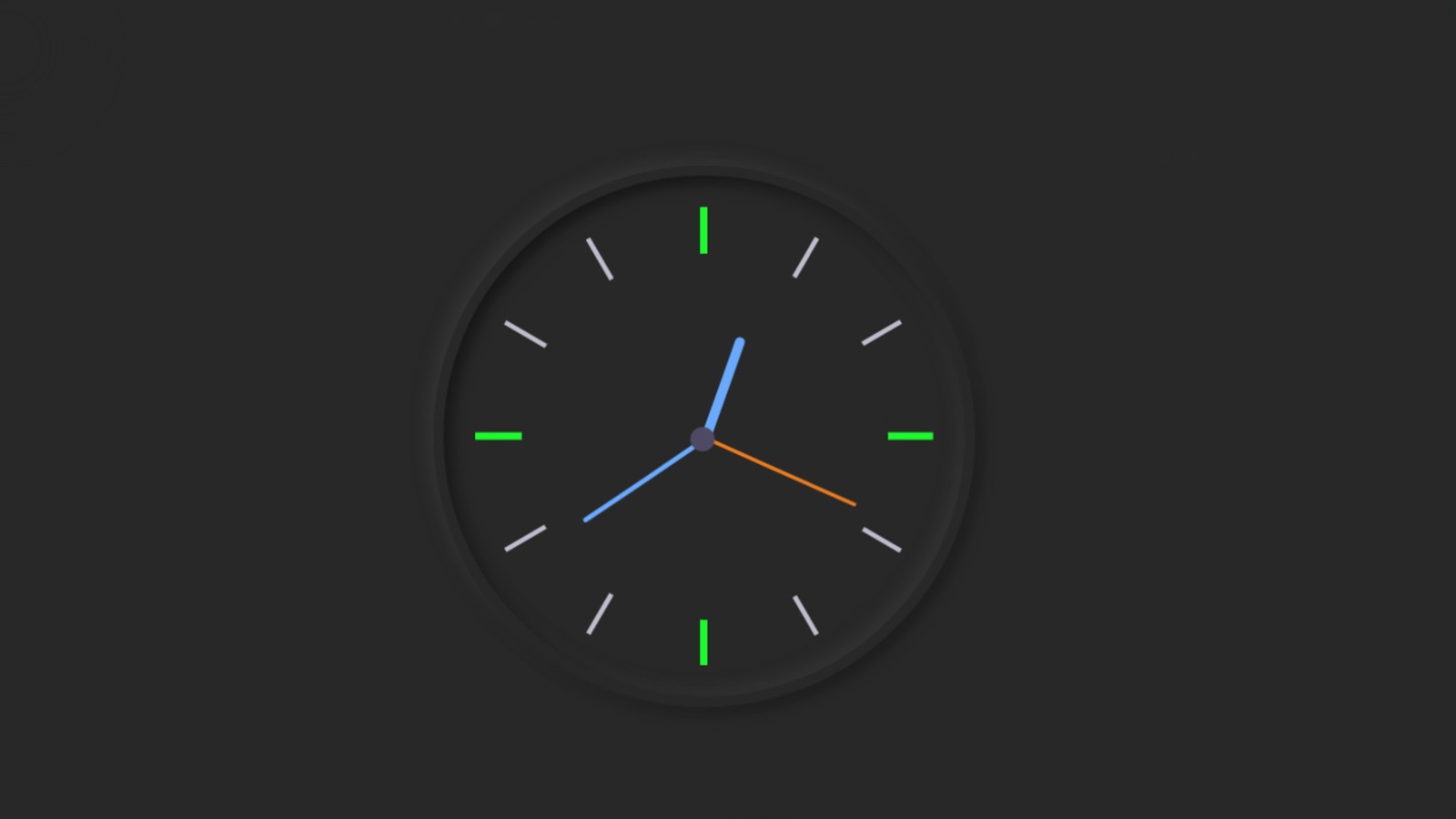
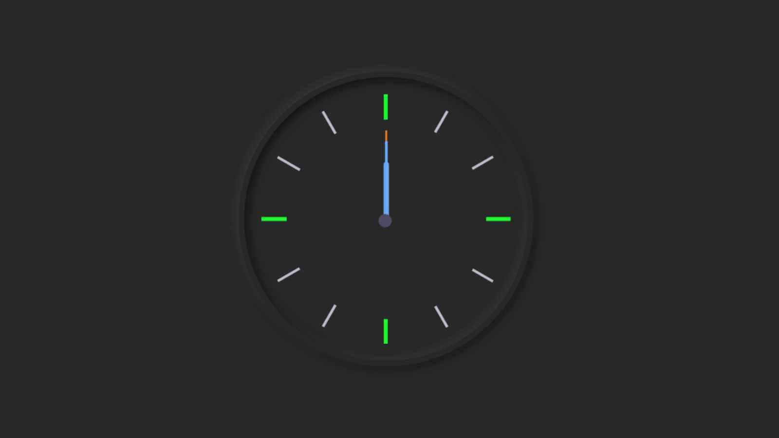
 As you can see in the picture above, here I have made a simple analog clock with the help of HTML CSS, and JavaScript. Earlier I made many more types of analog and digital watches. You can see those designs if you want. As we all know analog clock case has three hands and numbers from 1 to 12.

 Here too I have used symbols in that place instead of using numbers from 1 to 12. In this watch, I have made the hour hand the smallest, then the minute and second hand respectively.

JavaScript Analog Clock [Live Demo]

  If you want to see how this analog clock works then you can watch the demo below. Here I have provided the required source code so you can copy the code and use it in your own work.

See the Pen
analog clock 7
by Foolish Developer (@fghty)
on CodePen.

As you can see in the picture above this is a neomorphic design watch. In this case, I did not use any JavaScript library or jQuery plugin. I structured it using HTML code and designed it using CSS code. JavaScript has helped make this complete analog clockwork.

The time of this watch will depend on the time of your device. Time will be taken once then it will be updated every second.

our more design

More Design

Create Analog Clock using HTML, CSS, and JavaScript

Hope you like this design. I have shared the complete tutorial below on how I made this design. Hope the tutorial below will help you.
For this, first of all, you have to create an HTML and CSS file.

Step 1: Create the basic structure of the clock

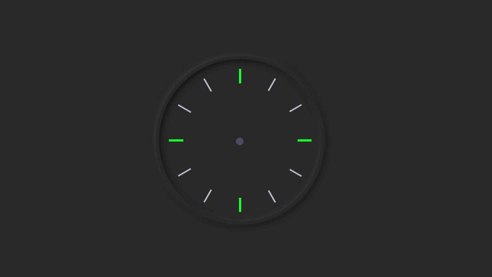
This HTML code is basically the basic structure of this analog clock. I have used some amount of CSS code to design the background and shape this watch. As you can see in the picture above it is made in the form of a neomorphic design. Here I have used CSS code to implement that Neumorphism design.

 As you can see in the demo above I used a border around this watch to make the code border: 7px solid # 282828. I used box-shadow to make it clearer. border-radius 50% gave this watch a round shape. I also used height and width 30 rem. If you want to make this watch bigger, you can increase its size.

<div class=”clock”>
  </div>
 html {
  background: #282828;
  text-align: center;
  font-size: 10px;
}
body {
  margin: 0;
  font-size: 2rem;
  display: flex;
  flex: 1;
  min-height: 100vh;
  align-items: center;
}
.clock {
  width: 30rem;
  height: 30rem;
  border: 7px solid #282828;
  box-shadow: -4px -4px 10px rgba(67,67,67,0.5),
                inset 4px 4px 10px rgba(0,0,0,0.5),
                inset -4px -4px 10px rgba(67,67,67,0.5),
                4px 4px 10px rgba(0,0,0,0.3);
  border-radius: 50%;
  margin: 50px auto;
  position: relative;
  padding: 2rem;
}
Create the basic structure of the clock

Step 2: Make a mark from 1 to 12 on the clock

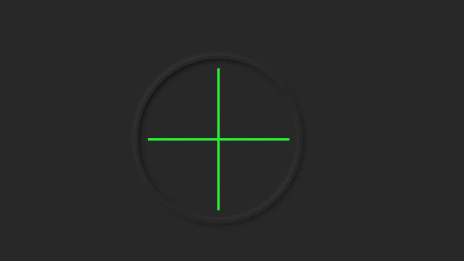
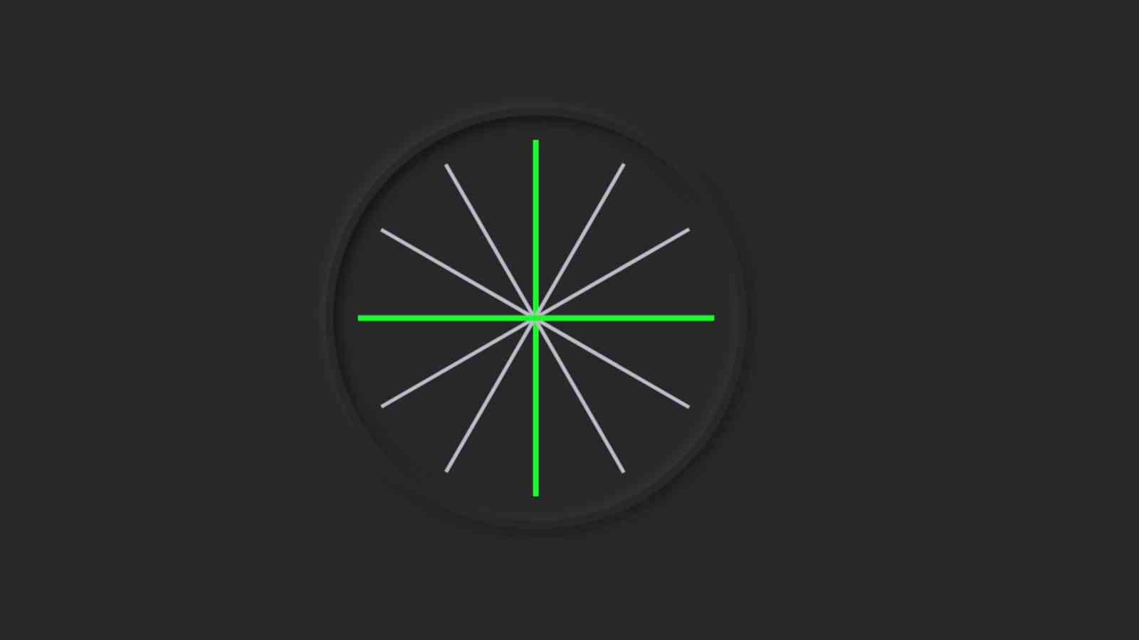
The design I have made for beginners so in this case, I have easily used symbols instead of numbers from 1 to 12. I have used the following HTML and CSS code to create these symbols. First of all, I made two lines using the following codes. I put these two lines at 90 degrees to each other.

 <div class=”outer-clock-face”>
          <div class=”marking marking-one”></div>
          <div class=”marking marking-two”></div>
          <div class=”marking marking-three”></div>
          <div class=”marking marking-four”></div>
 </div>
.outer-clock-face {
  position: relative;
  width: 100%;
  height: 100%;
  border-radius: 100%;
  background: #282828;
  overflow: hidden;
}
.outer-clock-face::after {
  -webkit-transform: rotate(90deg);
  -moz-transform: rotate(90deg);
  transform: rotate(90deg)
}
.outer-clock-face::before,
.outer-clock-face::after,
.outer-clock-face .marking{
  content: ”;
  position: absolute;
  width: 5px;
  height: 100%;
  background: #1df52f;
  z-index: 0;
  left: 49%;
}
Make a mark from 1 to 12 on the clock
.outer-clock-face .marking {
  background: #bdbdcb;
  width: 3px;
}
.outer-clock-face .marking.marking-one {
  transform: rotate(30deg)
}
.outer-clock-face .marking.marking-two {
  transform: rotate(60deg)
}
.outer-clock-face .marking.marking-three {
  transform: rotate(120deg)
}
.outer-clock-face .marking.marking-four {
  transform: rotate(150deg)
}
mark from 1 to 12 on the clock

I made a circle using the HTML and CSS code below. As a result, the middle of the long lines are covered and it has a full 1 to 12 mark size.

<div class=”inner-clock-face”>
 </div>
.inner-clock-face {
  position: absolute;
  top: 10%;
  left: 10%;
  width: 80%;
  height: 80%;
  background: #282828;
  -webkit-border-radius: 100%;
  -moz-border-radius: 100%;
  border-radius: 100%;
  z-index: 1;
}
.inner-clock-face::before {
  content: ”;
  position: absolute;
  top: 50%;
  border-radius: 18px;
  margin-left: -9px;
  margin-top: -6px;
  left: 50%;
  width: 16px;
  height: 16px;
  background: #4d4b63;
  z-index: 11;
}
I made a circle using the HTML and CSS code below.

Step 3: Make three hands to indicate the time

In this cell, I have used three hands which have been made using HTML and CSS code below.

<div class=”hand hour-hand”></div>
<div class=”hand min-hand”></div>
<div class=”hand second-hand”></div>
.hand {
  width: 50%;
  right: 50%;
  height: 6px;
  background: #61afff;
  position: absolute;
  top: 50%;
  border-radius: 6px;
  transform-origin: 100%;
  transform: rotate(90deg);
  transition-timing-function: cubic-bezier(0.1, 2.7, 0.58, 1);
}
.hand.hour-hand {
  width: 30%;
  z-index: 3;
}
.hand.min-hand {
  height: 3px;
  z-index: 10;
  width: 40%;
}
.hand.second-hand {
  background: #ee791a;
  width: 45%;
  height: 2px;
}
Make three hands to indicate the time

Step 4: Activate the clock with JavaScript code

Above we have designed the whole watch but this watch is not functional yet. This means that no hand of this watch is functional and it does not indicate the exact time. For this, we need to use JavaScript code.

Using JavaScript below I have given instructions on how to rotate these hands. If you know basic JavaScript you will definitely understand it.
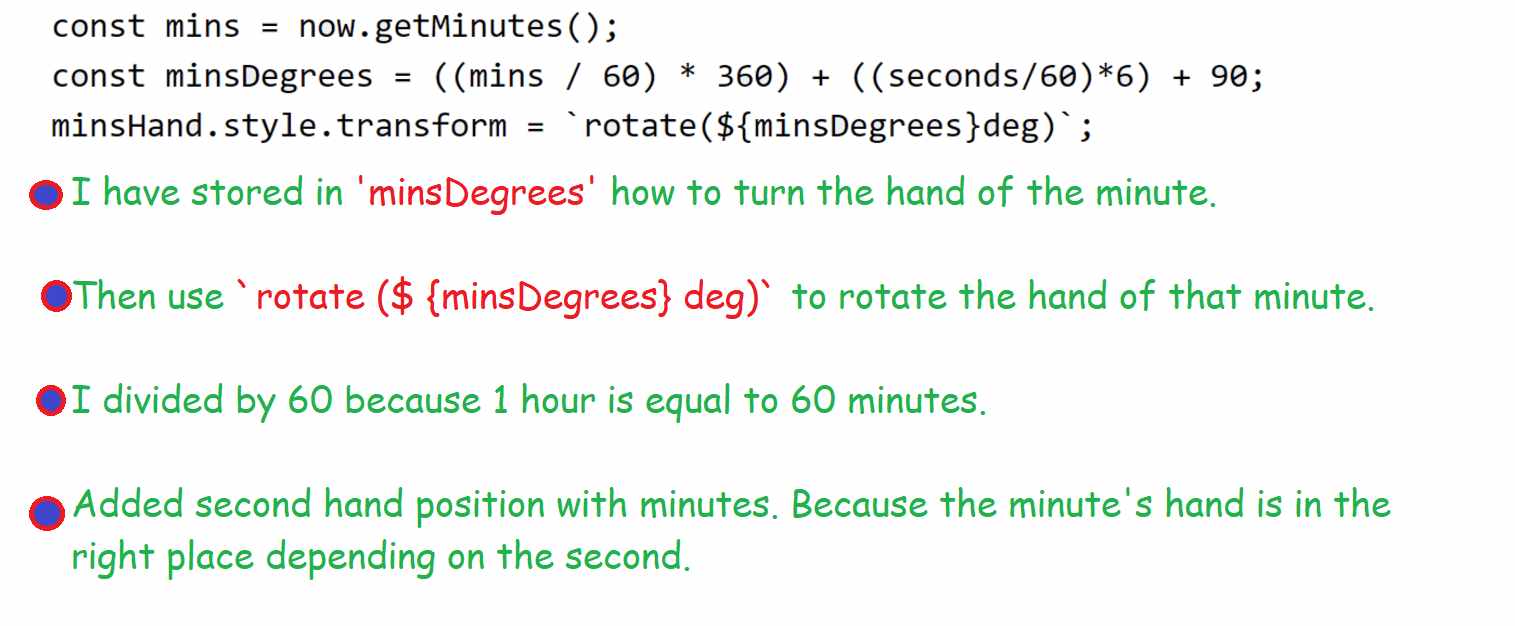
I have fully explained in the pictures below how this JavaScript code works.

const secondHand = document.querySelector(‘.second-hand’);
const minsHand = document.querySelector(‘.min-hand’);
const hourHand = document.querySelector(‘.hour-hand’);
function setDate() {
  const now = new Date();
  const seconds = now.getSeconds();   // second hand rotation
  const secondsDegrees = ((seconds / 60) * 360) + 90;
  secondHand.style.transform = `rotate(${secondsDegrees}deg)`;
  const mins = now.getMinutes();    // minutes hand rotation
  const minsDegrees = ((mins / 60) * 360) + ((seconds/60)*6) + 90;
  minsHand.style.transform = `rotate(${minsDegrees}deg)`;
  const hour = now.getHours();     // Hours hand rotation
  const hourDegrees = ((hour / 12) * 360) + ((mins/60)*30) + 90;
  hourHand.style.transform = `rotate(${hourDegrees}deg)`;
}

second hand rotation

minutes hand rotation
setInterval(setDate, 1000);
setDate();
Activate the clock with JavaScript code

Hope you find out in this tutorial how I made this analog clock using HTML, CSS, and JavaScript. You can download the required source code using the download button below.

If there is a problem or this code does not work, you can let me know by commenting.

Download Code