12+ CSS Rain Effect | Simple Rain Animation Effect
The rain effect is an animation effect that helps in creating animated webpages. These types of effects are mainly used in the weather report website, where the user uses different…

20+ Cloud Effect CSS (Code + Demo)
Are you looking for Cloud Effect CSS? Here I have made a list of the best CSS Cloud Effects. If you use these designs in your website, the quality and…

20+ CSS Heartbeat Animation (Code + Demo)
In this article I have made a collection of 20 best CSS Heartbeat Animations. Every heartbeat animation here is beautiful. You will find the live preview and source code here.…

20+ CSS Wave Animation (Code + Demo)
Are you looking for CSS Wave Animation Designs? In this article, I will give you the 20 best Wave Animation CSS to find.In the world of web design, animations play…
15+ Scroll Down Button HTML CSS (Free Code)
The Scroll Down Button HTML CSS is often used in longer pages, where the goal is to guide the user through the content in a linear fashion. Scroll down animation…
Simple Snowfall Animation using HTML CSS (Free Code)
In this article you will learn how to create Snowfall Animation using HTML CSS and JavaScript. We see CSS Snow Animation Effect in many places which helps to enhance the…
How to Create Pulse Animation Using CSS (Code + Demo)
CSS Pulse Animation We see it in different places on web pages. Pulse Animation is used to make different UI elements interesting.
Here we will discuss how a Pulse Animation can be created using CSS. Here I have shared different types of designs such as Simple Pulse Animation CSS, button pulse animation, text pulse animation, image pulse animation, pulse animation on hover, etc.
Here I will use only CSS and HTML. I have shared here the complete information of each design, source code, and live demo of everything.
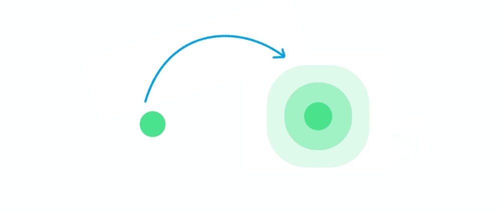
Examples – 1
Simple Pulse Animation CSS
This is a simple Pulse Animation design created by HTML and CSS only. This design is basically a basic example of Pulse Animation.
There is a small round point here that will continue to be the center of animation.

Hopefully, with the help of the demo button above, you know how it works. If you want you can download all the code using the button below.
But below I have given all the HTML CSS code. The code used for this CSS Pulse Animation effect is very simple so you will not have any difficulty understanding it.
The following code is the HTML code that helps to add the basic information of this pulsing animation. Here I have put together all the HTML codes that you can copy and paste into your HTML file.
The following code is the CSS code that activates this pulsing animation. Copy these and paste them into your CSS file. Remember to rename your CSS file to ‘style.css’.
Hopefully, you have been able to create a simple pulse animation design using the above code.
Examples – 2