
How To Create Text Typing Animation using HTML & CSS
Text Typing Animation or typewriter makes the homepage of any website much more beautiful and attractive. There are many ways to make the homepage interesting, among them CSS text typing…
Text Typing Animation or typewriter makes the homepage of any website much more beautiful and attractive. There are many ways to make the homepage interesting, among them CSS text typing…
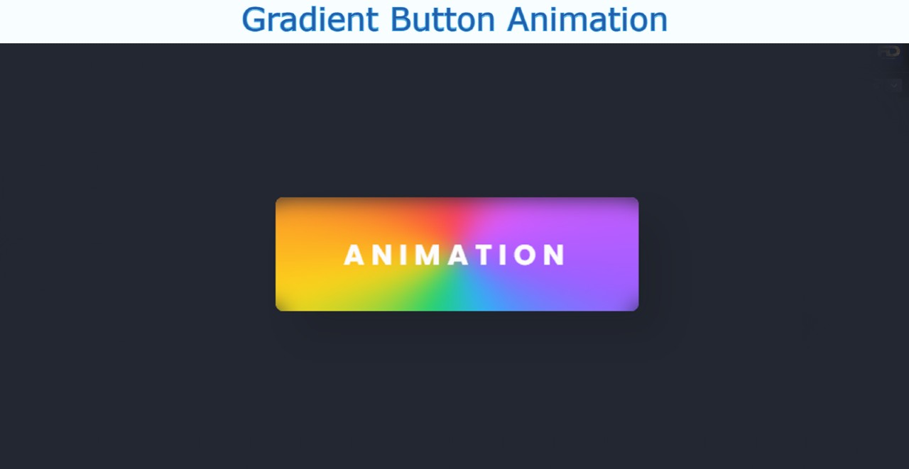
This is an easy tutorial where you will learn how to create a Gradient Button using CSS. You will see this type of Gradient Button or Gradient text on different…
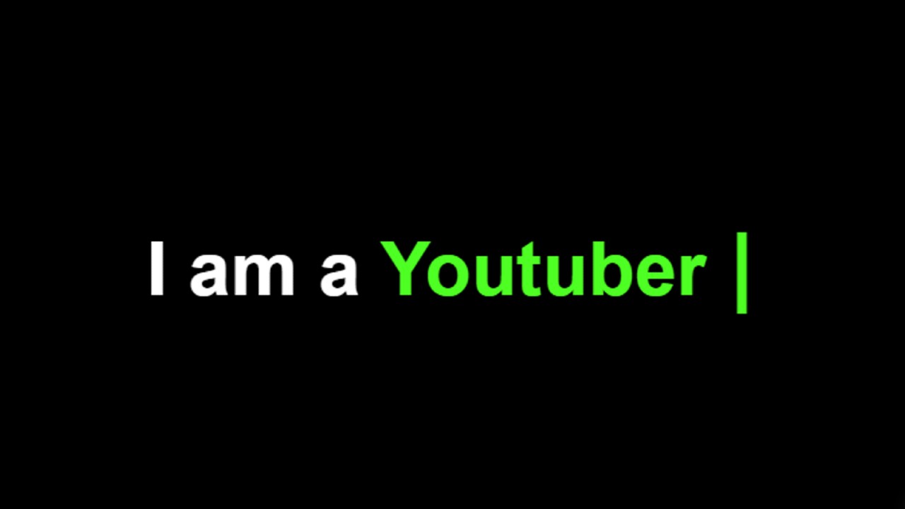
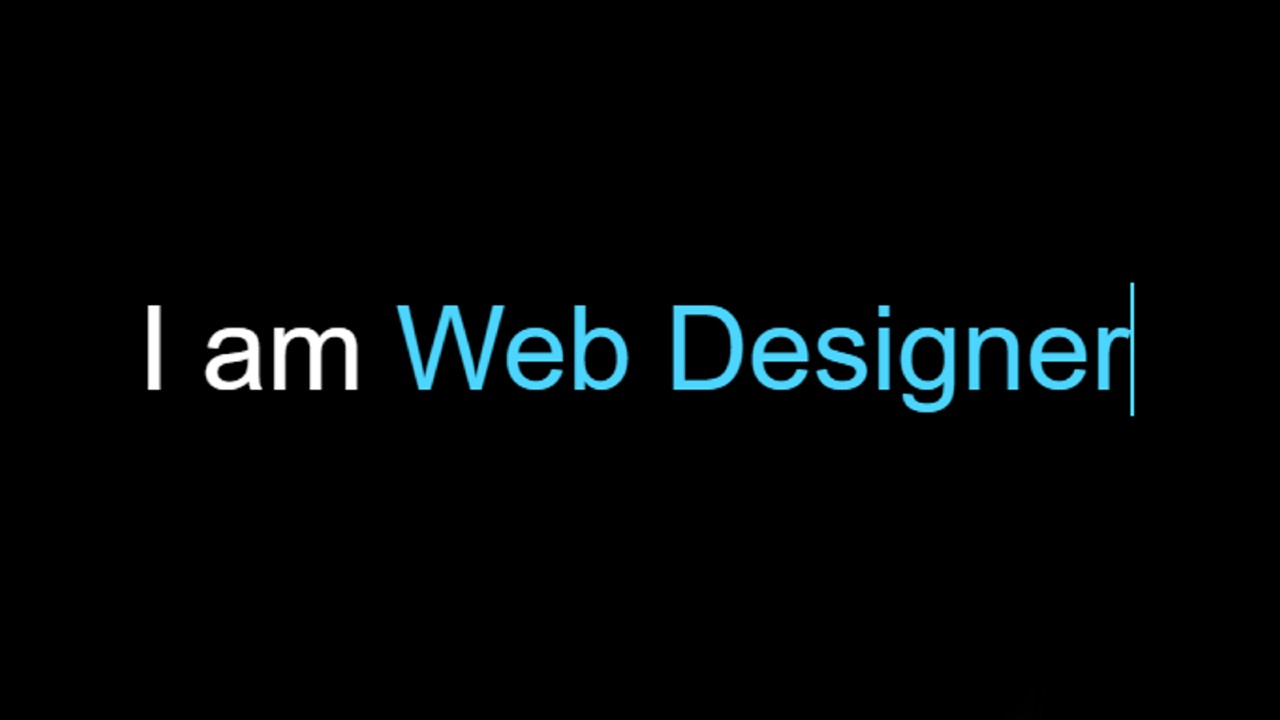
In this article, I am going to show you how to create Text Typing Animation using only HTML and CSS. Earlier I made another typewriter where I used JavaScript. We…
Text Typing Animation Effect is better known as a typewriter. This type of text typing effect you can easily create with the help of JavaScript. In this tutorial, you will…
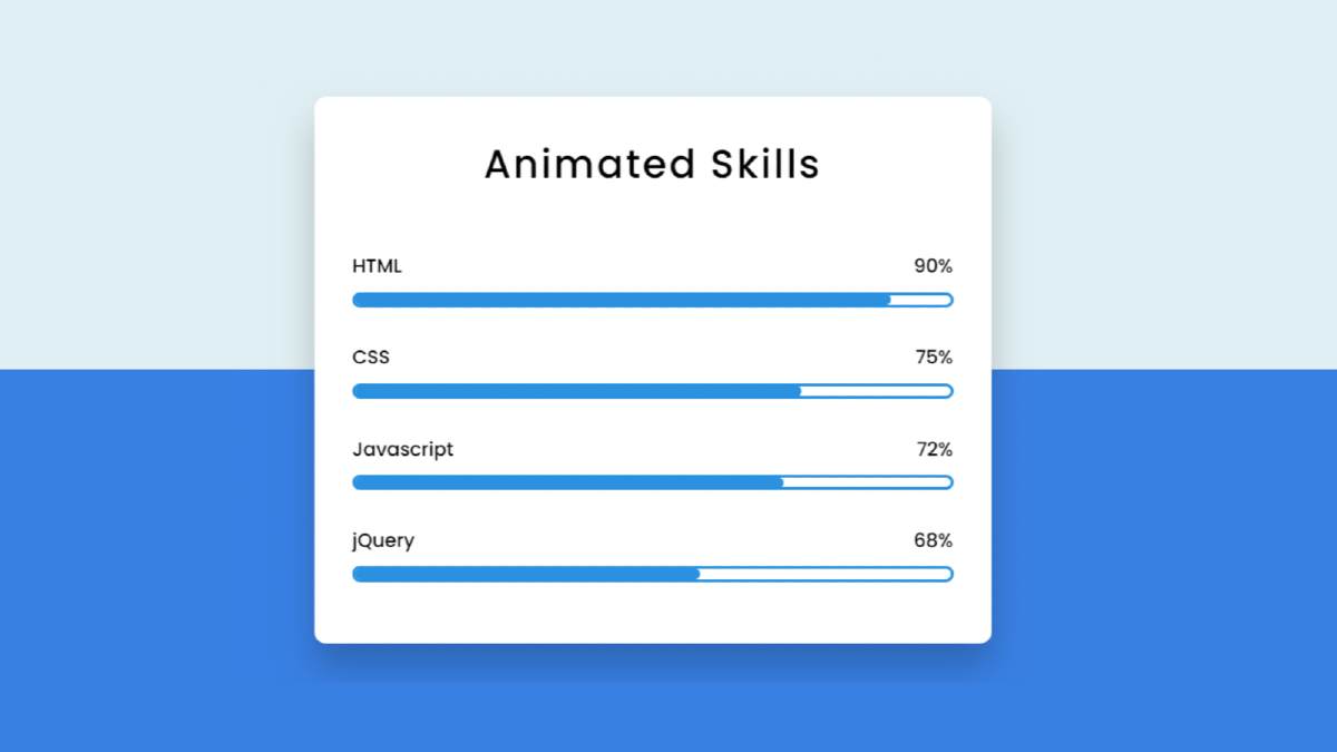

Animated Skills Bar HTML CSS is used in various personal and education websites. Skill Bar lets you decorate your Experience webpage.
Hello in this article I have shown you how to create Animated Skills Bar using only HTML and CSS code. Earlier I designed many more types of progress bars. I did not use any JavaScript or JQuery in this design. I have designed this skills bar using only HTML and css3.
Here I have made four bars and used animation in each of them. When you load this page, it will reach the value you set from 0. Here I have used blue color. You can use a different color for each if you want.
I used a shadow around the box so that the box could be seen more clearly. I first used a title in that box and four times below it. Here is a title and a percentage for each progress bar.
You can watch the live demo below to get a live experience of how the design works. Of course, here you will get the complete source code for making this design.
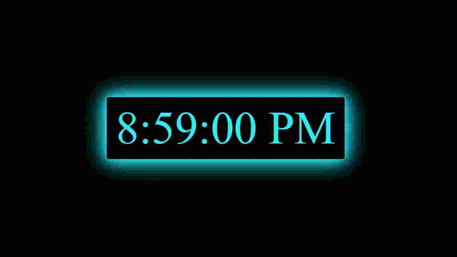
In this article, you will learn how to make a digital clock with the help of HTML CSS, and JavaScript programming code. In a previous article, I showed you how…

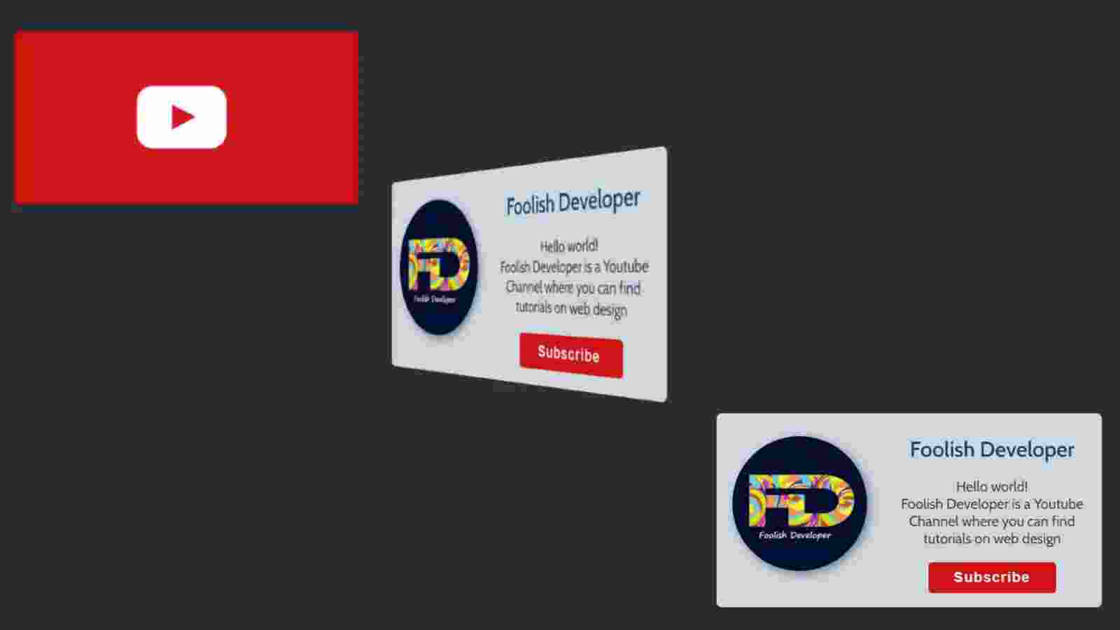
Learn how to make a flip card using Html and CSS code. Flip Card is a great UI design that you can create with the help of basic Html and CSS. The flip card basically helps to add a lot of information to a card. You can add some information on the front and back of this card.
As a result, this type of flip card is used to add a lot of information in one place. When you click on this card or move the mouse, the backside of this card will appear in front. The structure I have created in this article is basically a subscribe box and in this case, information related to a YouTube channel has been added. Under normal circumstances, I used the background red color on the front of this card and a youtube logo image.
The back of this design can be seen when you hover the mouse over the card. On the backside, I added the profile image, name, some information about that youtube channel. I have added a subscribe button with all this information. Clicking on it will subscribe to the channel.
See the Pen
Flip subscribe Card by Foolish Developer (@fghty)
on CodePen.
In the following tutorial, I have shared complete information for making this design. I have shared with you the method of making this flip card with all the information step by step. I hope you can learn how to make a flip card by following the tutorial below.
First of all, I have used the basic HTML structure below which has been used to create the front and back sites of the card.
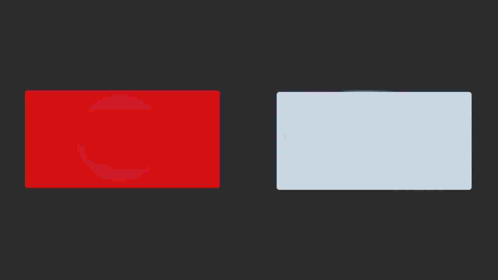
The CSS code below has helped to design the front and backside of this card and add a variety of colors. On the front I used red and on the back I used white. Height: 13px and width: 26px have been used for this card.
<!DOCTYPE html>
<html lang=”en”>
<head>
<meta charset=”UTF-8″>
<meta http-equiv=”X-UA-Compatible” content=”IE=edge”>
<meta name=”viewport” content=”width=device-width, initial-scale=1.0″>
<title>Document</title>
<style>
</style>
</head>
<body>
<div class=”card-wrap”>
<div class=”card”>
<div class=”card-front”>
<!– Card Fonts –>
</div>
<div class=”card-back”>
<!– card Back –>
</div>
</div>
</div>
</body>
</html>
@import url(‘https://fonts.googleapis.com/css2?family=Cabin:wght@400;500;600;700&display=swap’);
*{
box-sizing: border-box;
margin: 0;
padding: 0;
}
html{
height: 100vh;
justify-content: center;
font-family: ‘Cabin’, sans-serif;
background-image: linear-gradient(60deg, #66757F, #292F33);
display: flex;
align-items: center;
}
.card-wrap{
border-radius: 0.37rem;
perspective: 1000px;
height: 13.65rem; /* Card Height */
width: 27.15rem; /* card width */
}
.card{
height: inherit;
width: inherit;
position: relative;
transition: transform 1s;
transform-style: preserve-3d;
}
.card-front,.card-back{
width: inherit;
backface-visibility: hidden;
position: absolute;
height: inherit;
border-radius: 0.37rem;
}
.card-front{
background-color: #d30404; / * Card front background color */
display: flex;
align-items: center;
justify-content: center;
}
.card-back{
background-color: #CCD6DD;
transform: rotateY(180deg);
}
The hover effect is used in the card as I said before. When you click on this card you will see the back of this card. For this, I have used a small amount of CSS code below which means that when you click on the top of the card the card will rotate at a 180-degree angle.
.card-wrap:hover .card{
transform: rotateY(180deg);
}
First of all, we have added the profile image on the front of this card i.e. YouTube logo with the help of our own HTML and CSS code.
<div class=”card-logo”>
<img src=”https://i.pinimg.com/originals/19/7b/36/197b365922d1ea3aa1a932ff9bbda4a6.png”/>
</div>
.card-logo img{
width: 290px;
}

Again we will design the back of this card i.e. we will add all the information on the back. As I said before I added a profile image and some information on the back. The following HTML and CSS code helped to create and design the profile image.
Box-shadow has been used to make this profile image more interesting. I have used a border radius of 50% in this case. The following HTML code helps to make the various information on the card and the subscribe button on the card to make this image completely round.
<div class=”user”>
<img src=”https://lh3.googleusercontent.com/a-/AOh14Gj99VObFyE8W_h8RrcwZO_aYiIHu5AAa_XpnOym=s600-k-no-rp-mo” alt=”user-profile-picture”>
</div>
.card-back .user img{
width: 35%;
float: left;
border-radius: 50%;
margin: 1.6rem 1.1rem;
box-shadow: 3px 3px 10px #66757F;
}


Hello in this article I have shown you how to create text typing animation effects using HTML, CSS, and JavaScript programming code. I have already made another text typing animation…

In this article, I am going to show you how to easily create social media buttons of Neumorphism design using HTML and CSS programming code. This is one of the…

Hello Readers, In this article I will tell you how to easily create neon button animations using only simple HTML and CSS programming code. Neon is a type of CSS…