

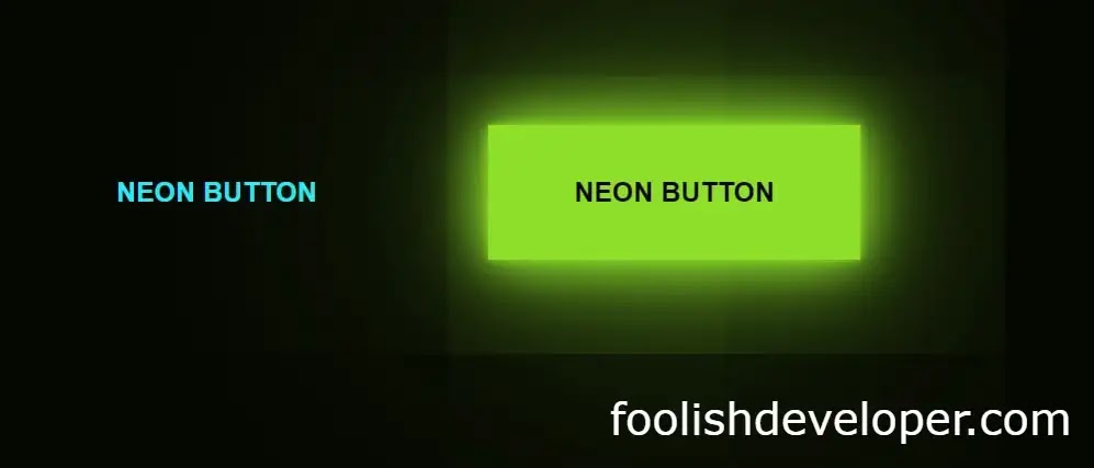
Hello Readers, In this article I will tell you how to easily create neon button animations using only simple HTML and CSS programming code. Neon is a type of CSS animation based on light effects. In the case of such animations, light effects of different colors are created using CSS code which is called neon animation.
This effect is used in different cases such as text, box, button, etc. In this article, I have shown the design of two neon buttons. These buttons are made entirely by Border of Snake Animation. The hover effect has been added to the buttons here. As a result, when the user clicks on it or moves the mouse, the colors will appear. Here I have used two colors one is blue, the other is green. You can use any color you want here. Below is all the information on how to use different colors.
Video tutorial of Neon Animation Button
The video below will completely help you to learn how to make neon buttons. This youtube video is made with complete information. Of course, you can watch the video if you want to know and learn completely.
Hope you learned how to make it in the video above. Below I have shown the complete step-by-step and given all the necessary source code so that you can make it yourself.
HTML and CSS programming code basically help to create neon animation buttons. Helps to structure HTML code and CSS code helps to create complete designs and animations. Basically, the role of CSS is to make it. If you want to see the live demo, you can watch the live demo by clicking the demo button above. By clicking on the download button above, you can download the source code required to make this neon button for free.
Below I have shown how I designed this button using source code. If you do not understand the video tutorial above, we hope you will be completely satisfied with the tutorial below. Below I have shown which programming code is used to create an element in full step by step.
Step 1: Create two Button
The following HTML codes have been used to create the structure of the button. Since two buttons have been created here, I have added the HTML code required to create two buttons here. You can use many more buttons as you need.
<a href=”#”>
<span></span>
<span></span>
<span></span>
<span></span>
Neon Button
</a>
<a href=”#”>
<span></span>
<span></span>
<span></span>
<span></span>
Neon Button
</a>

Step 2: Design of the buttons
These programming codes are mainly used for the basic design of the buttons. With the help of the codes, the text in the button has been made a colorful flower.
*{
margin: 0;
padding: 0;
box-sizing: border-box;
}
body{
display: flex;
height: 100vh;
background: #050801;
font-family: ‘raleway’,sans-serif;
justify-content: center;
align-items: center;
font-weight: bold;
}
a{
color: #03e9f4;
text-decoration: none;
text-transform: uppercase;
transition: 0.5s;
overflow: hidden;
position: relative;
display: inline-block;
padding: 30px 50px;
margin: 90px 0;
margin-right: 50px;
}

Step 3: Add color to the buttons
The following codes have been used to make the background color of the buttons. These are made with the help of a full hover effect, which means that when you click on the button or move the mouse, these colors will shine brightly.
a:hover{
background: #03e9f4;
color: #050801;
box-shadow: 0 0 5px #03e9f4,
0 0 25px #03e9f4,
0 0 50px #03e9f4,
0 0 200px #03e9f4;
-webkit-box-reflect:below 1px linear-gradient(transition, #0005)
}

A little bit of my own programming code has been used to change the buttons to different colors. If you change the code below, the color of the button will change. You can see NB below to know more about it.
a:nth-child(2){
filter: hue-rotate(270deg);
}
Step 4: Create border snake animation
If you notice, you will see that in general, a kind of snake animation can be noticed on the border of the buttons. This animation was originally created with some code that is advanced in the CSS programming language. The following programming codes have been especially helpful for creating those animations.
a span{
position: absolute;
display: block;
}
a span:nth-child(1){
top: 0;
background: linear-gradient(90deg,transparent,#03e9f4);
animation: animate1 1s linear infinite;
left: 0;
width: 100%;
height: 2px;
}
/* add keyframes for animation*/
@keyframes animate1{
0%{
left: -100%;
}
50%,100%{
left: 100%;
}
}
/* 2nd line animation*/
a span:nth-child(2){
top: -100%;
background: linear-gradient(180deg,transparent,#03e9f4);
animation: animate2 1s linear infinite;
right: 0;
width: 2px;
height: 100%;
animation-delay: 0.25s;
}
/* add keyframes*/
@keyframes animate2{
0%{
top: -100%;
}
50%,100%{
top: 100%;
}
}
/* 3rd line animation*/
a span:nth-child(3){
bottom: 0;
right: 0;
background: linear-gradient(270deg,transparent,#03e9f4);
animation: animate3 1s linear infinite;
width:100%;
height: 2px;
}
@keyframes animate3{
0%{
right: -100%;
}
50%,100%{
right: 100%;
}
}
/* 4th line animation*/
a span:nth-child(4){
bottom: -100%;
left: 0;
background: linear-gradient(360deg,transparent,#03e9f4);
animation: animate4 1s linear infinite;
width: 2px;
height: 100%;
animation-delay:0.75s;
}
@keyframes animate4{
0%{
bottom: -100%;
}
50%,100%{
bottom: 100%;
}
}
Hopefully, the tutorial above has completely helped you to learn how to make this neon button design. If you have any difficulty in understanding this tutorial. Then of course you can ask me by commenting. I will help you completely.