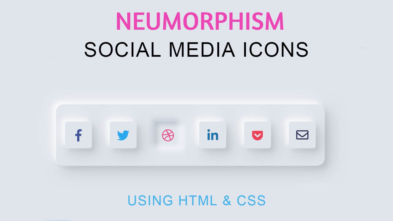
In this article, I am going to show you how to easily create social media buttons of Neumorphism design using HTML and CSS programming code. This is one of the many types of social media buttons I’ve designed before.
It is built using the Neumorphic Design Library. This is a modern design library with a modern look at Skeuomorphism. I have already shown many different elements using this design. Hope you like these social media buttons like the others. I only used HTML and CSS programming code to make it. I have structured these menus using HTML code. I arranged it in the shape of Neumorphism using CSS code.
What is Neumorphism design?
If you have no knowledge of Neumorphism design, here is some general information. This is a design that allows you to highlight any element more clearly. This type of design is very easy to create and you can easily create this type of design using CSS code. In today’s world of smartphones, people are more attracted to graphics and more support for 3D design.
To meet such needs, web designers have developed Skeuomorphism design in a more modern way called Neumorphism design. A picture of which is shown in the picture above. You will be surprised to hear that these designs are just a game of color. Yeah Al that sounds pretty crap to me, Looks like BT ain’t for me either.
If you want to learn how to make these Neumorphism design social media buttons, you can follow the video tutorial below. In the video tutorial below, I have shown step by step which programming code I have used to create an element. This will allow you to learn how to make it completely beautiful.
Hopefully, you have learned how to make it from the video above. Below I have shown you how to make it with pictures. If you want to download the live demo of this design and the required source code, you can use the two buttons above.
Design the background and headings of the icons
To create this social share button, you need to create the background and heading first. Here I have created headings using H1 tags. I have given an underline of yellow color to enhance beauty. For this, I have used some CSS and some HTML code which are given below.
Add social icons using HTML code
If you see the demo above, you will understand that I have used 6 social-media-icons here. You can increase the amount of these icons or change the icons if you wish. I have used the following code to construct these icons. The following codes are HTML codes that you can easily change.
Design the icons using the CSS code
I have used some CSS code to design the icons in this social menu bar. If you look at the picture below, you will understand that these 6 icons are surrounded by a border. In general, it seems that the icons are a little higher. The following programming codes have been used to create it.
Arrange the icons in the form of Neumorphism buttons
CSS code has been used to sort the menu icons in the form of Neumorphism buttons. As a result, each icon is beautifully designed.
Add a hover effect to social icons
A kind of animation has been used here which makes the icons of this Neumorphism design look more clear and original. Under normal circumstances, the icons appear to be slightly above the surface. When you click on those buttons, the buttons will move slightly inwards. You can see the image below to watch the live demo.
Hopefully from the above tutorial, you have learned how to make Neumorphism Social Buttons. If you want to know how to make it step by step, you can definitely watch the video above. Thank you so much for reading this article to the end.


