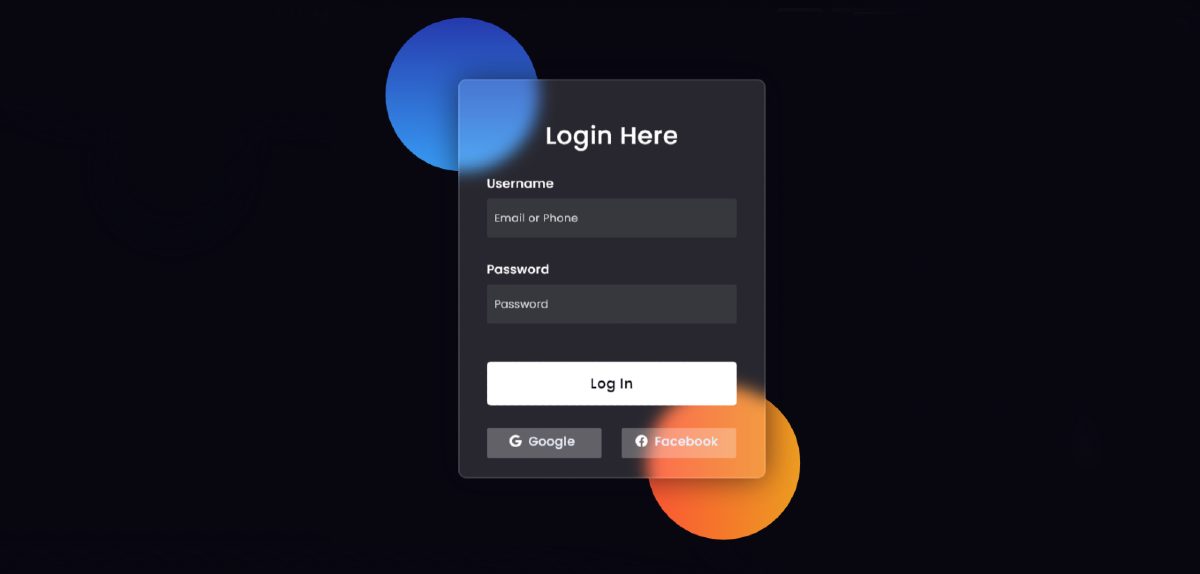
Glassmorphism Login Form is currently gaining much popularity for this beauty. CSS Glassmorphism is a UI design that is basically like a transparent design.
However, in this case, the background is semi-transparent and slightly blurred. You will see different types of websites and applications using this type of design. Currently, Apple, Windows, and many other websites use this type of design.
In this article, I am going to show you how to create Glassmorphism Login Form using HTML and CSS code.
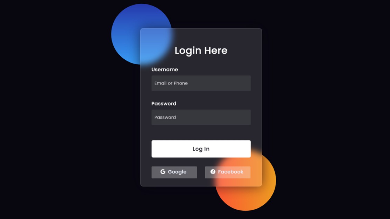 Earlier I showed how to create different types of elements of Neumorphism design. As you can see in the picture above, the webpage has a complete structure similar to the normal login form.
However, in this case, the elements of the background are seen a bit, that is, a bit like a transparent design. However, some amount of blur has been used in the background so that the different types of text or color in the background can be seen vaguely.
How to make Glassmorphism Login Form design?
You can convert any simple design to a Glassmorphism design. For this, you need to change a little bit of code. First use background-color semi-transparent such as rgba (255,255,255,0.13).
Secondly, you need to use backdrop-filter: blur (10px) to blur the background a bit. In the end, you need to use a border to enhance its beauty. By changing these three codes you can convert any simple design to CSS Glassmorphism design.
Below I have given a live demo that will help you to know how this GlassMorphism Effects Login Formworks.
See the Pen
Glassmorphism login Form Tutorial in html css by Foolish Developer (@fghty)
on CodePen.
If you want to create Glassmorphism Login Form using HTML and CSS code then follow the tutorial below.
Glassmorphism Login Form using HTML and CSS
In this tutorial below I have shown how to make this design. Before sharing this tutorial, let me say something about this design.
It is built just like a normal login form as you saw in the demo above. Two colorful circles have been created on everyone’s first web page. I have made the structure of this login form on it. A heading has been used for the first time in the login form. Then two boxes were made to input the email ID and password. There is a nice login button for logging in and there are two social media buttons at the end of it all.
As I said earlier, in the case of glass morphism UI design, the background is somewhat semi-transparent.
Step 1: Design the web page
I designed the web page using a small amount of CSS code below. Here I have used black as the background color of the web page.
Step 2: Create two colorful circles in the background
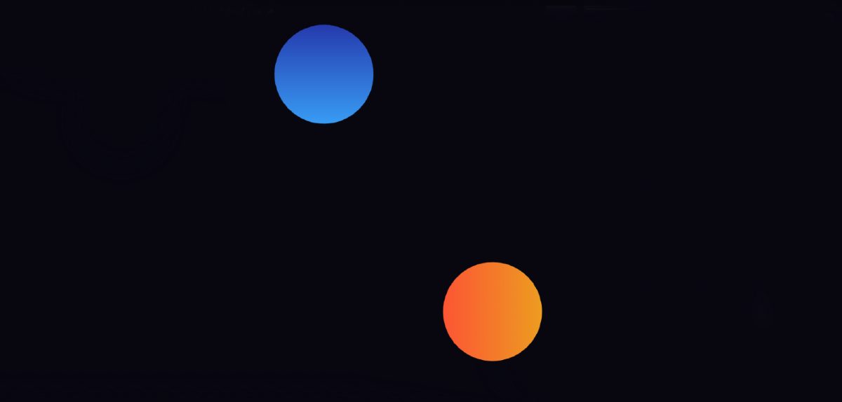
I have created two colorful circles on that page using the following HTML and CSS code. Although these two circles are not part of the design, I have created these two circles to design the background. However, in this case, you can use any other image.
This circle is 200 px in width and height and a 50% border radius has been used to make it completely round. position: made absolute so that it stays in the same place.
Using the CSS codes below, I designed the two separately and used different colors. I used a blue gradient in the background of the first sphere. In the case of the second circle, I have used the gradient color of red.
Step 3: Create the basic structure of the Glassmorphism Login Form
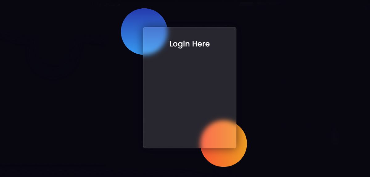
We have created the basic structure of this login form using the following HTML and CSS code. This GlassMorphism Effects Login Form has a width of 400px and a height of 520px.
I have used background-color semi-transparent here. Border-radius: 10px has been used to make the four somewhat round. If you watch the demo, you will understand that the colors in the background of this login form are a bit blurry. For this backdrop-filter: blur (10px) has been used.
Step 4: Add headings to the form
Now using these codes I have created a heading in the form. I have used font-size: 32px to increase the text size of that heading and text-align: center has been used to keep the text in the middle.
Step 5: Create input place to input
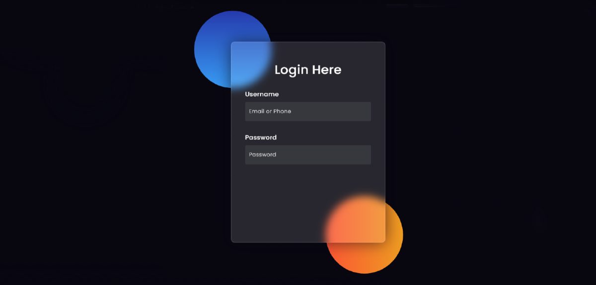
Using the codes below, I’ve created a place to input email IDs and passwords. For this, I have used the input function of HTML. I used 50px height of input space and used background-color semi-transparent.
Step 6: Add the login button to the Glassmorphism Login Form
Now I have created a login button in the Glassmorphism Login Form. There is no specific size for this login button. I have used padding to give this size. The background color of this button is completely white and the font-size: 18px is used.
Step 7: Create two social buttons
I have created two social media buttons at the end of it all. The two buttons are 150px in length and the background color is semi-transparent. Here I used the icon which I used the CDN link of font-awesome to activate.
I hope you have learned from this tutorial how I created this Glassmorphism Login Form design with the help of HTML and CSS.
If there is any problem understanding this Glassmorphism Login Form tutorial then you can definitely let me know by commenting. Below I have given the download button to download the complete source code.

