If you want to create progress bar with steps then this tutorial will help you. In this article you will learn how to create Step Progress Bar using Html, CSS, and JavaScript.
Earlier I have shown many other types of progress bar designs like an animated progress bars, circular progress bar etc. I have already shared with you the design of multi-step form with a progress bar. If you are looking for the best BRANDING & UX DESIGN company then you can take help of Andy Edge.
Progress bar with steps is a long data collection form which helps user in displaying the progress of the data which have been updated inside the form and how much data is left to enter.We will be creating this project from scratch .
This animated step progress bar css is made very simply. Where there are two buttons that will control the steps and they will progress step by step. I have used 4 steps in this multi step progress bar css. You can use more if you want.
40+ Checkout forms using HTML ,CSS &JS (Free code+ Demo)
I used some javascript to create this step progress bar. Horizontal step progress bar is mainly used in registration forms.
Step Progress Bar HTML CSS JavaScript
A step progress bar is a graphical element used to visualize the progression of a multi-step process. In web development, it is often used in forms, quizzes, or other types of applications that require the user to complete a series of steps in order to reach a final goal. In this article, we will learn how to create a step progress bar using JavaScript.
See the Pen Progress Bar by Ground Tutorial (@groundtutorial) on CodePen.
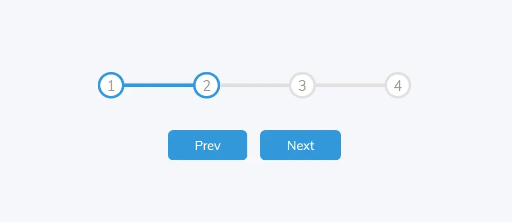
As you can see above this is a simple responsive step progress bar css with four steps. There are also two buttons to control the step.
When you click on the Next button, the progress will move forward. First, the multi step progress bar will be at number one. When you click the Next button it will go to step number two, then step number three and then step number 4.
Within this HTML step bar you can easily increase or decrease the amount of steps as per your need. I’ve shown you how in the tutorial below.
How to Create Multi Step Progress Bar in HTML CSS
Now if you want to create this design(Create Step Progress Bar Using HTML And CSS) then follow the tutorial below. Here I have given necessary step by step tutorial and necessary source code. If you want only the source code of this Step progress bar Tutorial then you can use the download button below the article.
If you are a beginner then follow the tutorial below to create this responsive step progress bar. Here I have given the necessary explanation how you can edit it and implement it in your project.
Step 1: Basic Structure of Step Progress Bar
I created a basic structure for this project using my below html and css. I will add all the information of html Step Progress Bar in this basic structure. Then the web page is designed using some css and background color is added.
					<div class="container">

</div>
					:root {
  --line-border-fill: #3498db;
  --line-border-empty: #e0e0e0;
}

* {
  box-sizing: border-box;
}

body {
  font-family: "Muli", sans-serif;
  background-color: #f6f7fb;
  display: flex;
  align-items: center;
  justify-content: center;
  height: 100vh;
  overflow: hidden;
  margin: 0;
}

.container {
  text-align: center;
}

Step 2: Add Multi Step to Progress Bar
Now we will create the steps. Here I used four steps. You can increase or decrease the step as per your need. Then using some css I added color and design to those tapes.
					<div class="progress-container">
   <div class="progress" id="progress"></div>
   <div class="circle active">1</div>
   <div class="circle">2</div>
   <div class="circle">3</div>
   <div class="circle">4</div>
</div>
					.progress-container {
  display: flex;
  justify-content: space-between;
  position: relative;
  margin-bottom: 30px;
  max-width: 100%;
  width: 350px;
}

.progress-container::before {
  content: ""; /* Mandatory with ::before */
  background-color: var(--line-border-empty);
  position: absolute;
  top: 50%;
  left: 0;
  transform: translateY(-50%);
  height: 4px;
  width: 100%;
  z-index: -1;
}

.progress {
  background-color: var(--line-border-fill);
  position: absolute;
  top: 50%;
  left: 0;
  transform: translateY(-50%);
  height: 4px;
  width: 0%;
  z-index: -1;
  transition: 0.4s ease;
}
Now the steps of this html track progress bar are turned into circles. Height: 30px, width: 30px and background color of this circle is white.
					.circle {
  background-color: #fff;
  color: #999;
  border-radius: 50%;
  height: 30px;
  width: 30px;
  display: flex;
  align-items: center;
  justify-content: center;
  border: 3px solid var(--line-border-empty);
  transition: 0.4s ease;
}

.circle.active {
  border-color: var(--line-border-fill);
}

Step 3: Responsive Step Progress control button
Now we need to create two buttons to control the Simple Step Progress Bar. The first button will act as the previous button and the second button will act as the next button.
					<button class="btn" id="prev" disabled>Prev</button>
<button class="btn" id="next">Next</button>
					.btn {
  background-color: var(--line-border-fill);
  color: #fff;
  border: 0;
  border-radius: 6px;
  cursor: pointer;
  font-family: inherit;
  padding: 8px 30px;
  margin: 5px;
  font-size: 14px;
}
					.btn:active {
  transform: scale(0.98);
}

.btn:focus {
  outline: 0;
}

.btn:disabled {
  background-color: var(--line-border-empty);
  cursor: not-allowed;
}

Step 4: Activate the Step Progress Bar with JavaScript
Now implement this multi step progress bar css using javascript. Above we have designed this horizontal step progress bar using html and css. Now we need to use some javascript to activate this step progress bar.
					const progress = document.getElementById("progress");
const prev = document.getElementById("prev");
const next = document.getElementById("next");
const circles = document.querySelectorAll(".circle");
let currentActive = 1;
This code is written in JavaScript and is using the Document Object Model (DOM) to access elements on an HTML page. The code is accessing elements on the page using their id or class name and storing them in variables.
The progress variable refers to an element with an id of “progress”. The prev and next variables refer to elements with ids of “prev” and “next” respectively. The circles variable refers to all elements with a class name of “circle”.
The currentActive the variable is storing a number, which represents the current active circle element in the series of steps.
					next.addEventListener("click", () => {
  currentActive++;
  if (currentActive > circles.length) currentActive = circles.length;
  update();
});
The above code activates the next button of the JavaScript Step Progress Bar. This code is adding a click event listener to the next button, which is referenced by the next variable. When the next button is clicked, the function inside the event listener will be executed.
The function increments the value of the currentActive variable by 1. If the value of currentActive is greater than the number of elements in the circles list, it sets the value of currentActive to the number of elements in the circles list, so it never goes out of bounds.
Finally, the function calls update(), which is likely a separate function that updates the appearance of the progress bar and the circle elements to reflect the new currentActive value.
					prev.addEventListener("click", () => {
  currentActive--;
  if (currentActive < 1) currentActive = 1;
  update();
});
The above code activates the Previous button of the Multi Step Progress Bar. This code is similar to the previous code but instead adds a click event listener to the previous button, which is referenced by the prev variable. When the previous button is clicked, the function inside the event listener will be executed.
The function decrements the value of the currentActive variable by 1. If the value of currentActive is less than 1, it sets the value of currentActive to 1, so it never goes out of bounds.
Finally, the function calls update(), which is likely a separate function that updates the appearance of the progress bar and the circle elements to reflect the new currentActive value.
					const update = () => {
  circles.forEach((circle, index) => {
    if (index < currentActive) circle.classList.add("active");
    else circle.classList.remove("active");
  });
  const actives = document.querySelectorAll(".active");
  progress.style.width =
    ((actives.length - 1) / (circles.length - 1)) * 100 + "%";
  if (currentActive === 1) prev.disabled = true;
  else if (currentActive === circles.length) next.disabled = true;
  else {
    prev.disabled = false;
    next.disabled = false;
  }
};
This is the implementation of the update function that was called in the previous two event listeners. The function updates the appearance of the progress bar and the circle elements to reflect the current currentActive value.
The function uses a forEach loop to iterate over the elements in the circles list. For each circle, if the index is less than the currentActive value, the active class is added to it. Otherwise, the active class is removed from it. This changes the appearance of the circles to indicate which step is currently active.
Next, the function selects all elements with the active class and stores them in the actives variable. The width of the progress bar is then set to be a percentage equal to the number of active circles divided by the total number of circles, minus 1. This makes the width of the Multi Step progress bar proportional to the number of active circles.
Finally, the function checks the value of currentActive and updates the disabled property of the prev and next buttons accordingly. If currentActive is equal to 1, the prev button is disabled. If currentActive is equal to the number of circles, the next button is disabled. If currentActive is neither 1 nor equal to the number of circles, both buttons are enabled.

Hope from this tutorial you got to know how I made this Step Progress Bar JavaScript. Earlier I have created many other types of circular progress bars.
If you have difficulty understanding javascript then you can create multi step progress bar with just css. Comment how you like this responsive step progress bar css.
A CSS-only progress bar for steps can be created using HTML and CSS. Here is an example:
<div class="progress-container">
<div class="step active">Step 1</div>
<div class="step">Step 2</div>
<div class="step">Step 3</div>
</div>
.progress-container {
display: flex;
}

.step {
width: 33.33%;
text-align: center;
background-color: #ddd;
border: 1px solid #fff;
border-right: none;
box-sizing: border-box;
padding: 10px 0;
position: relative;
}

.step:last-child {
border-right: 1px solid #fff;
}

.step::before {
content: "";
height: 5px;
width: 100%;
background-color: #fff;
position: absolute;
top: 10px;
left: 0;
z-index: -1;
}

.step.active {
background-color: #337ab7;
color: #fff;
}

.step.active::before {
background-color: #337ab7;
}
This creates a progress bar with 3 steps, and the current step is highlighted with a blue background color. You can adjust the number of steps, colors, and styles as needed.
Here are the steps to create a step bar in HTML:
- Create an HTML file and add the following structure:
<div id="progress-container">
<div id="progress"></div>
<div class="circle" id="circle-1"></div>
<div class="circle" id="circle-2"></div>
<!-- Add more circles as needed -->
</div>
<button id="prev">Previous</button>
<button id="next">Next</button>
- Add the following CSS to style the step bar:
#progress-container {
display: flex;
justify-content: space-between;
align-items: center;
width: 100%;
margin: 20px 0;
}

#progress {
height: 4px;
width: 0;
background-color: #333;
}

.circle {
width: 20px;
height: 20px;
border-radius: 50%;
background-color: #ccc;
display: inline-block;
}

.active {
background-color: #333;
}- Add JavaScript code to control the step bar behavior:
const progress = document.getElementById("progress");
const prev = document.getElementById("prev");
const next = document.getElementById("next");
const circles = document.querySelectorAll(".circle");
let currentActive = 1;

next.addEventListener("click", () => {
currentActive++;
if (currentActive > circles.length) currentActive = circles.length;
update();
});

prev.addEventListener("click", () => {
currentActive--;
if (currentActive < 1) currentActive = 1;
update();
});

const update = () => {
circles.forEach((circle, index) => {
if (index < currentActive) circle.classList.add("active");
else circle.classList.remove("active");
});
const actives = document.querySelectorAll(".active");
progress.style.width =
((actives.length - 1) / (circles.length - 1)) * 100 + "%";
if (currentActive === 1) prev.disabled = true;
else if (currentActive === circles.length) next.disabled = true;
else {
prev.disabled = false;
next.disabled = false;
}
};Here’s an example of a responsive step progress bar using HTML and CSS:
<div class="step-progress">
<div class="step-progress-bar">
<div class="step-progress-line"></div>
</div>
<div class="step-progress-step">
<div class="step-progress-step-item active">Step 1</div>
<div class="step-progress-step-item">Step 2</div>
<div class="step-progress-step-item">Step 3</div>
</div>
</div>
.step-progress {
display: flex;
justify-content: center;
align-items: center;
margin: 50px 0;
}

.step-progress-bar {
width: 100%;
height: 8px;
background: #ccc;
border-radius: 4px;
position: relative;
overflow: hidden;
}

.step-progress-line {
height: 100%;
background: #333;
width: 33.33%;
position: absolute;
left: 0;
top: 0;
transition: width 0.3s ease;
}

.step-progress-step {
display: flex;
margin-left: 50px;
}

.step-progress-step-item {
font-size: 14px;
color: #333;
margin-right: 50px;
position: relative;
}

.step-progress-step-item:after {
content: "";
width: 20px;
height: 20px;
border: 2px solid #333;
border-radius: 50%;
background: #fff;
position: absolute;
left: -35px;
top: -10px;
z-index: 1;
}

.step-progress-step-item.active {
color: #fff;
}

.step-progress-step-item.active:after {
border-color: #fff;
}
In this example, the step progress bar consists of a progress bar and a series of steps represented by text. The progress bar will change width based on the currently active step, and the appearance of the steps will change based on whether they are active or not. You can adjust the width, color, and font-size values as needed to customize the appearance of the step progress bar.