
In this article, I am going to show you how to create Text Typing Animation using only HTML and CSS. Earlier I made another typewriter where I used JavaScript.
We find this type of animation on various websites which is more commonly known as a typewriter. Basically personal websites or different types of business websites use the most CSS text typing effect. Undoubtedly this type of design will enhance the beauty of your website a lot more. There are many types of typewriters.
In some cases, many types of text are typed and in some cases, a text is typed repeatedly. The first part of the line used here is completely fixed which means there is no animation in it. The next part, that is, the next few words are being typed repeatedly. In the meantime, I made another JavaScript text typing animation where many beginners did not understand. So I made this text typing animation HTML CSS design for beginners.
You can use the demo section below to see a live demo of how it works.
See the Pen
Typing text2 by Raj Template (@RajTemplate)
on CodePen.
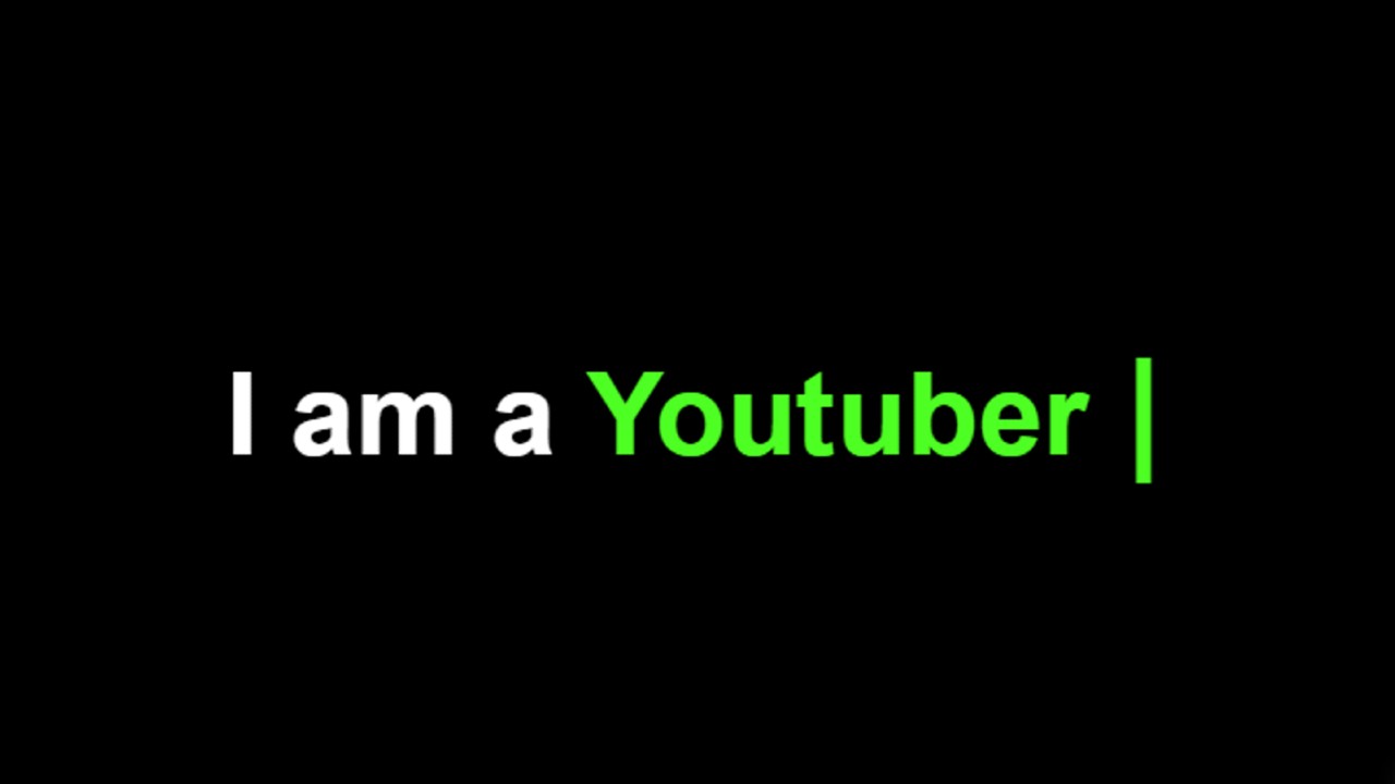
Text Typing Animation Effect Using HTML & CSS
If you want to know how to make it step by step, then follow the tutorial below. If you want to download the source code, you can use the download button at the bottom of the article.
Hopefully, the demo above has helped you get a live experience of it. As you can see we have used a line here where some parts are fixed and some parts are being typed repeatedly. It uses a cursor that makes the type of animation even more interesting and beautiful.
I used HTML and CSS code to create this animation. So first of all you have to create an HTML and CSS file then follow the complete procedure shown below.
Step 1: Design the web page with CSS
First I used CSS code to design web pages. Here we have used the background color black which you can change and use as your own.

Step 2: Add the typed text line
I added the required text using the HTML and CSS code below. There is a text line here as you saw in the demo above. Where some parts have fixes and some parts are being typed repeatedly. Here the part in span (<span> </span>) will be typed repeatedly and the rest will be fixed.
I have used text font-size: 50px and the color white. I have used overflow: hidden here so we will not be able to see this test under normal conditions.

I have determined the color of the typed text using the CSS code below. I used green which looks much brighter on a black background.

Step 3: Add cursor to text type animation
Now I have added the cursor which is what makes this animation even more interesting. The color of the cursor I used is green and the font size is 50 px.

Step 4: Activate the animation with CSS 3
Now I have added animations to the typed text using @keyframes.

I implemented the cursor animation using the Below CSS codes.

Hopefully from the tutorial above you have learned how to create this text typing animation effect using only HTML and CSS code.
If you want to make this typewriter using JavaScript, you can definitely take a look at another tutorial I made. Please let me know in the comments how you like this tutorial.