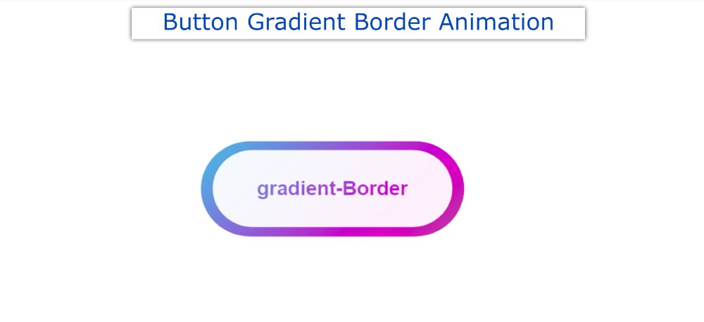

In this tutorial, you will learn how to make CSS Button Gradient Border. Earlier I shared with you the tutorials of different types of gradient buttons. However, the background gradient color was not used here. Instead, the background is kept completely transparent and CSS Gradient Borders are used on the button borders.
Buttons we use in different places. If that button is attractive and animated it attracts more user attention. In that case, you can use such a simple CSS Button Gradient Border Button. This will definitely enhance the beauty and quality of your website.
CSS Button Gradient Border
Only if you have a basic idea about HTML and CSS can you build it. Below I have given a demo that will help you to get a live preview of this project. If you only want the source code, you can use the download button at the bottom of the article.
See the Pen
Untitled by Foolish Developer (@foolishdevweb)
on CodePen.
I created a button on a web page as you can see above. A text has been used in the CSS Gradient button. I have kept the background of the button completely transparent.
How to Create CSS Gradient Borders
However, I have used CSS Gradient Borders animation in button text and borders. Here you will have to animate different colors together. Here you can add colors of your choice.
Follow the steps below to create this CSS Button Gradient Border. I have given below all the code and step-by-step information.
1: Basic structure of Gradient Border
The basic structure of this button has been created using the following HTML and CSS codes. I used linear-gradient color in the background of the button. Here I have used 5 colors.
You can add colors of your choice. Every color here can be seen at a 45-degree angle. Here I used the animation for four seconds. That means a color can be seen again after 4 seconds.

2. Activate the background color animation
The following keyframes have been used to make the animation added above work. Animation is defined in different percentages using @keyframes.

3. Add a button to CSS Gradient Border
Now I have added buttons in this CSS Button Gradient Border project. This button uses min-width: 300px, min-height: 100px.
The buttons are slightly smaller than the gradient area. As a result, some color of Gradient can be seen around the button.

Hopefully, you have learned from the above tutorial how I created this Gradient Borders in CSS. Earlier I shared many more tutorials on CSS Gradient Borders.