
Here you will learn how to create paper folding animation CSS using HTML and CSS. Earlier I shared with you different types of image hover and animation. This is the first time I am going to share with you a tutorial on CSS3 Paper Folding Effect.
If you know basic HTML and CSS then you can create this design. When you move the mouse over the image or click on it, the image will be held like paper. This means that the image will be divided into several parts and will come closer to each other.
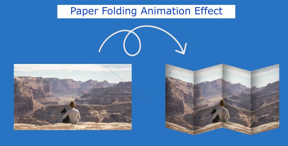
CSS Paper Folding Effect
Undoubtedly it is much more interesting and beautiful than the ordinary image hovers effect. Below I have given a demo that will help you to know how it works (Simple Paper Folding Effect Using CSS). Below you will find the required source code and preview.
See the Pen
Image hover effect by Foolish Developer (@foolishdevweb)
on CodePen.
As you can see above. I used an image on the webpage. Normally no animation effect can be seen in the image. When you mouse over or click on the image, the image will split into four parts and move closer to each other. It looks like a sack that encloses with a drawstring.
Different types of shadows have been used here to make this folding effect more attractive and effective. Only HTML and CSS are used here. If you want to create CSS Paper Effect then follow the information below. There is nothing like sharing tutorials here. Because very little code has been used.
Paper Folding Effect HTML code
If you only want to download the code, you can use the button below the article. I have created the basic structure of paper folding animation CSS using the following HTML codes. Here we have used four ‘li’ to divide the image into four parts. I have added the image here by CSS.
Paper Folding Effect CSS code
I have added all the information in the CSS code below on how it will be designed and activated.
First I have designed the basic structure of the image area by CSS.
Width: 640px, height: 360px has been used for this area. Even then I used the image width 25% and height 100%. The width used here is 25% because I have divided the image into four parts.
Then I selected the four parts of the image with “: nth-child” and designed it with the help of ‘background-position’. Using ‘background-position’, we have connected each part to each other at different angles.
Hopefully, you have been able to create this CSS Paper Folding Effect using the above codes. If there is any difficulty then you can let us know by commenting. Below I have given all the source code to create this paper folding animation CSS.