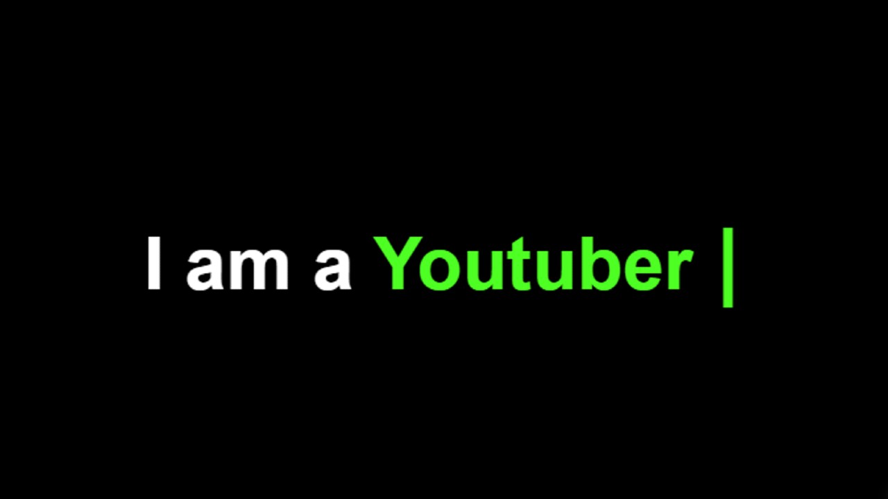
Text Typing Animation HTML CSS
In this article, I am going to show you how to create Text Typing Animation using only HTML and CSS. Earlier I made another typewriter where I used JavaScript. We…
In this article, I am going to show you how to create Text Typing Animation using only HTML and CSS. Earlier I made another typewriter where I used JavaScript. We…

Text Typing Animation Effect is better known as a typewriter. This type of text typing effect you can easily create with the help of JavaScript. In this tutorial, you will…


Responsive Filterable Image Gallery is used on various websites to sort images by category. In this article, I am going to show you how to create a Responsive Filterable Image Gallery with the help of HTML CSS, and javascript.
Filterable Image Gallery is a popular web element that is used around various websites. It is a kind of image gallery where a large number of images are neatly arranged together. The notable point is that all the images can be sorted by category here. There is a navigation bar where all the categories are sorted. When clicking on any one of those categories. Then all the images in that category are seen and the rest of the images are hidden. As a result, the user can easily find the images of his choice.
This type of design is mainly used in many websites where a lot of images are put together. However, in this case, I have created this Filterable Image Gallery using Pure JavaScript.
If you do not understand what I am saying then you can watch the video tutorial below. This video will help you to know better how I made this design.
Hopefully, you have learned how to make it from the video tutorial above. As you can see above, I first created a navigation bar on a web page. Where I created five-category buttons. Here I have used a total of 9 images. I have used different categories of images here.
You can add many more images with these 9 images if you want. In the category in the navigation bar, you can see the image related to the category you click on. In the same way, when you click on another category, the images of that category will be seen and the rest will be hidden. I made it fully responsive so that it can be used on all devices.
I hope you understand how this Responsive Filterable Image Gallery works. But for better understanding, I have given the live demo below. This live demo will help you get a live experience of this design.
See the Pen
by Foolish Developer (@fghty)
on CodePen.
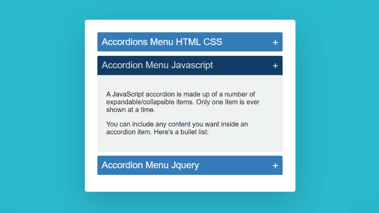

In this article, I am going to show you how to create an Accordion Menu menu using HTML, CSS, and JavaScript code. Earlier I showed the design of many more types of Animated CSS accordion menus. Now it’s time to recreate it with JavaScript.
The responsive accordion menu has an original heading. When you click on that heading, all the information related to that heading can be seen below.
Accordion Menu is a modern content structure where a large amount of information can be neatly arranged in one place. This type of structure is used on different types of websites. This type of design is mainly used in the FAQ section or question-answer section.
This type of Accordion Menu is very important for arranging related questions and answers for different types of services. In addition, a large amount of text is arranged on different types of websites depending on the different headings.
If you do not understand what I am saying then you can watch the video tutorial below. This video tutorial will help you to know how I made this simple javascript accordion.
We hope you have learned how to make this design from the video tutorial above.
I made a small box on a web page as you can see above. I used three headings in that box. I have given the background color to highlight those headings and made it a bit bigger in size. Then I added some amount of content under that heading.
Here you can add any type of content. Under normal circumstances, information is hidden. When you click on that heading, the information under that heading can be seen below.
You can use the demo section below to get a live experience of this design. Here you will find the required source code which you can copy and use in your own work.
See the Pen
Accordions Menu HTML CSS by Foolish Developer (@fghty)
on CodePen.
Hopefully, the demo above has helped you to know how this javascript accordion works.
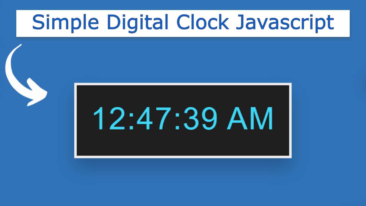

Simple Digital Clock Javascript is a great UI design. You can create this kind of digital clock with the help of basic HTML, CSS, and javascript.
In this article, I am going to show you how to create a simple digital clock using HTML, CSS, and JavaScript code. I have shown many more types of analog and digital clocks before. In the meantime, I have made more such clocks where I have added dates and months along with time.
We know that clocks are both analog and digital. Digital watches are much easier to make than analog watches. If you know basic HTML and CSS JavaScript you can easily create such a design. This is basically the role of JavaScript code. HTML and CSS have also been used to design and structure.
This clock has the opportunity to view hours, minutes, and seconds. There are also AM and PM options.
If you want to know how it is made, you can watch the video tutorial below. In this video, I have shown step by step how I made this Simple Digital Clock using HTML, CSS, and javascript code.
Hopefully, you have learned from the above video tutorial how I made this digital clock. I made a small box on a web page as you saw in the video above.
I used black as the background color of the box and used a border all around to make it brighter. Then I made this clock work using JavaScript code.
First I took the current time from the device using JavaScript’s new Date () method. Then I updated it every one second or 1000 milliseconds using setTimeout. Use the demo section below to see a live experience of how this works.
See the Pen
digital clock 3 by Foolish Developer (@fghty)
on CodePen.
Hopefully, you have learned how to make this javascript digital clock from the video and demo section above.


Simple Analog Clock javascript is a web element that helps show the exact time. You can easily create an analog clock with the help of JavaScript.
In this article, I am going to show you how to create a simple analog clock using JavaScript code. I have designed many more types of JavaScript analog and digital clocks before. This design will be of great help to those who want to learn how to design an analog clock for the first time.
I made this design using simple HTML, CSS, and JavaScript code. Since I made it for Beginners, here I have tried to use the simplest code. Here is a complete explanation of what each code is used for. This will allow you to learn how to make it very easily.
First I set the background color of the web page. Here I have used images to make numbers and symbols from 1 to 12. But you can make these numbers manually if you want. I have already made many more designs where I have shown you how to make these numbers manually. Then I made three hands in this watch using HTML and CSS code. I used JavaScript to make those hands work.
Below is a live demo so you can better understand how it works. Here you will find the necessary source code which you can copy and use in your own work.
See the Pen
simple analog clock 1 by Foolish Developer (@fghty)
on CodePen.
The time used here is not the time on any server. It basically uses time from your device using JavaScript’s new Date function.
Below the article, there is a download button with the help of which you can download the source code if needed. Hopefully, the live demo above has helped you fully understand how this analog clock works.
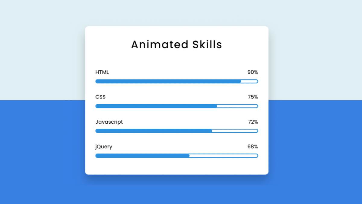

Animated Skills Bar HTML CSS is used in various personal and education websites. Skill Bar lets you decorate your Experience webpage.
Hello in this article I have shown you how to create Animated Skills Bar using only HTML and CSS code. Earlier I designed many more types of progress bars. I did not use any JavaScript or JQuery in this design. I have designed this skills bar using only HTML and css3.
Here I have made four bars and used animation in each of them. When you load this page, it will reach the value you set from 0. Here I have used blue color. You can use a different color for each if you want.
I used a shadow around the box so that the box could be seen more clearly. I first used a title in that box and four times below it. Here is a title and a percentage for each progress bar.
You can watch the live demo below to get a live experience of how the design works. Of course, here you will get the complete source code for making this design.
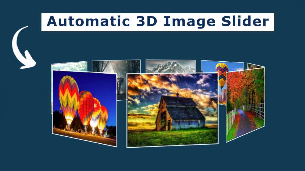

In this article, I will show you how to create an automatic image slider using HTML and CSS code. Earlier I designed many more types of image sliders and 3D image slideshows. I did not use any javascript code in this design. In this case, this automatic image slider has been created using only pure HTML and CSS code.
the image gallery is used in many places on the website. The slider is mainly used on the homepage of the website. The normal image slider has a rectangular box and the images can be changed automatically or manually.
But in the case of this design, all the images here are kept in a circular shape. Here I have used 9 images and created a circle of 360 by adding each image to one another. This slider rotates at certain intervals.
In this case, there is no place to change the image manually. It tends to change the image automatically. I have already created one more such image gallery. In that case, I made two buttons to change the image manually. You can see the design if you want to change the images manually.
If you do not understand what I am saying then you can use the demo below to get a live experience of how it works.
See the Pen
3d automatic image slider by Foolish Developer (@fghty)
on CodePen.
If you want the required source code, you can download the required source code using the download button at the bottom of the article.
As you can see in the video above, here are 9 pictures arranged neatly on a home page. Each image is arranged at a 40-degree angle with the other. As a result, 9 images are joined together to form a 360 circle.


Responsive Our Team Section is used in various business and personal websites. Team Section you can easily create with the help of HTML and CSS code. This will increase the quality of your website as well as attract users. Here you can sort some information including profile images of important people of your company or business.
In this article, I will show you how to Create a responsive team section using HTML, CSS, and Bootstrap. Before that, I made many more types of profile cards and team sections.
Here I have used three profile images you can increase or decrease the amount if you want. I have shared in the tutorial below how to increase this amount. It’s a completely responsive team section bootstrap which I used bootstrap programming code to make it responsive. HTML and CSS are mainly used here to design it.
I have used social media icons for each profile image. Under normal circumstances, these icons are completely hidden. These icons appear when you click on the profile box. All in all, it is a beautiful and simple Responsive Our Team Section design.
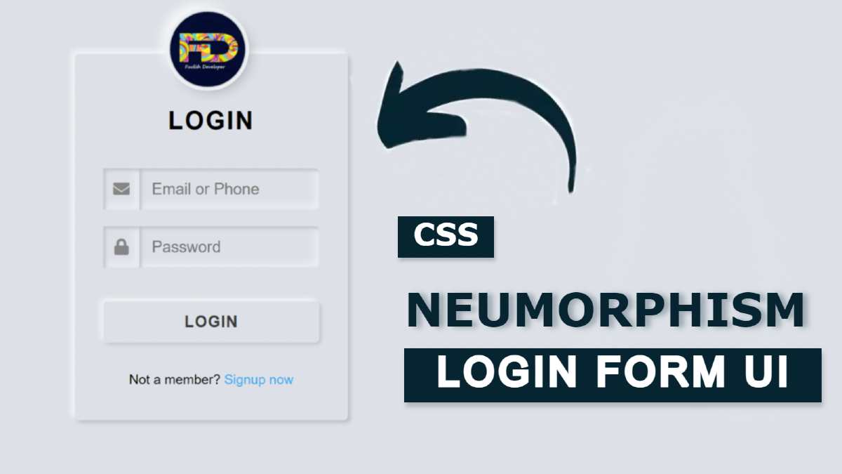

Neumorphism Login Form is much more interesting than other login designs. CSS Neumorphism Login Form You can easily create with HTML and CSS. In this article, I am going to show you how to create a Neumorphism login form using only HTML and CSS code. Earlier I made login form in many more designs.
We all know that the login form is a very important element of a website. This type of login form is used to access accounts on various websites. There are different types of login forms that I have already created. Neumorphism is a very important UI trend. This design is much simpler and much more interesting to look at than the general design.
Neumorphism All these elements are made by a single color in the case of login design. In this case, the element and the background of the web page are completely the same. The size of the element is determined here using only the shadow of the CSS code.
You can watch the video below to know the complete tutorial on how I made this CSS Neumorphism login page.
Hopefully, you have learned how to make it from the video tutorial above. Everything here is like a normal login form.
In the case of Neumorphism design, the background color of the webpage and the background color of the element is the same. In that case, the shape of the element is created using the shadow (box-shadow) of CSS.
First of all, I used a profile image. This image is slightly above the login form, meaning that half of the image is inside the Neomorphism Login Form Design and the other half is outside the login form. Which looks much more interesting and beautiful to look at. Below that, I used a title. I used email ID and password input space to log in. I have used one icon for each input. Then there is a login button.
Normally the button rises slightly upwards. When you click on it, the button will move slightly inwards. I have used some text below everyone. All in all, it is a very simple CSS Neumorphism login form design.
Below I have given a live demo that will help you know how it works. Below you will find the required source code which you can copy and use for any of your own purposes. Also at the bottom of the article, I have given the download button to download the source code. But if you are a beginner then you must follow the tutorial below.