
In this article, I will show you how to create an automatic image slider using HTML and CSS code. Earlier I designed many more types of image sliders and 3D image slideshows. I did not use any javascript code in this design. In this case, this automatic image slider has been created using only pure HTML and CSS code.
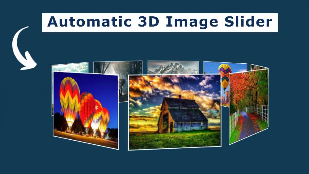
the image gallery is used in many places on the website. The slider is mainly used on the homepage of the website. The normal image slider has a rectangular box and the images can be changed automatically or manually.
But in the case of this design, all the images here are kept in a circular shape. Here I have used 9 images and created a circle of 360 by adding each image to one another. This slider rotates at certain intervals.
In this case, there is no place to change the image manually. It tends to change the image automatically. I have already created one more such image gallery. In that case, I made two buttons to change the image manually. You can see the design if you want to change the images manually.
Simple Automatic Image Slideshow [Live Demo]
If you do not understand what I am saying then you can use the demo below to get a live experience of how it works.
See the Pen
3d automatic image slider by Foolish Developer (@fghty)
on CodePen.
If you want the required source code, you can download the required source code using the download button at the bottom of the article.
As you can see in the video above, here are 9 pictures arranged neatly on a home page. Each image is arranged at a 40-degree angle with the other. As a result, 9 images are joined together to form a 360 circle.
This slider will stop rotating when you mouse over or click on an image in this circle. Normally it rotates from time to time, but when you click on it, the slider stops rotating. Also, a zoom effect has been given to the image. When you click on the image, the image will zoom in a bit.
Hopefully, you have got a complete idea about this image slider from the live demo above.
How to Create Automatic Image Slider in HTML and CSS
Now if you are engaged then you should follow the tutorial below. Using the HTML code I created the basic structure of the slider and added the necessary images.
I designed it completely with the help of CSS code and arranged the images beautifully at a certain angle. Since JavaScript is not used here, I have made this slider functional using @keyframes of CSS code.
Step 1: Add HTML code and required images
I have added the structure of the slider and the necessary images with the help of the HTML code below. Here I have used 9 images. You can use as many images as you want.
Step 2: Basic design of slider with CSS code
Now I have basically designed the slider using the CSS code below and set the background color of the web page.
Here we have used animation: roter 29s linear infinite which helps the image slider to rotate at regular intervals. Here I used 29 seconds to rotate the whole slider once. If you want the images to change more quickly then here you can use any other value instead of 29.

Step 3: Set the specific size of the images
Now I have given a shape to the images in this slider. The height and width of the image are 100% used. That means that the image will be the equivalent of the frame. border: 2px solid white has been used around the images.
Added image hover here. As I said before, when you click on the images here or move the mouse, the images will zoom in a bit. For this, I have used transform: scale (1.1).
If you want to increase or decrease the zoom of images, you can increase or decrease the value of transform: scale (1.1). Here I have used 1.1 If you want to zoom more then you can use 1.5 or 1.6 here.
Here transition: all 3s ease is used to make this zoom smooth.

As mentioned earlier, @keyframes controls the rotation of this complete image slider.

Step 4: Create round circles using the images
As you can see in the picture above, here we can see only one picture out of 9 pictures. This is because each picture has a fixed location. Now we will sort these images to a specific angle using CSS code. Here I have arranged one picture with the other at a 40-degree angle.
transform: rotateY (calc ()) at each 40 degree angle. I put the first image at a 40-degree angle, the second image at 80 degrees, and the third image at a 120-degree angle. That’s how I put image 9 at a 360-degree angle.
Since I have used 9 images, I have arranged each image at a 40-degree angle. Because a circle is formed by 360 degrees. Since I have used nine images, I have arranged each image here (360/9 = 40) at a degree angle.
If you want to increase or decrease the size of this image, you will divide your image size by 360. Use the quotient that comes out as a degree, that is, arrange each picture at that degree angle. For example, if you use that image, then arrange each image at a 60-degree angle.
Here translateZ (300px) is used to place the images 300px away from the center of the circle. As a result, the slider has got a round shape.

Since there is no option to change the image, these images will rotate at regular intervals. I hope you understand from this article how I created this automatic image slider using HTML and CSS code. If you have any problems you can let me know by commenting.