
How to Zoom Image on Scroll using JavaScript
Zoom Image on scroll Effect You can easily create with JavaScript. When you scroll the wheel, the elements will zoom in and out.Zoom image on scroll is javascript effect in…
Zoom Image on scroll Effect You can easily create with JavaScript. When you scroll the wheel, the elements will zoom in and out.Zoom image on scroll is javascript effect in…

I created a Get Day Name of the Week project using the getDay () method. getDay () is a JavaScript method that allows you to collect Day's information from your…

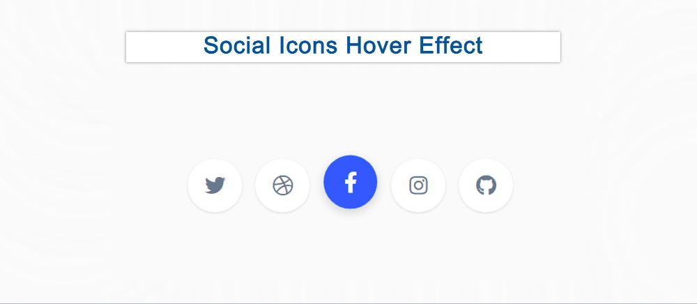
This is a CSS tutorial where you will learn how to create simple social media icons with a hover effect. The hover or animation effect makes the social button much more interesting. Here a few CSS social buttons have been created and hover colors have been used in them.
Social icons are a common element among different websites or projects. The social media buttons that have been created here use animated hover colors.
This social icon hovers effect is made using only HTML and CSS you can use anywhere. I have added icons using HTML. These social icons have been designed and hovered using CSS.
See the Pen
Social Icon Hover Effect by Shantanu Jana (@shantanu-jana)
on CodePen.
This is a complete tutorial where you can get all the source code, step-by-step tutorials, and live previews. So if you are a beginner then this tutorial will help you a lot. If you want to see the preview then use the demo section above.
Here five hover effect social icons are used and they are given in the form of a round button.
Now if you want to make it, you need to have some idea about HTML and CSS. If you are not technical then use the download button directly below the article.
All social icons have been added by the following HTML code. Here I have used 5 social icons.

In this article, you will learn how to create javascript draggable div. What is Draggable Div Element?
Basically, it is an element that you can drag anywhere on the web page. We see this kind of draggable element in many large websites or applications.
Elements that can be dragged from one place to another are called javascript draggable div. In the meantime, I have shared how to create a right-click menu using JavaScript.
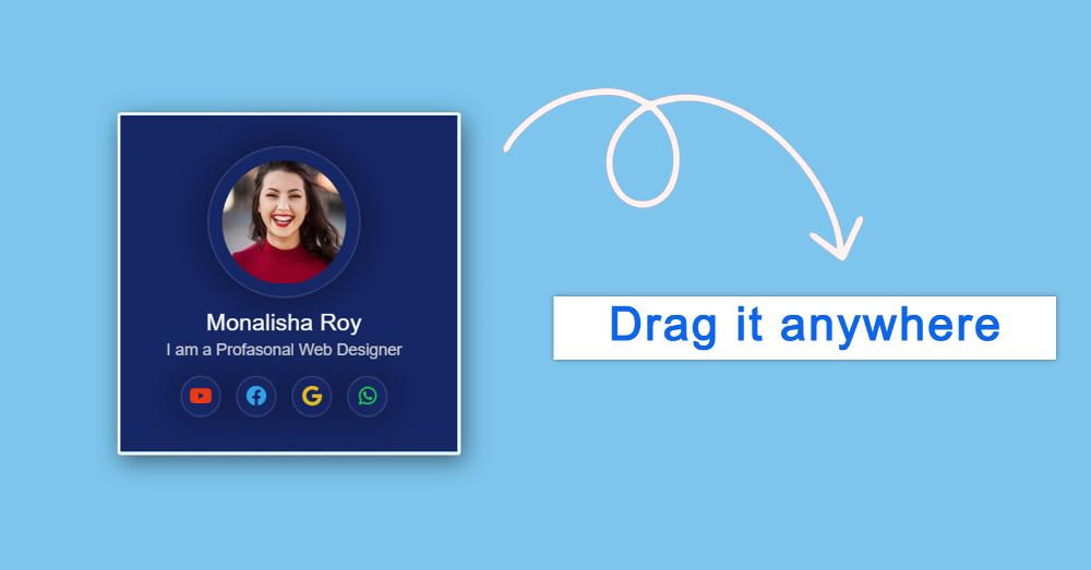
I have added a profile card to the basic structure of this draggable div javascript. However, you can add any of your information by excluding the profile card.
When we see this type of element in an application, it seems to be a lot standard. However, it is not so difficult. If you want, you can create this kind of Drag and Drop element using some basic HTML CSS and JavaScript.
If you have difficulty understanding what I am saying then follow the preview below. Here you will find a live preview of this Draggable Div Element design and the required source code.
See the Pen
Untitled by Foolish Developer (@foolishdevweb)
on CodePen.
As you can see above, I designed a web page. I made a small box on it. Under normal conditions, this box will be in top: 0 and left: 0 positions.
You can then move it to the angle and position of your choice. I have created a profile card in this element. For the profile, first, we added the profile image, some basic text, and four social media buttons.
Although this profile is not part of the Drag element. I just added the card to add some information. Shared step-by-step tutorials here. For this, you must have some idea about HTML CSS JavaScript.
First I created the basic structure of the Drag element. Here you can create using a single div if you want. But I have used a div and a header here.
Div is basically the basic structure and the header is the part where you can drag by clicking. Although the length of the header here is equal to the size of the whole box. So you can move Div Element by clicking on any part of the box.
I have designed the webpage of this project using the following CSS codes. Here a blue color is used in the background of the webpage.

Now the basic structure of the element or the box has been created. Box width: 21rem, height: 21rem, and a light border has been used all around. Shadow has been used here to enhance the beauty.
Now we will design the header. This is basically where we can click and move the JavaScript Draggable Div Element. Here I have used 100% of the length and height.
This will allow you to move it by clicking anywhere in the entire box. Cursor: move is used here, so moving the mouse over the box will change the style of the cursor.

When you click on the box or move it, the style changes a bit. Although it will not work without JavaScript.
Now it’s time to implement this HTML Drag and Drop via JavaScript. It is comparatively much harder. For this, you must have an idea about JavaScript.
Here we have shared the necessary explanations of the code lines. Hopefully, these codes will not be a problem for you to understand.

To make this div element draggable complete the work above. Now you can move this element anywhere.
You can add any information here. Here I have added a profile card. If you want to add a profile card to that draggable element then follow the steps below. Otherwise, skip the steps.
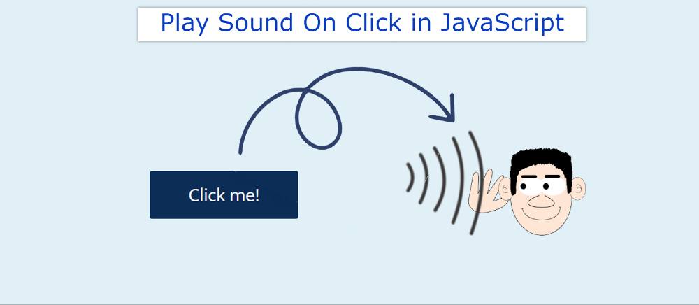
Play sound on click using javascript is a function that create a sound on clicking on the button as the user clicks on the button the click evenlistener triggers the…

In this article, you will learn how to create a 3D button using HTML and CSS. Different types of HTML buttons can be created. Earlier I showed you how to make…
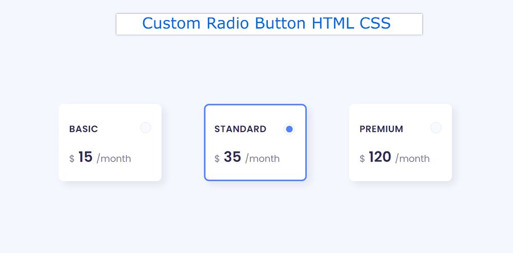

If you want to create Custom Radio Button using HTML and CSS then this tutorial will help you completely. customize radio buttons is a common web element that is used in many different places. The input of HTML is created using type = “radio”.
However, ordinary radio buttons cannot be used everywhere. This radio button needs to be styled to be used for various purposes. Here is a simple radio button using some CSS to make it suitable for interesting and professional use.
3 Radio buttons have been used here. These Custom Radio Buttons are made in the form of small boxes.
Many times one has to choose any one of the many options on the webpage. In that case, there is no alternative to this kind of CSS Radio Button.
See the Pen
Untitled by Shantanu Jana (@shantanu-jana)
on CodePen.
This tutorial will help you to know how to style a radio button. It is designed to be used for a professional purpose. Above is a demo that will help you figure out how it works. Here you will find the required source code and tutorials.
As you can see, three boxes have been created on the webpage. Those boxes are basically radio buttons. You can select these radio buttons. By default, the middle option will be selected.
You can also select any other option of your choice by clicking on it. It’s a little easier to build with a little bit of HTML and CSS used.
below I put all the HTML codes together. Later I designed them with CSS. These select buttons are made in the shape of a box. This box contains some basic information.

I designed the webpage using the following code. Light blue is used in the background of the webpage here.

In this article, you will learn how to create a 3D Flip Card using HTML and CSS. CSS flip card is used in different places. This type of card flip…
Drop Down Navigation Menu is a common web element. If you are looking for the best CSS DropDown Menu then you have come to the right place. Here I have…
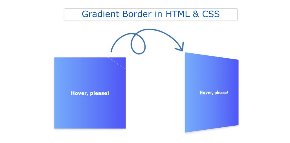
In this tutorial, you will learn how to create a CSS Gradient Border using HTML and CSS. We use different types of borders in different places. However, if different types…