
If you want to create Custom Radio Button using HTML and CSS then this tutorial will help you completely. customize radio buttons is a common web element that is used in many different places. The input of HTML is created using type = “radio”.
However, ordinary radio buttons cannot be used everywhere. This radio button needs to be styled to be used for various purposes. Here is a simple radio button using some CSS to make it suitable for interesting and professional use.
Custom Radio Button CSS
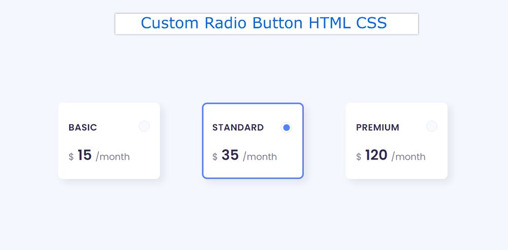
3 Radio buttons have been used here. These Custom Radio Buttons are made in the form of small boxes.
Many times one has to choose any one of the many options on the webpage. In that case, there is no alternative to this kind of CSS Radio Button.
See the Pen
Untitled by Shantanu Jana (@shantanu-jana)
on CodePen.
This tutorial will help you to know how to style a radio button. It is designed to be used for a professional purpose. Above is a demo that will help you figure out how it works. Here you will find the required source code and tutorials.
How to Customize radio buttons in CSS
As you can see, three boxes have been created on the webpage. Those boxes are basically radio buttons. You can select these radio buttons. By default, the middle option will be selected.
You can also select any other option of your choice by clicking on it. It’s a little easier to build with a little bit of HTML and CSS used.
Step 1: Radio Button’s HTML code
below I put all the HTML codes together. Later I designed them with CSS. These select buttons are made in the shape of a box. This box contains some basic information.

Step 2: Design webpages with CSS
I designed the webpage using the following code. Light blue is used in the background of the webpage here.

Step 3: Customize the Radio Button
Now the radio buttons have been shaped like a box. Those boxes have width: 200px, height: 150px, and shadow has been used around the box.

Now the button has been designed with the help of before and after.

Step 4: Design the information in the Radio Button
Now the information contained in the HTML radio button has been designed. A heading and some basic text have been added to this box.

Step 5: Add hover and checked effects
Now hover and click effects have been added to this design. As I said above. When you click on one of the options, you will see a border around that button. Which will help the user to understand which option is in the selected state.

Custom Styled Radio Button (Source Code)
Checkbox or Custom Radio Button is ready for use. Now I have combined all the source codes together and given them below.
There are many users who just want to. I have assembled all the codes for them together. So you create an HTML file and add all the following code to that file.
See the Pen
Untitled by Shantanu Jana (@shantanu-jana)
on CodePen.
Hopefully from the tutorial above you have learned how to create this customized radio button. If there is any problem then you must let me know in the comments.
Below is a button that allows you to download the source code of the Styled Radio Button.