
Automatic Multiple Image Slider in HTML CSS
In this article, you will learn how to create an Automatic Multiple Image Slider. You've probably heard of the automatic image slider, but the automatic multiple image slider is quite…
In this article, you will learn how to create an Automatic Multiple Image Slider. You've probably heard of the automatic image slider, but the automatic multiple image slider is quite…
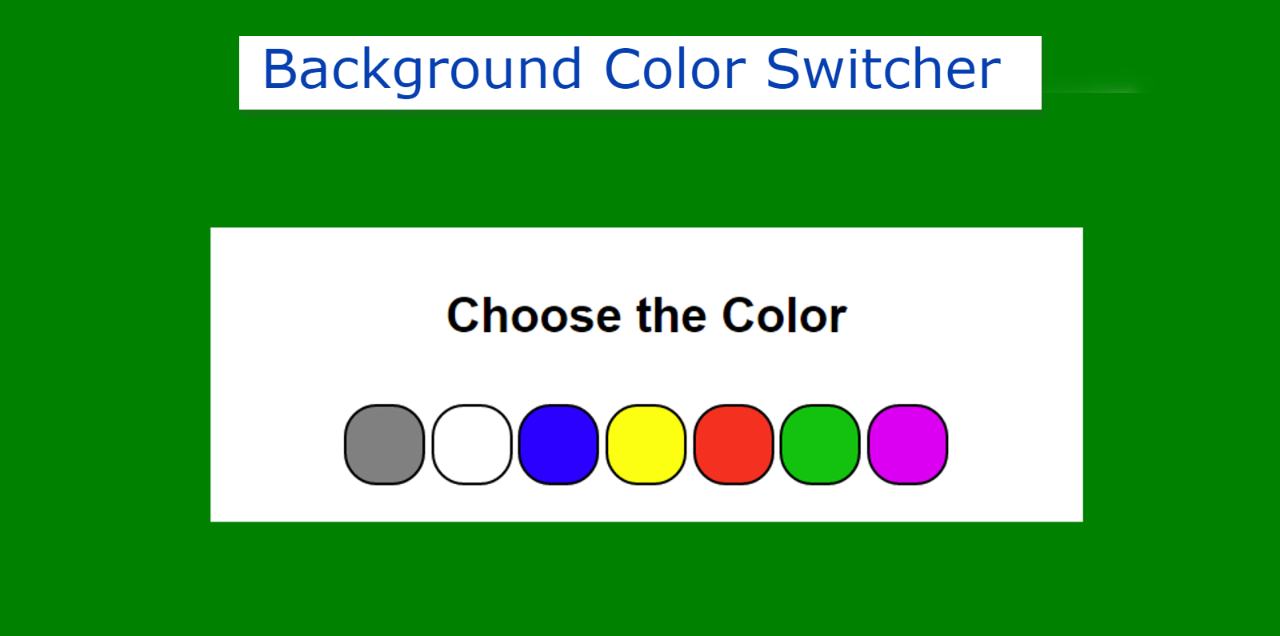

In this article, you will learn how to make a Background Color Switcher using JavaScript. JavaScript Background Color Switcher will help to change the background color choice of the webpage. If you want to know more about colors then you can follow Color Hex Map site. There you will know about RGB, hex etc formats well.
Earlier I shared with you the tutorial on how to create a random color generator and javascript background color generators. This design is basically to switch the color of the background.
This type of project is very important if you want to change the background color of any element or webpage. In this tutorial, I have shared the complete step-by-step tutorial, source code, and live demo. This will give you a complete idea of how to make a javascript change background color on click.
Here I have made many color boxes. You can select any one of those colors in the background. If you want you can change the colors of your choice here and add many more types of colors here.
First I created a small area on the web page. I have used white as the background color of that area. Under normal circumstances, the background color of the webpage is white. In that box, I first used a heading, and then I made 7 small round boxes.
I used different colors in each box. When you click on those colors, you can see that color in the background.
See the Pen
Untitled by Foolish Developer (@foolishdevweb)
on CodePen.
We see the option to change this type of color text, text size, etc. on different types of websites. This type of design greatly enhances the quality of the website and user satisfaction.
Related Post:
1. Loan Calculator using JavaScript
2. Show and Hide Password Using jQuery
3. Save Text to a File using JavaScript
4. Simple Weather App using JavaScript
5. BMI Calculator using Javascript
6. Simple Stopwatch using JavaScript
Dark and light themes are now used on almost every website. In that case, only two background colors are used. But here you can use multiple background colors.
The basic structure of this project has been created using the following HTML and CSS codes. A box has been created with the help of the following codes and a heading has been used. Here the max-width of the box: 540px and here the background color of the box is white.

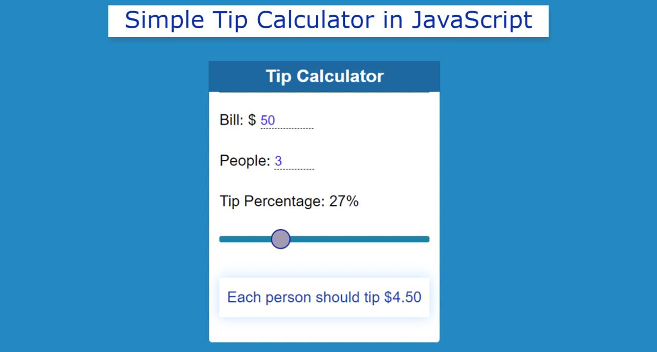

Simple Tip Calculator is a great JavaScript project for beginners. If you know Basic JavaScript then of course this type of Javascript Tip Calculator is important enough for you. Tip Calculator is basically an application that will help to do Tip Calculation.
For example, you and three of your friends went to eat at a hotel. And there’s a $ 100 bill. You have decided to give a 10% tip of the total bill to the waiter. And three of your friends will pay for that tip. In such a situation, there is no alternative to this type of project to calculate how much amount or how many dollars each person has to pay.
If you want to do this manually you have to work a lot harder. Since programming is to make our daily necessary work easier. So this kind of project will make your calculation much easier. Here you will only input information and it will automatically show the result.
So if you are a beginner then you should definitely try this type of project. Here you will find complete source code and tutorial on how to create a Simple Tip Calculator using JavaScript. But yes, you need to have some basic idea about JavaScript. This is because some amount of JavaScript has been used to make this project work.
However, I have done a complete step-by-step explanation. Even if you don’t know JavaScript, you can understand it. If you want the source code, you can use the download button below the article.
See the Pen
Untitled by Foolish Developer (@foolishdevweb)
on CodePen.
Hopefully, the demo above has helped you to know the live preview of the project (Tip Calculator in JavaScript). But if you can copy the source code from the demo section.
Related Post:
1. Loan Calculator using JavaScript
2. Show and Hide Password Using jQuery
3. Save Text to a File using JavaScript
4. Simple Weather App using JavaScript
5. BMI Calculator using Javascript
6. Simple Stopwatch using JavaScript
I would request you to follow the tutorial below. Because here you will know in full step by step how I made it. First, the background color of the webpage is blue. Then I made a box. At the beginning of this box, I used a heading which is basically to enhance the beauty of this project.
I created two input areas. In the first input box to input the amount of the bill and in the second input box to input the information of how many people will give this tip.
Then I created a range slider for the percentage of the tip. This means that you can determine what percentage of the total amount you want to give as a tip here. Below all there is a display in which the results can be seen. That is, after inputting the above information, the result of that calculation can be seen in the display below.
We have created the basic structure of Simple Tip Calculator using the following HTML and CSS code. I have created a box here to tell the basic structure in which all the information can be found.
First I used the background color blue of the webpage and then I created this box. I used background color white and width: 80% and max-width: 350px.


In this article, you will learn how to create a Simple Loan Calculator using HTML CSS, and JavaScript. JavaScript Loan Calculator will help you to calculate the loan amount, interest rate, and information of monthly payment.
Before that, I used JavaScript to create many types of calculator projects like Age calculator, Height calculator, weight calculator, etc. Now I am going to show you how to make a simple loan calculator using JavaScript. We basically use the general formula to calculate the interest rate and monthly payment of a loan amount. However, JavaScript will help you to make this task more perfect and easy.
Computer programming makes our tasks much easier. Similarly, this EMI calculator will help you to calculate the monthly payment of your loan. Here I have used HTML CSS and JavaScript. HTML and CSS helped create and design the basic structure of this JavaScript loan calculator. Here JavaScript helps to make it work.
First I used a heading that basically helped to enhance the beauty. Then I made 3 input boxes. To input the loan amount in the first input box, interest rate in the second input box, and information input of the third input box month. Below all is a small display where the calculations can be seen.
This loan calculator will help you know how much money you have to pay each month with interest.
For example, if you want to buy a product, the total value of this product is X and there is a Y % interest rate. You want to repay that loan in 6 months. In this case, you can easily find out how much money you have to pay per month from this calculator.
If you want to do it manually, you have to work a little harder.
See the Pen
Untitled by Foolish Developer (@foolishdevweb)
on CodePen.
Hopefully, the above demo has helped you to know how this interest rate calculator javascript works. If you only want to get the source code then you can copy the source code from the demo section above.
But keeping in mind the beginners, I have shared the complete step-by-step tutorial. If you want to know how to build this JavaScript loan calculator then you must follow our tutorials step by step.
See Full List See full list

You can learn how to make automatic and manual image sliders from this tutorial. Earlier I showed you how to create two types of image sliders, manual and automatic. However,…
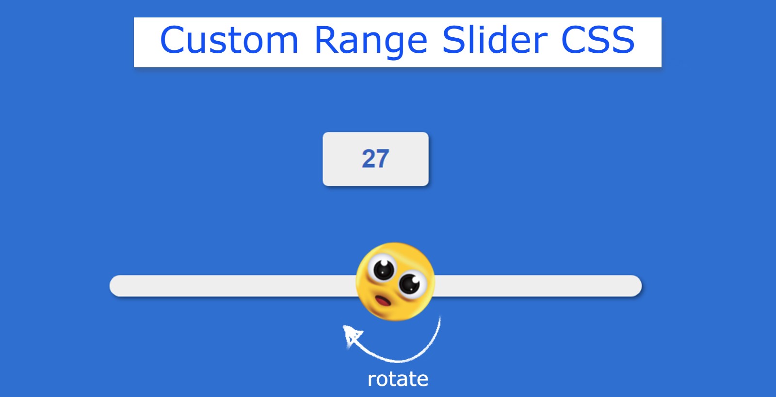

You will learn how to build a Custom Range Slider using HTML CSS and JavaScript. Custom Range Slider We see it in different types of e-commerce websites or different types of business websites. This type of HTML range slider is used to select a specific value in the slider.
This is a kind of input function of HTML. HTML has many types of inputs like text, password, file, slider, etc. This type of Custom Range Slider has a minimum and maximum value. The user can select any one of those values.
This type of range slider with min and max values is very important for an eCommerce site. I have used animation in this Custom Range Slider. The button that changes the value is designed with CSS. Emojis are used instead of buttons.
The emoji in the slider can rotate 360 degrees. The emoji will be at 0 degrees at the slider minimum value. It will rotate when you change the position of the emoji. If you are a beginner then this project (Custom Range Slider using HTML CSS) is very important for you.
See the Pen
Untitled by Foolish Developer (@foolishdevweb)
on CodePen.
First, we created the basic structure of the slider using HTML. Then JavaScript has been used to activate this Custom Range Slider.
This slider can be used in addition to JavaScript. However, JavaScript is important for activating the display. The value of the display will change when you change the position of the button on the slider.
To make this custom range slider HTML CSS you need to have a basic idea about HTML CSS. I have given a demo that will help you to know more about this custom range slider.

If you want to create a transparent login form using HTML and CSS then you have come to the right place. Here I will show you how to create a…
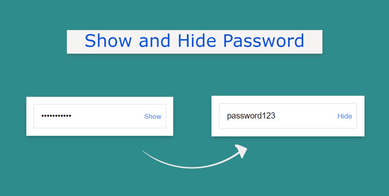

Show and Hide Password A JavaScript project helps to see and hide passwords in the input field. This article will help you to know how to show and hide passwords using jQuery. When we input a password into an input box, it appears as a bullet. As a result, those passwords can be easily protected from hackers.
The “Show and Hide Password” option is very important in case the user wants to see the password. This will allow the user to easily see the password in the input field.
When we use type = “password” in an input field, the characters input in that input box will appear as bullets. When type = “text” of input is used then the passwords will be converted to text and we will see.
There is a small button in the input box that can be clicked to see the password. In general, input type = “password”. Type = “text” of the input will be converted when that button is clicked.
This article will help you to know how to create password Show and Hide using JQuery. Very little JQuery has been used here. JQuery is an external JavaScript library. I took the help of HTML CSS JavaScript to create this project.
First, we created and designed the input field using HTML and CSS. Then he implemented it with the help of Jquery. First, we created a box on the webpage on which we created an area for input. There is a small button in the input box that will help to show and hide the password.
See the Pen
Untitled by Foolish Developer (@foolishdevweb)
on CodePen.
Hope the above demo has helped you to know how to create this JavaScript Show and Hide Password project. As I said before, I took the help of Jquery to make this project. So you must include the JQuery CDN link in your HTML file.
The basic design of this password input box is created using the following HTML and CSS codes. Here I first made a box on the webpage using the background color green.
I used white as the background color of the box and width: 320px. Along with this, a shadow has been used around the box which enhances the beauty.


This tutorial will help you if you want to create a calculator using HTML and CSS. Here I have shared with you how to make a simple web calculator. Earlier…