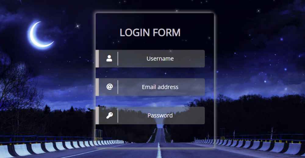
If you want to create a transparent login form using HTML and CSS then you have come to the right place. Here I will show you how to create a CSS transparent login page. We all use the login form to access the accounts of different websites.
The transparent login form is a simple login page but in this case, the background can be seen completely. That is, the background image and color can be seen clearly. The login form of this type of transfer is much more modern and beautiful than the normal login form. Here you will learn how to create a nice transparent login page using HTML and CSS.
Transparent Login Form HTML CSS
I used HTML CSS to create this login form and used a nice background image. First I did some design on top of the webpage and added the background image to the webpage. Then I created the login form. Here I have used shadow to understand the area of the form.
See the Pen
Untitled by Foolish Developer (@foolishdevweb)
on CodePen.
A heading or title is used first in the Transparent login form. Then there are three places to input. The first input box contains the username, the second input box contains the email address, and the third box contains the password input. Each input box has an icon and some color effects.
✅👉Related Post: 20 Best Transparent Login Form
A button has been used at the end of all that allows you to log in. If you know the basics of HTML and CSS then you can easily create this CSS transparent login form.
Step 1: Basic structure of Transparent Login Form
I designed the webpage using the HTML and CSS codes below and created a basic structure of the login form. As I said before, an area has been created which will contain all the information.
Step 2: Add a title
Now I have created a title in the login form and designed it with the help of CSS code. Font-size: 32px has been used to increase the size of the text.
Step 3: Input box to input login information
Now it’s time to create three input boxes. An icon is used with each input box. HTML’s input function has been used to create the input box. I used light white as the background color.
Now I have placed the icons in the specified place. We added the icon above but it was not in the input box of the login form. Now I have placed it nicely in that input box and used the color white.
Now using CSS before and after has made this input box more beautiful and modern. First I made a thick line on the left side of the input box using After Effects.
I have used white as the background color for this line. Then I made another line using before but this line is comparatively much thinner.
Step 4: Create a button in the Transparent Login Form
Now it’s time to create a button in the login form of this transfer that will help you log in. Depending on the size of this button.
Hopefully from the tutorial above you have learned how I created this transparent login form using HTML and CSS.
If you have any difficulty in creating this project, you can definitely let me know in the comments. Earlier I shared with you the design of another simple transparent login form.


