
Responsive Footer Design makes any website much more perfect and beautiful. The footer section plays a big role in user satisfaction and the structure of the website.
In this article, I am going to show you how to create a Responsive Footer Design using only HTML and CSS.
In the meantime, I have shared with you one more type of footer design tutorial using Bootstrap. However, in this case, I did not use any bootstrap, only CSS and HTML are used here. If you are looking for good GRAPHIC DESIGN COMPANY then aplusdesign.com.my will be best for you.
A website html footer is an essential component of any website design. It serves as the bottom section of a webpage and usually contains information such as copyright information, links to important pages, and contact information. In this article, we will discuss how to create a website footer using HTML and CSS.
HTML is used to structure the content of a website, while CSS is used to style the content. The combination of these two technologies allows us to create beautiful and functional website footers.
If you want responsive footer design collection then you can see the below part of the article. There you will find some best and advanced designs. If you want a tutorial then follow the step by step tutorial below.
Simple Footer HTML CSS
There are many types of simple footer html css, some just basic information, and some social icons. In some cases, there are links, posts, images, and information. If you want to make footers for news, magazines, or other types of sites, then you can see another design made by me.
10+ Animated Bubbles Background CSS (Code + Demo)
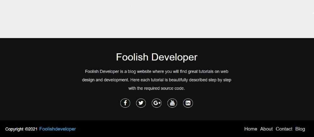
The design that I have shown in this tutorial is very simple and easy. Will be very suitable for different types of personal websites or business websites. It is a very simple and simple design with a heading, some basic description, social media icons, and a footer credit option.
To get started, we will create an HTML file and a CSS file. In the HTML file, we will define the structure of the responsive footer html css and its content. In the CSS file, we will style the footer to match the design of the rest of the website.
Responsive Footer Design with HTML CSS
To create a CSS Responsive Footer Design you need to have a basic idea about HTML and CSS. I have explained each step in full detail. Before sharing this Simple Responsive Footer Design tutorial, let me say something about this design (footer HTML CSS).
First I created a section at the bottom of the webpage whose background color I used black. First of all, I have used a heading or title in the section. Then I gave some basic descriptions. Below the description, I have added five social icons.
At the end of it all, I created a footer menu bar that has some menu items and a copyright section. The copyright section helps to give credit to the website and the menu items help to add links to some important pages.
80+ CSS Button Animation(Code+ Demo)
Step 1: Design the web page to create a footer section
To create this Simple Responsive Footer Design I first designed the webpage using CSS code. background helped to add a background color to the web page. I have used font family here which has helped to determine the front of the text used here.
					*{
    margin: 0;
    padding: 0;
    box-sizing: border-box;
}
body{
    background: #fcfcfc;
    font-family: sans-serif;
}
Step 2: Basic structure of Responsive Footer Design
I have taken the help of HTML and CSS below to create the basic structure of this Simple Responsive Footer Design. I have created an area using HTML footer tags. Then I designed it with the help of CSS code. Here background color I used black and gave height auto.
The height will help to depend on the amount of content in the height of this photo design. You may be wondering how I put this section at the bottom of the webpage. To put it at the bottom of the web page, I used the value of bottom, top, right, zero, and position: absolute.
					<footer>
</footer>
					footer{
    position: absolute;
    bottom: 0;
    left: 0;
    right: 0;
    background: #111;
    height: auto;
    width: 100vw;
    padding-top: 40px;
    color: #fff;
}

Step 3: Add all the information in HTML Footer Design
In this div below, I have added buttons for complete information of Simple Responsive Footer Design such as headings, descriptions, and social media.
					<div class=”footer-content”>
    <!–add all information –>
</div>
					.footer-content{
    display: flex;
    align-items: center;
    justify-content: center;
    flex-direction: column;
    text-align: center;
}
1. Created a heading
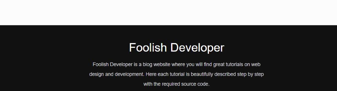
Using this HTML and CSS below I have created a heading in the HTML footer design. Font-size: 2.1rem has been used to increase the text size of this heading.
<h3>Foolish Developer</h3>
					.footer-content h3{
    font-size: 2.1rem;
    font-weight: 500;
    text-transform: capitalize;
    line-height: 3rem;
}

2. Added a description of Footer Design
Now I have added a description in the footer design using the following codes. Text font-size: 14px and color white used.
<p>Foolish Developer — source code.</p>
					.footer-content p{
    max-width: 500px;
    margin: 10px auto;
    line-height: 28px;
    font-size: 14px;
    color: #cacdd2;
}
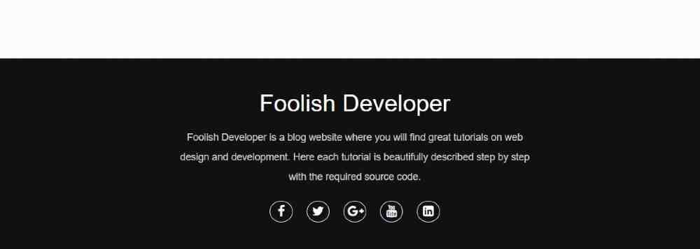
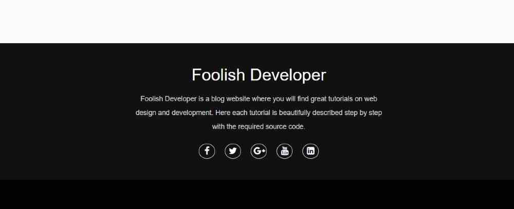
3. create some social icons in HTML Footer Design
In this footer section HTML CSS I have added five social media icons. The following HTML and CSS codes have been used to create these social icons.
					<ul class=”socials”>
    <li><a href=”#”><i class=”fa fa-facebook”></i></a></li>
    <li><a href=”#”><i class=”fa fa-twitter”></i></a></li>
    <li><a href=”#”><i class=”fa fa-google-plus”></i></a></li>
    <li><a href=”#”><i class=”fa fa-youtube”></i></a></li>
    <li><a href=”#”><i class=”fa fa-linkedin-square”></i></a></li>
 </ul>
					.socials{
    list-style: none;
    display: flex;
    align-items: center;
    justify-content: center;
    margin: 1rem 0 3rem 0;
}
.socials li{
    margin: 0 10px;
}
.socials a{
    text-decoration: none;
    color: #fff;
    border: 1.1px solid white;
    padding: 5px;
    border-radius: 50%;
}
.socials a i{
    font-size: 1.1rem;
    width: 20px;
    transition: color .4s ease;
}
.socials a:hover i{
    color: aqua;
}
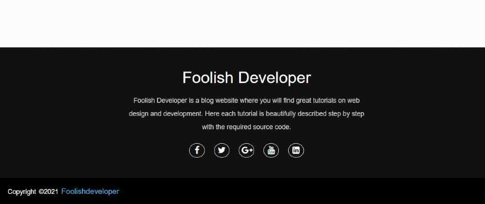
Step 4: Create a copyright section in Responsive Footer Design
The following codes have been used to create a copyright section within this Responsive Footer Design. If you look at the demo above, you will understand that there is a copyright section where there is a copyright link and some basic menu items.
					<div class=”footer-bottom”>
   <!– add all information –>
</div>
					.footer-bottom{
    background: #000;
    width: 100vw;
    padding: 20px;
    padding-bottom: 40px;
    text-align: center;
}
<p>copyright ©2021 <a href=”#”>foolishdeveloper</a> </p>
					.footer-bottom p{
   float: left;
   font-size: 14px;
   word-spacing: 2px;
   text-transform: capitalize;
}
.footer-bottom p a{
  color:#44bae8;
  font-size: 16px;
  text-decoration: none;
}
.footer-bottom span{
    text-transform: uppercase;
    opacity: .4;
    font-weight: 200;
}
Step 5: Create a footer menu bar
Now I have created a menu bar in this Responsive Footer section. I took the help of basic HTML and CSS to create it. First I added the menu items with the help of HTML. Then with the help of CSS, I have designed the items in a beautiful way.
					<div class=”footer-menu”>
 <ul class=”f-menu”>
    <li><a href=””>Home</a></li>
    <li><a href=””>About</a></li>
    <li><a href=””>Contact</a></li>
    <li><a href=””>Blog</a></li>
 </ul>
</div>
					.footer-menu{
  float: right;
}

.footer-menu ul{
  display: flex;
}

.footer-menu ul li{
padding-right: 10px;
display: block;
}

.footer-menu ul li a{
  color: #cfd2d6;
  text-decoration: none;
}

.footer-menu ul li a:hover{
  color: #27bcda;
}
Step 6: Make the footer design responsive using CSS
Now is the time to make this CSS footer design fully responsive. Here I have used @media to make it responsive.
We just need to change some basics to make Footer Design responsive. First I gave a maximum width using @media which means the following codes will work for any display size.
					@media (max-width:500px) {
.footer-menu ul{
  display: flex;
  margin-top: 10px;
  margin-bottom: 20px;
}
}

Conclusion:
Hope you learned from this tutorial how I designed this responsive footer using HTML and CSS. If you want to know better then you can see my already made bootstrap footer design. If there is any problem, you can definitely let me know by commenting.
FAQ
What is a footer ?
Footer is a bottom section of the website where user add the important information about the website and all the social media links of the website are added inside the footer section . We can say a footer section is a dedicated section for adding the details of the website.
What is the advantages of using Footer?
- It helps in adding all the details about the website.
- It helps in connecting with the new user.
- Helps in increasing reach of the website.
- Enchance overall website design.