
How to Make a Word Counter with JavaScript
You will learn how to create word counters with the help of JavaScript. You will see that there are many websites on the internet that are much more popular for counting words or characters. I will try to explain in this tutorial a basic structure of how these designs work.
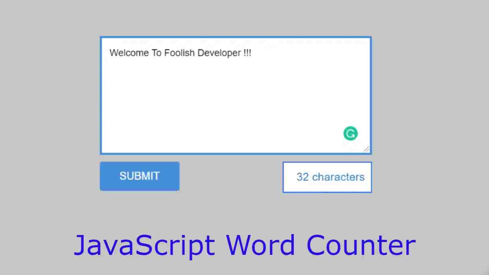
A simple word counter depending on the general JavaScript programming code. First of all, I have made a box (Textarea) here. When you write something in that box, every character you write in that box will be a live count. The counted results can be seen in the box below.
Simple Word Counter with JavaScript
Basically, this design will count the number of characters, each character you write in this box will count with space. I used a small amount of HTML and CSS code to create the box and design the background.
Here all the work is handled by JavaScript, that is, everything shown in the box that counts these words is handled by JavaScript. If you want to know better how this word (character) counter works then you can see the demo below.
See the Pen
word counter by Foolish Developer (@fghty)
on CodePen.
As you can see, I made a rectangular box here. When you type something in that box, it will count live. The counted results can be seen through a small box below.
In the background of this box, I have used white color and added a blue border all around to enhance the beauty. Follow the tutorial below to make this design. In this case, first of all, let me say that I have used the bootstrap CDN link. Be sure to add a link to these two in the head section of your HTML file.
Step 1: Design the background of the word counter
First of all, you create HTML and CSS files. Then copy the following HTML structure and add it to your HTML file.
<!DOCTYPE html>
<html lang=”en”>
<head>
<link rel=”stylesheet” href=”https://cdn.jsdelivr.net/npm/bootstrap@4.6.0/dist/css/bootstrap.min.css”>
<meta charset=”UTF-8″>
<meta http-equiv=”X-UA-Compatible” content=”IE=edge”>
<meta name=”viewport” content=”width=device-width, initial-scale=1.0″>
<title>Document</title>
<style>
/* CSS Code */
</style>
</head>
<body>
<div class=”column”>
</div>
<script>
// Javascript code
</script>
</body>
</html>
Using the CSS code below I basically designed this word counter in the background.