Button Ripple Effect using HTML, CSS & JavaScript

Button Ripple Effect using HTML, CSS & JavaScript

In this article, you will learn how to create Button Ripple Effect using HTML, CSS, and JavaScript. I have shared many more button animations with you before. This is the first time I will create a Ripple Effect in a button.

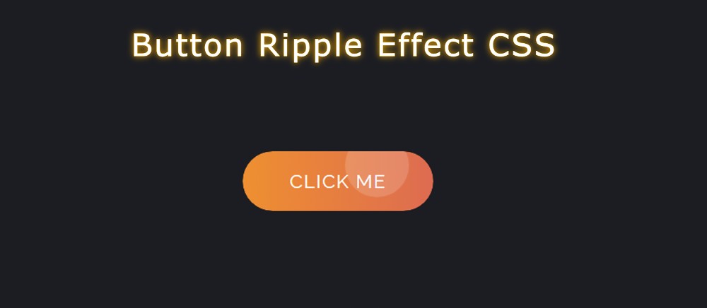
Button Ripple Effect CSS is basically a kind of onclick effect i.e. when you click on the button this Button Ripple Effect JavaScript can be seen. 

If you don’t know what Ripple Effect is, let me tell you, it is a kind of simple effect. When you click on something, a colorful circle will be created in that place. These colorful circles can be matched in size.

Button Ripple Effect CSS

Below I have given a demo that will help you to understand how this circular ripple effect works. Here you will find the required source code and live preview.

See the Pen
Untitled
by Foolish Developer (@foolishdevweb)
on CodePen.

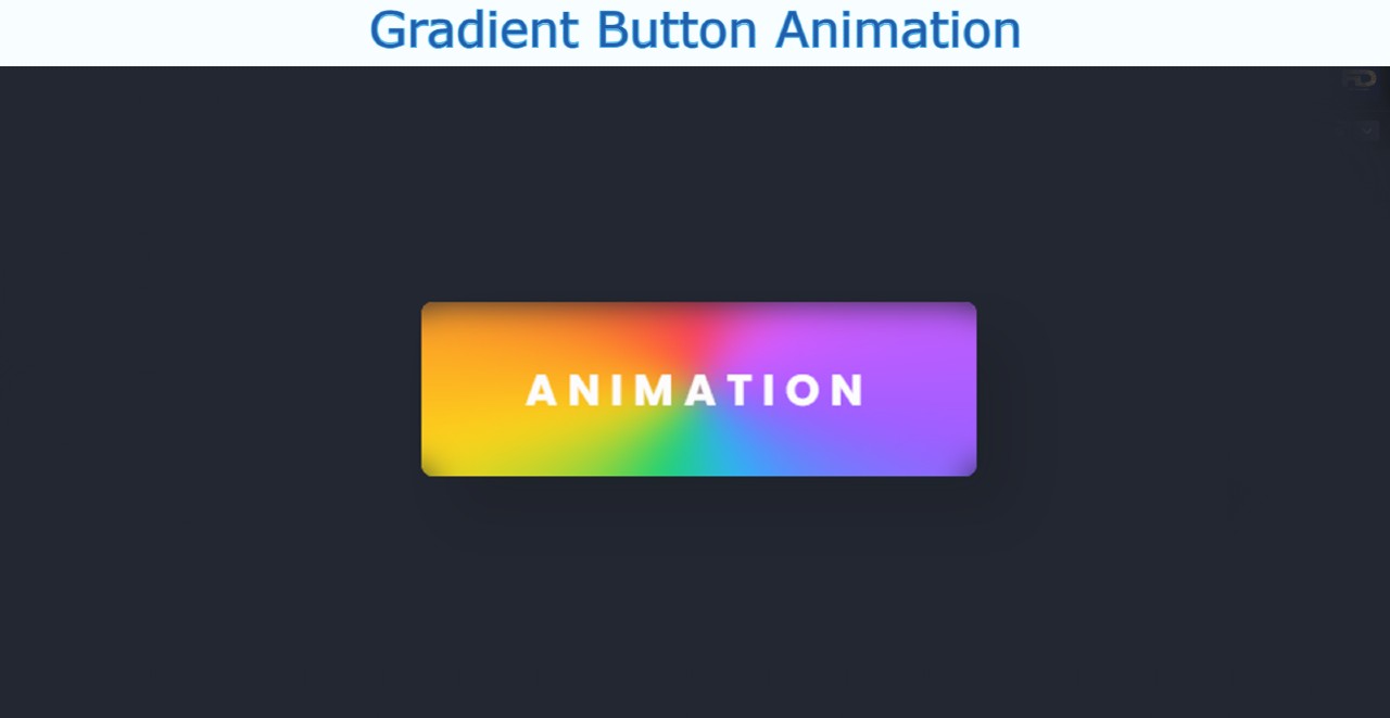
Although I have shared tutorials on creating many more types of buttons before, the most notable of which are neon buttons, gradient buttons, glowing buttons, etc. 

Html, CSS, and javascript have been used to create this button ripple effect. The button’s structure was first created using HTML. Then it was designed by CSS. After all, the ripple effect has been implemented by JavaScript.

You need JavaScript enabled to view it to create this button ripple animation. JavaScript will basically help you determine the position of your causer and create those colorful circles in the place where you click.

How to Create Button Ripple Effect CSS

If you want to create this Button Ripple Effect you can follow the step-by-step tutorial below. If you know basic HTML, CSS, and javascript then you can create it. 

If you only want the source code, you can use the download button or code section at the bottom of the article.

Step 1: The basic structure of the button

First, the basic structure of the button was created using some HTML code.

<div class=”content-wrapper”>
   <div class=”button-ripple-effect”>Click me</div>
</div>

The webpage is designed with the following CSS. I have used black as the background color of the webpage here.

* {
margin: 0;
padding: 0;
box-sizing: border-box;
}
.content-wrapper {
display: flex;
justify-content: center;
align-items: center;
min-height: 100vh;
background-color: #1c1d22;
}
The basic structure of the button

Now the button has been designed. The size of this button depends on the padding and linear-gradient color is added to the background.

.content-wrapper .button-ripple-effect {
position: relative;
padding: 20px 50px;
border: 0;
border-radius: 60px;
background: linear-gradient(90deg, #f18c2c, #df694f);
color: #ffffff;
font-family: “Raleway”, sans-serif;
font-size: 20px;
text-transform: uppercase;
letter-spacing: 1.4px;
cursor: pointer;
overflow: hidden;
-webkit-mask-image: -webkit-radial-gradient(white, black);
}
button has been designed

Step 2: Add Ripple Effect to the button (more…)

Continue ReadingButton Ripple Effect using HTML, CSS & JavaScript

How To Create a Bottom Navigation Bar HTML CSS

How To Create a Bottom Navigation Bar HTML CSS

In this tutorial, you will learn how to create Bottom Navigation Bar HTML CSS. Earlier I shared another tutorial on creating a Bottom Navigation Menu. This type of CSS tab we see mainly in the case of responsive devices. 

This type of Bottom Navigation Bar HTML is found mainly in the case of mobile apps. This design can only be created by HTML CSS. 

Although I have used some JavaScript to make the animation used here work. If you omit the animation, you can create this mobile bottom navigation bar with HTML CSS.

Bottom Navigation Bar HTML CSS

For your convenience, I have given a preview below. Icons have been used instead of text for menus. If you only want the source code, use the button below the article.

See the Pen
Navigation Bar – JS
by Foolish Developer (@foolishdevweb)
on CodePen.

First, the basic structure of the Fixed bottom navbar has been created on the webpage. White color has been used in the background of the navbar. 

Then I used 5 icons here. You can increase the amount of menu according to your needs. Here the color of the active icon will be red. Borders have been added to the active icons using CSS before and after

A border of 8px can be seen above and below the menu item that will be active. When you click on another icon, its borders will be removed and added to that icon.

How to Create a Bottom Navigation Menu

Below I have shared step by step tutorial and show how to create a bottom navigation bar design. For this, you need to have an idea about HTML, CSS, and javascript. 

However, if you are a beginner, follow the tutorial below. If you create this Bottom Navigation Menu using HTML checkboxes then you don’t need to use JavaScript.

Step 1: Basic structure of Bottom Navbar

First, the basic structure of this fixed bottom navbar has been created.

<nav class=”navigation-bar”>
  <ul class=”list-items”>
     
  </ul>
</nav>

I designed the webpage using the code below and added a background color.

* {
  margin: 0;
  padding: 0;
  box-sizing: border-box;
}
body {
  min-height: 100vh;
  background-color: #f2f2f2;
  display: flex;
  align-items: center;
  justify-content: center;
}

I have used min-height: 30px, min-width: 200px of this navbar and the background color is white.

.navigation-bar {
  background: #fff;
  border-radius: 3px;
  min-height:30px;
  min-width:200px;
  overflow: hidden;
  box-shadow: 0 15px 25px rgba(0, 0, 0, 0.1);
}
.navigation-bar .list-items {
  list-style: none;
  display: flex;
  position: relative;
}
Basic structure of Bottom Navbar

Step 2: Add menu items to the Navigation Bar (more…)

Continue ReadingHow To Create a Bottom Navigation Bar HTML CSS

CSS Button Gradient Border Animation (Free Code)

CSS Button Gradient Border Animation

In this tutorial, you will learn how to make CSS Button Gradient Border. Earlier I shared with you the tutorials of different types of gradient buttons. However, the background gradient color was not used here. Instead, the background is kept completely transparent and CSS Gradient Borders are used on the button borders.

Buttons we use in different places. If that button is attractive and animated it attracts more user attention. In that case, you can use such a simple CSS Button Gradient Border Button. This will definitely enhance the beauty and quality of your website.

CSS Button Gradient Border

Only if you have a basic idea about HTML and CSS can you build it. Below I have given a demo that will help you to get a live preview of this project. If you only want the source code, you can use the download button at the bottom of the article.

See the Pen
Untitled
by Foolish Developer (@foolishdevweb)
on CodePen.

I created a button on a web page as you can see above. A text has been used in the CSS Gradient button. I have kept the background of the button completely transparent. 

How to Create CSS Gradient Borders

However, I have used CSS Gradient Borders animation in button text and borders. Here you will have to animate different colors together. Here you can add colors of your choice.

Follow the steps below to create this CSS Button Gradient Border. I have given below all the code and step-by-step information.

1: Basic structure of Gradient Border

The basic structure of this button has been created using the following HTML and CSS codes. I used linear-gradient color in the background of the button. Here I have used 5 colors. 

You can add colors of your choice. Every color here can be seen at a 45-degree angle. Here I used the animation for four seconds. That means a color can be seen again after 4 seconds.

<div class=”container”>
    
<div>
* {
  box-sizing: border-box;
  margin: 0;
}
.container {
  position: absolute;
  transform: translateX(-50%) translateY(-50%);
  top: 50%;
  left: 50%;
  min-width: 300px;
  min-height: 100px;
  padding: 12px 15px;
  background-image: linear-gradient(-45deg, #3eff0d, #db12c8, #00ffee,#fffa00,#0099ff);
  border-radius: 1000px;
  -webkit-border-radius: 1000px;
  -moz-border-radius: 1000px;
  -ms-border-radius: 1000px;
  background-size: 400% 400%;
  animation: mymove 4s linear infinite;
}
Basic structure of Gradient Border

2. Activate the background color animation (more…)

Continue ReadingCSS Button Gradient Border Animation (Free Code)

Simple Button Hover Effects using HTML & CSS (Free Code)

In this article, I have shown you how to create Simple Button Hover Effects using HTML and CSS. Buttons are used in different places on any website. In this tutorial, you will learn how to make simple button hover effects CSS.

Animated buttons are much more interesting than ordinary buttons. Added hover effect to this button. When the mouse is moved over the button, some changes will be made to the button. 

I have designed this button with the color of the Indian flag. In other words, the color of the Indian flag has been used in the background of the simple hover button CSS.

Simple Button Hover Effects CSS

When hovering over that button, the back of the button can be seen as the color shadow of the button. You can use this Simple Button Hover Effects in any of your buttons. Undoubtedly this CSS button hovers effect will make your button more beautiful.

Below is a demo or preview that will help you to know how this button hover works.

See the Pen
Untitled
by Foolish Developer (@foolishdevweb)
on CodePen.

As you can see above, there is a button that uses the color of the Indian flag in the background. That is, the first ocher, then white and then green has been used. I have used a text here.

I used a small amount of HTML and CSS to make it. If you only want the source code, you can use the download button at the bottom of the article. However, I request you to follow the tutorial below.

Step 1: Basic structure of button hover

Button’s basic information has been created using the following HTML and CSS codes. Here I have used a text that you can change the text to your liking. 

Background color black has been used here. When you use it in your project, you can change this color to your liking.

<div class=”ct-btn”>
   <div class=”gr-tri”>
       <span class=”gr-shadow3″></span>
       <button class=”gradient-neon”>My India</button>
   </div>
</div>
* {margin:0;padding: 0;}
body {
  background-color: #272727;
  margin: 200px auto;
}
.ct-btn {
  justify-content: center;
  display: -webkit-box;
  display: flex;
  cursor: pointer;
  margin:20px;
}
Basic structure of button hover

Step 2: Design the button with CSS (more…)

Continue ReadingSimple Button Hover Effects using HTML & CSS (Free Code)

Day and Night Mode Toggle using JavaScript

Day and Night Mode Toggle using JavaScript

In this article, I have shown you how to create Day and Night Mode Toggle using HTML CSS and JavaScript. Earlier I shared with you the design of many more types of CSS Toggle Switch. This is the first time we have created a Day and Night Mode design using toggle design.

Now, different types of websites use dark and light themes. This kind of feature undoubtedly enhances the quality and user satisfaction of the website. Various websites like YouTube, Facebook have introduced such dark mode features. If you want, you can easily create such designs with the help of HTML CSS, and JavaScript.

Day and Night Mode Toggle JavaScript

In the following tutorial, I have shown how to create a dark mode toggle. There is no reason to worry if you are a beginner. Here is a complete step-by-step tutorial for you. Here is an explanation of each code used.

Here JavaScript is just two lines and the rest is a little bit HTML and CSS. If you have an idea about basic HTML CSS and JavaScript then you can easily create a project (Day and Night Mode JavaScript) by following this tutorial.

Below is a demo that will help you learn how it works. Here you will find the required source code.

See the Pen
Day Night Toggle Switch to Changes Background Color
by Raj Template (@RajTemplate)
on CodePen.

On the first, I have defined an area that will contain the contents. Then I created the toggle button which will change the dark and light mode. Then I added all the tests using the paragraph below.

Step 1: Basic area of content

I have created an area for this project using the code below. This area cannot be seen because the background color was not used. However, it will contain all the information. The width of this area  500px.

<div class=”all”>
 
</div>
*,
*:before,
*:after{
    padding: 0;
    margin: 0;
    box-sizing: border-box;
}
body{
    padding: 30px;
}
.all{
  width: 500px;
  margin: 40px auto;
}

Step 2: Create a day-night toggle button (more…)

Continue ReadingDay and Night Mode Toggle using JavaScript