Traveling is the nature of human beings; people have to travel from one place to another, either for adventure, a job, a holiday, or a summer vacation. Traveling to new cities with no details about the city is quite difficult to maintain a budget, and also because we are new in the particular city, we don’t know what places and moments to visit during our vacation, and getting tickets for the place is also quite difficult, so to overcome that problem, we have designed a very useful and user-interactive website that creates a complete tour of the particular city, from booking of the tickets to hotels and different tourist places. This all at once helps the user in easy planning of the trip.
We have created a Tavel website using HTML and CSS that helps you plan your next trip. We have used HTML to create the structure of the website, and using CSS, we have designed the website to interact.

I hope you get some idea about the project. We will be creating the whole website from scratch, and we will be completely designing the website using CSS only. But first, let’s take a look at our live demo code. It is a beginner project, and we will be guiding you step by step on how to create the structure of the website and then use CSS to style our project.
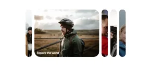
30+ HTML CSS and Javascript Projects
Live Demo:
See the Pen Love Travel by Phan Trung Kiên (@kienphancoding) on CodePen.
let’s start our project by adding some basic structure for our tourism website using HTML.
Adding Structure (HTML):
Using the section tag, we will create a section for our whole tourism website with the class “theme_container.” We will be creating the main container, inside which we will be adding all the elements and designs.
Now, using the header tag, we will create the first element of the website, which will appear first as the site loads. Using the header tag with class flex-box, which helps in adding the styling using CSS, we will first add an image using the src tag, and then using the unordered list tag, we will create a list of items that we will be adding inside our header section. Using the unordered list tag, we will create different navigation links that help users navigate through the website easily.
Similarly, we will be creating a navbar with all the links and a search box for searching different places. We have used some basic HTML tags for creating the headers section of the tourism website using HTML and CSS.
<section class="theme__container">
  <!-- HEADER -->
  <header class="flex-box">
    <div class="header__left flex-box">
      <a href="#" class="header__logo">
        <img src="https://leloc90.github.io/loveTravel/assets/images/Logo-transparent.png" alt="Logo">
      </a>
      <ul class="hide-on-tablet-mobile header__navbar flex-box">
        <li class="navbar__item"><a href="" class="navbar__link">HOME</a></li>
        <li class="navbar__item"><a href="" class="navbar__link">PACKAGES</a>
          <ul class="header__subnav">
            <li class="subnav__item"><a href="" class="subnav__link">
                Search 1
              </a>
              <span class="subnav__sticker-color-red">HOT</span>
            </li>
            <li class="subnav__item"><a href="" class="subnav__link">Search 2</a></li>
            <li class="subnav__item --subnav__after">
              <a href="" class="subnav__link">Tour Package</a>
              <i class='bx bxs-right-arrow'></i>
              <ul class="header__ex-subnav">
                <li class="subnav__item"><a href="" class="subnav__link">Carousel</a>
                  <span class="subnav__sticker-color-blue">Best</span>
                </li>
                <li class="subnav__item"><a href="" class="subnav__link">Single Product</a></li>
                <li class="subnav__item"><a href="" class="subnav__link">Cart</a></li>
                <li class="subnav__item"><a href="" class="subnav__link">Check out</a></li>
              </ul>
            </li>
            <li class="subnav__item"><a href="" class="subnav__link">Destination</a></li>
            <li class="subnav__item"><a href="" class="subnav__link">Typology</a></li>
          </ul>
        </li>
        <li class="navbar__item"><a href="" class="navbar__link">SHOP</a>
          <ul class="header__subnav">
            <li class="subnav__item"><a href="" class="subnav__link">Archive</a></li>
            <li class="subnav__item"><a href="" class="subnav__link">Single Product</a></li>
            <li class="subnav__item"><a href="" class="subnav__link">Cart</a></li>
            <li class="subnav__item"><a href="" class="subnav__link">Check out</a></li>
          </ul>
        </li>
        <li class="navbar__item"><a href="" class="navbar__link">ABOUT US</a>
          <ul class="header__subnav">
            <li class="subnav__item"><a href="" class="subnav__link">About us</a>
              <span class="subnav__sticker-color-green">New</span>
            </li>
            <li class="subnav__item"><a href="" class="subnav__link">About us 2</a></li>
            <li class="subnav__item"><a href="" class="subnav__link">About us 3</a></li>
          </ul>
        </li>
        <li class="navbar__item"><a href="" class="navbar__link">PAGES</a>
          <ul class="header__subnav">
            <li class="subnav__item"><a href="" class="subnav__link">Services</a></li>
            <li class="subnav__item"><a href="" class="subnav__link">Agency Tours</a></li>
            <li class="subnav__item"><a href="" class="subnav__link">Testimonials</a></li>
            <li class="subnav__item"><a href="" class="subnav__link">Prices</a></li>
            <li class="subnav__item"><a href="" class="subnav__link">Promotions</a></li>
            <li class="subnav__item"><a href="" class="subnav__link">Faq</a></li>
            <li class="subnav__item"><a href="" class="subnav__link">Coming soon</a></li>
            <li class="subnav__item --subnav__after"><a href="" class="subnav__link">About us</a>
              <i class='bx bxs-right-arrow'></i>
              <ul class="header__ex-subnav">
                <li class="subnav__item"><a href="" class="subnav__link">About us 1</a></li>
                <li class="subnav__item"><a href="" class="subnav__link">About us 2</a></li>
                <li class="subnav__item"><a href="" class="subnav__link">About us 3</a></li>
              </ul>
            </li>
            <li class="subnav__item --subnav__after"><a href="" class="subnav__link">Contact</a>
              <i class='bx bxs-right-arrow'></i>
              <ul class="header__ex-subnav">
                <li class="subnav__item"><a href="" class="subnav__link">Contact 1</a></li>
                <li class="subnav__item"><a href="" class="subnav__link">Contact 2</a></li>
                <li class="subnav__item"><a href="" class="subnav__link">Contact 3</a></li>
              </ul>
            </li>
          </ul>
        </li>
        <li class="navbar__item"><a href="" class="navbar__link">NEWS</a>
          <ul class="header__subnav">
            <li class="subnav__item"><a href="" class="subnav__link">Archive</a></li>
            <li class="subnav__item --subnav__after"><a href="" class="subnav__link">Single Post</a>
              <i class='bx bxs-right-arrow'></i>
              <ul class="header__ex-subnav">
                <li class="subnav__item"><a href="" class="subnav__link">Full width</a></li>
                <li class="subnav__item"><a href="" class="subnav__link">Right Sidebar</a></li>
                <li class="subnav__item"><a href="" class="subnav__link">Left Sidebar</a></li>
              </ul>
            </li>
          </ul>
        </li>
        <li class="navbar__item"><a href="" class="navbar__link">CONTACT</a>
          <ul class="header__subnav">
            <li class="subnav__item"><a href="" class="subnav__link">Contact 1</a></li>
            <li class="subnav__item"><a href="" class="subnav__link">COntact 2</a></li>
          </ul>
        </li>
        <li class="navbar__item"><a href="" class="pri-btn navbar__btn navbar__link">BOOK NOW</a></li>
      </ul>
    </div>
    <div class="header__right">
      <label for="sub-menu__check" class="header__menu-icon">
        <i class='bx bx-menu'></i>
      </label>
    </div>
  </header>
  <input hidden type="checkbox" id="sub-menu__check" class="sub-menu__check">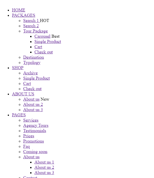
Creating Sub Menu :
We will create a submenu for our tourism website. Where we will add details about different travel locations along with the travel packages and other details. Using the label tag, we will create a sub-menu for small screen devices, and then we will add a circle icon using the font Awesome Class.
Now, we will create a section for places using the div tag. We will then, using the paragraph tag, add the text for the best packages. We will be adding the different images and place names, as well as the prices of the particular places. Similarly, we will be creating multiple sentences for different places using the div and heading tags.
Also, we will be creating the structure for small-screen devices so that we can create a responsive website that can be used on both large-screen desktops and small-screen mobiles.
 <label for="sub-menu__check" class="sub-menu hide-on-tablet-mobile">
    <label for="sub-menu__check"><i class='sub-menu__close-btn bx bx-x-circle'></i></label>

    <div class="sub-menu__places">
      <p class="sub-title__text">BEST</p>

      <h2 class="title__text --title__text-underline sub-menu__text">PACKAGES</h2>

      <div class="sub-menu__place-wrap">
        <img src="./assets/images/berlin.jpg" alt="Berlin">
        <div class="sub-menu__place-info">
          <h5>Berlin</h5>
          <p><i class='bx bx-map'></i>Europe</p>
          <a href="" class="pri-btn sub-menu__btn --berlin-btn-color">FROM 700$</a>
        </div>
      </div>

      <div class="sub-menu__place-wrap">
        <img src="./assets/images/hong-kong.jpg" alt="Hong Kong">
        <div class="sub-menu__place-info">
          <h5>Hong Kong</h5>
          <p><i class='bx bx-map'></i>Asia</p>
          <a href="" class="pri-btn sub-menu__btn --hong-kong-btn-color">FROM 500$</a>
        </div>
      </div>

      <div class="sub-menu__place-wrap">
        <img src="./assets/images/San-francisco.jpg" alt="San Francisco">
        <div class="sub-menu__place-info">
          <h5>San Francisco</h5>
          <p><i class='bx bx-map'></i>United States</p>
          <a href="" class="pri-btn sub-menu__btn --san-fran-btn-color">FROM 400$</a>
        </div>
      </div>

    </div>

    <div class="dest__item sub-menu__dest-item dest__europe">
      <img src="./assets/images/arch.png" alt="">
      <div class="dest__item-info">
        <p class="dest__item-title">Europe</p>
        <p class="dest__item-text">3 PACKAGES</p>
      </div>
      <div class="dest__overlay">
        <h5>Packages</h5>
        <ul class="dest__overlay-list">
          <li class="dest__overlay-item">
            <a href="" class="dest__overlay-link">Berlin</a>
          </li>
          <li class="dest__overlay-item">
            <a href="" class="dest__overlay-link">Amsterdam</a>
          </li>
          <li class="dest__overlay-item">
            <a href="" class="dest__overlay-link">Tuscany</a>
          </li>
          <a href="" class="dest__overlay-btn">VIEW DESTINATION</a>
        </ul>
      </div>
    </div>

    <div class="sub-menu__places">
      <p class="sub-title__text">LAST</p>

      <h2 class="title__text --title__text-underline sub-menu__text ">MINUTES</h2>

      <div class="sub-menu__place-wrap">
        <img src="./assets/images/tuscany.jpg" alt="Berlin">
        <div class="sub-menu__place-info">
          <h5>Tuscany</h5>
          <p><i class='bx bx-map'></i>Italia</p>
          <a href="" class="pri-btn sub-menu__btn --tuscany-btn-color">FROM 730$</a>
        </div>
      </div>

      <div class="sub-menu__place-wrap">
        <img src="./assets/images/amsterdam.jpg" alt="Hong Kong">
        <div class="sub-menu__place-info">
          <h5>Amsterdam</h5>
          <p><i class='bx bx-map'></i>Netherlands</p>
          <a href="" class="pri-btn sub-menu__btn --amsterdam-btn-color">FROM 1500$</a>
        </div>
      </div>

      <div class="sub-menu__place-wrap">
        <img src="./assets/images/phuket.jpg" alt="San Francisco">
        <div class="sub-menu__place-info">
          <h5>Phuket</h5>
          <p><i class='bx bx-map'></i>Thailandia</p>
          <a href="" class="pri-btn sub-menu__btn --phuket-btn-color">FROM 1200$</a>
        </div>
      </div>

    </div>
  </label>

  <label for="sub-menu__check" class="sub-menu-tablet-mobile hide-on-desktop">
    <label for="sub-menu__check"><i class='sub-menu__close-btn bx bx-x-circle'></i></label>
    <ul class="navbar-mobile__list">
      <li class="navbar-mobile__item">
        <a href="" class="navbar-mobile__link">HOME</a>
      </li>
      <li class="navbar-mobile__item">
        <a href="" class="navbar-mobile__link">PACKAGES</a>
        <ul class="subnav-mobile__list">
          <li class="subnav-mobile__item"><a href="" class="subnav-mobile__link">SEARCH</a></li>
          <li class="subnav-mobile__item"><a href="" class="subnav-mobile__link">TOUR PACKAGE</a></li>
          <li class="subnav-mobile__item"><a href="" class="subnav-mobile__link">DESTINATION</a></li>
          <li class="subnav-mobile__item"><a href="" class="subnav-mobile__link">TYPOLOGY</a></li>
        </ul>
      </li>
      <li class="navbar-mobile__item">
        <a href="" class="navbar-mobile__link">SHOP</a>
        <ul class="subnav-mobile__list">
          <li class="subnav-mobile__item"><a href="" class="subnav-mobile__link">ARCHIVE</a></li>
          <li class="subnav-mobile__item"><a href="" class="subnav-mobile__link">SINGLE PRODUCT</a></li>
          <li class="subnav-mobile__item"><a href="" class="subnav-mobile__link">CART</a></li>
          <li class="subnav-mobile__item"><a href="" class="subnav-mobile__link">CHECK OUT</a></li>
        </ul>
      </li>
      <li class="navbar-mobile__item">
        <a href="" class="navbar-mobile__link">ABOUT US</a>
        <ul class="subnav-mobile__list">
          <li class="subnav-mobile__item"><a href="" class="subnav-mobile__link">ABOUT US 1</a></li>
          <li class="subnav-mobile__item"><a href="" class="subnav-mobile__link">ABOUT US 2</a></li>
          <li class="subnav-mobile__item"><a href="" class="subnav-mobile__link">ABOUT US 3</a></li>
        </ul>
      </li>
      <li class="navbar-mobile__item">
        <a href="" class="navbar-mobile__link">PAGES</a>
        <ul class="subnav-mobile__list">
          <li class="subnav-mobile__item"><a href="" class="subnav-mobile__link">SERVICES</a></li>
          <li class="subnav-mobile__item"><a href="" class="subnav-mobile__link">AGENCY TOURS</a></li>
          <li class="subnav-mobile__item"><a href="" class="subnav-mobile__link">TESTIMONIALS</a></li>
          <li class="subnav-mobile__item"><a href="" class="subnav-mobile__link">PRICES</a></li>
          <li class="subnav-mobile__item"><a href="" class="subnav-mobile__link">PROMOTIONS</a></li>
          <li class="subnav-mobile__item"><a href="" class="subnav-mobile__link">FAQ</a></li>
          <li class="subnav-mobile__item"><a href="" class="subnav-mobile__link">COMING SOON</a></li>
        </ul>
      </li>
      <li class="navbar-mobile__item">
        <a href="" class="navbar-mobile__link">NEWS</a>
        <ul class="subnav-mobile__list">
          <li class="subnav-mobile__item"><a href="" class="subnav-mobile__link">ARCHIVE</a></li>
          <li class="subnav-mobile__item"><a href="" class="subnav-mobile__link">SINGLE POST</a></li>
        </ul>
      </li>
      <li class="navbar-mobile__item">
        <a href="" class="navbar-mobile__link">CONTACT</a>
        <ul class="subnav-mobile__list">
          <li class="subnav-mobile__item"><a href="" class="subnav-mobile__link">CONTACT 1</a></li>
          <li class="subnav-mobile__item"><a href="" class="subnav-mobile__link">CONTACT 2</a></li>
        </ul>
      </li>
      <li class="navbar-mobile__item">
        <a href="" class="navbar-mobile__link">BOOK NOW</a>
      </li>
    </ul>
  </label>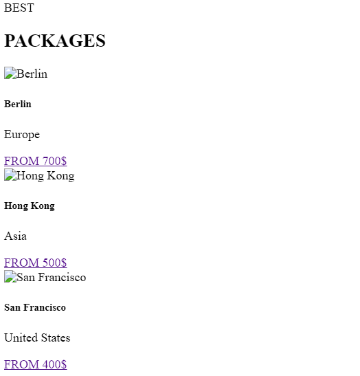
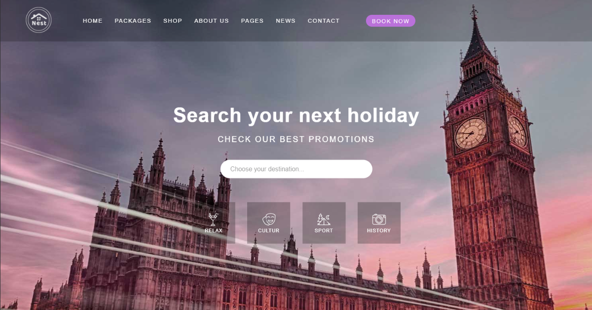
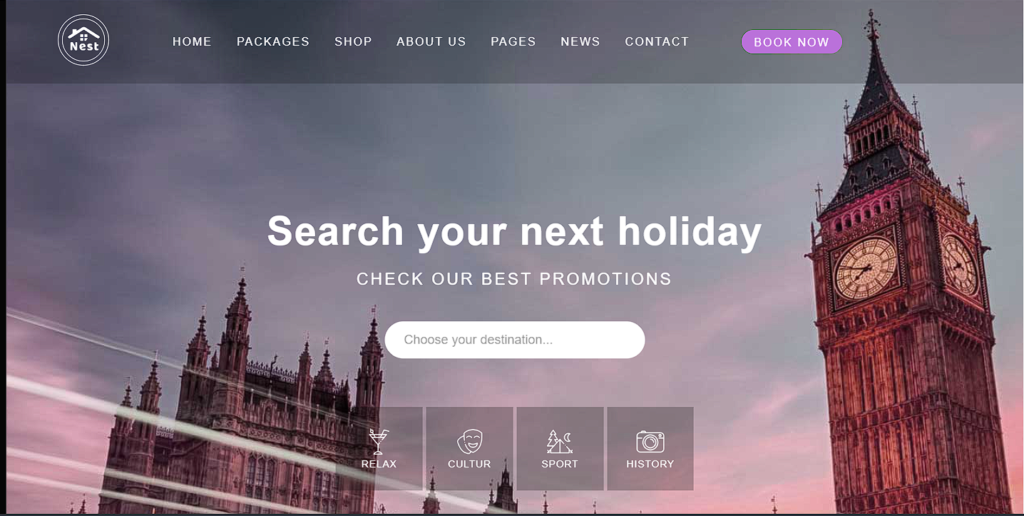
Holiday Section:
Using the article tag selector with the class “theme_holdiay,” we will create our holiday section for the website. We will provide a feature for the customer to plan their holidays according to them, and we will also show the number of promotions at different places. Using the div tag and the image tag, we will be adding the image to different holiday locations.
E-Commerce Website Using HTML, CSS & Javascript
  <article class="theme__holiday">
    <h3 class="holiday__title">Search your next holiday</h3>
    <p class="holiday__text">CHECK OUR BEST PROMOTIONS</p>
    <div class="holiday__search flex-box">
      <input type="text" placeholder="Choose your destination..." class="holiday__search-btn">
      <i class='bx bx-search'></i>
    </div>
    <div class="holiday__choose-wrap flex-box">
      <div class="holiday__choose-item">
        <a href="">
          <img src="https://leloc90.github.io/loveTravel/assets/images/t-relax.png" alt="">
          <span>RELAX</span>
        </a>
      </div>
      <div class="holiday__choose-item">
        <a href="">
          <img src="https://leloc90.github.io/loveTravel/assets/images/t-cultural.png" alt="">
          <span>CULTUR</span>
        </a>
      </div>
      <div class="holiday__choose-item">
        <a href="">
          <img src="https://leloc90.github.io/loveTravel/assets/images/t-sport.png" alt="">
          <span>SPORT</span>
        </a>
      </div>
      <div class="holiday__choose-item">
        <a href="">
          <img src="https://leloc90.github.io/loveTravel/assets/images/t-history.png" alt="">
          <span>HISTORY</span>
        </a>
      </div>
    </div>
  </article>
</section>
Destinations :
Now we will be creating a section for the destinations, and we will be adding our proposals for different destinations for different users. Using the <h2> tag selector, we will be adding the heading for our destinations, and then using the article list tag, we will create an article for different destinations.
In this section, we will be adding the details for different locations with the necessary image and view of the location, as well as the package details for each destination. We will be creating an article section to list all the details of the locations.
Here in our destinations locations, we will be adding the destinations that have more tourist sites, so that attracts people to visit sites.
<!-- DESTINATION -->
<section class="dest__wrap">
  <p class="sub-title__text">OUR PROPOSALS</p>
  <h2 class="title__text">OUR <span class="--title__text-underline dest-text">DESTINATIONS</span></h2>
  <article class="dest__list">
    <!-- Europe -->
    <div class="dest__item-flex">
      <div class="dest__item abc dest__europe">
        <img src="https://leloc90.github.io/loveTravel/assets/images/arch.png" alt="">
        <div class="dest__item-info">
          <p class="dest__item-title">Europe</p>
          <p class="dest__item-text">3 PACKAGES</p>
        </div>
        <div class="dest__overlay">
          <h5>Packages</h5>
          <ul class="dest__overlay-list">
            <li class="dest__overlay-item">
              <a href="" class="dest__overlay-link">Berlin</a>
            </li>
            <li class="dest__overlay-item">
              <a href="" class="dest__overlay-link">Amsterdam</a>
            </li>
            <li class="dest__overlay-item">
              <a href="" class="dest__overlay-link">Tuscany</a>
            </li>
            <a href="" class="dest__overlay-btn">VIEW DESTINATION</a>
          </ul>
        </div>
      </div>
    </div>
    <!-- Thailandia -->
    <div class="dest__item-flex">
      <div class="dest__item abc dest__thailandia">
        <img src="https://leloc90.github.io/loveTravel/assets/images/buddha.png" alt="">
        <div class="dest__item-info">
          <p class="dest__item-title">Thailandia</p>
          <p class="dest__item-text">1 PACKAGES</p>
        </div>
        <div class="dest__overlay">
          <h5>Packages</h5>
          <ul class="dest__overlay-list">
            <li class="dest__overlay-item">
              <a href="" class="dest__overlay-link">Phuket</a>
            </li>
            <a href="" class="dest__overlay-btn">VIEW DESTINATION</a>
          </ul>
        </div>
      </div>
    </div>
    <!-- Asia -->
    <div class="dest__item-flex">
      <div class="dest__item abc dest__asia">
        <img src="https://leloc90.github.io/loveTravel/assets/images/torii-gate.png" alt="">
        <div class="dest__item-info">
          <p class="dest__item-title">Asia</p>
          <p class="dest__item-text">2 PACKAGES</p>
        </div>
        <div class="dest__overlay">
          <h5>Packages</h5>
          <ul class="dest__overlay-list">
            <li class="dest__overlay-item">
              <a href="" class="dest__overlay-link">Hong Kong</a>
            </li>
            <li class="dest__overlay-item">
              <a href="" class="dest__overlay-link">Phuket</a>
            </li>
            <a href="" class="dest__overlay-btn">VIEW DESTINATION</a>
          </ul>
        </div>
      </div>
    </div>
    <!-- Italia -->
    <div class="dest__item-flex">
      <div class="dest__item abc dest__italy">
        <img src="https://leloc90.github.io/loveTravel/assets/images/pisa.png" alt="">
        <div class="dest__item-info">
          <p class="dest__item-title">Italy</p>
          <p class="dest__item-text">1 PACKAGES</p>
        </div>
        <div class="dest__overlay">
          <h5>Packages</h5>
          <ul class="dest__overlay-list">
            <li class="dest__overlay-item">
              <a href="" class="dest__overlay-link">Tuscany</a>
            </li>
            <a href="" class="dest__overlay-btn">VIEW DESTINATION</a>
          </ul>
        </div>
      </div>
    </div>
    <!-- Netherlands -->
    <div class="dest__item-flex">
      <div class="dest__item abc dest__netherlands">
        <img src="https://leloc90.github.io/loveTravel/assets/images/london-eye.png" alt="">
        <div class="dest__item-info">
          <p class="dest__item-title">Netherlands</p>
          <p class="dest__item-text">1 PACKAGES</p>
        </div>
        <div class="dest__overlay">
          <h5>Packages</h5>
          <ul class="dest__overlay-list">
            <li class="dest__overlay-item">
              <a href="" class="dest__overlay-link">Amsterdam</a>
            </li>
            <a href="" class="dest__overlay-btn">VIEW DESTINATION</a>
          </ul>
        </div>
      </div>
    </div>
    <!-- United States -->
    <div class="dest__item-flex">
      <div class="dest__item abc dest__usa">
        <img src="https://leloc90.github.io/loveTravel/assets/images/golden-gate.png" alt="">
        <div class="dest__item-info">
          <p class="dest__item-title">United States</p>
          <p class="dest__item-text">1 PACKAGES</p>
        </div>
        <div class="dest__overlay">
          <h5>Packages</h5>
          <ul class="dest__overlay-list">
            <li class="dest__overlay-item">
              <a href="" class="dest__overlay-link">San Francisco</a>
            </li>
            <a href="" class="dest__overlay-btn">VIEW DESTINATION</a>
          </ul>
        </div>
      </div>
    </div>

  </article>
</section>

<!-- NEXT HOLIDAY -->
<article class="next-holiday">
  <div class="next-holiday__text-wrap">
    <p class="next-holiday__text-1">Your</p>
    <p class="next-holiday__text-2">Next <span class="--title__text-underline holiday-text">Holiday</span></p>
  </div>
  <div class="next-holiday__btn-wrap">
    <a href="" class="next-holiday__btn">VIEW ALL PACKAGES</a>
  </div>
</article>

<!-- TOURS -->
<section class="tours__container">
  <article class="tours__beaches">
    <div class="beaches__info">
      <p class="sub-title__text">NORTH AMERICA</p>
      <h2 class="title__text">The Best <span class="--title__text-underline beaches-text">Beaches</span></h2>
      <p class="beaches__desc">
        Lorem ipsum dolor sit amet, consectetur adip iscing elit. Proin rhoncus urna dictum neque molestie ultricies mauris ac.
      </p>
      <p class="beaches__desc">
        Lorem ipsum dolor sit amet, consectetur adip iscing elit. Proin rhoncus urna dictum neque molestie ultricies mauris ac.
      </p>
      <div class="beaches__price">
        <span class="beaches__old-price">800</span>
        <span class="beaches__new-price">500 $</span>
        <span class="beaches__price-person">/ FOR PERSON</span>
      </div>
      <a href="" class="pri-btn beaches__btn">BOOK NOW</a>
    </div>

    <div class="beaches__wrap">
      <div class="beaches__bullets">
        <a href="#beaches__img-1" class="beaches__bullets-item"></a>
        <a href="#beaches__img-2" class="beaches__bullets-item"></a>
        <a href="#beaches__img-3" class="beaches__bullets-item"></a>
      </div>
      <div class="beaches__img-container">
        <div id="beaches__img-1" class="beaches__img-main beaches__img-1"></div>
        <div id="beaches__img-2" class="beaches__img-main beaches__img-2"></div>
        <div id="beaches__img-3" class="beaches__img-main beaches__img-3"></div>
      </div>
      <div class="beaches__wrap-time">
        <div class="time__block">
          <span class="time__number">000</span>
          <span class="time__text">DAYS</span>
        </div>
        <div class="time__block">
          <span class="time__number">00</span>
          <span class="time__text">HOURS</span>
        </div>
        <div class="time__block">
          <span class="time__number">00</span>
          <span class="time__text">MINUTES</span>
        </div>
        <div class="time__block">
          <span class="time__number">00</span>
          <span class="time__text">SECONDS</span>
        </div>
      </div>
    </div>
  </article>

  <article class="tours__list">
    <div class="tours__item">
      <img src="https://leloc90.github.io/loveTravel/assets/images/icon-around.png" alt="">
      <div class="tours__info">
        <h5>World Tour</h5>
        <p>Lorem ipsum dolor sit amet conse ctetur adip iscing elit Proin rhonc us urna dictum.</p>
        <a href="">View more</a>
      </div>
    </div>

    <div class="tours__item">
      <img src="https://leloc90.github.io/loveTravel/assets/images/icon-boat.png" alt="">
      <div class="tours__info">
        <h5>Cruises</h5>
        <p>Lorem ipsum dolor sit amet conse ctetur adip iscing elit Proin rhonc us urna dictum.</p>
        <a href="">View more</a>
      </div>
    </div>

    <div class="tours__item">
      <img src="https://leloc90.github.io/loveTravel/assets/images/icon-landmark.png" alt="">
      <div class="tours__info">
        <h5>Best Tours</h5>
        <p>Lorem ipsum dolor sit amet conse ctetur adip iscing elit Proin rhonc us urna dictum.</p>
        <a href="">View more</a>
      </div>
    </div>
  </article>
</section>

<!-- DISCOVER -->
<section class="discover__container">
  <div class="discover__item discover__img-1">
    <p>01. LAST MINUTE</p>
    <h4>Discover Cities</h4>
    <a href="" class="discover__btn-1">DETAILS</a>
  </div>

  <div class="discover__item discover__img-2">
    <p>02. PROMOTIONS</p>
    <h4>Discover Nature</h4>
    <a href="" class="discover__btn-2">DETAILS</a>
  </div>
</section>

<!-- PROMOTION -->

<section class="promotion__container">
  <p class="sub-title__text">PROMOTIONS</p>
  <h2 class="title__text">OUR <span class="--title__text-underline promotion-text">PACKAGES</span></h2>

  <article class="promotion__wrap">
    <div class="promotion__item">
      <div class="promotion__item-img --item-img-1">
        <div class="promotion__item-sticker-1">
          <img class="sticker__img" src="https://leloc90.github.io/loveTravel/assets/images/arch.png" alt="">
        </div>
      </div>
      <div class="promotion__item-info">
        <div class="promotion__item-head">
          <h5>Berlin</h5>
          <p><i class='bx bx-map'></i>Europe</p>
        </div>
        <div class="promotion__item-thema">
          <div class="promotion__item-thema-text">
            <p>CULTURAL</p>
            <P>RELAX<span style="background-color: #ffd205;">+ 1</span></P>

          </div>
          <div class="promotion__item-thema-price">
            <span>700 $</span>
          </div>
        </div>
        <div class="promotion__item-desc">
          <p>Lorem ipsum dolor sit amet, consectetur adipiscing elit. Nunc ut efficitur ante. Donec dapibus dictum scelerisque.</p>
        </div>
        <a href="" class="pri-btn promotion-btn-1">DETAILS</a>
      </div>
    </div>

    <div class="promotion__item">
      <div class="promotion__item-img --item-img-2">
        <div class="promotion__item-sticker-2">
          <img class="sticker__img" src="https://leloc90.github.io/loveTravel/assets/images/torii-gate.png" alt="">
        </div>
      </div>
      <div class="promotion__item-info">
        <div class="promotion__item-head">
          <h5>Hong Kong</h5>
          <p><i class='bx bx-map'></i>Asia</p>
        </div>
        <div class="promotion__item-thema">
          <div class="promotion__item-thema-text">
            <p>HISTORY</p>
            <P>CULTURAL<span style="background-color: #f76570;">+ 1</span></P>

          </div>
          <div class="promotion__item-thema-price">
            <span class="old-price">1000</span>
            <span>500 $</span>
          </div>
        </div>
        <div class="promotion__item-desc">
          <p>Lorem ipsum dolor sit amet, consectetur adipiscing elit. Nunc ut efficitur ante. Donec dapibus dictum scelerisque.</p>
        </div>
        <a href="" class="pri-btn promotion-btn-2">DETAILS</a>
      </div>
    </div>

    <div class="promotion__item">
      <div class="promotion__item-img --item-img-3">
        <div class="promotion__item-sticker-3">
          <img class="sticker__img" src="https://leloc90.github.io/loveTravel/assets/images/golden-gate.png" alt="">
        </div>
      </div>
      <div class="promotion__item-info">
        <div class="promotion__item-head">
          <h5>Sanfrancisco</h5>
          <p><i class='bx bx-map'></i>United State</p>
        </div>
        <div class="promotion__item-thema">
          <div class="promotion__item-thema-text">
            <p>SPORT</p>
            <P>RELAX<span style="background-color: #ba71da;">+ 1</span></P>

          </div>
          <div class="promotion__item-thema-price">
            <span>400 $</span>
          </div>
        </div>
        <div class="promotion__item-desc">
          <p>Lorem ipsum dolor sit amet, consectetur adipiscing elit. Nunc ut efficitur ante. Donec dapibus dictum scelerisque.</p>
        </div>
        <a href="" class="pri-btn promotion-btn-3">DETAILS</a>
      </div>
    </div>
  </article>
</section>
Footer Section:
Now we will be creating the last section for our website, the footer section, where we will be adding all the important and social media links along with the website privacy and policy and also the copyright of the design of the website.
Using the footer tag, we will be creating a footer container. We will be adding all the necessary details and contact information in a form inside the footer. Using the <p> tag, we will be adding a small text to keep in touch so that we can provide you with the latest offers and schemes.
We will be adding the social media links, images, copyright symbol, and privacy policy link to the website footer.
<footer>
  <section class="footer__container">

    <article class="footer__head">
      <div class="footer__title">
        <p>KEEP IN TOUCH</p>
        <h5>Travel with us</h5>
      </div>
      <div class="footer__input">
        <input type="text">
        <a href="" class="pri-btn footer__btn">SEND</a>
      </div>
    </article>

    <article class="footer__body">
      <div class="footer__body-left">
        <div class="footer__logo">
          <img src="./assets/images/Logo-6.png" alt="">
        </div>
        <p class="hide-on-mobile">
          Lorem ipsum dolor sit amet, consectetur adipiscing elit. Curabitur ut diam et nibh condimentum venenatis eu ac magnasin. Quisque interdum est mauris, eget ullamcorper.
        </p>
        <div class="footer__social-icon">
          <a href=""><i class='bx bxl-twitter'></i></a>
          <a href=""><i class='bx bxl-youtube'></i></a>
          <a href=""><i class='bx bxl-facebook'></i></a>
          <a href=""><i class='bx bxl-instagram-alt'></i></a>
        </div>
      </div>

      <div class="footer__body-right">

        <div class="footer__body-info">
          <h5>OUR AGENCY</h5>
          <ul class="footer__info-list">
            <li class="footer__info-item">
              <i class='bx bx-chevron-right'></i>
              <a href="" class="footer__info-link">Services</a>
            </li>
            <li class="footer__info-item">
              <i class='bx bx-chevron-right'></i>
              <a href="" class="footer__info-link">Insurancee</a>
            </li>
            <li class="footer__info-item">
              <i class='bx bx-chevron-right'></i>
              <a href="" class="footer__info-link">Agency</a>
            </li>
            <li class="footer__info-item">
              <i class='bx bx-chevron-right'></i>
              <a href="" class="footer__info-link">Tourism</a>
            </li>
            <li class="footer__info-item">
              <i class='bx bx-chevron-right'></i>
              <a href="" class="footer__info-link">Payment</a>
            </li>
          </ul>
        </div>

        <div class="footer__body-info">
          <h5>PARTNERS</h5>
          <ul class="footer__info-list">
            <li class="footer__info-item">
              <i class='bx bx-chevron-right'></i>
              <a href="" class="footer__info-link">Booking</a>
            </li>
            <li class="footer__info-item">
              <i class='bx bx-chevron-right'></i>
              <a href="" class="footer__info-link">RentalCar</a>
            </li>
            <li class="footer__info-item">
              <i class='bx bx-chevron-right'></i>
              <a href="" class="footer__info-link">HostelWorld</a>
            </li>
            <li class="footer__info-item">
              <i class='bx bx-chevron-right'></i>
              <a href="" class="footer__info-link">Trivago</a>
            </li>
            <li class="footer__info-item">
              <i class='bx bx-chevron-right'></i>
              <a href="" class="footer__info-link">TripAdvisor</a>
            </li>
          </ul>
        </div>

        <div class="footer__body-info">
          <h5>LAST MINUTE</h5>
          <ul class="footer__info-list">
            <li class="footer__info-item">
              <i class='bx bx-chevron-right'></i>
              <a href="" class="footer__info-link">London</a>
            </li>
            <li class="footer__info-item">
              <i class='bx bx-chevron-right'></i>
              <a href="" class="footer__info-link">California</a>
            </li>
            <li class="footer__info-item">
              <i class='bx bx-chevron-right'></i>
              <a href="" class="footer__info-link">Indonesia</a>
            </li>
            <li class="footer__info-item">
              <i class='bx bx-chevron-right'></i>
              <a href="" class="footer__info-link">Europe</a>
            </li>
            <li class="footer__info-item">
              <i class='bx bx-chevron-right'></i>
              <a href="" class="footer__info-link">Oceania</a>
            </li>
          </ul>
        </div>
      </div>

    </article>
    <div class="footer__body-bottom">
      <p>THE BEST WORDPRESS TRAVEL THEME</p>
      <p>COPYRIGHT NICDARK THEMES 2018</p>
    </div>

  </section>
</footer>
Styling Tourism Website (CSS):
Basic Styling:
We will set the box-sizing attribute to “border-box.” and the padding and margin to zero using the universal tag selector (*). We will create two variables for text color using the root selector. Two text colors that we create will be used to change the color of the text.
We will set the width and height of the website container to 100% and 870 pixels, respectively, using the class selector (.theme_container). We will also set the background picture using the URL using the background-image attribute.
* {
  margin: 0;
  padding: 0;
  box-sizing: border-box;
  -webkit-tap-highlight-color: transparent;
}
.abc {
  overflow: hidden;
}
a:hover,
i:hover {
  opacity: 0.85;
}

body {
  font-family: "Poppins", sans-serif;
}

:root {
  --primary-text-color: #9a9a9a;
  --primary-text-color-2: #555555;
}

.pri-btn {
  padding: 8px 15px 6px;
  display: inline-block;
  border-radius: 30px;
  color: #fff;
  letter-spacing: 2px;
  text-decoration: none;
}

.flex-box {
  display: flex;
  justify-content: space-between;
  align-items: center;
}

.sub-title__text {
  color: var(--primary-text-color);
  letter-spacing: 2px;
  font-size: 15px;
}

.title__text {
  color: var(--primary-text-color-2);
  display: inline-block;
  font-size: 40px;
}

.--title__text-underline {
  position: relative;
}

.--title__text-underline:after {
  content: "";
  display: block;
  opacity: 0.7;
  height: 4px;
  position: absolute;
  right: 0;
  bottom: 10px;
  border-radius: 24%;
  width: 100%;
}

.sub-menu__text::after {
  background-color: #ffd105;
  height: 3px;
}
.dest-text::after {
  background-color: #1bbc9b;
}
.beaches-text::after {
  background-color: #14b9d5;
}
.holiday-text::after {
  background-color: #e66874;
}
.promotion-text::after {
  background-color: #1bbc9b;
}

.sub-menu__text {
  font-size: 25px;
}

.theme__container {
  width: 100%;
  height: 870px;
  position: relative;
  background-image: url(https://leloc90.github.io/loveTravel/assets/images/parallax-2.jpg);
  background-repeat: no-repeat;
  background-position: center;
  background-size: auto;
}
Styling Header:
We will set the header’s width to 100% and its height to 104 pixels using the header tag selector and the height property. To set the position to absolute, we will use the position property.
Now we will be adding the basic styling to the navbar. We will add some margin-left, font size, and padding to the navbar links.
/*START HEADER */
header {
  width: 100%;
  height: 104px;
  position: absolute;
  top: 0;
  left: 0;
  right: 0;
  background-color: rgba(0, 0, 0, 0.2);
}

.header__logo {
  margin-left: 64px;
  margin-right: 64px;
  text-align: center;
  text-decoration: none;
}

.header__logo img {
  width: 64px;
  object-fit: cover;
  object-position: center;
}

.header__navbar {
  list-style: none;
}

.navbar__item {
  position: relative;
}

.navbar__link {
  text-decoration: none;
  color: #fff;
  font-size: 14px;
  letter-spacing: 2px;
  padding: 8px 15px 6px;
  position: relative;
}

.navbar__link:not(:last-child)::after {
  content: "";
  display: block;
  position: absolute;
  width: 100%;
  height: 30px;
  background-color: transparent;
}

.navbar__btn {
  background-color: #ba71da;
  margin-left: 50px;
}

.header__menu-icon {
  color: #fff;
  font-size: 40px;
  margin-left: 64px;
  margin-right: 64px;
  cursor: pointer;
}
Sub Navbar :
Class selector property (.navbar_item): with the hover property, we will set the display as “block,” and using the class selector property, we will set the position as “absolute.” Using the top property, we will add a top position of 24 pixels, and using the box-shadow property, we will set the box shadow of 5 pixels to the z axis.
Now we will be styling the navbar navigation links. We will be adding the font size, color, and border around the navbar to give it a unique look.
/* Start Subnav */

.navbar__item:hover .header__subnav {
  display: block;
}

.header__subnav {
  position: absolute;
  left: 0;
  top: calc(100% + 24px);
  background-color: #fff;
  box-shadow: 1px 2px 5px rgba(0, 0, 0, 0.4);
  width: 200px;
  list-style: none;
  z-index: 1;
  display: none;
}

.header__ex-subnav {
  position: absolute;
  left: calc(100% + 24px);
  top: 0;
  background-color: #fff;
  box-shadow: 1px 2px 5px rgba(0, 0, 0, 0.4);
  width: 200px;
  list-style: none;
  z-index: 1;
  display: none;
}

.subnav__item:hover .header__ex-subnav {
  display: block;
}

.--subnav__after::after {
  content: "";
  display: block;
  position: absolute;
  right: -24px;
  background-color: transparent;
  width: 24px;
  height: 100%;
}

.subnav__item {
  position: relative;
  padding: 12px 24px;
  border-bottom: 1px solid rgba(0, 0, 0, 0.1);
  display: flex;
  justify-content: space-between;
  align-items: center;
}

.subnav__item:hover {
  background-color: rgba(0, 0, 0, 0.05);
  cursor: pointer;
}

.subnav__item:last-child {
  border-bottom: none;
}

.subnav__link {
  text-decoration: none;
  color: var(--primary-text-color);
  font-size: 15px;
  letter-spacing: 2px;
  width: 100%;
}

.subnav__item span {
  display: inline-block;
  padding: 2px 4px 2px 5px;
  letter-spacing: 1px;
  border-radius: 4px;
  font-size: 10px;
  color: #fff;
}

.subnav__sticker-color-red {
  background-color: #f76570;
}

.subnav__sticker-color-green {
  background-color: #1bbc9b;
}

.subnav__sticker-color-blue {
  background-color: #14b9d5;
}

.subnav__item i {
  font-size: 10px;
  color: var(--primary-text-color);
  transform: translateY(1px);
}
styling Holiday :
We will be adding the basic styling to the holiday section using the basic CSS properties, such as the position property. We will set the position of the holiday section as “absolute,” and using the top and left properties, we will add a space of 50%. We will be adding the maximum width of 1200px, and using the letter-spacing property, we will add a letter spacing of 12px.
We will be styling all the elements of the holiday section separately to add a unique and interactive look to the website.
.theme__holiday {
  position: absolute;
  top: 50%;
  left: 50%;
  transform: translate(-50%, -50%);
  text-align: center;
  color: #fff;
  width: 80%;
  max-width: 1200px;
  letter-spacing: 1px;
}

.holiday__title {
  font-size: 50px;
  margin-bottom: 20px;
}

.holiday__text {
  font-size: 20px;
  letter-spacing: 3px;
  margin-bottom: 40px;
}

.holiday__search {
  background-color: #fff;
  width: 32%;
  margin-left: auto;
  margin-right: auto;
  padding: 14px 24px;
  border-radius: 30px;
  margin-bottom: 60px;
}

.holiday__search-btn {
  border: none;
  font-size: 16px;
  opacity: 0.7;
  outline: none;
  cursor: text;
}

.holiday__search i {
  font-size: 18px;
  color: #c1c1c1;
  cursor: pointer;
}

.holiday__choose-wrap {
  width: 44%;
  margin-right: auto;
  margin-left: auto;
}

.holiday__choose-item {
  width: 108px;
  height: 104px;
  background-color: rgba(0, 0, 0, 0.25);
  display: flex;
  flex-direction: column;
  justify-content: center;
  align-items: center;
}

.holiday__choose-item a {
  text-decoration: none;
  color: #fff;
}

.holiday__choose-item img {
  width: 32%;
}

.holiday__choose-item span {
  display: block;
  font-size: 12px;
}

/* END HOLIDAY */

/*START SUB MENU */
.sub-menu__check:checked ~ .sub-menu {
  transform: translateX(0%);
  opacity: 1;
}

.sub-menu {
  position: fixed;
  right: 0;
  top: 0;
  opacity: 0;
  transform: translateX(100%);
  width: 376px;
  background-color: #fff;
  z-index: 1;
  padding: 0px 30px 0 42px;
  height: 100vh;
  overflow-y: auto;
  transition: linear 0.5s;
}

.sub-menu-tablet-mobile {
  position: fixed;
  right: 0;
  top: 0;
  width: 300px;
  height: 100%;
  background-color: #555555;
  z-index: 1;
  padding: 24px;
  opacity: 0;
  transform: translateX(100%);
  transition: linear 0.5s;
  overflow-y: scroll;
}

.navbar-mobile__list,
.subnav-mobile__list {
  list-style: none;
}

.navbar-mobile__item {
  margin-bottom: 16px;
}

.navbar-mobile__link,
.subnav-mobile__link {
  text-decoration: none;
  color: #fff;
}

.navbar-mobile__link {
  font-weight: bold;
  font-size: 20px;
}

.subnav-mobile__link {
  font-size: 14px;
  letter-spacing: 2px;
  margin-left: 24px;
}

.sub-menu__close-btn {
  position: absolute;
  top: 8px;
  right: 8px;
  font-size: 32px;
  color: var(--primary-text-color);
  opacity: 0.7;
  cursor: pointer;
}

.sub-menu__places {
  margin-top: 24px;
  text-align: center;
  margin-bottom: 40px;
}

.sub-menu__title:after {
  content: "";
  display: block;
  background-color: #ffd105;
  opacity: 0.5;
  width: 100%;
  height: 5px;
  position: absolute;
  bottom: 11px;
}

.sub-menu__place-wrap {
  margin-top: 36px;
  display: flex;
  justify-content: space-between;
  align-items: center;
}

.sub-menu__place-wrap img {
  width: 100px;
  height: 100px;
}

.sub-menu__place-info {
  flex: 1;
  margin-left: 28px;
  text-align: left;
}

.sub-menu__place-info h5 {
  font-size: 20px;
  font-weight: 300;
  letter-spacing: 1px;
  margin-top: -8px;
}

.sub-menu__place-info p,
.promotion__item-head p {
  color: var(--primary-text-color);
  letter-spacing: 2px;
  font-weight: 400;
  font-size: 14px;
}

.sub-menu__place-info p i {
  transform: translatey(1px);
  opacity: 0.7;
  margin-right: 6px;
}

.sub-menu__place-info a {
  font-size: 14px;
  text-decoration: none;
}

.sub-menu__btn {
  padding: 4px 20px;
  margin-top: 20px;
}
.--berlin-btn-color {
  background: linear-gradient(to right, #ffd205 0%, #ff9b05 100%);
}

.--hong-kong-btn-color {
  background: linear-gradient(to right, #f76570 0%, #f78d65 100%);
}

.--san-fran-btn-color {
  background: linear-gradient(to right, #ba71da 0%, #da717b 100%);
}

.--tuscany-btn-color {
  background: linear-gradient(to right, #1bbc9b 0%, #1bbc63 100%);
}

.--amsterdam-btn-color {
  background: linear-gradient(to right, #f3a46b 0%, #f3c96b 100%);
}

.--phuket-btn-color {
  background: linear-gradient(to right, #14b9d5 0%, #14d5b1 100%);
}

.sub-menu__dest-item {
  margin-bottom: 40px;
  position: relative;
  width: 270px;
  height: 270px;
  filter: grayscale(10%);
}

.dest__europe {
  background: no-repeat center / cover
    url(https://i.pinimg.com/564x/e7/ac/31/e7ac31fe00d29fbba88251c8e87f0f8f.jpg);
}

.dest__thailandia {
  background: no-repeat center / cover
    url(https://i.pinimg.com/564x/8b/84/49/8b8449cf9de2e1880cd774be3157960b.jpg);
}

.dest__asia {
  background: no-repeat center / cover
    url(https://i.pinimg.com/564x/94/b3/d2/94b3d2d4aaeb950c498c26f19917393e.jpg);
}

.dest__italy {
  background: no-repeat center / cover
    url(https://i.pinimg.com/564x/ad/b2/ba/adb2babdef50452e60ef77d5e3cbbba6.jpg);
}

.dest__netherlands {
  background: no-repeat center / cover
    url(https://i.pinimg.com/564x/22/e0/25/22e025a2be1481376455d424593041db.jpg);
}

.dest__usa {
  background: no-repeat center / cover
    url(https://i.pinimg.com/564x/fc/52/da/fc52da4969cc8d0c02eadaecdb8a7f8d.jpg);
}

.dest__item img {
  width: 40px;
  height: 40px;
  margin-left: 24px;
  margin-top: 24px;
}

.dest__item-info {
  color: #fff;
  background: linear-gradient(
    to top,
    rgba(0, 0, 0, 0.15) 0%,
    rgba(0, 0, 0, 0) 100%
  );
  display: flex;
  flex-direction: column;
  justify-content: flex-end;
  width: 100%;
  position: absolute;
  bottom: 0;
  left: 0;
  top: 0;
  padding-left: 24px;
  padding-bottom: 20px;
  padding-top: 20px;
}
.dest__item-title {
  font-size: 20px;
  font-weight: 600;
  letter-spacing: 1px;
}

.dest__item-text {
  font-size: 16px;
  letter-spacing: 2px;
}

.dest__item:hover .dest__overlay {
  opacity: 1;
}
.dest__overlay {
  position: absolute;
  top: 0;
  left: 0;
  right: 0;
  bottom: 0;
  background-color: #14b9d5;
  text-align: center;
  display: flex;
  flex-direction: column;
  justify-content: center;
  align-items: center;
  opacity: 0;
  transition: linear 0.5s;
}

.dest__overlay h5 {
  font-size: 20px;
  font-weight: 600;
  letter-spacing: 1px;
  color: #fff;
  margin: 0 0 16px;
}

.dest__overlay-list {
  list-style: none;
}

.dest__overlay-link {
  color: #fff;
  text-decoration: none;
  line-height: 1.7;
}

.dest__overlay-btn {
  padding: 3px 23px;
  background-color: #fff;
  color: #14b9d5;
  margin-top: 24px;
  border-radius: 30px;
  text-decoration: none;
  display: inline-block;
  font-size: 15px;
  transition: linear 0.2s;
}

.dest__overlay-btn:hover {
  /* animation: ring 1s linear; */
  opacity: 0.95;
  transform: scale(1.03);
}

@keyframes ring {
  0% {
    transform: rotate(0deg);
  }
  25% {
    transform: rotate(1deg);
  }
  50% {
    transform: rotate(-1deg);
  }
  75% {
    transform: rotate(1deg);
  }
  0% {
    transform: rotate(0deg);
  }
}
Styling Promotion and Destination section:
We will be styling the destination section, and using the different CSS properties, we will be styling the image and the paragraph elements, and we will align all of them in a single profile card with the hover property. As the user hovers over any of the destinations, the card will flip and provide the details of the destination.
.dest__wrap {
  width: 80%;
  max-width: 1200px;
  text-align: center;
  margin: 60px auto 0;
}

.dest__list {
  width: 100%;
  margin-top: 40px;
  display: flex;
  flex-wrap: wrap;
  margin-left: -6px;
  margin-right: -6px;
  text-align: left;
}

.dest__item-flex {
  flex: 0 0 33.33333%;
  max-width: 33.33333%;
  padding: 0 6px;
  margin-bottom: 12px;
}

.abc {
  width: 100%;
  height: 270px;
  position: relative;
  filter: grayscale(10%);
  height: 380px;
}

/* END DESTINATION */

/* START NEXT HOLIDAY */
.next-holiday {
  margin-top: 60px;
  margin-bottom: 60px;
  height: 204px;
  width: 100%;
  background: no-repeat center / cover
    url(https://leloc90.github.io/loveTravel/assets/images/parallax-search-2.jpg);
  display: flex;
  justify-content: center;
  align-items: center;
}

.next-holiday > * {
  width: 32%;
}

.next-holiday__text-wrap {
  font-size: 46px;
  font-weight: bold;
  color: #fff;
  line-height: 1;
}

.next-holiday__text-2 {
  display: inline;
}

.next-holiday__btn-wrap {
  text-align: center;
}
.next-holiday__btn {
  color: rgba(247, 101, 112, 0.95);
  background-color: #fff;
  padding: 8px 40px;
  border-radius: 30px;
  text-decoration: none;
  font-size: 14px;
}

/* END NEXT HOLIDAY */

/* TOURS */
.tours__container {
  width: 80%;
  max-width: 1200px;
  margin: 0 auto;
}

.tours__beaches {
  display: flex;
  justify-content: space-between;
  align-items: center;
}
.beaches__info {
  width: 32%;
  padding: 12px;
  align-self: flex-start;
}

.beaches__desc {
  font-size: 14px;
  color: var(--primary-text-color);
  margin: 16px 0;
  line-height: 1.8;
  letter-spacing: 1px;
}

.beaches__price {
  margin-top: 24px;
}

.beaches__old-price {
  font-size: 30px;
  color: #dadada;
  text-decoration: line-through;
  margin-right: 12px;
}

.beaches__new-price {
  font-size: 30px;
  color: var(--primary-text-color-2);
}

.beaches__price-person {
  font-size: 14px;
  color: var(--primary-text-color-2);
}

.beaches__btn {
  background-color: #1bbc9b;
  text-decoration: none;
  padding: 6px 22px 4px;
  font-size: 14px;
  margin-top: 24px;
}

/* Beach wrap */
.beaches__wrap {
  width: 65%;
  padding: 12px;
  position: relative;
}

.beaches__bullets {
  position: absolute;
  top: 20px;
  left: 50%;
  transform: translateX(-50%);
}

.beaches__bullets-item {
  display: inline-block;
  width: 60px;
  height: 3px;
  background-color: rgba(255, 255, 255, 0.5);
  border-radius: 10px;
  z-index: 2;
  margin: 0 4px;
}

.beaches__bullets-item:hover {
  background-color: #fff;
}

.beaches__img-container {
  width: 100%;
  height: 400px;
  display: flex;
  overflow-x: scroll;
  scroll-behavior: unset;
}

.beaches__img-container::-webkit-scrollbar {
  display: none;
}

.beaches__img-main {
  width: 100%;
  height: 100%;
  flex-shrink: 0;
}

.beaches__img-1 {
  background: no-repeat center / cover
    url(https://leloc90.github.io/loveTravel/assets/images/parallax-4.jpg);
}

.beaches__img-2 {
  background: no-repeat center / cover
    url(https://leloc90.github.io/loveTravel/assets/images/parallax-4-1.jpg);
}

.beaches__img-3 {
  background: no-repeat center / cover
    url(https://leloc90.github.io/loveTravel/assets/images/package-3.jpg);
}

.beaches__wrap-time {
  background-color: #14b9d5;
  height: 110px;
  display: flex;
  justify-content: center;
  align-items: center;
  position: absolute;
  bottom: 0;
  left: 50%;
  transform: translate(-50%, 36%);
}

.time__block {
  width: 120px;
  color: #fff;
  display: flex;
  flex-direction: column;
  justify-content: center;
  align-items: center;
  letter-spacing: 1px;
  position: relative;
}

.time__block:not(:first-child)::after {
  content: "";
  display: block;
  background-color: rgba(0, 0, 0, 0.08);
  position: absolute;
  left: 0;
  width: 3px;
  height: 64%;
  transform: rotate(12deg);
}

.time__number {
  font-size: 32px;
}

.time__text {
  font-size: 13px;
}
/* Tour list */
.tours__list {
  width: 100%;
  display: flex;
  justify-content: space-between;
  align-items: center;
  margin-top: 80px;
}

.tours__item {
  width: 30%;
  padding: 12px;
  display: flex;
  justify-content: center;
  align-items: flex-start;
}

.tours__item img {
  width: 46px;
  height: 46px;
  margin-right: 12px;
}

.tours__info {
  letter-spacing: 1px;
}

.tours__info h5 {
  font-size: 20px;
  color: var(--primary-text-color-2);
}

.tours__info p {
  font-size: 13px;
  color: var(--primary-text-color);
  margin: 12px 0;
}

.tours__info a {
  text-decoration: none;
  color: #14b9d5;
  font-size: 12px;
}

/* END TOURS */

/* START DISCOVER */

.discover__container {
  margin: 60px 0;
  width: 100%;
  display: flex;
  justify-content: center;
  align-items: center;
}

.discover__img-1 {
  background: no-repeat center / cover
    url(https://i.pinimg.com/564x/d6/62/c1/d662c1c1725a7d182c1712d9f1ee106c.jpg);
}

.discover__img-2 {
  background: no-repeat center / cover
    url(https://i.pinimg.com/564x/ac/e5/ed/ace5ed785beb820ccbf5f202bf5bf3f7.jpg);
}

.discover__item {
  flex: 1;
  height: 248px;
  display: flex;
  flex-direction: column;
  justify-content: center;
  align-items: center;
  letter-spacing: 1px;
}

.discover__item p {
  font-size: 13px;
  color: #fff;
}

.discover__item h4 {
  font-size: 32px;
  color: #fff;
  margin-bottom: 20px;
}

.discover__item a {
  text-decoration: none;
  padding: 8px 36px 6px;
  background-color: #fff;
  border-radius: 30px;
  font-size: 14px;
}

.discover__btn-1 {
  color: #f3a46b;
}

.discover__btn-2 {
  color: #1bbc9b;
}

/* END DISCOVER */

/* START PROMOTION */

.promotion__container {
  width: 80%;
  max-width: 1200px;
  margin: 0 auto;
  text-align: center;
}

.promotion__wrap {
  margin-top: 40px;
  display: flex;
  justify-content: space-between;
  align-items: center;
}

.promotion__item {
  width: 33%;
  padding: 12px;
}

.promotion__item-img {
  width: 100%;
  padding-top: 60%;
  position: relative;
}

.--item-img-1 {
  background: no-repeat center / cover
    url(https://i.pinimg.com/564x/47/e2/8c/47e28cb37314c93cdb615ff64bd2c0e5.jpg);
}

.--item-img-2 {
  background: no-repeat center / cover
    url(https://i.pinimg.com/564x/4a/0b/ea/4a0bea20dae8f4246f46d4e46cdf547b.jpg);
}

.--item-img-3 {
  background: no-repeat center / cover
    url(https://i.pinimg.com/564x/88/48/78/884878043ee17464c8972e66effcc716.jpg);
}

.promotion__item-sticker-1,
.promotion__item-sticker-2,
.promotion__item-sticker-3 {
  --sticker-size: 50px;
  position: absolute;
  bottom: -25px;
  right: 20px;
  background-color: #000;
  border-radius: 50%;
  width: var(--sticker-size);
  height: var(--sticker-size);
}

.promotion__item-sticker-1 {
  background: linear-gradient(to right, #ffd205 0%, #ff9b05 100%);
}

.promotion__item-sticker-2 {
  background: linear-gradient(to right, #f76570 0%, #f78d65 100%);
}

.promotion__item-sticker-3 {
  background: linear-gradient(to right, #ba71da 0%, #da717b 100%);
}

.sticker__img {
  transform: translateY(36%);
  width: 54%;
}

.promotion__item-info {
  margin-top: 20px;
  text-align: left;
  padding: 0 20px;
  border: 1px solid #f1f1f1;
  border-top: none;
}

.promotion__item-head {
  letter-spacing: 1px;
}

.promotion__item-head h5 {
  font-size: 20px;
  color: var(--primary-text-color-2);
}

.promotion__item-thema {
  margin-top: 20px;
  display: flex;
  justify-content: space-between;
  align-items: center;
  padding: 12px 0;
  border-top: 1px solid #f1f1f1;
  border-bottom: 1px solid #f1f1f1;
}

.promotion__item-thema-text {
  font-size: 14px;
  letter-spacing: 1px;
  color: var(--primary-text-color-2);
}

.promotion__item-thema-text span {
  display: inline-block;
  padding: 1px 8px 1px;
  border-radius: 14px;
  font-size: 10px;
  color: #fff;
  line-height: 1.4;
  margin-left: 12px;
  transform: translateY(-2px);
}

.promotion__item-thema-price {
  font-size: 24px;
  color: var(--primary-text-color-2);
}

.old-price {
  text-decoration: line-through;
  font-size: 20px;
  opacity: 0.8;
}

.promotion__item-desc {
  margin-top: 20px;
  font-size: 15px;
  color: var(--primary-text-color);
  line-height: 2;
  letter-spacing: 1px;
}

.promotion-btn-1,
.promotion-btn-2,
.promotion-btn-3 {
  padding: 5px 15px 4px;
  font-size: 13px;
  margin: 20px 0;
}

.promotion-btn-1 {
  background-color: #ffd205;
}

.promotion-btn-2 {
  background-color: #f76570;
}

.promotion-btn-3 {
  background-color: #ba71da;
}

Footer Styling :
We will first set the top margin to 60 pixels using the footer tag selector. Next, we will change the background to “center” using the background property. Finally, we will add the background image using the URL.
Create Portfolio Website Using HTML and CSS
Additionally, we will set the maximum width of the footer to 1200 pixels using the maximum width property and the class selector (.footer_container) to set the width to 86%.
/* START FOOTER */

footer {
  margin-top: 60px;
  background: no-repeat center / cover
    url(https://i.pinimg.com/564x/3d/3a/3d/3d3a3d91c6661b52356b8957de137b3e.jpg);
  width: 100%;
  padding-top: 38%;
  position: relative;
}

.footer__container {
  width: 86%;
  max-width: 1200px;
  position: absolute;
  top: 60px;
  margin: 0 auto;
  left: 0;
  right: 0;
}

.footer__head {
  display: flex;
  justify-content: center;
  align-items: center;
}

.footer__title,
.footer__input {
  width: 50%;
  padding: 0 30px;
}

.footer__title {
  padding-left: 20%;
}

.footer__title p {
  font-size: 15px;
  color: white;
  letter-spacing: 1px;
}

.footer__title h5 {
  font-size: 38px;
  color: white;
  letter-spacing: 1px;
  line-height: 1.8;
}

.footer__input input {
  background-color: #fff;
  border-radius: 30px;
  padding: 10px 24px;
  width: 250px;
  outline: none;
  border: 1px solid #f1f1f1;
  font-size: 20px;
  color: var(--primary-text-color);
  margin-left: 12px;
}

.footer__btn {
  margin-left: 16px;
  background-color: #14b9d5;
}

/* footer body */

.footer__body {
  background-color: #fff;
  width: 100%;
  padding: 32px 42px;
  display: flex;
  justify-content: space-between;
  align-items: center;
  margin-top: 40px;
}

.footer__body-left {
  width: 45%;
}

.footer__logo {
  width: 54px;
  height: 54px;
  margin-bottom: 12px;
}
.footer__logo img {
  width: 100%;
}

.footer__body-left p {
  color: var(--primary-text-color);
  letter-spacing: 1px;
  line-height: 1.8;
  font-size: 14px;
}

.footer__social-icon {
  margin-top: 20px;
}

.footer__social-icon i {
  color: var(--primary-text-color-2);
  font-size: 26px;
  margin-right: 8px;
}

.footer__body-right {
  width: 50%;
  display: flex;
  justify-content: space-between;
  align-items: center;
  margin-left: 24px;
  margin-right: 24px;
}

.footer__body-info h5 {
  font-size: 17px;
  color: var(--primary-text-color-2);
}

.footer__info-list {
  list-style: none;
  font-size: 16px;
  color: var(--primary-text-color);
  margin-top: 24px;
  line-height: 1.5;
}

.footer__info-item i {
  transform: translateY(2px);
}

.footer__info-link {
  text-decoration: none;
  color: var(--primary-text-color);
  font-size: 14px;
}

.footer__body-bottom {
  width: 100%;
  background-color: #14b9d5;
  font-size: 12px;
  color: #fff;
  padding: 16px;
  display: flex;
  justify-content: space-between;
  align-items: center;
  letter-spacing: 2px;
}
/* END FOOTER */

/* Desktop medium */
@media (min-width: 109px) and (max-width: 1320px) {
  .footer__title {
    padding-left: 10%;
  }

  footer {
    padding-top: 50%;
  }
}

/* Desktop small */
@media (min-width: 1024px) and (max-width: 1208px) {
  .header__logo {
    margin-left: 32px;
    margin-right: 32px;
  }

  .navbar__btn {
    margin-left: 32px;
  }

  .navbar__link {
    padding: 8px 8px 6px;
  }

  footer {
    padding-top: 60%;
  }

  .footer__container {
    width: 82%;
  }

  .footer__title {
    width: 44%;
    padding-left: 5%;
  }

  .footer__input {
    width: 60%;
  }
Final Video Output :
Conclusion
Hopefully, the above tutorial has helped you to know how this Tourism website using HTML and CSS works.
Here we have learned how to use the Tourism Website Using HTML and CSS. Next time, I am going to write an article on how Car Racing game using HTML and CSS. Please give us your valuable feedback on how you like this Tourism Website Using HTML and CSS.
If you like the project, don’t forget to follow our website, foolishdeveloper.com
Author: Arun